• January 2026
    S M T W T F S
     123
    45678910
    11121314151617
    18192021222324
    25262728293031
  • On Facebook

  • Archives

  • Categories

  • Comic Blog Elite

    Comic Blogs - BlogCatalog Blog Directory

House of Mystery #1 [Review]

Quick Rating: Good
Story Title: The First Drink is on the House, The Hollows

A new story is set up as we’re introduced to the present status quo of the House of Mystery…

houseofmystery001Writers: Matthew Sturges, Bill Willingham
Artists: Luca Rossi, Ross Campbell
Colors: Lee Loughridge
Letters: Todd Klein
Cover: Sam Weber
Variant Cover: Bernie Wrightson
Co-Editors: Shelly Bond & Angela Rufino
Publisher: DC Comics

I don’t normally read Vertigo books as single issues, especially for their first arcs, knowing I’ll be able to check them out in a bargain-priced TPB for the first arc, and tend to find the stories much more engaging read as full arcs rather than singles.

What intrigued me with this series was the premise that there would be stories within the story…as well as a vague recollection of the "House of Mystery" having a role in Gaiman‘s Sandman series, which I read a number of years ago.

The issue actually opens with Cain and Abel, in their familiar relationship I recalled from Sandman, which drew me right into the issue. While Cain finds himself in an interesting predicament, the story moves forward a few years, and we find ourselves in the midst of a farewell party for an individual preparing to leave, even as others remain stuck. We also get the beginnings of a look at someone on the run with only drawings of a mysterious house. We’re also treated to a story by one of the patrons of the kitchen–as stories are the only currency of any weight here. This story provides some context to who she is, leading into a rather disturbing revelation that she herself doesn’t even seem to realize…though it seems perfectly fitting for a mysterious house full of people who can’t seem to go anywhere.

The story reminds me of a story from the Sandman, at least as far as characters being brought together in one place and sharing stories of their pasts and where they come from and all that. At the same time, there seems to be a certain "framing" story overall that hints at a larger story at play, even while we meet the characters in this house and are treated to the stories they tell one another. That the art team varies for the stories being told is something I really like, more fully illustrating the difference between the main story we’re witnessing as readers, and the story we’re witnessing as fellow listeners while a story is told within the story.

Overall, the art all around works quite well to me, accentuating the story in a very believable way. In something of a rare moment, I feel like I got both a "full" story in this issue where I don’t feel I have to get the next issue…but there’s also enough of something else that I’m interested in seeing what else is to be found. The final page seems to work as well both as an ending and a beginning…a nice "hook" for the reader.

This is a very solid first issue, and if subsequent issues read much in the way this one did, I think it’ll be a nice treat, without even needing to read a bunch of issues in one sitting just to feel like I’m getting the fuller picture.

If only to try it out, I definitely recommend this issue.

Ratings:

Story: 4/5
Art: 3/5
Overall: 3.5/5

Batman and Robin #5 [Review]

Quick Rating: Not Wonderful
Story Title: Revenge of the Red Hood part two: Scarlet

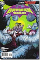
Batman and Robin vs. Red Hood and Scarlet.

batmanandrobin005Writer: Grant Morrison
Penciller: Philip Tan
Inker: Jonathan Glapion
Colorist: Pete Pantazis
Letterer: Patrick Brosseau
Assistant Editor: Janelle Siegel
Editor: Mike Marts
Covers: Frank Quitely and Philip Tan
Publisher: DC Comics

I really enjoyed the first issue of this series. It had a sense of excitement and freshness, and just that great sense of things being new and much better than the recent past. However, at this point, even some of what I liked in that first issue is wearing thin…and the "honeymoon" is definitely over.

This issue picks up with Red Hood and Scarlett confronting Batman and Robin. Red Hood’s determined to kill all of Gotham’s criminals and doing so while replacing the "Batman brand" with his own "brand." Scarlet–a girl the duo tried to save earlier in this series–has been manipulated into playing Jason Todd’s game, serving as his "sidekick." We continue to see the Gotham populace react to the bloody vigilantism as well as a more specific reaction from Jim Gordon.

I don’t know what it is, exactly–perhaps Morrison‘s writing style–but this story feels like it got rather convoluted in a hurry. I’ve never liked Jason Todd…I always thought the best story with him was the one in which he "died." The character seemed so much more effective in that tragic role. Now, it seems the character is little more than a bloodthirsty psycho.

Not liking the character, and not feeling much "connect" to the story, this story’s quickly growing stale for me.

The art for this issue doesn’t really do it for me, either. It’s not bad, but it’s somehow just not to my liking, at least not in this issue. It does a good enough job overall of getting things across, but other points I find myself doubling back to try to figure something out. Though I’m not caring for the style lately, Tan does do quite a good job of keeping a visual style similar to Quitely‘s opening arc. There’s a different look and it’s easy to tell that it’s not Quitely…but the style is not some huge departure visually.

All in all…if you like Morrison‘s denser writing style, if the art appeals to you, and/or you like seeing Jason Todd as portrayed of late…this issue’ll be well worth it. If not…you’ll probably enjoy one of the other Bat-books more.

Ratings:

Story: 2/5
Art: 3/5
Overall: 2.5/5

Batman and Robin #3 [Review]

Quick Rating: Solid
Story Title: Batman Reborn Part Three: Mommy Made of Nails

Batman and Robin vs. Professor Pyg as the new dynamic duo solidifies as a team.

batmanandrobin003Writer: Grant Morrison
Artist: Frank Quitely
Colorist: Alex Sinclair
Letterer: Patrick Brosseau
Assistant Editor: Janelle Siegel
Editor: Mike Marts
Covers: Frank Quitely and Tony Daniel
Publisher: DC Comics

This issue picks up with Batman interrogating a lackey in typical Batman fashion–though it turns out he was "allowed" access to the suspect by Commissioner Gordon himself. The two clash over methods, but ultimately part ways still allies (which is a nice change from what could otherwise be a cliched story element). Batman’s trying to find the captured Robin, who we find about to be tortured by "Professor Pyg." Battle ensues as Batman and Robin vow to be an actual team after recent solo play, and though their opponents (doll people) are fairly creepy–especially as rendered by Quitely–they seem to fit quite well into a rogues gallery that includes the likes of Clayface, Two-Face, Mr. Zsasz, and others. After dealing with the villain at hand, the heroes locate someone they’ve been seeking–a man familiar to readers of Morrison‘s past Batman issues who was instrumental in Batman: RIP. We have a full-page panel that is silent here, though if one’s read RIP, the dialogue is known from the opening page of that arc.

All in all, another solid issue. While I can appreciate adding to a fairly limited rogues gallery, I’m not particularly interested in the new villains–at least not yet. I enjoyed the fact that I’ve not been left half a year before seeing any costumed crazies taken down by the new Batman and Robin; I’ve also enjoyed the way we can really see what an abrasive kid Damian is ("Whose neck do I break first?" upon coming back to consciousness) which seems to further the need for guidance–that Dick can provide. It’s also refreshing to read a story from this writer that I can actually follow–that at least is entertaining on face value even if I’m picking up nothing in the way of background references. (If there are a lot of subtle things to be teased out of the story by multiple readings and lengthy analysis…cool. But I enjoyed this read just fine without ’em).

The art feels rather lumpy…it gives the characters a strange sort of appearance. Nothing quite disfiguring, but far from the smooth lines I’m used to seeing the characters with in other titles. Still, for the style, it’s consistent and gets everything across I’d expect it to, so no huge issue for me there…though there are a few other artists whose work would probably make this feel absolutely top-notch.

As is…a good issue, and worth picking up if you’ve been giving the title a try. I’m not sure if this is truly the final issue of the arc, but it feels like it is, so the next issue will likely make another good jumping-on point; if you can find the first couple issues to give you all three, it’s definitely a very worthwhile read.

Ratings:

Story: 4/5
Art: 3.5/5
Overall: 3.5/5

Batman and Robin #1 [Review]

Quick Rating: Good!
Story Title: Batman Reborn Part One: Domino Effect

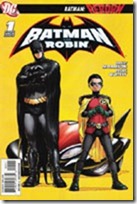
The new Batman and Robin make their debut, with new villains, a new ride, and a lot of potential.

batmanandrobin001Writer: Grant Morrison
Artist: Frank Quitely
Colorist: Alex Sinclair
Letterer: Patrick Brosseau
Assistant Editor: Janelle Siegel
Editor: Mike Marts
Covers: Frank Quitely and J.G. Jones
Publisher: DC Comics

The cover has a certain iconic look to it…though there’s also every chance that’s partially because it’s one of the images that’s been around for awhile now for this month’s new status quo amidst the Bat-books. Batman has a confident, amused look about him, with a Robin who looks like he’s itchin’ for action…and this is the image that initially convinced me that I would actually like to see Damian as Robin. There’s something to the potential dynamic here that really interests me.

We open the issue on a new villain (a Mr. Toad? They wouldn’t give us a character too similar to the X-Men villain The Toad, would they?) being pursued by Batman and Robin…who have a flying Batmobile (which seems just like Morrison to throw in there). Outlandish though it is, when it comes to the DCU and the Bat-corner and whatnot…I suppose a flying car isn’t so far out there as to be entirely unbelievable. We get a few pages of them interacting with Alfred (where we see both Dick’s and Damian’s personalities come through a bit, especially in the way they talk to Alfred…this also shows how different the two are).

We get the obligatory scene with Gordon and his officers, the obligatory here’s-what-the-villains-are-up-to-since-they’ve-not-yet-been-found-out-by-Batman scene…and as has become fairly standard for new books and new directions with DC, we even get the obligatory page with several panels "previewing" what is to come over the next year in the book.

The story feels like a Morrison book…but this time, in a good way…at least for this issue. We see the main characters in action; there’s no question of who they are. We get the "updated"/current takes on other classic elements associated with Batman; we get a new villain–several, actually–who could be sorta interesting if only for an arc. However, unlike the last Batman arc I read by Morrison, I don’t feel like I’m "lost" going in; if there’s more than the surface story, then hey–that’s cool; but I don’t feel like I’m missing out on some in-joke here.

The art is pretty good overall–I enjoy the visual style on the whole. I just don’t like the way the faces come across–it seems like everyone is "lumpy" in a not-so-good sorta way, almost for the sake of having that kinda detail on the faces. In addition to the cover as I mentioned at the start of this review, there’s also a page of the title duo disembarking from their flying vehicle that I would love to have as a poster, and that is loaded with potential (it remains to be seen what the reaction to them is, if we even see it next issue).

Honestly, I feel like this is what that All-Star book should’ve been…and with a simple sentence like "Bruce is gone, Dick has taken over" one wouldn’t even have needed to slog through the last year or so of stuff to get to this status quo.

I like it. There’s loads of potential here–especially if this book keeps to its own sandbox while sharing the status quo with the other books for the "general DCU" stuff. This won’t be for everyone, but as first issues go, as really debuting the new Batman status quo, and all that kinda stuff….this is an issue well worth checking out…the bigger question will be whether it can live up to its potential and expectation.

Ratings:

Story: 4/5
Art: 4/5
Overall: 4.5/5

All-Star Superman #8 [Review]

Quick Rating: Average
Story Title: Us Do Opposite

Superman and Zibarro on the Bizarro World as said world sinks into the Underverse.

allstarsuperman008Writer: Grant Morrison
Pencils: Frank Quitely
Digitally Inked & Colored by: Jamie Grant
Letters: Phil Balsman
Asst. Editor: Brandon Montclare
Editor: Bob Schreck
Cover Art: Frank Quitely
Publisher: DC Comics

Perhaps it’s the timing, or zeitgeist, patience wearing thin or just plain change-of-tastes…this issue is the first that I’ve really felt outright let-down by.

The issue continues from the previous one (which was itself a "To Be Continued…"), picking up with Superman on the Bizarro world with some guy called Zibarro, an imperfect imperfect (read: "perfect") duplicate of Supes. (At least, that’s the impression I got contextually–whether this issue is on-time (bimonthly) or not, it feels like it’s been awhile since the previous issue, and I didn’t recall much detail from that.) The Bizarro world is sinking into the "underverse," and while Superman has gotten the Bizarros off Earth, he himself is trapped on their world, and rapidly losing his powers (the further into the Underverse they get, the more the sunlight is changed to red sunlight, which of course means no more yellow/power for Supes). This forces Superman and Zibarro to get creative for a solution to their problem. Meanwhile, on Earth, Lois and others compare notes on the situation as a whole, leading Lois to a particular revelation that’s been a long-time coming.

Yes, I was let-down by this issue. For one thing, I had wrongly assumed it would conclude the Bizarro story from the previous issue. I’d figured a 2-parter wouldn’t be bad, but I rather like the one-off nature of earlier issues, where you could pick up a single issue and enjoy it start to finish, without needing context of the previous issue(s). That this is also a "To Be Continued…" issue is a disappointment. The "Bizarro-speak" gets extremely frustrating very quickly…I found myself trying to sort it out/logically comprehend it, but quickly gave up, and relied more on tone and visuals to figure out what was going on, as well as context from Supes and Zibarro speaking normally.

I’m also not a fan of the Bizarro concept as a whole…and while I’m sure this story has some nice homage to silver age stories (much as this series as a whole seems to be a modern-age sensibilities / homage to the silver age), it lacks the charm of earlier stories presented in this series, and simply fails to engage me.

The art is good, as usual, for the story…Quitely provides a that distinct, almost simplistic visual style that has defined this series visually so far, taking apparent cues from Superman: For All Seasons without outright mimicking it. The art fits the story, shows what is going on, and in general works quite well; I really have no complaints with it.

With no real recapping, this issue doesn’t seem like the best point for a new reader to jump on-board. While you do get a story of Superman on the Bizarro world, it’s missing much of the context and the "why" presented by the previous issue. If you’ve read the previous issue, you’ll probably want to read this for the obvious story continuation. And if you’re a general Bizarro fan or fan of silver-age type stories in and of themselves, you may just enjoy this, context-be-darned.

Ratings:

Story: 2.5/5
Art: 4/5
Overall: 3/5

All-Star Superman #7 [Review]

Quick Rating: Good
Story Title: Being Bizarro (part 1 of a 2-part adventure)

Bizarre creatures descend on the Earth, duplicating those they come into contact with, while a square world heads toward Earth…

allstarsuperman007Writer: Grant Morrison
Pencils: Frank Quitely
Digitally Inked & Colored By: Jamie Grant
Letters: Phil Balsman
Asst. Editor: Brandon Montclare
Editor: Bob Schreck
Cover Art: Quitely
Publisher: DC Comics

This title continues to be a sort of "modern update" to silver-age stories, with similar elements that seem very familiar from those classic stories, while adding or incorporating a modern twist. Morrison and Quitely deliver another tale that fits well within the continuity established for this title–though it seems almost as if the idea of Supes having been poisoned has been left to the side, with not a mention of it here, nor of the events from the previous issue–in fact, we are plunged directly into the action at this issue’s open.

The issue opens with a P.R.O.J.E.C.T. mission gone bad that may hint at story elements to come, and then we find Superman in space dealing with some unearthly behing before being ambushed by some clay-looking creatures, and witnessing the appearance of a cube planet. Cut to Earth–Metropolis–where more of these creatures crash-land, bringing destruction and chos with them. Upon touching anyone, the creatures take their shapes, and the vocabulary generally recognized as being that of Bizarro. Another one appears, with the costume of Superman, and the battle is on–Superman versus his bizarre duplicate, as well as that for survival amidst the Planet’s staff.

Up-front, this is probably my least-favorite issue of this series–probably largely due to the fact that it’s a 2-parter, so we’ve only got half a story and a decent wait between issues means it’ll be awhile til I get to read the next part.

As stated above, this issue continues very much in line with the previous issues–maintaining both the visual and the written continuity/feel. The story takes the classic Bizarro concept and gives it a mild shove, that seems at once over-familiar and yet inspired. However, I’m not particularly impressed overall. This isn’t bad, but it’s not blowing anything to a new level for me or giving particular "insight" to a character, metatextually or otherwise.

Quitely‘s art keeps the feel I’ve gotten used to for this title, and while I wouldn’t be enthused about seeing it for the "regular" Superman, for this title it works very well; I have no real complaint with it. I was even amused at one panel that made me think "Niiiice…Zombie-Superman!" for a moment.

Unless you’re specifically turned off by Morrison or Quitely and previous issues, you’ll probably find this–like I did–to be another solid (if somewhat disappointing compared to the previous issue) entry in the series. If you’ve not checked the title out before, this may seem a bit more "out-there" than much else, but it IS the start of a new story, so not a terrible point to jump on.

Ratings:

Story: 3.5/5
Art: 4/5
Overall: 3.5/5

All-Star Superman #6 [Review]

Quick Rating: Very Good
Story Title: Funeral in Smallville

Superman deals with the appearance of doppelgangers, and a certain loss…

allstarsuperman006Writer: Grant Morrison
Pencils: Frank Quitely
Digitally Inked & Colored: Jamie Grant
Letters: Phil Balsman
Editorial Assists: Brandon Montclare
Editor: Bob Schreck
Cover Art: Quitely
Publisher: DC Comics

This particular issue doesn’t seem to have the ongoing continuity thread of the earlier issues (as far as Supes being sun-poisoned and dying). It certainly holds up on the "presents a self-contained/issue story" end, though.

Superman/Clark hangs out with his parents, and while it’d be second nature to him to deal with the harvest using his powers, Pa insists on hiring help to get it done the old-fashioned way. This "help" proves to be more than they let on, leading to a rather cliched super-battle that somehow doesn’t come off in THAT bad a way.

Morrison‘s writing here is good, and while the cover pretty much gives away what happens, it’s easy to be occupied with the action, until what happens does. In that way, we see a Superman that is seemingly much younger than the "main continuity" version, as well as almost more realistic. The story itself is nothing new, but it’s the specific presentation that makes it worthwhile: in THIS continuity, for THIS Superman; and in a way it seems to draw from several versions of the character, providing a sort of "merged" handling of the elder Kent. Morrison seems to enjoy dipping toes into a number of swimming pools, giving us glimpses of different ideas or ways to take certain characters: before I’d even read the identity of one future character, I recognized the symbol from that story from 1998 (seems that was a million years ago, doesn’t it?).

Quitely‘s art is good, and just works well with the writing; the style (at least for the moment, coming down off a cold) reminds me of Tim Sale‘s style, particularly from Superman: For All Seasons. (To some degree, the story itself almost seems like it could be fit with that, though it’s been years since I last read it).

As infrequent as this book is, it’s not a favorite exactly, but it’s certainly enjoyable, and well-done. This is the Superman to introduce people to who aren’t terribly familiar with the character and uninterested in a monthly commitment; it gets at some core elements popularly known with the character, without relying heavily on or being expected to use heavy continuity. If you pick up no other Superman book, this would be the one that’s worth getting.

Ratings:

Story: 4/5
Art: 4/5
Overall: 4/5

All-Star Superman #5 [Review]

Quick Rating: Good
Story Title: The Gospel According to Lex Luthor

Clark Kent interviews an imprisoned Lex Luthor…

allstarsuperman005Writer: Grant Morrison
Pencils: Frank Quitely
Digitally Inked & Colored: Jamie Grant
Letters: Phil Balsman
Asst. Editor: Brandon Montclare
Editor: Bob Schreck
Cover Art: Frank Quitely
Publisher: DC Comics

Superman doesn’t show up in this issue. Instead, this is a more character-centric piece looking in on the "All-Star Universe" Lex Luthor, as interviewed by–and interacting with–Clark Kent (who, of course, is actually Superman, but Luthor doesn’t know this.)

Visually, this issue seems–without my having the prior 4 open before me–on-par with those issues. Quitely‘s art seems to capture at once a simplicity often lost to comics, while managing to convey a subtle complexity. That’s not to say this is the most detailed art, nor is it the most simplistic–it’s an interesting blend of both, and for a standalone-continuity incarnation of Superman and the supporting cast, I think it works very nicely.

The story here–Clark Kent interviewing Lex Luthor, encountering The Parasite, and Luthor apparently keeping Kent alive (under his "protection") within the prison)–is, as in previous issues, reminiscent of a silver-age sensibility. However, there’s a complexity going on in Morrison‘s writing that shows those silver-age things in contemporary light. In short, the story can look and feel a bit silver-age, but that’s like a side-effect from a story that is still well-written.

As with the previous issue, this issue includes something between a cameo and a full-blown appearance of an established (in the regular DC Universe) villain, but in a way that isn’t quite the same-old, same-old. The appearance makes good sense given the setting, and provides a bit of impetus in moving the story forward–and perhaps (possibly) setting some stuff up for down the road (especially if we’re to believe Luthor to be quite the smart cookie).

If Superman interests you but you don’t want to get bogged down in years of continuity; or you’re just a fan of Quitely or Morrison, this issue should be a pleaser. The story focus is on the characters, and Superman doesn’t appear in-costume. While disappointing to some, I’m sure…it works for me, given the story.

Ratings:

Story: 3.5/5
Art: 3.5/5
Overall: 3.5/5

All-Star Superman #4 [Review]

Quick Rating: Very Good
Title: The Superman/Olsen War!

On this particular day in the life of Jimmy Olsen, the kid’s got his hands full with an evil Superman and a plan to save the world…question is, what will it cost him?

allstarsuperman004Writer: Grant Morrison
Pencils: Frank Quitely
Digitally Inked & Colored by: Jamie Grant
Letters: Phil Balsman
Asst. Editor: Brandon Montclare
Editor: Bob Schreck
Cover Art: Frank Quitely and Jamie Grant
Publisher: DC Comics

I hardly even remember the previous issue, offhand. Thankfully, due to the nature of this series, one doesn’t really have to remember that issue to "get" and enjoy THIS one.

Jimmy Olsen here is working on a series of "For a Day" columns, in which he takes on certain jobs for a day, following them with a column about his experiences. The focal role he takes on in this issue is as Director of "P.R.O.J.E.C.T."

Of course, Jimmy being Jimmy, trouble ensues, resulting in the summoning of Superman to the scene, to bail everyone outta said trouble…though this, predictably, only leads to more trouble–and ultimately, a certain ‘friction’ between Superman and Jimmy.

The conflict becomes physical, and as the issue’s story-title suggests, we get to see Superman and Jimmy really go at it–while providing a semi-unique interpretation of yet another character, working it into the "All-Star" version of things in such a way that doesn’t interrupt status quo, and is left open to return later.

This issue is yet another example of how both Morrison and Quitely present a Superman comic that greatly differs from the current/ongoing main titles…and yet "gets" a certain essential aspect of the characters, telling stories that are possibly more fun and entertaining than those main titles. This may not be THE Superman that everyone seeks…but this version of Superman should be recognizable by anyone.

The art is clear and distinct–conveying exactly what needs to be conveyed. The visuals may not be "photorealistic," but they don’t need to be–they have a style all their own, that works very well for this issue–and the series as a whole.

While I am personally a fan of "continuity," this issue is argument in itself showing what can be done outside the bounds of "continuity."

Long-time Superman fan or newer reader, this issue–and the earlier issues of the series, as well–are very much worth picking up. If you don’t care for the main Superman books, this series is far enough removed that you needn’t worry about some infinite crossover or anything. Being approximately bi-monthly, the series puts less strain on the wallet, and each issue having a self-contained story, while carrying certain threads from one to another makes for a rewarding, satisfying reading experience.

Ratings:

Story: 4.5/5
Art: 4/5
Overall: 4.5/5

All-Star Superman #1 [Review]

Quick Rating: Good!
Title: …Faster…

Superman saves a group of scientists, Luthor puts his plan to kill Superman in motion, and of course, some Daily Planet drama…

allstarsuperman001Writer: Grant Morrison
Pencils: Frank Quitely
Inks: Jamie Grant
Colors: Jamie Grant
Letters: Phil Balsman
Asst. Editor: Brandon Montclare
Editor: Bob Schreck
Cover Art: Frank Quitely
Publisher: DC Comics

I was prepared to be rubbed the wrong way by this title. I’d heard mixed things about it, and Morrison‘s been a bit of hit-or-miss with me. I also wasn’t sure what I’d think of a story going back to basics on the character, especially when it would seem that meant going back to more of a "silver age" sensibility and such, particularly in the Superman/Lois relationship.

But I sat down to read this issue, and my # 1 complaint is that it’s like being allowed to watch just the first 15 minutes of a movie. You get the introduction of the characters, a bit of conflict, the set-up for the main plot, and a bit of a cliff-hanger when you have to turn it off and do something else, and wait another month for another dose.

The story certainly delivers on the back-to-basics, as we have a Superman unencumbered by marriage or other official romantic ties; a bumbling Clark Kent racing in at the last second to everyone’s wonderment at his whereabouts. Lex Luthor is an evil scientist under government watch (apparently he’s been allowed out of prison to use his genius to better mankind (or the government) so long as he doesn’t keep trying to kill Superman).

And in four panels on the first page, the character’s origin is summed up, which is cool as a refresher, and pretty much necessary only to remind readers (such as those who haven’t touched a Superman comic ever, or in the last 20 years or such) of the origin, since it’s arguable that just about everyone knows the basics of the origin: Doomed planet Krypton, parents launch a rocket into space, where the baby is found by a couple and raised on earth.

I don’t know that this is Morrison‘s most novel approach to a character, but something about it definite works. We get a status quo more reminiscent of the pre-Crisis Superman stuff, but the tone is definitely modern, including an interesting take on the nature of Superman’s powers.

This issue has a lot of little details and little moments, and I’d love to talk about them all, but that’s impossible for a review such as this. Suffice to say that if you’ve never really cared for Superman–either he was too powerful, too god-like and un-relatable or to the other extreme, was too human, not powerful enough…this take falls somewhere in the middle.

Quitely‘s art is also very good, conveying a sort of not-quite arrogance about Superman, but a playful, carefree attitude as he goes about doing his business of saving others. The facial expressions of the characters carry a lot of story, and the artist’s style in general works well here.

Other than the opening page, nothing’s said of the origins of the character-we’re plunged right into the midst of the story, everyone knows who Superman is, Clark’s already a reporter for the Planet, and so on–which is rather refreshing. It’s like being a kid again, being given a random Superman comic that just happens to start a multi-part story. (And this one has nothing to do with crises or multiple earths, united villains, countdowns to anything, etc.)

Well-worth checking out!

Ratings:

Story: 4/5
Art: 4/5
Overall: 4/5