• March 2023
    S M T W T F S
     1234
    567891011
    12131415161718
    19202122232425
    262728293031  
  • On Facebook

  • Archives

  • Categories

  • Comic Blog Elite

    Comic Blogs - BlogCatalog Blog Directory

Detective Comics #965 [Review]

detective_comics_0965A Lonely Place of Living Chapter 1

Writer: James Tynion IV
Pencils: Eddy Barrows
Inks: Eber Ferreira
Colors: Adriano Lucas
Letters: Sal Cipriano
Covr: Barrows, Ferreira, Lucas
Assistant Editor: Andrew Marino
Editor: Chris Conroy
With Gratitude to: Marv Wolfman, George Perez, and Jim Aparo
Published by: DC Comics
Cover Date: November 2017
Cover Price: $2.99

I’ve gotten woefully behind in actually reading Detective Comics, though it seems it should be one of my favorite titles. But I was a bit put off by the supposed ‘death’ of Tim Drake early in the new run last year, and wasn’t in a big hurry to follow anything "long-term" with that for a number of reasons. And time passed.

Recently, I was quite excited by a familiar-looking image, in an ad for the then-upcoming (now here) Detective Comics story A Lonely Place of Living. For the cover alone, standard or variant (in an extremely rare bit of sentiment) I was going to get the issue ASAP: it’s a callback to my own earliest days "in comics." My first-ever issue of Batman was #439–the closing chapter of Year Three; my second issue was #440…the opening chapter of A Lonely Place of Dying, which is where this story gets its title (sorta like the recent The Lazarus Contract‘s title playing off the classic The Judas Contract).

So for nostalgia alone I was gonna get this issue. But given continuity things of the last six years, I didn’t know exactly what the story itself would yield, outside of the story title and the cover playing off the classic.

We open on a flashback–Tim confronting Dick as he visits the circus he grew up with, showing him photos of Batman going off the deep end and explaining that he knows Batman is Bruce Wayne and that he–Dick–is Nightwing, formerly Robin. In the present, we find Tim being questioned by Mr. Oz–recently revealed to be (a?) Jor-El, father of Kal-El (Superman). We’re treated to brief flashbacks to the events of A Lonely Place of Dying, and then the beginning of the original Robin mini-series as Tim dons the duds and officially becomes Robin. Jor-El reveals his "truth" to Tim even as Tim exerts some control of the situation. He soon finds himself in contact with Batman…only it’s not the Batman he expects…rather, it’s a Batman he swore would never exist. Before much can come of that, the two find themselves facing possibly the most dangerous creature Oz had captured, which leaves us waiting for the next issue.

I would have to actually go back to the original issues or one of the collected editions on my shelves to confirm, but the dialogue in the flashbacks hit pretty darned CLOSE to my memory of the exchanges between the characters, and honestly gave me a slight chill at the way the flashbacked-scenes brought up memories for me.

As of reading this issue, I already knew the "big reveal" of Oz’s identity (though I’m still not sure if or how I’ll accept it–I’m still waiting for some other swerve and imagine it’ll be quite a long time before I’d accept it as the canon it’s being presented as and not just another plot point on the way to something else). I definitely dug Tim’s ingenuity, seeing that despite his time as a prisoner, he’s continued working on a way to escape (and after another earlier escape that we saw in Superman Reborn).

I was not prepared for/expecting the older Bat-Tim to show up or be any part of this at all…I honestly initially saw him as "just another character" of no significance; some swerve to this story or some trap for Tim or some such; it was seeing someone’s comment about the Titans of Tomorrow story that jogged my memory and contextualized the character…making this all the more cool as a story.

I’m not particularly familiar with Tim’s story or origins from 2011-onward; really since before 2009 as I’d lapsed as a reader early in the Red Robin run, and got right back out of the New 52 iteration of Teen Titans that I’d tried at the start. But at least for this opening chapter of A Lonely Place of Living, I feel like I’ve got "my" Robin back, "my" Tim Drake.

Which is a rather personal thing for me as the character debuted AS I got into comics…

Story, art…all in all, this is an excellent issue, certainly for playing on my nostalgia. The story is strongly rooted in continuity, in history…and the art just looks good, with nothing taking me out of the story. This issue just is.

If you’re a fan of Robin, or Tim Drake, or the current run of Detective Comics, I highly recommend this. Really, even if you aren’t a fan of them…this feels like something big, and all the moreso to me personally. Only this first chapter in and I already know I am absolutely looking forward to the inevitable double-dipping of getting the collected volume, and wondering what form that might take–as well as whether or not we’ll get any new version of a collected volume of the original A Lonely Place of Dying story!

tec965_batman441

The Hellblazer: Rebirth

hellblazer_rebirth_0001Writer: Simon Oliver
Artist: Moritat
Colorists: Andre Szymanowicz and Moritat
Letterer: Sal Cipriano
Cover: Moritat
Associate Editor: Jessica Chen
Editor: Kristy Quinn
Published by: DC Comics
Cover Date: September 2016
Cover Price: $2.99

It’s kinda hard to believe it at this point, but I’ve been a fan of John Constantine–the Hellblazer–for 15 years now. I was introduced the character barely halfway into his 300-issue run with Vertigo (around #160) and have followed off-and-on ever since, as well as backtracking. With the new editions of the collected volumes combined with what I already had, I have the entire series–and several of the spin-offs–on my shelf (though I still have some reading to catch up yet fully). I checked out Justice League Dark at the dawn of the New 52, specifically for the "DC Universe version" of Constantine (who had just earlier that year been re-introduced into the DCU proper in the Search for Swamp Thing mini during/following Brightest Day). I checked out the first couple issues of last year’s DC You launch, and had previously checked out the first issue or two of the previous Constantine series.

Neither of those overly grabbed me (and having the Vertigo Hellblazer stuff all in collected editions, I was content to pass on single issues for eventual collected volumes) and I was even going to pass on this issue for the moment (It’s part of a bundle I pre-ordered but still have a couple weeks to wait on arriving)…but I have "history" with the character/title, and seeing the "original" Hellblazer logo used here grabbed me enough to "double dip."

And while this is still a John Constantine–a Hellblazer–that IS set in a world in which Shazam and Wonder Woman exist as well, it also references back to key elements of the Vertigo series, establishing that this is a Constantine that has been impacted by those developments, and not just grabbed from his pre-Hellblazer stage.

In short, he’s back.

After an adventure "banished" in the US due to a curse placed on him by a demon, John returns to London, reunites with his best mate Chas, and sets about dealing with the curse. Of course the demon shows up, as well as another figure from Constantine’s past (that I am not sure if I know or not, or SHOULD know, but whatever), and things are dealt with in "typical" Constantine fashion.

The character appears younger here than I recall him from the Vertigo series, yet the visual style "fits" what I’ve grown used to over the last several years’ worth of stuff in the New 52. The art for the issue works well with the story mixing both the rough "darkness" in tone with something that definitely takes place in a world with super-heroes around.

Story-wise, I really very much appreciate things here, that this ‘feels’ like the version of the character I’m used to. Yet, this is not marked as a "mature readers title" nor is it part of a "mature readers line," therefore certain "language" is "bleeped out," but it’s not hard to fill in the blanks in reading…which is a nice compromise and something I have zero problem with. Often, certain things are all the more effective being "implied" than explicit…including language.

This issue seems like a "bridge" issue, moving from the most recent ongoing into this new "post-Rebirth" series that retakes the simpler Hellblazer name and general-ish status quo. As such, it is also very nicely self-contained in a way that seems like it’ll work very nicely for a reader continuing on from the last series as well as a lapsed reader that hasn’t seen the character since the Vertigo run ended…and funnel both sides into August’s ongoing.

That said…this seems a great issue for fans of either version of the character, and instills a definite confidence in me for the ongoing. That I’m not familiar with the writer is fine by me…I’m more interested in reading about the Constantine character than I am in reading _______’s version of the character. This even works as just a random one-off issue where you don’t really have to have read anything recently before, and it has an actual "ending" without pulling a "To Be Continued…" or cliffhanger on the reader.

I definitely recommend the issue, and look forward to the ongoing series…though I’m not 100% "sold" on whether I’ll opt to follow it as single issues or wait for collected volumes. I’ll be happy to–and presently look forward to–the singles as long as I’m getting the bundles, and will take it from there.

Superman (2011) #32 [Review]

Superman #32

Men of Tomorrow – Chapter One: Ulysses

Writer: Geoff Johns
Penciller: John Romita Jr.
Inker: Klaus Janson
Colorist: Laura Martin
Lettering: Sal Cipriano
Cover: Romita Jr., Janson, Martin
Published by: DC Comics
Cover Price: $3.99

I wasn’t going to buy this issue. I’d been annoyed by the ads the last couple months, and wasn’t a fan of the art from previews…to say nothing of being annoyed AT the previews themselves (having never been a particular fan of the 5-page or so previews masquerading as chosen content in any given issue).

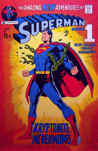
But at the shop, the coloring of the cover caught my attention: It’s not an image I recognized from the ads (the ads’ image I’d thought for SURE was the COVER IMAGE for this given its use all over the place!). While I’m not a fan of the linework, the image caught me–the red of the cape, the blue of the main suit, and maybe all the more, the orange and yellow background. It’s reminiscent of two VERY familiar covers in my mind: the Kryptonite Nevermore issue, and Adventures of Superman #497 from 1992.

Where usually the cover and art are not the primary influencing factor in my buying a comic, in this case, it definitely “sold” me on at least this issue alone.
I also quite like the fact that the visual style fits the interior; it sometimes feels like the covers can be a distinctly different thing, giving one impression while the interior is a completely different visual style.
I recall liking Romita‘s art some 12/13 years ago on Amazing Spider-Man, JMS‘ run, but as I’d noticed from the previews and now having been through the actual issue, I’m not terribly thrilled with the style with Superman. It’s certainly not bad–and loads better than anything I could ever dream of being able to draw myself–just that for this first issue it doesn’t fit with my preferred visual take on Superman (a la Dan Jurgens, Jim Lee, Ed Benes, to name a few). The art certainly does its job…I’m never really left wondering what’s going on, and there’s nothing that jars me out of the story scratching my head at anatomy or some other quirks that different artists’ styles sometimes have done to me. If you’re a fan of Romita‘s style, this would seem to be a solid example of that, except it’s with DC characters instead of Marvel.

While Janson‘s name sticks out quite a bit to me, I’m honestly not one that particularly consciously notices inking–linework tends to go together as one thing, with the penciller getting much of the credit. In this case, given just how recognizeable the art is to me as Romita’s style, I’d say the inking maintains the style, complimenting it quite well…it certainly doesn’t detract in any way I notice.

If I’m correctly recalling, the last time Johns came onto a Superman book was in Action Comics, beginning the Last Son arc with Donner, and I was none too thrilled with elements reintroduced to the Superman story during that run. I was also not all that thrilled with the Secret Origin arc and what THAT reintroduced.
However, this is an entirely different DC universe, an entirely different Superman, and as such, I’m along for the ride and whatever elements are brought in. I’ve not been particularly invested in the New 52 Superman, at this point having read barely 1/3 of the run.
Johns introduces us to Ulysses, a boy sent from his dying world by his parents to another place in the hopes that he would live…an origin quite parallel to that of Kal-El. Years later, Superman takes down Titano, a giant (mechanical) ape troubling Metropolis. Not long after, we spend some time at the Planet with Perry, Jimmy, and a visiting Clark. Perry offers to bring Kent back in, and offers a bit of a ‘speech’ that will surely impact the young reporter/blogger/super-hero. A new threat hits the city, and though Superman intervenes, it takes the intervention of a new  figure to temporarily resolve the issue, as the man believing himself to be the Last Son of Earth discovers he’s not nearly as alone as he’d thought.
Frankly, I don’t want to be interested. I don’t want another $3.99 book on my slate each month, especially with the title being what seems to me arbitrarily bumped to the higher price, when Superman started as a $2.99 book and Action Comics was the $3.99 book.
But Johns has done it–I’m interested in spite of myself. I may not be enthused with the art, but the story more than makes up for it. I haven’t a clue how LONG Johns will be on the book, and this strikes me as likely “graphic novel” fodder (without getting much into the issue of stories “written for the trade”) so it remains to be seen if I pick up the next issue.
I’m not ready to add this to my pull list by any means…but I’m not disappointed in having spent the $3.99 that I did, I’m interested in what comes next within the story, and it’s highly likely that if I don’t pick up the rest of this arc in single-issue format I’ll definitely look at picking up the inevitable hardback.

adventuresofsuperman497      superman233

superman0032

Superman Unchained #1 [Review]

Superman Unchained #1The Leap

Writer: Scott Snyder
Penciller: Jim Lee
Inker: Scott Williams
Colors: Alex Sinclair
Letters: Sal Cipriano
Cover: Jim Lee, Scott Williams, Alex Sinclair
Assoc. Editor: Chris Conroy
Group Editor: Matt Idelson
Published by: DC Comics
Cover Price: $4.99

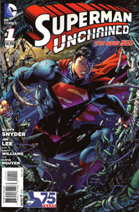
So…$4.99 for this Superman Unchained #1. It’s functionally a 20-page story with a 2-page “epilogue” or “backup” or “extra feature.” 22 pages for $4.99. BUT there’s what was billed as a “tipped-in POSTER” included. This poster is just a double-sided foldout allowing for two single images roughly 4x the size of a normal-sized page, the most “poster-like” loaded with caption boxes. Maybe technically this counts as an extra 8 pages…but that STILL only brings the pagecount to 30…for $4.99. Removing this so-called “poster” involved peeling it off a bound-in piece of tagboard–something which I would assume complicated the printing/binding process in itself to put in, plus the folding, placement of the glue, and the placement of the “poster.” And the “poster” itself had a couple dots of this glue, keeping it from flapping open.

All this hassle, and it’s basically for one side of a “poster” being this huge image of Superman crashing through a satellite, and then an extra-large image of him narrating the situation on the other side. Hardly something that would really make sense on the wall as a poster, more just some comic page pulled out of an issue and stuck on the wall.

$4.99. Five dollars. And while I read the first arc of Superman when the New 52 began–so have a BIT of context of Lois, Perry, and Clark’s relationships…I’m not even that clear on what things are here. And the issue’s big “reveal,” the thing that’s such a big deal, isn’t. Not to me. It doesn’t fit. It doesn’t interest me. It doesn’t change things.

So, objects are falling to Earth. Superman’s trying to stop them, letting one go since he sees it’ll fall “harmlessly” while he stops this huge “Lighthouse” satellite that’s gonna hit like a gigantic nuclear bomb. He confronts Lex Luthor, who has an alibi, and as he seethes over this, learns someone stopped that object he’d let go–but if it wasn’t him, Wonder Woman, or Green Lantern–then who, exactly, WAS it that stopped the thing? We learn of General Lane’s involvement, and of a secret weapon against Superman that goes back to the beginning of things.

Visually…the art’s good. It’s Jim Lee, whose art I’ve tended to almost always enjoy. Maybe I’m just irked about the “poster,” and/or the price and/or my own lack of context for not keeping up with Superman the last 15 months, but the art doesn’t blow me away. It’s good, but it’s not the “great” that I’d’ve hoped for. It’s not the Jim Lee art that a decade ago prompted me to NOT drop the Superman titles but rather keep up a few more months until Lee‘s run on an Azzarello story would begin.

Story-wise, I’m just not interested. I know a lot of people are loving Snyder‘s work, and will consider this to be great Superman…but unfortunately, this is NOT “my” Superman. Perhaps the collected volume(s) will end up being my thing, if I myself hear enough good about it to warrant checking them out. But for now…this issue just doesn’t do anything (positive) for me.

I have no intention of grabbing the next issue, and it’ll depend on others’ reviews whether or not I even bother returning to this title in any form, outside proper bargain bins. For your page count, you’d be better off grabbing the first Superman: Earth One graphic novel and reading that, especially if you’re looking for a specific tie-in to the Man of Steel film.

Batman Annual #1 [Review]

Full review posted to cxPulp.com.

Story: 4.5/5
Art: 4.5/5
Overall: 4.5/5

The New 52! #1 [Review]

The New 52! #1

Writer: Geoff Johns
Art: Jim Lee, Scott Williams, Ivan Reis, Joe Prado, Kenneth Rocafort, Gene Ha
Color: Alex Sinclair, Rod Reis, Blond, Art Lyon
Cover: Jim Lee, Scott Williams, Alex Sinclair
Letterer: Sal Cipriano
Assistant Editor: Kate Stewart
Editors: Dan Didio & Eddie Berganza

This issue is mostly teaser, and seems especially designed more for those following DC‘s The New 52 for the past 9 or so months moreso than a brand-new reader that might be sucked in for Free Comic Book Day 2012.

We’re shown a sentencing for a trio of characters, all of whom–if not off the bat, then by their fates–have a certain familiarity, as we see the origin of “Pandora,” who we see here has a much larger role to play in the new DCU in the near future. These three characters have been condemned by The Wizard (as in Shazam), punished for contributions to harm of mankind. In the present day, Pandora stirs up some trouble stealing back her box as she seeks to unravel her curse, and we’re then shown a glimpse into the near-future of the DCU, and the coming “event” due out “next year.”

There’s a whole mix of art to the issue, culminating in a fold-out posterlike 4-page spread by Jim Lee spotlighting the main Justice Leaguers in the “near future.” Overall, given this is essentially a sampler issue and I had no idea what to expect of it, the art didn’t stand out all that much to me. Some characters are familiar, others not so much, and I’m not sure if the unfamiliarity I have is with the New 52 in general, or with concepts being “introduced” in this issue.

Story-wise, there’s not a whole lot; this is like having the “origin” of Pandora (and a couple other characters) thrown in front of us to pull one in, like “hey, remember these guys? Here they are! See! Now you HAVE to read the coming event!”

As a free issue…yeah, this is worthwhile. If it weren’t for the credits taking up much of the bottom of the image, I’d be inclined to pull the center out of the issue and stick it on the wall as a small poster, at least. Almost half this issue is a section of 2-ish page “previews” of the second wave of DC titles, and I skipped over ’em. I already bought Earth 2 #1, and NOT being an art person, have no interest in the 5-7+ page previews DC‘s often stuck in the back of its books, and 1-2 pages mean even less.

Probably for the worse (to me), this issue makes it clear that The New 52 is building toward some huge event (coming next year, though), and since I’m not willing to invest in a bunch of titles as-is, I have even less interest now.

Story: 4/10
Art: 8/10
Whole: 6/10

Batman: The Dark Knight #6 [Review]

Full review posted to cxPulp.com.

Story: 2.5/5
Art: 3.5/5
Overall: 2.5/5

Azrael: Death’s Dark Knight #3 [Review]

Quick Rating: Below Average
Story Title: Book Three: Why Ask Why?

The stage is set for things to come as the new Azrael battles Nightwing.

azraeldeathsdarkknight003Writer: Fabian Nicieza
Artist: Frazer Irving
Letters: Sal Cipriano
Asst. Editor: Janelle Siegel
Editor: Mike Marts
Cover: Guillem March
Publisher: DC Comics

This issue, we get the battle between Nightwing and this new Azrael. We also get some further look into the “politics” and “origins” of the sect of the Order behind this new Azrael. Following the battle, we have a bunch of jammed-together scenes that don’t feel all that organic, but put stuff into place for the coming-soon ongoing Azrael series.

The art remains stylistic–not horrible, but not particularly thrilling. It definitely sets this book off from the other Bat-books, and sets a certain tone that I can’t quite put to words.

Story-wise, I’m not impressed. If this were in itself the third issue of an already-ongoing series, I might feel differently about it. As-is, I feel slightly hoodwinked, jumping on for a 3-issue mini that I thought would tie closely to Battle for the Cowl. What I got is something that is loosely tied to that story and an ending that doesn’t affect that story and simply tells me to follow more of this story in a new Azrael book.

This does definitely establish that there is a new Azrael and he’s not being abandoned after this brief story; if you’re interested in the concept, this isn’t a bad series…just look at this as a “pilot” and the rest of the series will pick up soon.

If you’ve not already picked up the first couple issues, this is not worth getting, and at this point, you may as well wait for a collected volume.

Ratings:

Story: 2/5
Art: 2/5
Overall: 2/5

Azrael: Death’s Dark Knight #2 [Review]

Quick Rating: Decent but not wonderful
Story Title: Book Two: Give and Take

The new Azrael’s costume is in demand…

azraeldeathsdarkknight002Writer: Fabian Nicieza
Artist: Frazer Irving
Letters: Sal Cipriano
Asst. Editor: Janelle Siegel
Editor: Mike Marts
Cover: Guillem March
Publisher: DC Comics

After so looking forward to this book…and generally being a fan of Nicieza‘s work, this issue leaves me quite disappointed. Especially for the fact that I had to practically re-read the thing to try to tell what exactly is going on–whatever larger plot, I’m apparently not picking up on it all that much.

The new Azrael’s costume is an old suit of armor, apparently cursed…and very much in demand, whether or not the man in the suit likes it…and the story seems to move around that and how the person wearing the suit is affected.

This issue’s art in and of itself is not bad–it’s nothing spectacular, but at the same time it is far from dissatisfying. No specific complaints on this aspect of the book.

Story-wise, I can’t help but wonder if I’m having trouble following things because of not being steeped in Azrael’s story. I know the original character from the Knightfall stuff, and read a couple other issues here or there–the Gotham Earthquake, stuff during No Man’s Land, as well as the final issue. Other than playing with some small toys placed in the larger Batman sandbox, this feels quite irrelevant to the Battle for the Cowl, and at a mere 3 issues–of which I’ve now read 2–I don’t know how the ending’s going to be at all satisfying…this almost needs to be 4 or more issues.

I dislike blatantly decompressed stories–those stretched several issues beyond what they need to be. This issue seems almost the opposite–I feel like we’re at best just starting to get an idea of what’s going on, and already the next issue is supposed to be the ending of the story.

I don’t particularly recommend this issue in itself. If you can snag it with the first issue and the third issue when that comes out, I imagine it might make for a decent one-sitting read. And perhaps the next/final issue will shed more light on things and make character more distinctive and memorable.

As-is, though, this issue–even with its cliffhanger–doesn’t even excite me enough to have me looking forward to that next issue.

Unless you’re coming to the Battle for the Cowl with a completist mentality, I think it’s safe to say you could avoid this book without really missing out on anything.

Ratings:

Story: 2/5
Art: 3/5
Overall: 2/5

Azrael: Death’s Dark Knight #1 [Review]

Quick Rating: Not bad
Story Title: Simple Sacrifices

A new Azrael is chosen and sent forth as Gotham struggles for lack of a Batman.

azraeldeathsdarkknight001Writer: Fabian Nicieza
Artist: Frazer Irving
Letters: Sal Cipriano
Asst. Editor: Janelle Siegel
Editor: Mike Marts
Cover: Guillem March
Publisher: DC Comics

It’s been awhile, but this is one book I was interested in for the character, regardless of writer or artist. It actually reminded me of my earliest days in following comics, back before I really noticed specific writers or artists and simply read and enjoyed comics for the specific characters.

We open on a new Azrael beheading a criminal (in a scene that I couldn’t help but think to myself “In the end, there can be only one…”). We then move behind the scenes to a faction of the Order of St. Dumas that is apparently not the same as that which set Jean-Paul Valley into things back in Sword of Azrael and beyond. These folks realize they need another Azrael, and so recruit someone who fits their present “requirements” for the role. We see this character into action as the new Azrael, and into a somewhat counter-intuitive cliffhanger.

I’m not terribly impressed with the art…it’s not to say it’s bad or anything, but there’s something to the style that just comes off kinda strange to me, and Nightwing in particular looked rather “off” in proportion/shape as depicted in here. Otherwise, the style definitely sets this book apart giving it its own look/feel, which does contribute a bit to the story as it helps show that this is definitely not an Azrael we’ve already seen.

The story itself also isn’t all that impressive to me, especially as something that’s only gonna run for three issues. I don’t see how there’ll be room to really see enough to get to know the character(s) in this book prior to the conclusion of the third issue, and that takes me outta things a bit. (At the same time, if this were an ongoing book or had several more issues, I think I’d be pretty much satisfied as far as first issues go). Nicieza builds on elements introduced in Morrison‘s run on Batman, which is cool–showing that this fits in existing continuity and isn’t being showhorned in.

Since we’re only one issue in here and have only one issue of Battle for the Cowl out so far, I’m not sure exactly where this series is going to fit–how tightly this will play into the main story. At the same time, there’s plenty of potential as we get introduced to this character who could be just the latest to hang onto the role before passing it along.

If you’re a fan of the Azrael concept and don’t mind reading a character that is NOT Jean-Paul Valley, or you’re just following the entirety of the Battle for the Cowl “event,” this’ll certainly be worth your while.

Ratings:

Story: 3/5
Art: 3/5
Overall: 3/5

%d bloggers like this: