• June 2023
    S M T W T F S
     123
    45678910
    11121314151617
    18192021222324
    252627282930  
  • On Facebook

  • Archives

  • Categories

  • Comic Blog Elite

    Comic Blogs - BlogCatalog Blog Directory

The ’90s Revisited: Uncanny X-Men #308

uncanny_xmen_0308Mixed Blessings

Writer: Scott Lobdell
Penciler: John Romita Jr.
Inkers: Dan Green, Al Vey
Letterer: Chris Eliopoulos
Colorist: Steve Buccellato
Editor: Bob Harras
Published by: Marvel Comics
Cover Date: January 1994
Cover Price: $1.25

This issue brought back a number of fond memories, as well as a new feeling as I “noticed” the art rather consciously this time. Having this issue relatively on-hand for this reading is something I must credit to fellow blogger Chris Sheehan, whose comments/discussion of the issue prompted the purchase and encouraged making the time for the re-read. It was his post that prompted me to re-purchase the issue (for the convenience of immediate availability in print without digging through umpteen unorganized longboxes to locate my original copy).

For a single issue, there’s a lot packed into so few pages. Essentially, though, we have Scott and Jean–Cyclops and Phoenix–walking the grounds outside the X-mansion. For once, there’s no overt threat, no villain interrupting, the world-at-large doesn’t need immediate saving, etc. Just a young man and woman spending time together, enjoying cool fall weather (well, Thanksgiving Day) and doing so amidst a larger group also living on the premises. So we get a bunch of “moments” between characters…and while the couple reminisces, they also come to a decision about their future.

This issue is one of a handful of X-Men comics I recall from the early/mid 1990s where we basically just have the characters hanging out at the mansion, interacting with each other in down-time withOUT having to deal with some villain or crossover or whatever. And reading this in 2016 where every story is written for the trade, and every trade is part of some big event and every event leads into the next with no time between…this issue is highly refresshing. There just aren’t issues like this anymore (at least not from Marvel/DC!).

The story itself is very much what I prefer in comics, giving us the characters, “quiet” “moments” and generally giving us a glimpse of what these characters do, how they might interact when not in the midst of fighting for their survival. We get to see them presented as actual people…which makes them that much more truly relatable (at least, to me!).

I remember thoroughly enjoying this issue over 20 years ago…and I enjoyed the story now. Unfortunately, while I don’t recall noticing the art–back then, if I did it didn’t throw me–but this read-through I REALLY consciously noted the art…and between this and bailing on a Superman story some time back for so disliking the art, I must conclude that as a general thing I dislike Romita Jr.’s visual style. There’s something to the style–sometimes a sense of sketchiness, other times something to faces and lips particularly that just doesn’t work for me and proved flat-out distracting to me, taking me out of the story itself. Which, while a complaint that I have, myself, is not to suggest the art is bad…it’s just definitely not to my taste, and it now being a conscious thing, it’s something I can watch out for.

And then, regardless of the linework and such itself, I had consciously forgotten (but hey, deja vu or such!) how much I dislike the flipping and flopping one must do to read certain ’90s comics, when the artists played fast ‘n loose with the “traditional” comic page and layouts. Some pages read fine, but rather than just varying panels across one or two pages, where one can just page through the issue with a single physical orientation and be fine…here, we’re given some instances with a double-page piece where you have to turn the comic sideways for a top-to-bottom experience with the issue physically turned sideways; others where the issue must be turned on its side for a then-typical left-to-right experience, and so on. Rather than being able to just lay the issue flat and page through, reading, while say, eating a bowl of cereal as breakfast it requires an active, physical experience of manipulating the book, which gets distracting and kicks one out of the story.

All in all, though…this is an excellent X-Men comic that I paid less than $4 for, and got so much more from it than any $3.99 new comic I can think of. If you know your X-Men and enjoy such stories, or have never read this, I’d urge you to give it a shot, if you can get the issue for (or less) that $4. If you find it in a 25-cent or 50-cent bin, all the better!

Age of Apocalypse Revisited: X-Men Omega

aoa_revisited_logo

xmenomega001_front…Endings

Story: Scott Lobdell
Dialogue: Mark Waid
Pencils: Roger Cruz
Inks: LaRosa, Townsend, Kesel, Candelario, Hanna, Milgrom
Letters: Richard Starkings and Comicraft
Colors: Steve Buccellato, Electric Crayon
Cover: John Romita Jr., Klaus Janson
Editor: Bob Harras
Published by: Marvel Comics
Cover Date: June 1995
Cover Price: $3.95

While not nearly as "iconic" as the Alpha issue to me…this issue is still one of THE most iconic comic issues of my youth. Though the majority of the context comes from the various individual titles that make up the Age of Apocalypse, this is THE issue they all led into, after spinning out of X-Men: Alpha. As such, while I didn’t remember details of most of the individual series, I remembered where things wound up because of this issue.

We open on a full-page of Magneto, bloodied and energy crackling around him, standing defiantly against an off-page foe, who we find is Holocaust, battering the leader of the X-Men for Apocalypse’s amusement before the villain reveals his final plans. Meanwhile, Angel finds Karma, while in the pens, the X-Men arrive via Blink’s portals. As they contemplate the lack of opposition and come across Beast, we move to see Cyclops and Jean leading freed humans across the bridge away from Apocalypse’s stronghold. Apocalypse’s forcefield is taken down by Angel’s suicide bomb…his sacrifice allows Nate (X-Man) access to Apocalypse…where he finds and is recognized by Magneto as The One that Forge had long ago promised to deliver.

while Nate takes on Holocaust, the X-Men have found the M’Kraan crystal, and Destiny confirms Bishop’s claims and everything comes down to Illyana choosing to help restore broken reality. The three enter the crystal, leaving the X-Men to fight Apocalypse’s forces. On the bridge, Jean realizes the bombs have been launched and throws up a psi-shield…holding them back as long as she can. In the crystal, Destiny guides Illyana in unlocking her powers, getting Bishop back to the moment things went wrong. Back on the bridge, Havok reveals himself, unleashing his powers to take out Jean and Scott before being taken out himself by Weapon X. The X-Men rescue baby Charles, mess up Beast’s escape attempt, while others have fallen in battle and misunderstanding.

In the past, Bishop confronts his past self and Legion, preventing Legion from killing anyone…and closing a loop that sees the X-Men ripped back to their own time and the chronal energies erasing their presence and Legion’s from the memories of all left behind…that events would unfold as they had with no taint from Legion’s obtrusive presence.

Nate finally gets to Apocalypse before being attacked again by Holocaust…using a shard of the M’Kraan crystal he and Holocaust are unexpectedly removed from the equation. The distraction is enough for Magneto to summon the power to rip Apocalypse apart, finally killing the evil mutant and ending his reign. In the last few moments left to him, he rejoins Rogue and his son, while reflecting on the importance of one man to the world itself…as the nuclear blast is about to engulf them. Hope is left behind, in Bishop accomplishing his mission…and preventing any of this from ever having happened.

This issue being what it is, as mentioned above…there’s little separating its nostalgic and emotional, lasting impact on me from the technicalities of the issue itself.

At this typing, I don’t particularly recognize Cruz‘ name or art…and would have sworn there was someone else on the art. Looking back, Cruz contributed to a couple previous X-issues, and was the penciler on the Alpha issue as well…so while the art isn’t ENTIRELY consistent with the individual series, it provides a definite consistency to the other bookend issue of this entire mega-arc. In and of itself, I really don’t have any complaints on the art…everyone is recognizeable and obvious for who they are…and though many of the characters don’t look quite as well-done as they were in the individual books, given this issue involves so many without being a "jam book," that’s hardly an issue for me. We have numerous inkers and a full roster of Letterers and Colorists…whether that was to get the book out "on time" or to allow more hands to touch the project, be a part of it, I don’t know. It’s really something I mostly notice for specifically scoping out the credits to write this up.

Story-wise, I see Mark Waid on dialogue, as with X-Men: Alpha…which is interesting again as before given I wasn’t consciously aware of him 20 years ago but know him as a writer whose work I like present-day…and realize how much I like his dialogue through this issue, hokey and cheesey as parts are. Magneto’s final moments in the issue resonate particularly for me.

Given the specific issues that things unfolded in, this is the first we’ve "seen" of the "regular" X-Men in the entirety of the labeled Age of Apocalypse issues. The brief bit we get with them–specifically of Storm realizing the true battle was fought elsewhere–is something that has stuck with me since originally reading the issue, and worked its way into my head over the years as a concept that truly influences my understanding and conception of time travel and alternate reality stories…really in a way I can’t quite put to typed words.

The Age of Apocalypse ends, the "true reality" is restored…but this story left lasting repercussions (and characters) on the X-universe and the Marvel universe in general. Fitting in a way, perhaps, that present-day 2015 we’re about to get major changes to the very fabric of the Marvel universe, as I’ve just finished re-reading this tale.

xmenomega001_full

Superman (2011) #32 [Review]

Superman #32

Men of Tomorrow – Chapter One: Ulysses

Writer: Geoff Johns
Penciller: John Romita Jr.
Inker: Klaus Janson
Colorist: Laura Martin
Lettering: Sal Cipriano
Cover: Romita Jr., Janson, Martin
Published by: DC Comics
Cover Price: $3.99

I wasn’t going to buy this issue. I’d been annoyed by the ads the last couple months, and wasn’t a fan of the art from previews…to say nothing of being annoyed AT the previews themselves (having never been a particular fan of the 5-page or so previews masquerading as chosen content in any given issue).

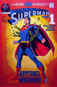
But at the shop, the coloring of the cover caught my attention: It’s not an image I recognized from the ads (the ads’ image I’d thought for SURE was the COVER IMAGE for this given its use all over the place!). While I’m not a fan of the linework, the image caught me–the red of the cape, the blue of the main suit, and maybe all the more, the orange and yellow background. It’s reminiscent of two VERY familiar covers in my mind: the Kryptonite Nevermore issue, and Adventures of Superman #497 from 1992.

Where usually the cover and art are not the primary influencing factor in my buying a comic, in this case, it definitely “sold” me on at least this issue alone.
I also quite like the fact that the visual style fits the interior; it sometimes feels like the covers can be a distinctly different thing, giving one impression while the interior is a completely different visual style.
I recall liking Romita‘s art some 12/13 years ago on Amazing Spider-Man, JMS‘ run, but as I’d noticed from the previews and now having been through the actual issue, I’m not terribly thrilled with the style with Superman. It’s certainly not bad–and loads better than anything I could ever dream of being able to draw myself–just that for this first issue it doesn’t fit with my preferred visual take on Superman (a la Dan Jurgens, Jim Lee, Ed Benes, to name a few). The art certainly does its job…I’m never really left wondering what’s going on, and there’s nothing that jars me out of the story scratching my head at anatomy or some other quirks that different artists’ styles sometimes have done to me. If you’re a fan of Romita‘s style, this would seem to be a solid example of that, except it’s with DC characters instead of Marvel.

While Janson‘s name sticks out quite a bit to me, I’m honestly not one that particularly consciously notices inking–linework tends to go together as one thing, with the penciller getting much of the credit. In this case, given just how recognizeable the art is to me as Romita’s style, I’d say the inking maintains the style, complimenting it quite well…it certainly doesn’t detract in any way I notice.

If I’m correctly recalling, the last time Johns came onto a Superman book was in Action Comics, beginning the Last Son arc with Donner, and I was none too thrilled with elements reintroduced to the Superman story during that run. I was also not all that thrilled with the Secret Origin arc and what THAT reintroduced.
However, this is an entirely different DC universe, an entirely different Superman, and as such, I’m along for the ride and whatever elements are brought in. I’ve not been particularly invested in the New 52 Superman, at this point having read barely 1/3 of the run.
Johns introduces us to Ulysses, a boy sent from his dying world by his parents to another place in the hopes that he would live…an origin quite parallel to that of Kal-El. Years later, Superman takes down Titano, a giant (mechanical) ape troubling Metropolis. Not long after, we spend some time at the Planet with Perry, Jimmy, and a visiting Clark. Perry offers to bring Kent back in, and offers a bit of a ‘speech’ that will surely impact the young reporter/blogger/super-hero. A new threat hits the city, and though Superman intervenes, it takes the intervention of a new  figure to temporarily resolve the issue, as the man believing himself to be the Last Son of Earth discovers he’s not nearly as alone as he’d thought.
Frankly, I don’t want to be interested. I don’t want another $3.99 book on my slate each month, especially with the title being what seems to me arbitrarily bumped to the higher price, when Superman started as a $2.99 book and Action Comics was the $3.99 book.
But Johns has done it–I’m interested in spite of myself. I may not be enthused with the art, but the story more than makes up for it. I haven’t a clue how LONG Johns will be on the book, and this strikes me as likely “graphic novel” fodder (without getting much into the issue of stories “written for the trade”) so it remains to be seen if I pick up the next issue.
I’m not ready to add this to my pull list by any means…but I’m not disappointed in having spent the $3.99 that I did, I’m interested in what comes next within the story, and it’s highly likely that if I don’t pick up the rest of this arc in single-issue format I’ll definitely look at picking up the inevitable hardback.

adventuresofsuperman497      superman233

superman0032

Fatal Attractions Revisited: Uncanny X-Men #304

…For What I Have Done

Writer: Scott Lobdell
Pencilers: John Romita Jr., Jae Lee, Chris Sprouse, Brandon Peterson, Paul Smith
Inkers: Dan Green, Dan Panosian, Terry Austin, Tom Palmer, Keith Williams
Colorist: Mike Thomas
Letterer: Chris Eliopoulos
Cover: John Romita Jr., Dan Panosian
Assistant Editor: Lisa Patrick
Editor: Bob Harras
Published by: Marvel Comics
Cover Dated: September, 1993

After a couple of the X-Books that were not the actual X-Men themselves, this issue finally pulls the X-Men I was familiar with into this story. Granted, I wasn’t extremely familiar with them–but I knew who most of them were thanks to the cartoon series. Wolverine, Bishop, Cyclops, Storm, Jean Grey, Beast, Professor Xavier, even Colossus…and of course, Magneto.

I recall reading the death of Illyana–Colossus’ sister–in the previous issue (sucked in by the image of Jean Grey and Jubilee with the blurb “If you read only ONE X-title this month–this issue MUST be it!”). This issue has the funeral as we see the various characters reacting to the death of the young girl. We also get some backstory on Magneto and the losses he’s suffered, which have been driving factors in his methods of trying to “save” the “mutant race.” There are some quieter moments between various characters; I especially like the Kitty Pryde/Storm and Banshee/Bishop scenes. I’m still amazed in retrospect at how very new some of these characters were in the summer of 1993 (particularly Bishop), and how much more all the characters have grown, changed, or otherwise [been] developed in the decades since this story.

As Illyana’s funeral draws to a close, Magneto crashes the party, which is almost immediately further crashed by Exodus and the rest of the Acolytes, who have come to grips with the revelation of Cortez’ part in Magneto’s near-death. The X-Men and Magneto and his Acolytes clash, as the ship Avalon is brought into Earth’s atmosphere above them, causing world-wide issues and fear. The battle quickly becomes one with catastrophic consequences should the X-Men fail, but ultimately it falls to Xavier to pull a new trick out of his figurative hat to save the day, using his power in a way I don’t recall seeing him do prior to this (though it wouldn’t seem all that out of place nowadays).

This issue felt a bit more like being dropped into the middle of a story, the way it opened–the Acolytes already trying to tear Cortez apart for his deception. I honestly don’t recall if this continues directly from Uncanny X-Men #303 or from some other issue of the X-books. While I vaguely remembered that it was shortly after Illyana’s funeral that Colossus left the X-Men, I’d forgotten that the funeral itself was in this issue, and the way Magneto and Co. crashed the funeral. I’d also completely forgotten the way Xavier ended this particular battle, which seemed both absurd and epic at the same time, to me.

The issue’s art is a bit fractured–there are five pencilers on the issue, and I noticed it while reading–particularly with Magneto’s flashback. Fortunately, other than Jae Lee‘s art, the rest fits relatively well together and isn’t glaring. Of course, that’s something I notice now but if I noticed back in ’93, I don’t recall it being a conscious thing of recognizing different artists’ work, or knowing about “fill in artists” or any such stuff. All that said…this is another issue that I don’t mind the art on the whole, and which seems to fit the story.

Including a few ads, this issue has 62 pages for only a $3.95 cover price. I like the cover–most of the characters shown on the front are the ones I would have been most familiar with, though in this sense are rather generic. But once opened up, we see that there are a lot more characters involved in the image, all angrily looking toward a huge foreground closeup of Magneto. And yet again, I like the hologram on this cover. While the hologram itself is pretty cool, its image strikes me as rather iconic for the time–I’m sure I’ve seen that several image of Magneto with the swirl of debris outside the context of this story. I wouldn’t be surprised if I’ve snagged a copy of this from a bargain bin since buying my original copy at full cover price in 1993, but the copy I have onhand right now for this rereading and such was part of a 3/$10 deal, which while not as satisfying on principle as getting the issue for under or around $1, is still quite worthwhile for being less than cover price.

This issue seems to set the stage for the next couple chapters, which to me are the heart of this story, and what I MOST think of with the title Fatal Attractions.

Avengers vs. X-Men #3 [Review]


Full review posted to cxPulp.com
.

Story: 3.5/5
Art: 3.5/5
Overall: 3.5/5

Avengers vs. X-Men #2 [Review]

Round 2

Story: Jason Aaron, Brian Michael Bendis, Ed Brubaker, Jonathan Hickman, Matt Fraction
Pencils: John Romita Jr.
Inks: Scott Hanna
Colors: Laura Martin
Letters: Chris Eliopoulos
Cover Art: Jim Cheung and Laura Martin
Assistant Editor: John Denning
Associate Editor: Lauren Sankovitch
Consulting Editor: Nick Lowe
Editor: Tom Brevoort
Published by: Marvel Comics

The battle breaks out here, as the Avengers attempt to take the beach while the X-Men seek to shove ’em back out to sea. The issue is primarily a big brawl, a long fight-scene, with snippets of stuff sure to be expanded on in the Vs. mini-series and/or tie-in issues. While the two groups duke it out, Cyclops is focused on seeing Hope to safety, while she wants to be in the thick of things, fighting rather than being fought over. By issue’s end, we see the toll the fighting’s already extracted from everyone–and possibly what’s to come as it’s pushed Hope to new levels, and Cap’s “away team” in space finds shock and awe in the approaching Phoenix force.

Story-wise…I’m not too impressed here. There’s more fighting than anything else (at least when taken for face value–there’s more depth than there looks, despite my summary above). It’s definitely interesting seeing some of the match-ups…and the Captain America/Cyclops slugfest made me think perhaps the cover of Avengers #25 is the REAL tie-in of that issue, as I’d swear that cover was yanked right out of this issue. Definitely liked the Iron Man/Magneto match-up…the narrative boxes surrounding that initial fight worked extremely well for me in summing up both characters’ strengths and natural bents.

Visually, little to complain about. The issue was action-packed enough that I honestly did not notice any of the AR logos except on the cover, so I’m even LESS impressed here than I was with ’em on the first issue. Romita‘s art isn’t my favorite, but a darned sight better in my eyes than a number of other artists, and I liked the work in this issue in general.

On the whole, this is another solid issue that moves things in the overall story forward–the battle is joined (not teased and put off til mid-arc), we see further development of things with Hope and the role she seems to be destined to play, and there’s enough to the individual fights that while they can clearly be expanded, it’s not just a panel here, panel there, go read another issue for the actual battle.

And as with the first issue, this issue does leave me looking forward to the next issue. Though I may not feel this way in the end or if I think too hard about the price tag…on the whole I kinda like that this is biweekly. 12 is a large number of “core event title” issues, but biweekly this should be over by early Fall…quite a bit crammed into half a year.

Recommended.

Story: 7.5/10
Art: 8.5/10
Whole: 8/10

Avengers vs. X-Men #1 [Review]


Full review posted to cxPulp.com
.

Story: 4/5
Art: 3.5/5
Overall: 4/5

Invincible Iron Man #500 [Review]


Full review posted to cxPulp.com
.

Story: 2/5
Art: 2/5
Overall: 2.5/5

%d bloggers like this: