• January 2026
    S M T W T F S
     123
    45678910
    11121314151617
    18192021222324
    25262728293031
  • On Facebook

  • Archives

  • Categories

  • Comic Blog Elite

    Comic Blogs - BlogCatalog Blog Directory

R.E.B.E.L.S. #2 [Review]

Quick Rating: Not Bad
Story Title: The First Recruit

Vril Dox and Supergirl take on the mercenaries, while Dox finds out more about his benefactor and what he’s expected to do moving forward.

rebels002Writer: Tony Bedard
Artist: Andy Clarke
Colorist: Jose Villarrubia
Letterer: Swands
Asst. Editors: Rex Ogle
Editors: Marts & Cunningham
Cover: Andy Clarke
Publisher: DC Comics

Resuming where the first issue left off, we find Vril Dox and Supergirl fighting the mercenaries that are trying to capture Dox. Dox finds himself faced with a message from the future intended to help him, but opts to use his own methods to go about attaining his goals. Making for Starhaven, Dox’s recruitment drive is in full effect, as we see that this is not a character we’re meant to like overall–he’s a real jerk (to put it mildly).

The story itself isn’t bad, though I’m not all that familiar with most of the characters overall (except Supergirl). Though I recognize Dox and a couple others, I don’t recognize most of the characters, and so am not all that interested. The writing seems solid so far–there’s enough foreshadowing that at least for this arc, it seems there’s a build toward some decent payoff–though I’d prefer to be more engaged in the story.

The art’s not bad, though it’s a bit different than what I’m used to, particularly on the Superman family of books and their depiction of Supergirl. Clarke’s art does bring just enough grittiness to make this seem like a book that doesn’t just fit in general into a generic DCU, but has an edge that reminds me of the earlier issues of Outsiders from 2003 to Infinite Crisis.

All in all, a decent book. Unfortunately, as it’s failed so far to really engage me, I suspect I wouldn’t miss it much (if at all) if I simply skipped it. If you’re interested in the cosmic stuff, you’ll probably enjoy this a bit more; ditto if you’re more familiar with Vril Dox as a character.

Ratings:

Story: 2.5/5
Art: 3/5
Overall: 3/5

R.E.B.E.L.S. #1 [Review]

Quick Rating: Decent
Story Title: The Future is Now

Vril Dox (Brainiac 2) arrives on Earth with pursuers on his tail, and seeks out Supergirl for a special purpose even he doesn’t know.

rebels001Writer: Tony Bedard
Artist: Andy Clarke
Colorist: Jose Villarrubia
Letterer: Travis Lanham
Asst. Editors: Siegel & Ogle
Editors: Marts & Cunningham
Covers: Andy Clarke
Publisher: DC Comics

This is the second time offhand that I have bought a R.E.B.E.L.S. #1. The last time I did so was way back around September 1994. L.E.G.I.O.N. was rebooted during Zero Hour as R.E.B.E.L.S., and was one of the series I’d decided to jump on to check it out from the very beginning. Fourteen-and-one-half years later, this new incarnation of the title had my curiosity, if only for nostalgic value.

This issue opens with a bit of a cliche–people going about normal life, talking about something that then sorta comes true with the arrival of an alien or whatever (in this case, Vril Dox), who asks for something rather simple that I for one normally wouldn’t expect an alien to ask: "Where’s the nearest restroom?" We quickly find out that Dox is being pursued, that his own organization has been taken from him and is now being used against him. Being rather cool and calculating (or rather, not-so-compassionate) he is prepared to see numerous human lives lost to attain his goal. Once Supergirl enters the fray, a couple secrets come out, and we find that there is a good deal at play, just waiting to be revealed.

Overall, I like Clarke’s visuals in this issue. There’s a certain level of detail and a style that seems to fit the story very well. The main complaint I have is that Supergirl looks a little "off," but characters I presume will be main/starring characters for this title have a good look about them that does NOT seem "off." One of the aliens reminds me a bit of both the Aliens as well as Arkillo from the GL books, and yet still has enough of a unique look to be its own thing, while evoking those others–regardless of the intentionality of the similarity.

The story is fairly basic, dealing with a bit of cliche–at least on the surface. Cliche or otherwise, there are some hints dropped as to stuff-to-come, and at least one bombshell drawn from existing continuity that casts characters in a new light. I’ve not read much of Bedard’s work, but recall liking what I have read. This issue really–aside from Supergirl–is playing in its own sandbox away from other DCU books. That sets it apart for me as it is not directly involved in other current stories that I’m following and thus has room to develop and build a bit.

There’s not enough here in this issue to convince me that this’ll be a great title nor that I’ll want to be in for the long haul, but there’s just enough of something to it that I’ll probably give it a couple more issues to pan out and really hook me. In the meantime, it’s a debut issue of a new series and it’s still within my $3 general threshold.

Worth checking out if you’re curious, but doesn’t seem an essential read.

Ratings:

Story: 3/5
Art: 4/5
Overall: 3.5/5

Legion of Super-Heroes in the 31st Century #1 [Review]

Quick Rating: Not Bad
Story Title: Yesterday’s Hero

The Legion members recount how a young Superman came to be part of their team…

legionofsuperheroesinthe31stcentury001Writer: J. Torres
Art: Chynna Clugston
Colors: Guy Major
Letters: Rob Clark Jr.
Editor: Jeanine Schaefer
Cover Art: Steve Uy
Publisher: Johnny-DC/DC Comics

The initial draw for me to this issue was the price. The prospect of buying a new issue with no discounts at a bricks and mortar store for just over the $2 mark grabbed my interest out of principle (though I sheepishly admit to virtually ignoring all Johnny-DC books for the last couple years). It’s a first issue, it’s cheap, and it features characters I’m not terribly familiar with…so hey, might as well check it out, right?
The first thing I noticed with the issue was the paper quality. Very thin, and if it isn’t, sure feels like the classic newsprint from comics of days gone by…which explains the cover price.

The story is pretty simple and straight-forward: the Legionaires have conflicting views on what exactly it was that led to a young man of steel being part of their 31st-century team. We basically get several narratives from the characters, recounting a couple of quick adventures, collectively serving as a first-issue introduction-and-origin of the team and info about its starring characters.

We’re given a look at the Legionaires "interviewing" the young man of steel to see that he’s eligible to join (this seems vaguely familiar to me as something from one of the original Legion of Super-Heroes stories from way-back-when); and then a fight with the Fatal Five.

The art is also fairly simple and not terribly detailed (which is not to say there’s no detail), and somewhat manga-ish. I realize this is to have it fit with the actual cartoon this series is a companion to (though I’m not sure if the first episode’s aired yet). It’s not particularly my cup of tea so to speak, but it fits the tone of the book, the characters are distinct and recognizeable, and so I really can’t complain about it in and of itself.

I’m not sure how this book will go over with long-time Legion of Super-Heroes fans, as my primary knowledge of the characters comes from the first year of the current iteration in the mainline DCU, but while this is definitely much different from that, I found it to be entertaining enough. I’m not a huge fan of the "Americanized-manga" styling, and a seemingly-on-the-surface over-simplification of things (the perception of which has largely kept out of the Teen Titans animated and Teen Titans Go! comic series). But as a simple, fun story not bogged down in continuity, this definitely isn’t bad.

It’s also a self-contained "full" story, in a debut issue of a new series, that actually introduces the main/core team, gives a look at all the characters and interacts with them…which scores points in MY book.

This is worth checking out if you’re looking (at least) for a quick diversion from all the heavy seriousness of many other current fare, and wouldn’t be a terrible issue to offer to the younger crowd–or read WITH them. Nothing all that spectacular, but certainly NOT bad at all.

Ratings:

Story: 3/5
Art: 3/5
Overall: 3/5

JLA/Hitman #1 [Review]

Quick Rating: Good
Story Title: On the Darkside Part One

Faced with the return of an old threat, the JLA finds itself in close quarters with the Hitman!

jlahitman001Writer: Garth Ennis
Art and Cover: John McCrea
Colorist: David Baron
Letterer: Travis Lanham
Asst. Editor: Harvey Richards
Editors: Peter Tomasi & Michael Siglain

Before I sat down to read this, I noticed some doubts had crept in. When this 2-parter was solicited, something about it piqued my interest–I would not have sought it out if it hadn’t. But seeing it sitting on my desk waiting to be read, I asked myself how entertaining it could possibly be. I’ve never read one single issue of Hitman. All I know of it comes from panels reprinted online and/or in Wizard magazine (such as the main character vomiting on Batman) and that the character was (one of?) the only success story to come from the Bloodlines event that ran through the 1993 DC Annuals. And the 90s JLA logo evoking a feel of the 90s-to-Infinite Crisis version of the Justice League–an era I’m not terribly familiar with–left me wondering if I’d care at all for this.

Thankfully, once I started reading, I just kept going.

We open on a scene with someone asking Clark Kent some questions, ultimately leading Kent to divulge a story Superman had shared with him a long time ago. This framing sequence leads into the core story itself. With information discovered about a returning NASA probe, the JLA realizes that a threat from the past is resurfacing, and that they’ll need access to another remnant of the past–and Batman knows just where to find such a person. Unfortunately, this person is Tommy Monaghan–the Hitman, and he doesn’t exactly mesh well with the JLA. Before too much can go down between the two parties, the real threat arrives, and the JLA finds itself in quite the ridiculous predicament, both frightening and yet almost silver-age simplistic.

Ennis crafts a very entertaining tale here, that takes these characters who–on the surface, at least–should have nothing to do with each other and puts them together in a believable fashion, while allowing the absurdity of things to also show through. The two things that stood out most to me and really tripped my geek-meter were the use of footnotes (which have me stoked to track down the referenced issues, not to merely understand what’s going on here–I get that just fine, but to read the original events characters reference and thus enjoy stuff that much more). And the Bloodlines event is mentioned by name and in broad strokes recapped–showing that other than being a generic "origin" for the Hitman, it’s an event that actually DID happen, that these characters DO remember, that actually MATTERED in the grand scheme of things.

Offhand, I’m not familiar with the artist, though the visual style feels familiar. I know that I like the visuals here, overall–the art just works, plain and simple. Though Batman in particular seems just a bit off with the sculpting of the cowl, something about it feels–somehow–like it fits.

This is the first of two chapters, probably "just" a one-off sorta story that while it references and builds on "continuity," will have no lasting impact on it at present. As a package, though, it’s a fun, enjoyable story. There’s a dark humour present here, and the character interactions speak to a fairly rich history. Also, for a guy that grew up on 90s’ comics, this carries the feel of those mid-to-late-90s comics, while the framing sequence seems pretty timeless, such that it could be taking place in the present.

If you’re a fan of the pre-Meltzer incarnation of the JLA, or of the Hitman, this should be a nice romp through familiar-but-now-gone territory. And even if you’re not familiar with one or both sides, this stands decently as its own story…and you could do a heckuva lot worse.

Ratings:

Story: 3/5
Art: 3/5
Overall: 3/5

House of Mystery #1 [Review]

Quick Rating: Good
Story Title: The First Drink is on the House, The Hollows

A new story is set up as we’re introduced to the present status quo of the House of Mystery…

houseofmystery001Writers: Matthew Sturges, Bill Willingham
Artists: Luca Rossi, Ross Campbell
Colors: Lee Loughridge
Letters: Todd Klein
Cover: Sam Weber
Variant Cover: Bernie Wrightson
Co-Editors: Shelly Bond & Angela Rufino
Publisher: DC Comics

I don’t normally read Vertigo books as single issues, especially for their first arcs, knowing I’ll be able to check them out in a bargain-priced TPB for the first arc, and tend to find the stories much more engaging read as full arcs rather than singles.

What intrigued me with this series was the premise that there would be stories within the story…as well as a vague recollection of the "House of Mystery" having a role in Gaiman‘s Sandman series, which I read a number of years ago.

The issue actually opens with Cain and Abel, in their familiar relationship I recalled from Sandman, which drew me right into the issue. While Cain finds himself in an interesting predicament, the story moves forward a few years, and we find ourselves in the midst of a farewell party for an individual preparing to leave, even as others remain stuck. We also get the beginnings of a look at someone on the run with only drawings of a mysterious house. We’re also treated to a story by one of the patrons of the kitchen–as stories are the only currency of any weight here. This story provides some context to who she is, leading into a rather disturbing revelation that she herself doesn’t even seem to realize…though it seems perfectly fitting for a mysterious house full of people who can’t seem to go anywhere.

The story reminds me of a story from the Sandman, at least as far as characters being brought together in one place and sharing stories of their pasts and where they come from and all that. At the same time, there seems to be a certain "framing" story overall that hints at a larger story at play, even while we meet the characters in this house and are treated to the stories they tell one another. That the art team varies for the stories being told is something I really like, more fully illustrating the difference between the main story we’re witnessing as readers, and the story we’re witnessing as fellow listeners while a story is told within the story.

Overall, the art all around works quite well to me, accentuating the story in a very believable way. In something of a rare moment, I feel like I got both a "full" story in this issue where I don’t feel I have to get the next issue…but there’s also enough of something else that I’m interested in seeing what else is to be found. The final page seems to work as well both as an ending and a beginning…a nice "hook" for the reader.

This is a very solid first issue, and if subsequent issues read much in the way this one did, I think it’ll be a nice treat, without even needing to read a bunch of issues in one sitting just to feel like I’m getting the fuller picture.

If only to try it out, I definitely recommend this issue.

Ratings:

Story: 4/5
Art: 3/5
Overall: 3.5/5

Batman and Robin #5 [Review]

Quick Rating: Not Wonderful
Story Title: Revenge of the Red Hood part two: Scarlet

Batman and Robin vs. Red Hood and Scarlet.

batmanandrobin005Writer: Grant Morrison
Penciller: Philip Tan
Inker: Jonathan Glapion
Colorist: Pete Pantazis
Letterer: Patrick Brosseau
Assistant Editor: Janelle Siegel
Editor: Mike Marts
Covers: Frank Quitely and Philip Tan
Publisher: DC Comics

I really enjoyed the first issue of this series. It had a sense of excitement and freshness, and just that great sense of things being new and much better than the recent past. However, at this point, even some of what I liked in that first issue is wearing thin…and the "honeymoon" is definitely over.

This issue picks up with Red Hood and Scarlett confronting Batman and Robin. Red Hood’s determined to kill all of Gotham’s criminals and doing so while replacing the "Batman brand" with his own "brand." Scarlet–a girl the duo tried to save earlier in this series–has been manipulated into playing Jason Todd’s game, serving as his "sidekick." We continue to see the Gotham populace react to the bloody vigilantism as well as a more specific reaction from Jim Gordon.

I don’t know what it is, exactly–perhaps Morrison‘s writing style–but this story feels like it got rather convoluted in a hurry. I’ve never liked Jason Todd…I always thought the best story with him was the one in which he "died." The character seemed so much more effective in that tragic role. Now, it seems the character is little more than a bloodthirsty psycho.

Not liking the character, and not feeling much "connect" to the story, this story’s quickly growing stale for me.

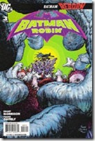
The art for this issue doesn’t really do it for me, either. It’s not bad, but it’s somehow just not to my liking, at least not in this issue. It does a good enough job overall of getting things across, but other points I find myself doubling back to try to figure something out. Though I’m not caring for the style lately, Tan does do quite a good job of keeping a visual style similar to Quitely‘s opening arc. There’s a different look and it’s easy to tell that it’s not Quitely…but the style is not some huge departure visually.

All in all…if you like Morrison‘s denser writing style, if the art appeals to you, and/or you like seeing Jason Todd as portrayed of late…this issue’ll be well worth it. If not…you’ll probably enjoy one of the other Bat-books more.

Ratings:

Story: 2/5
Art: 3/5
Overall: 2.5/5

Batman and Robin #3 [Review]

Quick Rating: Solid
Story Title: Batman Reborn Part Three: Mommy Made of Nails

Batman and Robin vs. Professor Pyg as the new dynamic duo solidifies as a team.

batmanandrobin003Writer: Grant Morrison
Artist: Frank Quitely
Colorist: Alex Sinclair
Letterer: Patrick Brosseau
Assistant Editor: Janelle Siegel
Editor: Mike Marts
Covers: Frank Quitely and Tony Daniel
Publisher: DC Comics

This issue picks up with Batman interrogating a lackey in typical Batman fashion–though it turns out he was "allowed" access to the suspect by Commissioner Gordon himself. The two clash over methods, but ultimately part ways still allies (which is a nice change from what could otherwise be a cliched story element). Batman’s trying to find the captured Robin, who we find about to be tortured by "Professor Pyg." Battle ensues as Batman and Robin vow to be an actual team after recent solo play, and though their opponents (doll people) are fairly creepy–especially as rendered by Quitely–they seem to fit quite well into a rogues gallery that includes the likes of Clayface, Two-Face, Mr. Zsasz, and others. After dealing with the villain at hand, the heroes locate someone they’ve been seeking–a man familiar to readers of Morrison‘s past Batman issues who was instrumental in Batman: RIP. We have a full-page panel that is silent here, though if one’s read RIP, the dialogue is known from the opening page of that arc.

All in all, another solid issue. While I can appreciate adding to a fairly limited rogues gallery, I’m not particularly interested in the new villains–at least not yet. I enjoyed the fact that I’ve not been left half a year before seeing any costumed crazies taken down by the new Batman and Robin; I’ve also enjoyed the way we can really see what an abrasive kid Damian is ("Whose neck do I break first?" upon coming back to consciousness) which seems to further the need for guidance–that Dick can provide. It’s also refreshing to read a story from this writer that I can actually follow–that at least is entertaining on face value even if I’m picking up nothing in the way of background references. (If there are a lot of subtle things to be teased out of the story by multiple readings and lengthy analysis…cool. But I enjoyed this read just fine without ’em).

The art feels rather lumpy…it gives the characters a strange sort of appearance. Nothing quite disfiguring, but far from the smooth lines I’m used to seeing the characters with in other titles. Still, for the style, it’s consistent and gets everything across I’d expect it to, so no huge issue for me there…though there are a few other artists whose work would probably make this feel absolutely top-notch.

As is…a good issue, and worth picking up if you’ve been giving the title a try. I’m not sure if this is truly the final issue of the arc, but it feels like it is, so the next issue will likely make another good jumping-on point; if you can find the first couple issues to give you all three, it’s definitely a very worthwhile read.

Ratings:

Story: 4/5
Art: 3.5/5
Overall: 3.5/5

Batman and Robin #1 [Review]

Quick Rating: Good!
Story Title: Batman Reborn Part One: Domino Effect

The new Batman and Robin make their debut, with new villains, a new ride, and a lot of potential.

batmanandrobin001Writer: Grant Morrison
Artist: Frank Quitely
Colorist: Alex Sinclair
Letterer: Patrick Brosseau
Assistant Editor: Janelle Siegel
Editor: Mike Marts
Covers: Frank Quitely and J.G. Jones
Publisher: DC Comics

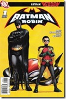
The cover has a certain iconic look to it…though there’s also every chance that’s partially because it’s one of the images that’s been around for awhile now for this month’s new status quo amidst the Bat-books. Batman has a confident, amused look about him, with a Robin who looks like he’s itchin’ for action…and this is the image that initially convinced me that I would actually like to see Damian as Robin. There’s something to the potential dynamic here that really interests me.

We open the issue on a new villain (a Mr. Toad? They wouldn’t give us a character too similar to the X-Men villain The Toad, would they?) being pursued by Batman and Robin…who have a flying Batmobile (which seems just like Morrison to throw in there). Outlandish though it is, when it comes to the DCU and the Bat-corner and whatnot…I suppose a flying car isn’t so far out there as to be entirely unbelievable. We get a few pages of them interacting with Alfred (where we see both Dick’s and Damian’s personalities come through a bit, especially in the way they talk to Alfred…this also shows how different the two are).

We get the obligatory scene with Gordon and his officers, the obligatory here’s-what-the-villains-are-up-to-since-they’ve-not-yet-been-found-out-by-Batman scene…and as has become fairly standard for new books and new directions with DC, we even get the obligatory page with several panels "previewing" what is to come over the next year in the book.

The story feels like a Morrison book…but this time, in a good way…at least for this issue. We see the main characters in action; there’s no question of who they are. We get the "updated"/current takes on other classic elements associated with Batman; we get a new villain–several, actually–who could be sorta interesting if only for an arc. However, unlike the last Batman arc I read by Morrison, I don’t feel like I’m "lost" going in; if there’s more than the surface story, then hey–that’s cool; but I don’t feel like I’m missing out on some in-joke here.

The art is pretty good overall–I enjoy the visual style on the whole. I just don’t like the way the faces come across–it seems like everyone is "lumpy" in a not-so-good sorta way, almost for the sake of having that kinda detail on the faces. In addition to the cover as I mentioned at the start of this review, there’s also a page of the title duo disembarking from their flying vehicle that I would love to have as a poster, and that is loaded with potential (it remains to be seen what the reaction to them is, if we even see it next issue).

Honestly, I feel like this is what that All-Star book should’ve been…and with a simple sentence like "Bruce is gone, Dick has taken over" one wouldn’t even have needed to slog through the last year or so of stuff to get to this status quo.

I like it. There’s loads of potential here–especially if this book keeps to its own sandbox while sharing the status quo with the other books for the "general DCU" stuff. This won’t be for everyone, but as first issues go, as really debuting the new Batman status quo, and all that kinda stuff….this is an issue well worth checking out…the bigger question will be whether it can live up to its potential and expectation.

Ratings:

Story: 4/5
Art: 4/5
Overall: 4.5/5

All-Star Superman #8 [Review]

Quick Rating: Average
Story Title: Us Do Opposite

Superman and Zibarro on the Bizarro World as said world sinks into the Underverse.

allstarsuperman008Writer: Grant Morrison
Pencils: Frank Quitely
Digitally Inked & Colored by: Jamie Grant
Letters: Phil Balsman
Asst. Editor: Brandon Montclare
Editor: Bob Schreck
Cover Art: Frank Quitely
Publisher: DC Comics

Perhaps it’s the timing, or zeitgeist, patience wearing thin or just plain change-of-tastes…this issue is the first that I’ve really felt outright let-down by.

The issue continues from the previous one (which was itself a "To Be Continued…"), picking up with Superman on the Bizarro world with some guy called Zibarro, an imperfect imperfect (read: "perfect") duplicate of Supes. (At least, that’s the impression I got contextually–whether this issue is on-time (bimonthly) or not, it feels like it’s been awhile since the previous issue, and I didn’t recall much detail from that.) The Bizarro world is sinking into the "underverse," and while Superman has gotten the Bizarros off Earth, he himself is trapped on their world, and rapidly losing his powers (the further into the Underverse they get, the more the sunlight is changed to red sunlight, which of course means no more yellow/power for Supes). This forces Superman and Zibarro to get creative for a solution to their problem. Meanwhile, on Earth, Lois and others compare notes on the situation as a whole, leading Lois to a particular revelation that’s been a long-time coming.

Yes, I was let-down by this issue. For one thing, I had wrongly assumed it would conclude the Bizarro story from the previous issue. I’d figured a 2-parter wouldn’t be bad, but I rather like the one-off nature of earlier issues, where you could pick up a single issue and enjoy it start to finish, without needing context of the previous issue(s). That this is also a "To Be Continued…" issue is a disappointment. The "Bizarro-speak" gets extremely frustrating very quickly…I found myself trying to sort it out/logically comprehend it, but quickly gave up, and relied more on tone and visuals to figure out what was going on, as well as context from Supes and Zibarro speaking normally.

I’m also not a fan of the Bizarro concept as a whole…and while I’m sure this story has some nice homage to silver age stories (much as this series as a whole seems to be a modern-age sensibilities / homage to the silver age), it lacks the charm of earlier stories presented in this series, and simply fails to engage me.

The art is good, as usual, for the story…Quitely provides a that distinct, almost simplistic visual style that has defined this series visually so far, taking apparent cues from Superman: For All Seasons without outright mimicking it. The art fits the story, shows what is going on, and in general works quite well; I really have no complaints with it.

With no real recapping, this issue doesn’t seem like the best point for a new reader to jump on-board. While you do get a story of Superman on the Bizarro world, it’s missing much of the context and the "why" presented by the previous issue. If you’ve read the previous issue, you’ll probably want to read this for the obvious story continuation. And if you’re a general Bizarro fan or fan of silver-age type stories in and of themselves, you may just enjoy this, context-be-darned.

Ratings:

Story: 2.5/5
Art: 4/5
Overall: 3/5

All-Star Superman #7 [Review]

Quick Rating: Good
Story Title: Being Bizarro (part 1 of a 2-part adventure)

Bizarre creatures descend on the Earth, duplicating those they come into contact with, while a square world heads toward Earth…

allstarsuperman007Writer: Grant Morrison
Pencils: Frank Quitely
Digitally Inked & Colored By: Jamie Grant
Letters: Phil Balsman
Asst. Editor: Brandon Montclare
Editor: Bob Schreck
Cover Art: Quitely
Publisher: DC Comics

This title continues to be a sort of "modern update" to silver-age stories, with similar elements that seem very familiar from those classic stories, while adding or incorporating a modern twist. Morrison and Quitely deliver another tale that fits well within the continuity established for this title–though it seems almost as if the idea of Supes having been poisoned has been left to the side, with not a mention of it here, nor of the events from the previous issue–in fact, we are plunged directly into the action at this issue’s open.

The issue opens with a P.R.O.J.E.C.T. mission gone bad that may hint at story elements to come, and then we find Superman in space dealing with some unearthly behing before being ambushed by some clay-looking creatures, and witnessing the appearance of a cube planet. Cut to Earth–Metropolis–where more of these creatures crash-land, bringing destruction and chos with them. Upon touching anyone, the creatures take their shapes, and the vocabulary generally recognized as being that of Bizarro. Another one appears, with the costume of Superman, and the battle is on–Superman versus his bizarre duplicate, as well as that for survival amidst the Planet’s staff.

Up-front, this is probably my least-favorite issue of this series–probably largely due to the fact that it’s a 2-parter, so we’ve only got half a story and a decent wait between issues means it’ll be awhile til I get to read the next part.

As stated above, this issue continues very much in line with the previous issues–maintaining both the visual and the written continuity/feel. The story takes the classic Bizarro concept and gives it a mild shove, that seems at once over-familiar and yet inspired. However, I’m not particularly impressed overall. This isn’t bad, but it’s not blowing anything to a new level for me or giving particular "insight" to a character, metatextually or otherwise.

Quitely‘s art keeps the feel I’ve gotten used to for this title, and while I wouldn’t be enthused about seeing it for the "regular" Superman, for this title it works very well; I have no real complaint with it. I was even amused at one panel that made me think "Niiiice…Zombie-Superman!" for a moment.

Unless you’re specifically turned off by Morrison or Quitely and previous issues, you’ll probably find this–like I did–to be another solid (if somewhat disappointing compared to the previous issue) entry in the series. If you’ve not checked the title out before, this may seem a bit more "out-there" than much else, but it IS the start of a new story, so not a terrible point to jump on.

Ratings:

Story: 3.5/5
Art: 4/5
Overall: 3.5/5