• January 2026
    S M T W T F S
     123
    45678910
    11121314151617
    18192021222324
    25262728293031
  • On Facebook

  • Archives

  • Categories

  • Comic Blog Elite

    Comic Blogs - BlogCatalog Blog Directory

Captain America #600 [Review]

One Year After

Writer: Ed Brubaker
Art: Butch Guice, Howard Chaykin, Rafael Albuquerque, David Aja, Mitch Breitweiser
Colors: Frank D’Armata, Edgar Delgado, Matt Hollingsworth, Mitch Breitweiser
Letters: VC’s Joe Caramagna, Chris Eliopoulos
Assoc. Editor: Jeanine Schaefer
Editor: Tom Brevoort
Cover: Steve Epting (variant by Alex Ross)
Publisher: Marvel Comics
Other features and bonus materials: Credits below review

The best thing I can say about this issue, and the “core” story is that in terms of the continuity itself, it’s pretty good. Brubaker and the artists deliver a story that fits well within the ongoing narrative…however, any “surprise” or “wonder” to where things were going were totally blasted away by Marvel’s hype-machine…a hype-machine that suggested this would be the best thing since sliced bread (or Captain America #25, anyway).

Guess what?

It’s not THAT good. It fails to live up to the hype.

The story centers on the one-year in-story anniversary of Steve Rogers’ death. The various characters–particularly Bucky as the new Captain America, Sharon Carter, Falcon, and the rest of the (whatever adjective) Avengers as they recognize the date and deal with it in their own way. Sharon makes a startling discovery that seems to be the key to what will come in the Reborn mini.

WHile there are numerous extras in the art credits for this story, the art still came across quite well, and the changes in art did not seem all that glaring to me–if anything, they managed to fit the story itself for the most part. The writing continues to be the strong stuff one expects from Brubaker, and delivers in that way.

However, it seems that one must now follow the story from this issue into a 5-issue mini-series to get “the whole story,” to say nothing of 1. this title apparently will be on hiatus for the duration of the mini and 2. this is the second big-number “anniversary issue” in the last several months–with all the #1s and a couple #50s and whatnot in the last decade or so…the point kinda loses its impact.

The bonus materials were decent, but not wonderful. I enjoyed the Origin segment for the art styling and its brief overview of Steve Rogers’ origin. The In Memoriam segment was also pretty good, giving a look at characters from Cap’s past that haven’t really had a huge place in the present stories. I vaguely recall at least one of the characters from the last Cap series I’d followed (the one that ran from 1998 or so until 2001/early 2002). The other segments were decent but nothing spectacular or memorable. I did not read the reprint part–something about it just wouldn’t draw me in, and I couldn’t bring myself to force a reading of it. However, it looks to be an early Cap vs. Red Skull story, presumably to add some context to the characters’ history given the Skull’s prominence in this series/saga.

All in all, the issue is (barely) worth its cover price…it took long enough to read to at least “justify” the $2 higher price over a standard issue. It did not measure up to the hype, though…and unless you’ve been following Brubaker’s saga for awhile, I wouldn’t really recommend this issue. I assume you’ll have all you need to “get” the story if you simply know that Steve Rogers died, and then pick up with whatever the story is in Captain America Reborn.

(Core) Story: 7/10
Art (core story): 8/10
Whole (including issue’s extras): 5.5/10


Origin
By: Alex Ross, Paul Dini, Todd Klein (first published in Captain America: Red, White and Blue; September 2002)

In Memorium
Script: Roger Stern
Art: Kalman Andrasofszky
Color Art: Marte Gracia
Letters: VC’s Joe Caramagna, Chris Eliopoulos

The Persistence of Memoriabilia
Script: Mark Waid
Art: Dale Eaglesham
Color Art: Paul Mounts
Letters: VC’s Joe Caramagna, Chris Eliopoulos

My Bulletin Board
By: Joe Simon

Red Skull’s Deadly Revenge
By: Stan Lee and Al Avison (first published in Captain America Comics #16; July 1942)

Cover Gallery
Special Thanks To: Philipp Lenssen (coverbrowser.com, comics.org)

Misc. Credits
Designer, Bonus Material: Spring Hoteling
Production, Bonus Material: Jerry Kalinowski
Editor in Chief: Joe Quesada
Publisher: Dan Buckley
Executive Producer: Alan Fine

X-Men Origins: Gambit #1 [Review]

Random Acts of Redemption

Writer: Mike Carey
Artists: David Yardin and Kraim Roberson
Colorist: Nathan Fairbairn
Letterer: Rob Steen
Assistant Editor: Daniel Ketchum
Editor: Nick Lowe
Cover: David Yardin
Publisher: Marvel Comics

I broke a personal rule for this issue: I actually paid the $3.99 cover price for it–a price that I despise and on the whole make a point of avoiding on principle alone. However, it’s a one-shot, and I count 30 pages of story, which is slightly higher than a standard issue.

The story of this issue basically follows Gambit–Remy Lebeau–from childhood until what I believe is the incident that introduced him to the X-Men (though I’ve never actually read his first appearance). This is a bit of a recap sort of issue, taking what’s been revealed and established through the years on the character and putting it into a single chronological narrative. That feat is accomplished quite well, and I enjoyed the story as its presented here. It’s also interesting to compare to what I remember of the Gambit series that ran for a couple years back in the late 90s/early 2000 to this…I’m pretty sure that a lot of the story here is based on what was established in that series.

Carey does an excellent job of boiling things down and hitting “the main points” of Gambit’s background. It’s kinda hard to believe (in a way) just how little was known (established) for so long about this character in the first few years of his existence, particularly throughout the 1990s…I’d be quite curious as to how one would “read” those issues in light of currently-established facets of the character, and see how all the cryptic comments/references to vague events hold up–how well more recent writers have fit things to those.

The art somehow reminds me a bit of the Ender’s Game/Shadow books–moreso with the coloring, I think. The style works well, and it’s enjoyable to see the “modern” take on glimpses at 20-year-old events in the X-Universe…characters look as they should on the whole, but the art style is obviously in line with this book as a whole.

If you’re a Gambit fan, this issue’ll be well worth snagging if you haven’t already (I had to wait an extra week as it sold out at my local shop the first week). As a one-shot with extra pages, it’s even worthwhile if–like me–you hate paying $4 for any single issue.

Story: 8/10
Art: 7.5/10
Whole: 8/10

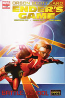
Ender’s Game: Battle School #4 [Review]

Creative Director & Executive Director Orson Scott Card
Script: Christopher Yost
Art: Pasqual Ferry
Color Art: Frank D’Armata
Lettering: VC’s Cory Petit
Story Consultant: Jake Black
Pasqual Ferry & Frank D’Armata:
Publisher: Marvel Comics

Beginning this issue, I feel like I’ve missed something. I’m not sure if I simply missed an issue…or if there was a story jump that’s alluded to in the opening text, or what–but I found myself wishing there was a bit of a recap page for this issue. I’ve read the novel this is based on, so know what’s happened…just no memory of seeing everything in this visual format.

We pick up with Ender having been transferred out of Bonzo’s army and into another army, which opens up different dynamics between Ender and the other kids. We move through the incident of the younger kids getting away from the larger bullies in the battle room, and finally to where Ender–in the computer simulation game–throws the snake through the mirror and is set upon by many smaller snakes.

On the whole, the art continues to be good and fairly stylistic. The visuals are different than what I have in my head for these events, but I can let that slide with no real trouble.

The story holds up as well–though again, I’ve read the novel and so can fill in any gaps that I’d otherwise find myself missing. This definitely continues to feel–both visually and the story–like an adaptation. Yost and Ferry do a good job of holding to the spirit of the source material, though, which is indeed a plus in that department.

For the point of the story we’re at 4 issues in out of 5, I can only assume that we are indeed going to hve a series of mini-series adapting the entirety of Ender’s Game. However, I wonder at the same time if we might get a longer series combining both Ender and Bean for the next segment, as it seems likely that this mini will end not long after the two are introduced.

If you’re not already familiar with Ender’s Game or interested in beginning with something that is an “adaptation of” the work, this probably isn’t for you–especially for the price. Otherwise, this isn’t bad, and one could do much worse than revisit the story in this format.

Story: 7/10
Art: 7/10
Whole: 7/10

Ender’s Shadow: Battle School #2 [Review]

Creative Director & Executive Director: Orson Scott Card
Script: Mike Carey
Art: Sebastian Fiumara
Color Art: Giulia Brusco
Lettering: Cory Petit
Story Consultant: Jake Black
Cover: Timothy Green II
Publisher: Marvel Comics

This issue picks up at and follows Bean through his time with Sister Carlotta as he learns from her and eventually seeks to learn more about where he himself came from. By issue’s end, we see Bean about to leave for Battle School to face his future.

Where with the previous issue I had not read the novel and thus had no pre-conceived notions or expectations, I have since read the novel this is based on, and had very high expectations for this issue.

The story seems quite accurate, though obviously a good deal is lost for lack of thought balloons and internal narration. Some of the art provides a bit of nearly cinematic symbolism as we follow Bean, which gives us an idea of what he’s thinking.

The art itself is good, though doesn’t quite fit the visuals I formed as I read the novel (and the first issue’s art did not insinuate itself into my mind enough to hold as I read the novel). There is a nice consistency in style, and does not seem bad; it is just what it is.

All in all, a solid issue, though two issues in and not even to Battle School, I wonder how rushed the rest of this story is going to feel.

Worth getting if you’re a fan of the Ender-verse stuff; having now read the novel (inspired BY the first issue to pick that up in the first place), I think this is a strong adaptation…it just suffers as any adaptation does by not BEING the source material.

Story: 7/10
Art: 7/10
Whole: 7/10

X-Men: Legacy #220 [Review]

Salvage (part one)

Writer: Mike Carey
Penciller: Scot Eaton
Inker: Andrew Hennessy
Colorist: Frank D’Armata
Cover: Lee Bermejo
Publisher: Marvel Comics

This issue continue’s Xavier’s quest for self-understanding via reconnecting with those who have played important roles in his life–or who have otherwise been significantly impacted by his own existence in their lives.

We open with a flashback to events during the Secret Invasion…than transition to Xavier and Gambit over a meal as they discuss where they’re headed and what they expect will come of seeking out Rogue. (Rogue made it clear awhile back she didn’t want Gambit following her and wants nothing to do with Xavier). We’re given a glimpse of what Rogue is up to these days in a ghost town where she and other X-Men apparently had once taken residence. While there, she is approached by a stranger supposedly looking to study the history of the town…but as Rogue quickly discovers, appearances can be quite deceiving. The issue ends with a revelation of who the stranger is, why she sought Rogue, and a vaguely familiar kind of cliffhanger as Xavier and Gambit are en route.

The art on this issue is good stuff…not only does it simply fit and serve the story, but I actually like this depiction of Xavier, Gambit, and Rogue visually. No complaints on this aspect of the issue.

Story-wise, it feels like we’re FINALLY getting somewhere with this book. Part of my initial interest a year or so ago in this title was that it’d basically feature Xavier, Gambit, and Rogue. This year later I’ve nearly lost interest in the waiting and the promised premise finally seems about to come about. The characters all come across as in-character with what’s been recently established.

This issue seems to have left out creator credits. The cover tells us that “Carey / Eaton / Hennessy” are to be associated with this issue. The interior features no credits–I had to go to Marvel’s website to research what creators were involved with the issue, and that’s assuming the site is accurate to this final product.

All in all, if you’re interested in the current Gambit/Rogue dynamic with Xavier, this seems a decent enough point to jump in, or to come back if you’ve lapsed for lack of the promised characters. The Xavier-tracking-down-old-acquaintances-to-find-himself is getting a bit old at this point…it remains to be seen how long that element drives the title and if it’ll be a point that’s beaten to death before resolution.

You could do far worse than this title–and as this X-book seems to be playing outside the stuff tied to Dark Reign and whatnot, it’s a chance to read a mainstream Marvel book without being subjected to that branding.

Story: 7/10
Art: 8/10
Whole: 7.5/10

Wolverine and the X-Men Magazine #1 [Magazine Review]

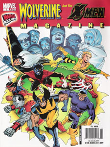
Wolverine and the X-Men Magazine #1 cover

Wolverine and the X-Men Magazine #1 cover

Normally, I wouldn’t consider a magazine something worth writing a review over. However, this one struck me as something I definitely would like to write a bit about.

I came across this at a Wal-Mart last weekend, and decided to flip through it, just to see what it contained. Once I saw what it contained (as well as its price), I decided it was worth picking up.

The cover’s nothing too special–although, I have to give it credit for grabbing MY attention (a nice, classic image, there).  This debut issue of the magazine (headlining Wolverine…after all, there IS a movie coming out in a few months) contains no articles–it’s not that sort of magazine. Instead, this is more of a magazine-sized collected-volume.

This contains Wolverine: First Class #1, Incredible Hulk #s 180-181, and X-Men: First Class #1. There’s also a Mini Marvels short by Chris Giarrusso that was probably contained in one of the First Class issues originally.

For a $5.99 cover price, one gets the contents (uninterrupted by ads except between stories) of four comics. The price is a mere penny ($.01) more expensive than the two First Class issues combined, PLUS the two classic Incredible Hulk issues are present (these featured the very first appearance of the Wolverine).

What really struck me as the value here was that where many of Marvel’s comics are now at the $3.99 point for a standard size issue, for only $2 more one has two issues of recent content, plus the two Hulk issues. That the magazine is a first issue and contains the contents of two first issues and a first appearance works very well–no one’s really being plopped in the middle of some story from the get-go here.

As an adult, I enjoyed this. I’d never picked up any of the First Class comics so those were both new to me. I’d also never read the Hulk issues Wolverine first appeared in–I don’t know if I even have any reprints despite 20 years of comic collecting.

I’m looking forward to the next issue, to see what they do–if this is (for awhile) basically a reprint magazine with two recent comics and a couple classics (or even a move to more recent comics), I’ll be quite pleased, and more than willing to lay out the $6 for an issue.

Definitely recommended!

Captain America #45 [Review]

Time’s Arrow – Part 3 of 3

Writer: Ed Brubaker
Pencilers: Luke Ross with Butch Guice
Inkers: Rick Magyar, Mark Pennington and Butch Guice
Colors: Frank D’Armata
Letterer: VC’s Joe Caramagna
Production Irene Lee
Assoc. Editor: Jeanine Schaefer
Editor: Tom Brevoort
Cover: Steve Epting
Publisher: Marvel Comics

Bucky (well, Captain America) continues his battle with Batroc and a mysterious assailant with ties to the past. By the time all’s said ‘n done, Cap finds himself facing an even bigger threat than he’d initially thought.

No real complaint on the art here for me. Art duties are shared a fair bit according to the credits, but nothing on-page took me out of the story or got me to pause and think about having seen different art–which is credit to the team for keeping a consistent enough style to not jar me outta the experience. (Which is not to say one can’t find the differences).

The story’s solid as usual for the title, and we’re really seeing all the more a tonal shift from the “super-hero” stuff to the spy/espionage stuff. The costume, shield, and title of the series are Captain America…but with a diferent man under the mask and different relationships with supporting cast, this is beginning to feel like a much different character and title.

There’s a fairly decent ending to this issue, closing out this 3-parter; but we’re still left with a to-be-continued note, as this story “cliffhangers” into the next.

As 3-parters go, this is not a bad initial post-Steve, Bucky-actually-IS-Cap-now story. However, having been brought on-board with the Death of Cap back in #25 and following that and checking this out, I get the feeling that this is going to read much better in collected format, and so plan to discontinue purchasing the monthly issues and wait for the collected volumes to follow this. Brubaker’s story is fairly deep, layered, and well-done…but I’m ready to break from his single issues and wait for full stories.

Story: 7/10
Art: 8/10
Whole: 7.5/10

Secret Invasion: Dark Reign #1 [Review]

Writer: Brian Michael Bendis
Artist and Cover: Alex Maleev
Color Artist: Dean White
Letterer: Chris Eliopoulos
Production: Joe Sabino
Assoc. Editor: Jeanine Schaefer
Editor: Tom Brevoort
Publisher: Marvel Comics

A week late and a dollar short…that about describes this.

Picking up where Secret Invasion #8 left off, this issue follows the “dark Illuminati”–a group of fairly villanous Marvel characters that serves here as a counterpart to the Illuminati group revealed in the “Road to Civil War” era. We see what Norman is willing to offer these individuals, and for what price, as well as some of their initial reactions to the offer and what they could do with it.

The story isn’t too bad–for what it is. What it is isn’t all that much–basicaly just a wordier description with pictures of the “premise” behind this whole “Dark Reign” thing kicking off (a sentence about what brings each character to the table would suffice).

The art is fairly stylistic–not something I’d consider terribly realistic, though it is by no means bad. It’s got a gritty feel to it that seems out of place for characters I’d consider to not be part of a “gritty” story. On the whole, though, you could get a lot worse. The main weakness is that Namor doesn’t look like Namor–he looks to me like some drunken, unshaven guy off the street put in Namor’s clothes.

As a whole, this issue is almost entirely uninteresting. I was only slightly curious as to what details might be provided heading into Marvel’s Dark Reign event, and enjoyed Bendis when I read Ultimate Spider-Man, so was thinking a “talking heads issue” given the context would actually hold me interest and feel like a good story. This felt quite short…only 26 pages of story, plus NINE pages of “previews” for three other titles.

This was NOT worth its cover price to me–better to have paid $2.99 for the main story and have NO previews. Hardcore Marvel fans and those actually enjoying the overall direction the Marvel Universe has been taking will probably enjoy this, especially if picking up a bunch of titles from across the Avengers/X-Men families of books. If you’re a casual fan or not chomping at the bit for stuff following that last page of Secret Invasion, don’t bother with this issue. The previews and price actually detract from the overall experience of the issue for me, hence the final rating falling below the story/art ratings.

Story: 6/10
Art: 6/10
Whole: 5.5/10

What If..? Fallen Son #1 [Review]

What If? Fallen Son: What If… Iron Man Had Died?

Writers: Marc Sumerak
Artist: Trevor Goring
Colorist: Elizabeth Breitweiser
Letterer: Dave Sharpe
Production: Joe Sabino
Assistant Editor: Jordan D. White
Editor: Mark Paniccia
Cover: Ed McGuinness
Publisher: Marvel Comics

This issue derives its story from the intent of answering the question “What if Iron Man had died [instead of Captain America]?” Opening with a recap of events we already know–the heroes’ Civil War, Captain America’s surrender, the bullets on the courthouse stairs–we see the outcome of the trial and where events could have gone had Cap not been assassinated. It is then that Tony Stark falls to events also tied back to the heroes’ war, and we see the world deal with Stark’s death, with snippets we get to check in on tied to the stages of grief. Without Stark to keep things moving as he’d tried, we see that certain more recent events are likely to have played out much differently.

While an interesting concept, I found this issue to be rather weak. I don’t know if that is the writing, or simply the amount of space to play with. We lose several pages to moving events forward without Cap’s death to get to Tony’s…and THEN cram in elements to tie to each of the grief stages, which makes things feel rather forced. Additionally, it seems that one ought to be up to date on subsequent Marvel events to fully appreciate certain moments here to fully appreciate the depth of this story’s events.

The art’s not bad, though not wonderful; it does the job and fits the story.

In addition to the main story, we’re treated to a brief story segment detailing the answer to the question “What if the Runaways became the Young Avengers?” (Written by C.B. Cebulski, Penciled by Patrick Spaziante, Inks by Victor Olazaba, Colors by John Rauch, Letters by Jeff Powell, Production by Joe Sabino, Assistant Editor Michael Horwitz, Associate Editor Chris Allo and Editor Justin Gabrie)

This is a four-page story segment; I don’t have the context nor the interest in it, and would have preferred the few extra pages to have been available to the main story. The art here is not bad, but the story seems a complete waste without having the earlier chapter and not having (nor intending to get) the later chapters. If this story is really worth telling, it should have gotten its own issue and not simply be broken across however many of the What If? issues we have this year.

For me, this issue was a real disappointment, only really redeemed by the fact that against general trend, it is a mere $2.99 cover price, so at least I didn’t waste my money on the new “in” price of $3.99.

Story: 5/10
Art: 6/10
Whole: 5.5/10

Ender’s Shadow: Battle School #1 [Review]

Creative Director & Executive Director: Orson Scott Card
Script: Mike Carey
Art: Sebastian Fiumara
Color Art: Giulia Brusco
Lettering: Cory Petit
Story Consultant: Jake Black
Cover: Jim Cheung & Morry Hollowell (variants by Timothy Green and Emily Warren)
Publisher: Marvel Comics

I almost missed this book. I’ve picked up the first two issues of Ender’s Game, and the trade dress for this is virtually identical, including the title’s logo font.

This story focuses on Bean rather than Ender. We open with Bean as a street kid trying to get in with a crew of other kids in order to survive. He presents a plan that hadn’t been done before, and while parts of what he suggests is followed–the crew gets a bully on their side–the other kids fail to see things through, which results in the bad stuff Bean knew would happen for a half-done job. The results of this helps propel him toward Battle School.

While I’d read the novel Ender’s Game a couple times and so was affected reading the comics adaptation of that, I’ve come into Ender’s Shadow cold–I’ve not read any of the later “Enderverse” novels, including the novel Ender’s Shadow. It’s cool reading about this character and seeing how Bean gets his name and winds up going to Battle School–I’m not sure how much credit to give to Card on the original work versus Carey on this adaptation. Suffice that whatever Carey does with the original, I’m having no trouble following along–and am enjoying this, knowing only that Bean was a character in Ender’s Game and that he’s the focal point of this run-through of that story.

The art has an interesting look to it. It’s almost sketchy in a way, simplistic, and yet it conveys so much at the same time. I have no problem with that–it seems to accentuate the story itself, and for a story I’m new to, I don’t think I really have much in the way of preconcieved notions as to what the look should be. I don’t have my Ender’s Game issues onhand to compare this to, but I’m pretty sure the visual styles are quite different…yet it works just fine, and I have no problem with it whatever.

On the whole, this is an enjoyable issue, even going in knowing it’s the first of a five issue mini. I enjoyed it more than the first issue of Ender’s Game, and am actually quite interested now in reading the novel of this title, just to learn more of Bean and everything only hinted at in this first issue’s segment of story.

While my usual hesitations at mini-series apply, if you’re particularly interested in seeing the property adapted visually, this is well worthwhile. For the more casual reader, I’d suggest waiting for the collected volume for a fuller experience instead of just getting a single issue’s content at a time.

Story: 8/10
Art: 8/10
Whole: 8/10