• May 2024
    S M T W T F S
     1234
    567891011
    12131415161718
    19202122232425
    262728293031  
  • On Facebook

  • Archives

  • Categories

  • Comic Blog Elite

    Comic Blogs - BlogCatalog Blog Directory

Phoenix Resurrection (2017) #1 [Review]

phoenixresurrection2017_0001Chapter One: Frustrate the Sun

Writer: Matthew Rosenberg
Penciler: Leinil Francis Yu
Inker: Gerry Alanguilan
Color Artist: Rachelle Rosenberg
Letterer: VC’s Travis Lanham
Main Cover: Leinil Francis Yu & Sunny Gho
Graphic Designers: Jay Bowen & Anthony Gambino
Assistant Editors: Christina Harrington & Chris Robinson
Associate Editor: Darren Shan
Editor: Mark Paniccia
Published by: Marvel Comics
Cover Date: February 2018
Cover Price: $4.99

I read the first couple issues of Morrison‘s NEW X MEN run, along with the first issue or two of that "new era" of Uncanny X-Men as well (and I think same for X-Force and/or X-Statix and Soldier X) before trailing off for awhile. I got back in toward the latter part of the run, having obtained the first two "deluxe oversized hardcovers" and not wanting to wait (then) for another. I remember making a special trip to the Toledo comic shop while visiting a friend for her graduation in December 2003, largely to get #150…and reading it left me with quite a surprise. Jean…dead? Well, SURELY, being Marvel, she’d be back pretty darned quick. A year, maybe two? Endsong kinda let me down, and I’m not sure if I ever actually read Warsong.

Move through time–2004, 2008, 2012…the Jean from the past was brought to the present (how long would THAT last? A year or two? The premise of the "original five" coming to the present sucked me into All-New X-Men for a bit!). 20012 to 2016, still the "original five." Into 2017…now the very tail-end of 2017, and we have this issue. Phoenix Resurrection #1 (never mind that 1995 gave us a Phoenix Resurrection in the Ultraverse books!).

Unlike the anecdotal "disaster" of the ordering requirements for the main wave of Legacy Lenticulars (LL, anyone?), this one’s "main cover" is *A* lenticular…but this one is actually done "right." Gone is the blurred mess of two static images blended together to approximate a real-life "gif," here we have an image of several of our mutants reacting to the flaming appearance of Dark Phoenix–Jean Grey–in the Red Costume…and we get that 3D/slight movement effect that DC has used to great effect and that had put to shame Marvel‘s versions. My main complaint with the cover is that it is at best symbolic, or some sort of prelim for use with an eventual collected edition…as has become the "norm" for modern comics, the cover does not necessarily depict what’s contained within the issue itself.

Visually, this is a pretty book, and I enjoyed the art itself throughout. As I’m no longer closely familiar with much of the X-verse, and am aware of plenty of recent changes and such, nothing much stood out in a negative way for me, and I marked inconsistencies up to my unfamiliarity; nothing seemed horrendous or off-putting to me.

Where I have problems with the visuals is layouts: the issue has 30 pages of story, 32 content pages if you count the "cinematic" double-page splash with the series’ logo and credits for the issue (in place of an opening/frontispiece to be simply omitted in collected format). While I applaud the relatively "strict" panels/gutters–a "classic" sort of page layout rather than EVERYTHING being full-bleed quasi-panels and such, I was not thrilled at so few panels per page–many pages having a mere 3-4 panels, a number of them having only 2, with very few words to a page. One page has a whopping THREE WORDS: "Elsewhere," "Well," and "fudge." (18 letters, not 18 words!). Yeah, the art is an integral part of telling (selling?) the story, but given this IS a comic book and not actually cinematic video, I’m rarely keen on "wasted space" trying to imitate another medium.

Story-wise, I did not feel that this issue remotely lived up to the hype or expectation–at least not the hype and expectation that I personally laid at its feet. Phoenix Resurrection. The Return of Jean Grey. Dark Phoenix (not Phoenix) depicted on the cover. Shiny cover. Surely Jean would appear in this issue, with plenty of questions as to her authenticity, what brought her back, why she’s back, what it means for "Young Jean," how it’ll affect other characters, if it has anything to do with "Regular Real Not-Old-Man Logan/Wolverine" being back, etc. Appear in this issue, set up questions and four more issues to dig into the details, the effects, push this story itself forward, etc.

While I can guess that the Jean we see toward the end of the issue is supposed to be "our" Jean (though whether it implies she’s been alive awhile–long enough to have a job and home and life with no overt recollection of life as one of the X-Men, or is some sort of dream-sequence or illusion or some sort of alternate life in her mind as her body heals/comes back/whatever) is not clear to me as of this single issue, on a typical single-read-through that I give whatever (new) issue(s) I read. I don’t see THAT she’s back (or not). I don’t see if there’s actually another force behind her return (the Phoenix Force) or if this is some sort of self-resurrection from her having BEEN one with the Phoenix Force in the past. Is there likely some other Big Bad waiting in the wings? Other than Jean maybe showing up/being back and having to figure out for herself what it means to her as herself, what’s the driving conflict of this title? What makes it justify five weekly issues (and I think a tie-in for a sixth issue) vs. Jean just showing up again/being a subplot in some sort of main title?

I’m curious about stuff–especially given I was there when she died back in 2003’s New X Men #150, and expected her return at least a decade ago–so will get the next issue, at least. And I would not be surprised if this was a good opening chapter to the eventual "graphic novel" when this series is collected into hardback, deluxe oversized hardback, and/or TPB. But as a single-issue, as a first issue of a mini-series, I’m not impressed with this, and would not recommend it if you’re looking just to do a toe-dip on stuff…especially at $4.99 instead of $3.99. As an art piece, the cover wouldn’t be bad to hang on a wall or such. Unless you’re eager to read/follow along in "real time" as issues are released (and given the title/subtitle, it’s not like there’s really any mystery as to whether or not it’s actually Jean, if she’ll actually be back, etc.) you’re probably better off waiting a couple months for the inevitable collected edition, if anything.

Otherwise, if you’re willing to invest in a 6 issue story within about 5 weeks, and you’re a fan of Jean herself, I’d say this is worth getting, as an opening chapter, that is by no means a stand-alone issue/story.

X-Men: Grand Design #1 [Review]

xmen_grand_design_0001X-Men: Grand Design

Cartoonist: Ed Piskor
Editor: Chris Robinson
X-Men Group Editor: Mark Paniccia
Editor in Chief: Axel Alonso
Chief Creative Officer: Joe Quesada
President: Dan Buckley
Executive Producer: Alan Fine
X-Men Created by: Stan Lee and Jack Kirby
Published by: Marvel Comics
Cover Date: February 2018
Cover Price: $5.99

I crab about Marvel comics all costing $3.99+ and virtually always put back even curiosities once I “confirm” that they’re $3.99+ for the issue held in-hand. I’m down on much of what Marvel has published for the last few years at least, and have had extremely mixed feelings on what stuff I have picked up.

This issue is $5.99.

And I barely thought anything of it. The issue FEELS thick, and heavy, and quite possibly THE single best value in a single issue that I have come across from Marvel in a long, long time.

It took me three sittings to get through this issue. Granted, I had other stuff going on, but I also hadn’t mentally “budgeted” a long time to stay put and read, used to even the extra-sized issues being pretty quick reads.

I’m not actually sure what I expected from this issue. I think initially I thought it was going to be a book that was text-only; when I realized it was actually a comic after all, I decided to give it a shot. What I got out of it is that whatever the length of the finished product, it’s like this detailed “history” of the X-Men, in comic format–using new art and narrative but covering existing material.

The page design includes coloring to make these glossy, higher-quality-paper pages look like old newsprint; the coloring to the story/art itself lends to that effect, giving this the appearance of a classic 1960s comic book or such. While there’s a little bit of “panel creativity” and “white space,” by and large the page layouts are tight and dense, modular classic panels–squares and rectangles with actual borders and gutters in a way that seems to have been largely jettisoned in “modern” comics. The dense visuals share space with dense text–plenty of caption boxes, speech balloons, and thought bubbles; the art is there, the art shows plenty, but there are no full or double-page splashes. The art serves the narrative, rather than some limited text serving up an excuse for big, flashy art.

Story-wise, I didn’t really feel like there was anything “new” or “fancy” or such here. Nothing particularly stood out, nothing was singularly memorable. But then, I was not expecting such. What the story is, what the writing is, is basically a straight-forward narrative, in chronological order, from the beginning of Marvel Comics into the 1960s and the beginning of the original X-Men issues. Things that were revealed in flashbacks a few issues in or 30-something YEARS’ worth of issues in, it’s here in order, unfolding as events unfolded–NOT in the order that details were doled out to readers as the actual issues were published. And this is presented as a tale from Uatu, the Watcher…giving a good context to things now being told in order.

In many ways, I’m sure a lot of people would consider this a boring read, and a re-tread, and probably a few other negative connotations to stuff. Me? I thoroughly enjoyed this. Part review, part history lesson, part summary, and part condensed revisitation of classic stories. I totally appreciate comics in general and the nature of them; the occasional “new reveal” or such, new flashbacks revealing previously-unknown information, the introduction of a character from someone’s past who just happened to not have been mentioned or relevant til “now” in the story that sheds new and different light on past events. But there’s something cool and refreshing about just following a single, one-directioned narrative pulling in everything–from information we got in X-Men #1, to stuff brought up/shown into 2009, 45-some years after X-Men #1.

X-Men: Grand Design (sample 2 pages' layout)

Pages seem to have 5-9 panels each, some more…making for plenty of room to cram a LOT of story into small space. No half, full, or double-page splashes to “cheat” or anything!

For my $5.99, three “sittings” to read, and sheer amount of time spent to read this whole thing, this is the best value in time-to-money I’ve found in years. As I got to the end of the issue, I wondered if this was monthly, or if I’d have to wait up to TWO months for the next issue…but then saw the next issue is supposedly in a mere two weeks.

At $5.99 an issue, and biweekly, and I’m very much looking forward to the next issue? Anyone reading much of my writing of late ought to realize that alone should speak to the quality I see in this. Again–this will not be for everyone. That said…I highly recommend it, especially to anyone who is or was a fan of the X-Men, particularly the 1960s “early days” OF the X-Men.

Cable #150 [Review]

cable_0150_lenticularThe Newer Mutants (Chapter 1)

Writer: Ed Brisson
Artist: Jon Malin
Colorist: Jesus Aburtov
Letterer: VC’s Travis Lanham
Cover Artists: Jon Malin, Federico Blee (Lenticular Cover Artists: Rob Liefeld and Jesus Aburtov (based on New Mutants #87 by Rob Liefeld and Todd McFarlane)
Graphic Designers: Jay Bowen, Anthony Gambino
Assistant Editor: Chris Robinson
Associate Editor: Mark Basso
Editor: Mark Paniccia
Published by: Marvel Comics
Cover Date: December 2017
Cover Price: $3.99

I "sampled" the ResurrXion stuff back in the spring, though between the pricing, frequency, "art," quantity of variants, quantity of titles involved, etc. I opted not to follow the various series. I did apparently buy Cable  #1 as I saw it recently while going through other recent-ish stuff for something, but haven’t yet read that, and otherwise figure it’s been at least a couple years since I’ve bought anything with Cable on the cover, though I’d followed the beginning of his post-Messiah CompleX series, and the final several years of his ’90s series into the first couple issues of Soldier X back in the day. I even sampled a couple issues of Cable & Deadpool at the beginning and end of the run (oops…Cable gets no "credit" for that series, as Marvel tossed it entirely into Deadpool‘s…um…pool).

Long complaining of Marvel‘s pricing, variants, stunts, rebooting of numbering, renumbering, event-into-event-into-event churn, etc, I’ve also long avoided most of their "newer" output–certainly over the last half-decade. But there comes a point where "curiosity" gets the better of me, or "nostalgia," or perhaps just "morbid curiosity," and I check out an issue or few. Plus, I can only complain so much while never actually purchasing something–I can grouse about stuff all I want, but I feel I have to occasionally have some hands-on experience, not just 100% taking "everyone else’s word" on stuff.

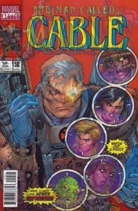
So I’ve got Cable #150. After all the hubbub on the "lenticular covers," I opted to go for that version…after all, it was available in-person, at cover price, and said cover price being the "regular" $3.99, I figured at least I’m getting a "fancy cover" for the price. Alas, though the cover has the slick, plastic-y feel (and sound!) of DC‘s lenticulars, I really don’t like this at all. It’s supposed to have both the New Mutants #87 cover from 1990 or so with the 2017 re-iteration of the image. But try as I might, I can’t get a clear, non-fuzzy view of either that doesn’t have distinct bleed-in of the alternate image. If it wasn’t for the non-lenticular version presented as the first page, I wouldn’t really even know what the "newer" image truly looks like! And honestly, the best the cover has looked to my eye is the scan I did for the image above…so not even "just" to the naked, human eye as far as looking at the cover in-person!

Simply as an image, I like the thing. I really dig the nostalgia–we go from Cable’s first appearance in a #87 to his own series at #150…full circle and all that. While I like the Liefeld re-do of the original, it works well as the cover, and I’m glad the interior is a different artist. Malin does a good job of giving a clean, sleek design to the characters while capturing the classic look–including Cable’s ridiculously huge gun, a staple of the ’90s. On one hand, I’m quite glad to see the character simply looking like himself; on the other, I’d swear he’s been through more changes and was looking much older. Of course, there’s also flashback stuff to this, so, whatever.

Overall, there doesn’t feel like there’s much story to this issue. Cable’s with Longshot, investigating the death of an External named Candra. Confirming the death (which shouldn’t be able to happen, as she was supposed to be immortal), they proceed to meet up with old Cable-ally Shatterstar, and the group then goes to confront the last remaining External: Selene. The confrontation proves less than ideal, with Selene thinking Cable & Co. are there to kill her, not question her…and ultimately we’re left with a bit of a revelation that screams "retcon" to me, while leaving us as readers none the wiser, really, and stuck waiting for another issue.

I’m not familiar with Brisson offhand, but this isn’t bad. Strictly in and of itself, I enjoyed this issue…just not the fact it’s (as "always") simply 1/6th of a constrained story arc. I get a sense of the nostalgia being gone for with this, but don’t really feel like there’s much context to stuff…while I expect things’ll be clarified in later issues, this feels more like the first chunk of pages of a singular lengthier story, and not a full story in itself. I shouldn’t be surprised–that’s basically standard practice these days, for the last decade or more. There is a brief ~3 page segment with the character’s "origin," rather broad and boiled down, but hitting a few key points (far from all, and basically touching on none of the development(s) since 1993). I don’t know that anything Marvel would publish on that front for this would satisfy me, though…especially as none of the origin was "new" to me. I’m clearly not the target audience for it, though!

As usual for a Marvel issue of late…the Marvel brand itself is damaged as far as my feelings towards ’em on so many points, and while by no means a bad issue, this issue is not enough to leave me interested in planning on getting the next issue…and Marvel‘s pricing doesn’t leave me all that expectant of being highly inclined to even bother with the collected edition once it comes out.

Though this brings in some ’90s elements and looks like a familiar-ish iteration of Cable himself, this issue by itself does not stand out as anything overly special, either as part of Marvel Legacy or as a 150th issue. With the screwy numbering and not really being a standalone issue, I’d say wait for the collected edition if anything, if this didn’t already draw you in on nostalgia, number, or cover image(s) alone.

cable_0150_blogtrailer

Astonishing X-Men (2017) #1 [Review]

astonishing_x-men_(2017)_0001Life of X – Part One

Writer: Charles Soule
Penciler: Jim Cheung
Inkers: Mark Morales, Guillermo Ortego, Walden Wong
Colors: Richard Isanove, Rain Beredo
Letterer: VC’s Clayton Cowles
Cover: Jim Cheung & Richard Isanove
Graphic Designers: Jay Bowen, Anthony Gambino
Assistant Editor: Christina Harrington
Editor: Mark Paniccia
Published by: Marvel Comics
Cover Date: September 2017
Cover Price: $4.99

I was a sucker. I’d seen a poster-image of this issue’s cover, and I vaguely recall the image grabbing me initially when it was first debuted with solicitation or shortly after. Archangel has always been a striking figure for me, and despite the last ten or so years, Bishop (especially looking as he does here) rings quite nostalgic for me. Then there’s Rogue, and while I don’t much care for the “Old Man” version, seeing ‘a Wolverine figure’ here drove it home. But in addition to that, there’s something about the blending of the coloring–the rich orangey-yellow background and the yellow and blue of the logo…and that the logo may not be the “classic” X-MEN logo, but it has a certain blend of the old and new while being its own thing…and NOT coming off as “pretentious” (as if text CAN be pretentious) to me.

I was ALSO a sucker because a local comic shop had sent out an email informing us that any Marvel purchase would get a free “cosmic cube,” and while I am actively disinterested in the current comics Event, I’m a sucker for plastic comic artifacts (such as Lantern Corps Rings), and the Cosmic Cube goes way back. And with Astonishing X-Men #1 being out this week and already having the against-my-better-judgment interest, I figured hey…fine. I tried X-Men: Gold #1 and X-Men: Blue #1, so I could give Astonishing X-Men #1 a go. Especially at $3.99.

After I’d bought the issue (amidst my other purchases), and gotten it home AND read it…THEN I realized that no…this was NOT a $3.99 issue. It was $4.99…so for that, I’m not a happy camper. But where even comic shops are lucky to return comics, it’s not like I can “return” the issue, so I’m sorta stuck with it, whatever “principle” I want to take with it.

I’m not happy that my inattention to detail had me ignorantly buying yet another $5 #1 issue from Marvel (in an industry when other publishers proved $10 vol. 1 collected editions with 5-6 issues).

Buuuuuut…

I enjoyed this issue.

I actually did!

We open on a quick scene, learning that mutant psychics all over the world are dying. Then we come to Betsy Braddock–Psylocke–who is one of the STRONGEST mutant psychics, and the force that’s killing the others isn’t able to subdue her until after she’s sent out a psychic cry for help. We’re also (re) introduced to Bishop; to Angel/Archangel, Gambit and Fantomex, Old Man Logan and Rogue; four of whom are on the receiving end of Psylocke’s cry for help; which draws them all in to her location. The force that’s been attacking the psychics is concentrated, and no longer constrained to just the local psychics. As the group converges, they must face the psychic energy-outlash while saving civilians and surviving themselves. Working together, the immediate, outward threat is resolved…but Betsy reveals that she now knows who is behind it–and that things are worse than even this was. Some of the group must go to the Astral Plane to stop the Shadow King. No time to seek shelter or plan–she sends them immediately, with Angel and Bishop remaining behind to protect them all. Meanwhile, we confirm that yes indeed, this is definitely Shadow King. And he’s got quite a secret…which provides a major “hook” for me regarding subsequent issues of this series!

While I was incredibly skeptical of X-Men Prime, X-Men Blue, and X-Men Gold, I bought the one-shot and #1s to “try,” to go against my anti-Marvel negativity and give the things “a shot,” an ISSUE, at least. And that way I could at least judge for myself how things seemed, and feel like I had more room to criticize–at least I’d have bought the big, over-priced first-issues, and have SOME hands-on “experience,” not just second-hand stuff.

And so, too, I figured for this. $4.99 is too much for a single issue, for a first issue. MAYBE for an Annual, or an oversized special/one-shot. But a $5+ issue should be rare and special…not plentiful as water. Marvel has abused the price point to where I virtually NEVER even bother to look at their comics, because I just KNOW they’re basically the most ridiculously-priced premium-priced things in the market. Real or perception, but that’s where I am.

But I’ve got the issue, I read it, and I actually enjoyed it. We have some prologue. We have character introductions. We have an immediate threat, and we see a group of disparate mutant figures come together, face the threat, and emerge victorious. We then have the setup for an even bigger threat–the one that carries beyond “just” this issue…and it looks to involve other nostalgic elements that work organically with the Shadow King character, as well as perhaps grabbing onto continuity and yanking on a loose thread, in preparation of some re-stitching and mending.

The story is engaging and keeps stuff moving; I can and will allow any “inconsistencies of character” to be credited to the last decade or more of mutant comics and lack of continuity and the apparent attempt here to play with the existing status quo. Visually, I dug this issue. Everyone’s recognizable and I like the visuals; there’s a sense of modernity with the aforementioned nostalgia; new and old, simply making this a good-looking comic. The multiple inkers do not take away from that–I only even know there were multiple inkers due to seeing the credits.

I don’t want to like any Marvel series right now. The X-Men are old favorites, and I’ve felt largely let-down by everything that’s been done with, to, and involving them for years, such that many of them are hardly recognizable to me anymore. I do not TRUST Marvel to not “yank the rug out” from under me, or some sorta bait-and-switch with this. I’ve already seen one or two of the other X-titles tie in to a major crossover event…and I want nothing to do with that, either. So…I might come back for the next issue of this arc, or at least check it out if I notice it on the rack. I am honestly very interested in what this particular story arc holds, and if I’m gonna pay Marvel‘s too-high inflated/”premium” price point, I can justify it a bit easier in smaller doses as single issues than collected volumes.

I actually don’t feel I can really speak to whether old fans or new fans or both would care or not care about this issue…I’m a weird creature when i comes to Marvel, and the X-Men. Suffice it to say that even at that $5 price point and $3.99 otherwise with possible bi-weekly shipping, I’m hooked here where even the likes of Blue and Gold didn’t grab me at this level. That makes this a definite “light in the darkness” of X-Books, and if you can stomach the $4.99 price point, this is about as good an issue for that as any that Marvel‘s put out of late!

astonishing_x-men_(2017)_0001_blogtrailer

Uncanny X-Men #600 [Review]

uncannyxmen600Writer: Brian Michael Bendis
Art: Sara Pichelli, Mahmud Asrar, Stuart Immonen, Kris Anka, Chris Bachalo, David Marquez, Frazer Irving
Inks: Wade Von Grawbadger, Tim Townsend, Mark Irwin
Colors: Marte Gracia, Jason Keith, Chris Bachalo, Frazer Irving
Cover: Chris Bachalo
Lettering & Production: VC’s Joe Caramagna
Assistant Editors: Christina Harrington, Xander Jarowey
Editors: Mike Marts and Mark Paniccia
Published by: Marvel
Cover Date: January 2016
Cover Price: $5.99

Winter Carnival

Writer: Mary Jo Duffy
Penciler: George Perez
Inker: Alfredo Alcala
Letterer: Janice Chiang
Cover Art: Paul Gulacy
Associate Editor: Ralph Macchio
Editor: Dennis O’Neil

The first X-Men comic I clearly, consciously remember getting is Uncanny X-Men #300. The costumes, the characters, the cover–it fit the then-current animated series on tv that I was getting familiar with, and had a nice shiny cover to draw extra attention (to say nothing of being a thicker cover physically, making for a durable, high-quality issue to hold).

Several years later I picked up #400, and then years after that 500–though I hadn’t kept up with every issue of the title.

So again now, I bought #600 despite not being entirely current on the title (and overlooking the multiple reboots between the last legitimately-numbered issue and this) because of having bought the last several 100-issue round-number issues when they came up. Some 22 years after getting #300, here I am with #600.

My understanding is that this is Bendis‘ final X-Men issue, as far as being the driving force behind the main X-books. Despite catching up a fair bit on Uncanny X-Men and All-New X-Men recently via Marvel‘s Digital Unlimited, I’m still a bit out of the loop on whatever’s transpired between where I left off there and stuff immediately prior to Secret Wars and the Last Days stuff. But I do know the characters and the bulk of recent stuff in the most general of terms.

This issue finds Beast (Hank McCoy) experiencing an “intervention” by his teammates, forcing him to confront what he’s done of late–with emphasis on having time-traveled to bring the original X-Men into the present where they’re now stuck. Amidst the intervention/confrontation, we get some flashes to a number of smaller interactions–“original” Jean wants to leave the group for awhile; “original” Bobby confronts current Bobby on repressed feelings; Kitty, Colossus, and Illyana catch up with each other, and so on. Meanwhile, we also see Scott Summers’ recent dream to fruition…and it proves to be just a bit different than we’ve been led to believe.

We also get a lengthy “backup story” by Perez, a solo Iceman thing, that while it looks good does not feel particularly relevant nor current. It seems set in the early 1970s, though it feels like a more recent piece. The art is very good–I usually do enjoy Perez‘ art–though I don’t entirely appreciate the black-and-white instead of color. Perhaps it was intended this way, maybe it was a stylistic choice, but that contributes to it not feeling like it belongs in this issue.

The main feature’s story is solid enough, and though it doesn’t feel like an ongoing issue but more like a one-shot, it works decently enough as itself, as what it is. At the same time, I’m not thrilled at what appears to be Bendis trying to cement several key points just before taking off, like he has to solidify or shoehorn in some stuff to force subsequent writers to address things or leave Bendis‘ work to be an absolute character element. I do definitely approve of the supposed conclusion of the Cyclops arc, and hope to see stuff picked up on, that it’d “redeem” the villanous element applied to the character over the last several years.

Visually…while I appreciate the CONCEPT of letting a bunch of artists work on the issue as “the” big anniversary issue…I can really do without it. The shifting visual styles is distracting and draws attention to stuff in a way that takes away from the otherwise-natural shifting nature of the story, giving us some smaller character moments while addressing the larger overall confrontation with Beast.

I definitely enjoyed Perez‘ work on the Iceman story…but it’s such an unrelated thing that I’m honestly resentful at its inclusion, at this issue being over-priced at $6 over the “standard” $4 just for the story’s inclusion. Better a $3.99 issue without it than $5.99 WITH. That said, the story would work as some bonus/extra cheap attraction, as it really has nothing to do with current continuity, and has no likely/obvious ongoing elements to contribute to stuff, other than being a ’70s-looking/’70s-sounding story.

The main story’s art was distracting…and I was reminded how recognizable and unwelcome (to me) Bachalo‘s art is amidst it all…especially for the cover. It’s also very disappointing that the cover looks like it’s half of or one of several “panels” of a larger image, without even a wraparound…only a bunch of variants.

I bought this issue personally for being the anniversary issue, being the actual high-number or “legacy-numbered” issue. That’s for the personal element of having got #300 off the shelf, and each subsequent 100-numbered issue. In and of itself, if you have followed Bendis‘ X-work, you’ll want to pick this up. Otherwise, this is quite skippable for whatever will be ‘current” moving forward. Outside of whatever closure you’d get having followed this series, and/or All-New X-Men, I’d suggest skipping this and waiting for whatever nearest #1 most directly follows and grabs your attention.

Ultimate End #1 [Review]

secretwars_ultimateend001Writer: Brian Michael Bendis
Penciler: Mark Bagley
Inker: Scott Hanna
Colorist: Justin Ponsor
Letterer: VC’s Cory Petit
Production Design: Manny Mederos
Cover: Mark Bagley
Assistant Editors: Chris Robinson, Emily Shaw
Editor: Mark Paniccia
Published by: Marvel Comics
Cover Date: July 2015
Cover Price: $3.99

Despite missing the first two issues (to this day 14-some years later I’ve had to rely on reprints for my personal collection) I had jumped into the Ultimate universe basically at its start, with Ultimate Spider-Man #3, and I believe I finally got to read the first two issues initially in a Mighty Marvel Must-Have edition. As such, seeing as how–after several false-starts on the “end” of the Ultimate universe–the ending is finally here, I couldn’t pass this up. And like I started with Ultimate Spider-Man with the single issues, so, too, I found it fitting to follow the single-issues here as well.

This triggers plenty of nostalgia for me from the cover, which utilizes the original trade dress of the Ultimate books–the two solid-color bars down either side of the cover with a skinnier image between. The Ultimate End logo looks familiar, though I think the font is slightly “off” from some of the other Ultimate _______ logos; and of course we have the Battleworld banner across the top and the Secret Wars stamp marking this as part of the overall Secret Wars 2015 event, specifically the Battleworld class of tie-ins. I had noticed an alternate cover with the Miles Morales Spider-Man costume, that looked like the original Ultimate Spider-Man #1 cover that I almost chose over the standard cover. However, never having acquired an original USM #1, I stuck to my guns on getting just the standard/main non-variant cover for this.

We open on (a) Spider-Man tangling with a Serpent Squad, putting him into interaction with Cloak, Dagger, and a Spider-Woman. We then shift to a huge gathering of heroes that seems made up of a mix and combination of “616” characters and “Ultimate” characters. Spidey joins in as everyone is debating the fault and situation itself they all find themselves in, before the party is further crashed by Thors.

Simply opening the book and reading, I was actually expecting the Miles Morales Spider-Man, so was surprised to see a classic-costumed Spidey. Further, this seems to be a Peter Parker Spidey, suggesting he’s either the 616 Spider-Man or another. The issue has a prologue and then jumps to “3 weeks ago,” and references a white portal/other world, so as a cursory read-through I’m not certain on the timing and how much the characters know of where they are and if that was pre-incursion or what; I have not kept up on any Marvel the last several years until Secret Wars #0 and 1. So what may be totally obvious to readers following along was not to me.

Still, knowing the basic premise, that didn’t bother me much…I recognized the various characters overall. Whether this was actually Battleworld as I assumed or a flashback to the universes still being separate isn’t a huge deal to me. Story-wise this worked well enough and had a familiar “feel” stylistically. The art of course is familiar, and Bagley‘s work is just as good now as I recall from when I was following the Ultimate Spider-Man series with his art.

This is only the first issue of–I believe–five, so there’s by no means a complete story here. We’re introduced to stuff, mostly, with a little bit of background/flashback given; this is clearly a first chapter of a larger singular story within the Secret Wars/Battleworld stuff. As I expected that going in and did NOT expect some one-off single-issue tale, I’m fine with that; I also went into this with the expectation that I’d enjoy it and that barring some huge disappointment or negative factor, I wasn’t going to bail on the series just from whatever this single issue held.

I enjoyed the issue overall–story and art, and appreciated the mix of nostalgia and new. I do look forward to the next issue and want to see where things go. I bought this because of my own history with the Ultimate books; though I suspect this may be one of the more “key” tie-ins to the overall Secret Wars as it deals specifically with ending the Ultimate Universe. (After all, Secret Wars is kicked off by the Ultimate and 616 Universes as the final two in existence, merging).

This seems like a very strong issue for a tie-in reading experience, and well worth getting if you’re following Secret Wars. It also seems likely to be a good story overall for putting the lid on the Ultimate Universe, fairly friendly even to readers like me who haven’t really read any of the Ultimate books for years. You could certainly do a lot worse than this issue!

Ultimate Spider-Man #160 [Review]

Death of Spider-Man: Part 5 of 5

Writer: Brian Michael Bendis
Penciler: Mark Bagley
Inker: Andy Lanning with Andrew Hennessy
Colorist: Justin Ponsor
Letterer: VC’s Cory Petit
Cover Art: Bagley & Ponsor
Assistant Editor: Sana Amant
Senior Editor: Mark Paniccia
Published by: Marvel Comics

So, this issue is mostly one big fight scene. Seems the Green Goblin’s been busy, and it’s all come back down to Norman Osborn vs. Peter Parker. But unlike that first time the Goblin came back–when it was Mary Jane who was thrown off a bridge, playing on readers’ knowledge of what happened to Gwen in the regular Marvel Universe–this time, it just feels like little more than a ripoff of a two-decades-old Superman story. Yet, it works.

The villain apparently rose…many have fallen, and it’s down to the titular hero to save those around him from said villain.

Face it…the title of the story, the branding of the last few issues of this title and the Ultimate Avengers thing–it gives it all away. Much like knowing weeks before the story even began that Doomsday! was a tale that would end with the death of Superman. It was the journey to get there, watching the hero gradually take more and more of a beating, attempting to dish it back, and ultimately making a final sacrifice to save those he loves from a monster’s rampage.

The story itself–pretty simplistic. I haven’t read the first four chapters of it in this title, and bought (but wound up only skimming) the issue where Peter takes the bullet for Cap….yet, the recap page at the beginning of this issue sum things up pretty succinctly–I don’t need those chapters to “get” this.

The art–maybe not fantastic, but after recently reading the first tpb of the post-Ultimatum Ultimate Comics Spider-ManBagley‘s art–which I’ve always enjoyed and associated with Ultimate Spider-Man–is SUCH a thing of beauty. The characters actually look like I’d expect, as I got used to. The way they looked over the course of all those practically biweekly issues in college and all those TPBs after that when I went back to the series last year and caught up on over 60 issues of story.

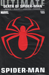
As a whole…not truly worth the $3.99 cover price. Not even with that black plastic bag with the hero’s logo in red on it. But y’know? I missed out on Ultimate Spider-Man #1; I wasn’t able to acquire any issues til #4 or so, and was only able to get back to #3. But by and large (I got the first hardcover with those first 13 fantastic issues) I got in at the beginning. So I couldn’t bring myself to entirely “pass” on this ending.

If you’re already buying this title, sticking with the singles after the Ultimatum stuff and the renumbering and the re-renumbering, the changes in art and all that…if you read the earlier chapters of this story…again, face it: you were already going to or have bought this issue already. If you’ve sat things out, wondering at simply waiting for the collected volume: keep to that route. You’ll get a full story. If you’ve avoided this story on principle…hold to it.

This isn’t going to be for everyone. In many ways, I should be appalled at this. To see the character I so enjoyed reading about–and the supporting cast–put in this (albeit fictitious) situation, to see things come to this…it’s horrible. Heart-wrenching. But when you come down to it…this issue makes this version of Peter Parker, Spider-Man, much more real, at least in the moment. We saw his origin. His beginnings. His career. And now, his end.

If you can find this issue, without being taken for a marked-up price…I recommend it. If you’re a lapsed fan of the series, it might be worth getting to be there for the end. If nothing else–consider the collected volume.

Story: 4/10
Art: 9/10
Overall: 7/10

Fall of the Hulks: Alpha [Review]

Quick Rating: Good
Story Title: Meeting of the Minds

The Leader and his group of intellectual villains work behind the scenes through Marvel’s history to assemble the lost knowledge of the Library of Alexandria.

fallofthehulksalphaWriter: Jeff Parker
Penciler: Paul Pelletier
Inker: Vicente Cifuentes
Colorists: Guru eFX
Letterer: Simon Bowland
Cover: Ed McGuinness, Mark Farmer, Dave Stewart
Production: Irene Y. Lee
Assistant Editor: Jordan D. White
Associate Editor: Nathan Cosby
Senior Editor: Mark Paniccia
Published by: Marvel Comics

I wasn’t really sure what to expect from this issue, except perhaps a jumping-on point in preparation for the coming Fall of the Hulks "event." What I did not expect was what seems to essentially be an "Illuminati" of intellectual Marvel villains and their "backstory" throughout Marvel’s past.

This issue basically follows The Leader, M.O.D.O.K., Egghead, The Wizard, The Mad Thinker, The Red Ghost, and Dr. Doom as they assemble the contents of the formerly-believed-lost contents of the Library of Alexandria through the years. Their first mission is an incursion into the home of the Eternals. Here the protagonists discover there are other locations around the planet with further Alexandrian contents, including Wakanda and Atlantis. Bucking the silver Age trend of simplicity, here we see that it takes months and years for the protagonists to prepare to actually launch a mission to gain the knowledge they’re after, as well as the explanation that allows for what we’ve already seen in the last half-decade of continuity regarding these characters. As the issue closes out, we get some info regarding the Red Hulk, which actually intrigues me after never before this having any interest in even the concept of that character.

The story is pretty good in and of itself. It’s not spectacular, and I’m not a huge fan of retcons…but for my understanding of things, the backstory that is here inserted into existing continuity seems to work. Additionally, I feel like I have a better understanding of who The Leader and The Red Ghost are now than I ever did before.
The art is also quite solid…while keeping its own feel, it also evokes some of the feeling of the different eras the story touches upon.

Though I came to the issue familiar with little more than the characters’ names and visual representations (excepting Dr. Doom), everyone was quite recognizable, and I really enjoyed the visuals.
Even though I’ve not followed the Hulk side of the Marvel Universe since World War Hulk ended, I still really enjoyed this issue and found that I didn’t need to know recent events. I’ve often enjoyed stories that flesh out villain characters and give them depth and motivation, and true explanation for why they would door act as they do, and this is one such issue.

I expect this is little more than set-up in the grand scheme of things, but if you want a Leader story involving a teaming-up of supervillains (including death and betrayal) reminiscent of 1980s stories but with a modern feel, this is a great issue for that.

Ratings:

Story: 3.5/5
Art: 4/5
Overall: 3.5/5

What If..? Age of Apocalypse #1 [Review]

classicreviewlogowhite

Quick Rating: Above Average
Story Title: What If…Legion had Killed Xavier and Magneto?

Summary: Here we’re shown what might have happened had neither Xavier nor Magneto lived to oppose the rise of an age in which the evil mutant Apocalypse rose to rule the world…

whatifageofapocalypse001 Writer: Rick Remender
Artist: Dave Wilkins
Colorist: Anthony Washington
Letterer: Nate Piekos
Production: Brad Johansen
Asst. Editor: Nathan Cosby
Editor: Mark Paniccia
Editor-In-Chief: Joe Quesada
Cover Art: Marko Djurdievic
Publisher: Marvel Comics

This holds a lot of potential–the original Age of Apocalypse remains one of my absolute favorite X-sagas, period. And seeing that world played with could be quite cool, taking the concept and pushing in another direction while remaining in the spirit of the original.

Unfortunately, while ripe with potential, this issue lacks the space to truly execute a high-level story re-doing that saga in the space of a single regular-sized comic.

We open with the Watcher informing us that in this reality that we are shown, both Xavier AND Magneto were killed by Legion (the original story saw only Xavier killed, with Magneto’s X-men opposing Apocalypse). The absence of both characters ushers in a different age of Apocalypse; we get a re-imagining of re-imagined characters. When the story kicks off, we see a band of mutants AND other heroes (Captain America, Thing, the "current" Dr. Strange, and so on) mount a final attack to preserve their haven–though one of them has ambition to go beyond merely surviving and seeks to change the whole of reality, despite warnings against messing with such business.

The story’s heart is in the right place, showing this alternate version of an alternate universe. It’s jam-packed with a lot of characters that, for lack of space to truly flesh them out, seem rather contrived and present for the "coolness factor" of showing them; there’s no room to really flesh them out and show where they came from, what brought them to this point.

The art seems rather sketchy, and at points characters seem to be out-of-proportion…This is no standard, clean-lined interpretation of the characters. While this would normally be a complaint with me, something about the context makes it work. The story takes place in a mucked-up world with little to BE bright, sun-shiny/happy about, and the characters can’t afford to be clean-cut "super-heroes" or such, and the visual style lends a certain edge that just works for the tone, allowing a bit of abstractness to get things across.

As with the Onslaught Reborn issue, the quantity of ads managed to annoy me and take me out of the story, and makes me wish all the more that I’d simply waited for the inevitable TPB of all this year’s What If..? issues to read without ads.

Given that this particular story delves back to the core of the Age of Apocalypse, it seems almost out-of-place amidst the others in this batch, taking on stories from the last 3 or so years. In and of itself, it’s an enjoyable enough read, though it feels like a pilot missing a series: I think something like this would have made for an interesting mini-series, giving more detail to the changes brought into the concept and setting things up; all the moreso for the "twist" ending.

You could certainly do better than this issue…but there’s a lot you could find that’s worse. If you’ve followed most of the stories this batch of What Ifs spring from, you might enjoy a collected version more than the singles.

Ratings:

Story: 3/5
Art: 3.5/5
Overall: 3/5

Ultimate Comics X #1 [Review]

His Father’s Son

Writer: Jeph Loeb
Pencils: Arthur Adams
Colorist: Aspen MLT’s Peter Steigerwald
Digital Inks: Aspen MLT’s Mark Roslan
Letters: Richard Starkings & Comic Craft’s Albert Deschesne
Production: Irene Y. Lee
Assistant Editor: Sana Amanat
Senior Editor: Mark Paniccia
Cover: Art Adams
Published by: Marvel Comics

Okay…so, I can hardly remember the last time I read an Ultimate comic. After reading from issue #3, I let Ultimate Spider-Man go around issue 80 when I gave in on the realization that the stories just weren’t being written for the single-issue format, and I wasn’t enjoying the pacing for the price per issue. I’m pretty sure I gave up on The Ultimates before that due to lateness, and I don’t recall sticking with Ultimates 2 more than a couple issues. All the hype over Ultimatum and the Ultimate Comics relaunch didn’t pull me in. I read Ultimate Iron Man 2 when I scored the hardback for the $6.

I’m not even sure what intrigued me with this issue. The teaser ads? Perhaps in small part–after all, WHAT is there to be done with Wolverine that’s NEW? Would this be something interesting like the Mary Jane and Spider-Man Loves Mary Jane series? Would a book about a teenaged Logan in modern high school (thinking “Wolverine” instead of “Sparkly Vampire”) come across well?

So, despite my extreme dislike of the $3.99 cover price, I grabbed the issue–choosing the cover whose image I recognized from the teaser ad. Behind Siege #2 (which was spoiled for me via twitter prior to reading), this was near the top of my stack this week–bypassing Deadpool and even a couple Blackest Night issues.

One of the things that Marvel has done well for many years is “The ‘Previously…’ Page” at the start of their issues. This is a page that is basically prose or just non-story content that serves to get a reader up-to-speed on stuff, contextualizing the story that’s about to begin; it also serves to have the issue’s credits all in one place, so that when this page is omitted, a collected volume flows as one long work, uninterrupted by titles and credits every chapter or so.

Opening this issue, we have a series of images with seven simple sentences that serve to place this story. Context provided–whether as wholly new information, or to catch one up. I’d read The Ultimates, and Ultimate Spider-Man, followed a bit of Ultimate Fantastic Four, and even some of the Ultimate X-Men. The pictures and words tell all I need to know–and the world in this issue is apparently the same as I’d read before, but much changed by Ultimatum. The world exists, but even though I haven’t read in years, I’m not lost.

This issue’s story begins with narration from James Hudson, talking about his son–a son brought to him by an old friend years earlier. That old friend wasn’t able to raise the boy, but knew James and his wife Heather could, and so entrusted them with the child. Now a teenager, and running concurrent with the narration of how the boy came to be Hudson’s son, we see this son discovering what he is, and how his being different changes his life. Kitty Pryde–a name and character I’m somewhat familiar with from both the Ultimate comics and mainstream Marvel continuity–enters, with a classic trapping of such stories: the message from a person to their loved one, recorded shortly before dying. This child–Jimmy Hudson–is confronted with the image of his father, and the reality of who he really is. We also learn the difference in his mutant ability from that of his father.

The story, surprisingly enough as I have really not enjoyed Loeb‘s work for years–is relatively engaging. It’s not perfect, but I remained interested throughout the issue, and that’s quite the achievement in my eyes. As a long-time comic reader familiar with much of the Marvel universe in general throughout much of the last couple decades, names were familiar, but as this is not the mainstream Marvel universe, I had zero problem with the Hudsons being different than the characters I knew before this issue, and rather enjoyed the reference to how James’s codename is come about. There was also something to the realization of who the main character is that is at once obvious and yet not exactly what I expected–and any duplication of a similar character in the main Marvel books works so much better to me here.

The issue reads like an origin issue. We have the introduction of characters who are (presumably) going to be much of a supporting cast. We’re introduced to who assumably is the main character of the book. We learn where he came from, how he is seen by his family and others. We see his discovery of his identity, and what that does to him. We’re left on an ending that both provides actual conclusion to this specific single issue’s story, and yet it is clear this is by no means the end–the issue is not a one-shot.

The art isn’t the greatest I’ve ever seen, but–except for one panel that really put me in mind of Millar‘s Kick-Ass–never really took me out of the story. It’s clear what’s going on throughout the issue, even the effect as we find out Jimmy’s “other” mutant ability. Particularly with no previous issue to go on, Adams’ art actually stakes itself as definitive to me for this character, and does quite a good job of it.

Again–I despise the $3.99 price point, particularly for a mere 22-page issue. As I’d already compromised my principle (avoiding all Marvel $3.99 books) with Siege and Siege: Embedded, I allowed myself a further compromise to pick this up, since it’s a debut issue of a new series, and I was actually somewhat intrigued.

What I got was a very enjoyable issue, that really does what a first issue of any series ought to do…and it stands alone. I won’t be picking up future issues, as I refuse to pay $3.99 as a regular, ongoing price for a “standard” comic.

In and of itself, though, this was a good read, and actually mostly worth its cover price for the experience. While I don’t plan to purchase future single issues…provided the inevitable collected volume is reasonably priced, I expect I’ll have some interest in picking that up to read this story and go from there.

Story: 8/10
Art: 7.5/10
Overall: 8/10