• June 2023
    S M T W T F S
     123
    45678910
    11121314151617
    18192021222324
    252627282930  
  • On Facebook

  • Archives

  • Categories

  • Comic Blog Elite

    Comic Blogs - BlogCatalog Blog Directory

The ‘90s Revisited: Magic the Gathering: Gerrard’s Quest #1

90s_revisited

magic_the_gathering_gerrards_quest_001Gerrard’s Quest Part 1: Initiation

Written by: Mike Grell
Pencils by: Pop Mhan
Inks by: Norman Lee
Letters by: Michael Taylor
Colors by: Dave Stewart
Separations by: Lisa Stamp, Stu Hiner, Brian Gregory, Harold MacKinnon
Cover by: Mark Harrison
Editors: Peet Janes and Ian Stude
Cover Date: March 1998
Cover Price: $2.95
Published by: Dark Horse Comics

I’ve been “aware of” this series for over 20 years. The original MTG comics were published by Acclaim, under their Armada imprint. Those lasted a couple years with a number of mini-series and specials. This, too, is a mini-series…but by late-1997/early-1998, the license had moved to Dark Horse. Also by this point there was a move toward a unified “whole” in the MTG continuity/story, rather than everything being a mash up of fantasy tropes and generic fantasy-style stories.

Here we begin “Gerrard’s Quest.” Despite that being the story title (even in the indicia!) it is NOWHERE on the cover of the issue. While the “issue’s chapter” IS “Initiation” that is what’s on the cover…where usually it would be interior-only, or in addition to the series’ subtitle. This is solely billed (cover-wise) as Magic the Gathering #1 of 4. Nothing to indicate anything came before…nothing to indicate (now long after the fact) that this is the first chapter of Gerrard’s Quest (as the long-outta-print collected volume is titled and the story referred to in general).

Without even looking back, I’m quite sure that even the Armada books had subtitles on the covers and/or the subtitle logos of whatever set the issue(s) contained stories for. So that’s a huge dislike of this to me from the start. Having only the MTG logo and the title “Initiation” at the bottom of the cover, it suggests to me that the issue is ABOUT some initiation. Into what, though? Is it the reader being initiated into the “I-read-Magic-the-Gathering-comics” portion of the comics audience? Is it about someone joining some group of planeswalkers banding together to save the multiverse? By the cover alone, the ONLY thing really of interest to me would be the MTG logo. The rest of the cover just looks like some generic fantasy-ish thing and even knowing the broad strokes (having read loads of the novels and re-read a bunch of the novels in the last 17 months or so) I’m not immediately sure who any of the characters/entities on the cover are supposed to be, outside of Gerrard.

The story in the issue is choppy and all over the place. It’s rather loose, and really seems little more than hitting bullet points. I’d have to practically re-write the issue to give it a proper summary here. Suffice it to say that it picks up with Gerrard lamenting others dying for him, and the burden of the artifacts that are his birthright, the “Legacy.” The ship he’s on gets to Rath, a lotta fighting happens, someone he apparently knew dies, other stuff happens and…yeah. Having read the anthology/novel Rath and Storm at least twice now (once back in 1999 or 2000, once back in late 2018 or early 2019) I have a vague idea from memories of THAT as to who THESE characters are and what’s going on.

Early in the issue I get the sense that the crew is on their way to Rath and the Stronghold to save Sisay. And then there’s some scene with people related to Crovax and then suddenly the Weatherlight and its crew are there…and after Rofellos dies, Sisay is with them.

What the heck did I miss?!?

This feels like little more than a generic visual review/overview of a prose story. And sure, it ends on a cliffhanger-like note with a to-be-continued promise…but strictly in terms of this issue, I’m not invested in any of these characters. I don’t KNOW who any of these characters ARE from this issue. (I only know the characters because I’ve read the prose novels!) Other than the clear sense that Gerrard’s upset about involvement with his “Legacy,” it’s just…pictures and dialogue.

I like the art well enough despite my clumsy attempt to describe it ahead: the layouts get sorta interesting and creative. The inks and colors work well. The overall visual experience seems a bit rough and angular and almost “gritty,” if that’s the word I’m looking for. It’s not awful, but it doesn’t have the smoother, sleeker sense of shiny wonder and just SOMETHING I can’t find the words for.

I finally tracked this mini-series down recently via a site I didn’t realize I COULD order comics from. Pulling this issue to read, I had visions of covering this whole mini-series…but assuming the subsequent 3 issues are on par with this one…I’m gonna be floundering for words and repeating myself and it’ll generally be a mess! The only REAL reason I would even suggest anyone track this issue/series down is if you’re a COMPLETIST on MTG comics.

Seriously.

In place of this, I would recommend tracking down the book or ebook of Rath and Storm, edited by Peter Archer, and read that instead. And that’s disappointing enough to say, given this is written by Mike Grell. But if you like his writing in general…find something else he’s written and read or re-read that and you’ll probably appreciate it more. I may yet read the rest of this mini, and maybe I’ll change my mind. But as of just this issue alone…it’s a disappointment and far more in the vein of “early MTG” than the far more epic, storied stuff that would come not long after in the novels and such.

magic_the_gathering_gerrards_quest_001_blogtrailer

Aliens: Defiance #1 [Review]

aliensdefiance0001Episode One: Derelict

Script: Brian Wood
Art: Tristan Jones
Colors: Dan Jackson
Lettering: Nate Piekos of Blambot
Cover: Massimon Carnevale
Publisher: Mike Richardson
Editor: Spencer Cushing
Designer: Cindy Calcerez-Sprague
Digital Art Technitian: Conley Smith
Published by: Dark Horse Comics
Cover Date: April 2016
Cover Price: $3.99

My earliest exposure to Aliens was the final battle with the Queen at the end of the 1986 film, that I saw accidentally, wandering out one time to where Dad had fallen asleep watching it or whatever preceded it. Several years later, I came across and read the novelization of Alien3, which led to me seeing that film (my first-ever R-rated film sought out!), and in turn led to “backtracking” to the others. I also recall at some point realizing I had read the novelization of the first film at some point without ever realizing when I read it that it had anything to do with any movie. I also came across the novels that expanded the Aliens universe, and which I eventually came to learn were themselves based on comics. It would be a few more years before I ever got around to getting to read those original comics–particularly the first ‘trilogy’. While I’ve “lapsed” over the years, the last few years I have been quite interested to learn of any Aliens comic series, and occasionally lament that it’s not a truly ongoing property (while realizing that it works better with finite stories). As a gamer, I’m pretty lax, and have not played the recent game with Ripley’s daughter, though I’ve been told a fair bit of the story (sadly, not consciously retained). But hey…comics, right?

So here I am…brand new long-form Aliens story kicking off, its cover putting me a bit in mind of a/the video game, and intrigued at what I BELIEVE to be at least a 12-issue saga–perhaps the longest single Aliens story I’ve been a part of as a fan (not getting into the comics until about a decade ago). I know Brian Wood‘s name from some prior stuff I’ve read/sampled–Northlanders, DMZ, The Massive–and been aware of his name on stuff like Star Wars more recently…so that’s a welcome factor for a new Aliens series. Icing on the cake is art by Tristan Jones, who I became aware of with his work on the Tales of the TMNT title from original TMNT publisher Mirage a few years back, and have loved seeing his work on various other projects since…and whose visual style seems a perfect fit to me for the Aliens property.

This issue is a first issue, giving us basically a brief paragraph of context/setup before we’re launched into the thick of things. We meet Zula Hendricks, a private involved in a mission to a derelict spacecraft. She and her fellow marines encounter Xenomorphs, and the situation does not go well. She and a synthetic survive, though she quickly learns that the synthetic is acting against programming, and her own world is changing as a result.

The story is good, for what it is. Which is not meant to be a negative statement…but this is only the first chapter of a multi-issue arc, that I believe is a year-long, so this is hardly going to be a full story in and of itself, nor is it giving everything away. And a single issue isn’t really enough space to re-introduce readers to a property, introduce new characters and detail their history, recent past, and present while also showing the scope of the property and of space and the horrors of the Xenomorphs. But we do get a fair bit packed into this, with Zula’s introduction and some flashbacks, a cameo of Amanda Ripley (which I believe thusly situates this time-wise somewhere between the first and second films), the synthetic Davis, some context for Zula and her place in things, and the final-page reveal of what seems to be the “mission” of this particular series…piquing my interest such that I almost wish this was a weekly series, because waiting another month for the next tidbit seems far too long. It’s not a cliffhanger in and of itself, but more a concept that promises a lot of great stuff, and I want to see it developed and played out, and be along for the ride.

Jones’ visuals are a great fit for this story, providing a great overall feel for this issue. His style is–as said above–very well suited for this property, and gives a gritty, dark, creepy look to the Xenomorphs and their brand of violence. The humans/humanoids come across as I would expect, while exuding whatever it is that just FEELS like they’re in an Aliens story. The linework and layouts are impressive, giving a sort of cinematic flow to the issue…and I’m pleased at the lack of full or double-page spreads, which often feel like cheats and wastes of space when they’re the bulk of an issue. Only one page is a single/full-page image, and that’s the ending of the issue, where after all those pages crammed full of panels, it provides a stark contrast, and really drives home the importance of the “moment” that it conveys.

The cover is also a fantastic piece of art, and for me quite iconic and recognizeable. It’s also all the more impressive to me as it’s the only cover image I’ve seen for this, allowing it to stand as itself and not be just one in a sea of variant covers diluting the thing. While there may be a variant or two out there specific to someone, I don’t believe there are any alternate covers from Dark Horse in and of itself as a push.

Plenty of questions are opened up here, and the apparent premise of this series now holds a great deal of potential. I look forward to learning more of Zula as well as Davis, and seeing what sort of interactions the two have. I’m interested in how their ‘mission’ will play out, and play into the larger scope of the Aliens universe. While we get the cameo of Amanda Ripley, I believe her story is told in the videogame, and more of an “Easter egg” tossed in for fans as well as being an indicator of the time this is set in. I look forward to seeing and learning more about the Aliens, and seeing these characters grow in their own knowledge and understanding of same.

It will be interesting to see how this is paced, overall as a series…but I almost wish this was already a completed work. As a first issue, this works well overall. I don’t know that this is something that in and of itself right now as a singular issue will pull anyone “new” into Aliens or be necessarily the greatest introduction to the property…but whether long-time fan of the Aliens comics or just now checking them out being familiar with the films and/or video game, I think this is a great start into the comics side of things.

I’m not particularly enamored with the cover price, but will suck it up, given this is Aliens . I’m definitely on board for this series, and definitely recommend checking it out if you’ve any interest already in the property.

Vampirella/Aliens #1 [Review]

aliensvampirella001Writer: Corinna Bechko
Artist: Javier Garcia-Miranda
Letterer: Simon Bowland
Colorist: InLight Studios
Cover Artist: Gabriel Hardman
Cover Colorist: Jordan Boyd
Published by: Dynamite Entertainment
Cover Date: N/A (September 2015)
Cover Price: $3.99

In twenty-seven years, throughout the entirety of the ’90s and the ‘bad girl’ craze and all that…I never bought even one single issue of Vampirella. That impressive run has now come to an end, thanks to a cover and crossover…with Aliens.

Some cloaked/hooded figures in some sort of underground temple on Mars are attacked by Aliens, and quickly revealed to be vampires. Even their enhanced abilities are no match, and they’re wiped out. Some time later, a ship arrives at the station on the surface, carrying an individual with special expertise…Vampirella. She and the station crew investigate stuff and–of course–encounter the Aliens. They also learn that vampires are not the cause of the strangeness but victims. After fending off an attack that left most of the group unconscious with creatures having attached themselves to faces…we see that even Vampirella isn’t immune to Aliens and their larval Facehugger forms.

I don’t honestly know what I expected from this. I’d known the series was coming up, probably even knew this first issue was due out, but I forgot about it all the same, until I saw it on the shelf.

Despite the presence of Vampirella…the cover looks like an Aliens comic. Aside from the ridiculously unnatural near-lack-of clothing on the female, this could be any Aliens comic, by the looks of it. And that suits me just fine, simply being interested in something new with Aliens. I also like the way the two publishers’ logos are…neither one seems out of place, and the way they appear with the issue number and creator names, if one didn’t know better it’d be quite possible to think that one’s an imprint of the other rather than two “competitors.”

I’m not familiar with the creative team, so nothing prior to compare this to in that regard. But in terms of being “an Aliens story,” this is pretty formulaic and familiar…which I actually appreciate and enjoyed as I read this. (That’s what Aliens crossovers ARE, too, to me: something entertaining despite formula…because it’s Aliens vs. ______ [insert character/property]!) So there’s not much story-wise, to me. I’m aware OF Vampirella but know basically nothing about the character or her past stories/continuity. Ok, so she’s a vampire? Cool…that means she’s at least “tougher” than “regular humans” (as we see in this issue). I don’t really “need” anything else…I’m entertained at “Aliens vs. Vampires” here.

Visually…I like the art. This looks and ‘feels’ like an Aliens comic. And that’s more than good enough for me. I’m especially impressed with the cover, though. Different artists, but the styles work well together–the interior art isn’t a match to the cover, but it’s not a jarring difference or anything. And surprisingly–almost shockingly–despite one particular glimpse of a “classic” look to Vampirella herself, we’re treated mostly to a far more feasibly-dressed female figure that doesn’t make me feel dirty for buying an issue with Vampirella in the title.

I’m not sure if this is 4 or 6 issues for the mini-series, but right now (particularly given the issue’s cliffhanger) I’m very interested in the next issue, and will be keeping an eye out for it next month, whether or not I stick with the single issues for the entirety.

Not being entirely familiar with Vampirella, I don’t know if fans specifically of the character will enjoy this (at least for this issue alone), though I can’t imagine (so far) that it particularly contradicts basic stuff with the character. As an Aliens fan, coming to this because of that side? I really enjoyed this.

The $3.99 for one story chunk is off-putting as ever, put I’ve been pretty much beaten into submission on the fact that all the comics I buy are basically $3.99. While this is certainly an issue worth picking up to try the series, to get to read the story now and as it unfolds, and whatever other usual motivations are present for buyiing a $4 single issue.

Based on this first issue alone, I suspect the eventual collected edition will be of definite interest to Aliens fans, and as we get further into the mini, I won’t be surprised if there’s more material with what will appear to be a distinctly Vampirella tone, for those fans.

Archie vs. Predator #1 [Review]

archievspredator001Script: Alex de Campi
Pencils: Fernando Ruiz
Inks: Rich Koslowski
Colors: Jason Millet
Letters: John Workman
Cover: Ruiz, Koslowski, Millet
Digital Production: Ryan Jorgensen
Design: Jimmy Presler
Assistant Editor: Ian Tucker
Editor: Brendan Wright
Publisher: Mike Richardson
Special Thanks to: Alex Segura, Roberto Aguirre-Sacasa, Mike Pellerito, Archie
Comics Publications
Published by: Dark Horse Comics
Cover Date: April 2015
Cover Price: $3.99

The novelty of this title–that it even exists AT ALL–intrigued me. I mean, really…Archie and PREDATOR?!? That’s on a level like Archie Meets Punisher! It’s totally ridiculous…so of course I had to check it out for myself.

I’m aware of (and read the first couple issues of) the Afterlife With Archie series and such, that there’s been a lot of stuff lately to cast the Archie gang in an adult light beyond the classic pop culture iterations everyone “knows.” So sure, this definitely fits that as a concept. And aside from the sheer ridiculousness of the mashup, I’m a fan of the Aliens and Predator properties (more Aliens than Predator, admittedly) and have enjoyed plenty of Archie fare in my day, so this was certainly not an unreasonable issue for me to pick up and give a shot.

The visual style is quite familiar–rather than recast the Archie gang with a different look that would fit more with Predator, it was the Predator that’s slightly recast to fit into the classic style of the Archie characters. Of course, this is set off by the presence of on-panel blood and one particularly gruesome panel that is truly at home in a Predator comic.

We have the kids preparing for spring break…Jughead wins a cruise and takes the rest of the gang with him; we then shift to the kids on some island with a jungle. As everyone settles in, they realize Dilton’s rather distressed–he’s brought “work” (Yearbook stuff) on the vacation. The others agree to pitch in to help him get his work done so he can relax, too…which includes the Polls (Most Likely to Succeed, Cutest Couple, Most Popular, etc.). This leads to a huge fight that turns physical between Betty and Veronica over Archie (as always), and ends with Betty running off into the jungle. Meanwhile, Cheryl Blossom and her beau had seen a shooting star and investigated, though to a much worse immediate fate than the main gang. They cut the spring break vacation short and head home–back to “normal” little realizing how NOT-normal things are about to get for them.

For this issue at least, this really does feel like a mash-up. Aside from the blood and such, this could be just any other Archie comic. That we do get to see the predator itself, and some gore, and all that–and some panels of things from the predator’s point of view keeps this from being “just” some prologue, and is just enough to keep me from writing this off as some would-be thing or a pointless first issue AS a single issue. Take out the predator panels and this is an Archie comic; take those panels by themselves and it’s a Predator comic with a dig at familiar characters. Put together it’s a solid first issue of a limited series, a finite story.

We get a typical sort of Archie full-issue-length setup, we get to see the Predator, and we get setup for the rest of the series. I’d say this meets my expectation for existing as a single issue of a four-part serialized story, pretty much justifying itself in this format…just slightly more expensive than an Archie Comics-published comic (this is published by Dark Horse Comics).

The story itself feels a bit “off,” surely the presence of the Predator and blood and such, but as a non-Archie Archie comic it works.

I was anxious to check this out for myself, as said a couple times above…but I don’t think I’ll care to pick up the remaining single issues. As a fan of the Aliens and Predator stuff, I tend to prefer the collected volumes to single issues, and this definitely falls into that category–I’d MUCH prefer to simply have an Archie vs. Predator volume to put on the shelf amidst my other Predator books.

If you’re a fan of classic Archie and don’t care for darker, more serious stuff and have any active disinterest in the Predator franchise, you’ll definitely want to avoid this. If you’re a Predator purist you may not care for the lighter tone inherent with the Archie side of things (in this issue particularly) though it looks likely that that’s gonna go downhill in the later issues. But if you’re amused or curious at the concept of Archie of all properties crossing over with the Predator…this is well worth checking out. Despite that, as said–I’m leaning very much toward the collected-edition format myself.

Past Aways #1 [Review]

pastaways001Script: Matt Kindt
Art: Scott Kolins
Colors: Bill Crabtree
Letters: Rob Leigh
Cover: Scott Kolins
Digital Production: Jason Rickerd
Design: Jimmy Presler
Assistant Editor: Ian Tucker
Editor: Brendan Wright
Publisher: Mike Richardson
Published by: Dark Horse Comics
Cover Date: March 2015
Cover Price: $3.99

Perhaps the most dismaying (to me) thing of this issue came in the backmatter, after the core of the issue itself. In reading stuff from the editor (Wright), I learn that several months ago there was an 8-page prelude to this issue in Dark Horse Comics Presents. In other words, deciding to pick up the FIRST ISSUE of a NEW SERIES did NOT actually let me start “at the beginning.” I’m NOT getting the very start of these characters (real-life time), and now if I want what happened before this I need to track down some other comic–from MONTHS ago–as it wasn’t even reprinted in this issue. Or I should forego the single issues, as that prelude may well be reprinted in the first collected edition. (However, being Dark Horse and not Image I’m not hopeful of a $9.99 first volume).

PRIOR TO learning that I’d missed content relevant to this story, this was an ok issue. The concept is certainly more interesting to me than the execution, the actual story. People from the far-future trapped in 2015, present day and trying to get home. I personally often marvel at modern technology and wonder what people would think seeing it fifty years ago. I rarely consider how “primitive” it might seem to people fifty years from now, or more.

This issue gives us a quick glimpse at several of these individuals from the future, showing where they are now, having been trapped in 2015 for some time. Outside of the descriptions given on the cover, there’s really not enough yet in just this single issue to establish the characters with any real depth or much to interest me. I can’t imagine there won’t be more depth in further issues as each character gets more “page time,” but there’s honestly not enough within the pages of this single issue to truly grab my interest the way I’d like.

The art is actually better in my assessment of this issue–though I recall having mixed feelings on Kolins‘ art, here I do like it. Having no prior “experience” with these characters, I have no other designs to compare them to, so they simply “are” as they appear here. Not being much for studying and picking up a lot of detail from the visuals, I’d’ve skipped over a LOT if it wasn’t for “captions” calling attention to certain things.

I picked this issue up with the expectation of trying a new series, only to learn that there was already story-stuff out before that I had no clue about, which is a huge turn-off. While I “get” that something like this will inevitably need room and time to develop on-page, having far more conceptual stuff than can POSSIBLY be put out in 26 or so pages…I feel like this is just a small slice of a larger story, even as an opening arc–something I’d probably enjoy more as a whole in a collected volume than serialized across a number of single/monthly segments. Whether Dark Horse will omit backmatter for collected editions or not, I don’t truly know–primarily, there’s a single page from the point of view of one of the characters describing an excursion into the “primitive” city and how that experience went.

Prose pages and image cutaways of bases and such can add depth and immerse a reader in things…but I do find I am a lot more skeptical of these things in newer series as I feel like they’re “cheating”–rather than more story content through pagecount, after reading a few pages of actual comic-style pages, then I’m subjected to prose reading to flesh things out. I’m TOLD stuff instead of being SHOWN or getting to “experience” it unfold across the issue(s).

If you’re willing–at $3.99 an issue–to invest in a new concept, a new series, track down a several-months-old issue of Dark Horse Presents and give more time to immersing yourself in this, it’s probably worth checking out. Otherwise, this seems very much like something that will be a more enjoyable thing in a larger chunk–such as the collected volume.

While I WAS learning heavily toward keeping an eye out for the second issue, to see where this goes, I’m probably going to “let it go,” as I have no desire to track down a random issue of Dark Horse Comics Presents to get the prelude…nor to continue onward KNOWING I’ve MISSED that prelude. I MAY check out the collected volume, but as I suspect 4-5 $3.99 issues’ content will probably be a $16+ volume (rather than an introductory-priced $9.99), this might be it for me.

Serenity: Leaves on the Wind #1 [Review]

serenityleavesonthewind001Script: Zack Whedon
Pencils: Georges Jeanty
Inks: Karl Story
Colors: Laura Martin
Letters: Michael Heisler
Cover: Dan Dos Santos
Executive Producer: Joss Whedon
Published by: Dark Horse Comics
Cover Price: $3.50

I have to blame a friend for my getting this. Firstly, I’m pretty sure she was aware of this then-upcoming series before I was, and then more recently being my “excuse” to “upgrade” my Firefly/Serenity collection. I also recently re-watched the entire series and movie, wrapping up just a couple weeks ago.

Given that recency, I was impressed with the cover from the start. Dos Santos captures Mal’s face in such a way that there’s no doubt that’s as portrayed by Nathan Fillion. The cover in general looks like a scene straight off the screen.

The interior art threw me off a little bit…there’s something almost too “light” or “bright” about its coloring, and some of the panels’ shots seemed a little more “out there” to me than I’d expect after being used to the visuals of the tv show. Granted, this is a comic book, so that change in visual style needs to be afforded a certain level of “pass” allowing for the difference in medium.

In and of itself, the visuals are good. I wasn’t blown away by anything seeming particularly amazing, but everything fit for the most part. There were a couple panels I had trouble telling who was supposed to be who, but I’m not entirely convinced that wasn’t just my brain refusing to parse ’em out without audible voices to identify the characters.

The story works in general. We pick up some time after the events of the film Serenity, so as the issue progresses the status quo is gradually revealed while leaving some questions (or at least the specifics of how things went down) up in the air.

That this is a comic and not the tv show and yet it’s advancing the same story creates an interesting dynamic of sorts that I haven’t experienced all that often…particularly as the two media aren’t usually directly connected in this way.

I could “hear” the characters’ voices in the dialogue, and given context of the story, the characters themselves seemed authentic to me.

Unfortunately and fortunately at the same time, the comic is a different presentation of the material…lacking the movement and charm of the actors and actresses themselves, their voices, and other things tv and film can do that comics can’t. However, the comic can show things on a grander scale than a tv budget can allow, thus opening the scope of the story that much more.

Unfortunately, as only the first issue of six, this is just a chunk of story for now. Far too short to really be compared to a singular episode of the tv show, yet it seems like there’ll be enough content to this story that the better comparison of the eventual whole would be to that of the film rather than a single episode.

In the current marketplace of primarily $3.99 cover prices, this is “only” $3.50…not as much a bargain as $2.99, but a more reasonable step in pricing than the leap to $3.99.

While you may have plenty of questions of the backstory, this also isn’t a horrible place to jump in fresh…though picking up as it does after the events of the tv show/film you’ll encounter a fair number of “spoilers” should you opt to go back to the source material.

All in all, this is an issue I was looking forward to, made “top of the stack” for my reading priority (even ahead of as-yet unread issues from the past several weeks), and was enjoyable to read.

I’m definitely looking forward to the next issue, and seeing where the characters go!

Captain Midnight #0 [Review]

captainmidnight000frontWritten by: Joshua Williamson
Art by: Victor Ibanez and Pere Perez
Colors by: Ego
Letters by: Nate Piekos of Blambot
Cover by: Raymond Swanland
Back Cover by: Steve Rude
Designer: David Nestelle
Editor: Jim Gibbons
Published by: Dark Horse Comics
Cover Price: $2.99

Captain Midnight #0 has a lot of things going for it.

First (and primarily, for me) it is only $2.99, but it’s a “full size” issue. Looks like a full issue, feels like a full issue, reads like a full issue.

Secondly, it has a really nice-looking cover that grabbed my attention in spite of myself. Often, the cover is not going to grab me–I’m solely looking for the TITLEs (which is how I often wind up with an UNwanted variant edition: I simply see a title logo and issue number, and it’s not til I’m home about to read that I realize it’s NOT the image I wanted.) Additionally, there’s ANOTHER full-cover image on the BACK of the issue: instead of being a whole separate EDITION to have too purchase to have, this cool image is included with the “standard” cover, but I still get to look at it, in-print, ON the issue I bought!

Thirdly, this is a #0, but not proclaimed on the cover to be “of ____” and so it more effectively stands alone–it’s not specifically saying that it’s the first issue of a mini-series. It may be a prologue, a foundation-stone, a beginning that sets up a mini-series or ongoing series, but in and of itself it’s just a single, one-shot stand-alone issue.

And this is all without even getting to the contents of the issue itself.

captainmidnight000backThis issue made it to the bottom of my (admittedly small 4-issue stack) of new issues for the week. Yet–much as I enjoy TMNT stuff from IDW these days–this wound up being my favorite issue of the week. I’d bought it on a whim–see paragraphs above–but had found myself with second thoughts, ready to write it off as a stupid extra purchase in an otherwise “small week.”

We open with a World War II-ear plane suddenly appearing…and present-day military is not at all thrilled at this out-of-the-blue Bermuda Triangle invader. They’re even less thrilled when the pilot does more than parachute out of the plane–he’s dressed in a unique uniform–with “wings”–allowing him extreme maneuverability beyond any expectation.

Complicating things further, their new “guest” refuses to give up information about what he is doing–his mission–claiming that to be “top secret” information. He is recognized as looking like a hero who disappeared during WWII, but most of those involved can’t believe him to be the same man, the “legend” or “fairy tale” they’ve heard about for years. A past associate of the man is brought into things, which opens the door to other revelations.

I’m not familiar with the artist for this issue–not consciously, anyway–and truthfully, I hardly even NOTICED the art as I read…which in this case means it did its job extremely well. It simply gets the story across, I’m not left wondering what’s going on or wasting extra time trying to piece together the action from what I see in any given panel. The art IS the visual of the story, it flows smoothly, and I have no problems with it whatsoever.

The story itself is engaging, well beyond any best-expectations I had for the issue. Though I mentioned earlier this made it to the bottom of my stack, that was words unread, visuals unseen but for the cover. When I started reading the issue, I immediately “assumed” this was going to be yet another WWII-era story somehow, and one way or the other resigned myself to something I wouldn’t particularly enjoy. Yet, I quickly found myself, page after page, hoping the next page was not a cliffhanger, not the end of the issue. And when I did reach the end of the issue, little as I even now know of the characters, even cliché as the situation is (think: Captain America via different ‘delivery’ to the Present), I’m interested.

Though this is largely prologue-type material, quasi-origin-issue and such, and doesn’t answer a whole lot or really have a particular ending (keeping it from being a fully self-contained issue), it’s well worth checking out; if it’s going to hook you, it will…else, it’s still something “new” “tried” for one issue at 25% less on the cover price of the umpteen double-shipping Marvel books.

Combined with the relative “bargain” pricing of $2.99 and being such an enjoying read without me feeling suckered, I have every intention of picking up #1 next month, regardless of whether Captain Midnight is “only” a mini-series or an actual ongoing series.

The Massive #s 1-3 [Review]

A couple months ago, give or take a week or so, I was at a semi-local comic shop that I get to every now and then, but no great regularity. I don’t recall now what I was looking for at the time, but I wound up buying two issues apiece of The Massive and Mind the Gap, figuring I’d “try” a couple new series. But the way my luck goes–spend full price on something, and got distracted by other stuff.

So I only just a week or so back finally read The Massive. And, being labeled on the front cover as parts 1 and 2 of 3, I went ahead and bought the third issue this past weekend to finish out the first arc.

Written by: Brian Wood  /  Art by: Kristian Donaldson  /  Colors by: Dave Stewart  /  Letters by: Jared K. Fletcher  /  Covers by: Brian Wood, Kristian Donaldson, Rafael Grampa, Dave Stewart, J. P. Leon  /  Designer: Justin Couch  /  Assistant Editor: Jim Gibbons  /  Editor: Sierra Hahn  /  Published by: Dark Horse Comics  /  Cover Price: $3.50

The basic premise of the series as a whole seems to be that a series of huge environmental disasters happened that have screwed up most of the world’s governments and such, leaving the world in an everyone-for-themselves-or-their-power-base kind of state. Central to the story are several characters on the ship Kapital–one ship of a 2-ship fleet, as they seek out their sister ship (the larger of the two)–The Massive.

Mixed in with the ongoing events–evading pirates, restocking material resources for survival, etc.–we get flashbacks to see where the characters have come from, the stuff that makes up their relationships now.

The art isn’t bad–it’s got a nice style to it, conveying these “normal” humans going about their lives in this world. I use “normal” as opposed to the depiction of super-heroes and the flashier sort of thing you’d expect for that sort of comic. While the world they live in has changed drastically, these are just normal people getting by in somewhat extraordinary situations.

The story itself is a solid premise, and the characters seem like real people, with real lives, histories, and all that. Giving backstory as well as present story allows the exploration of two periods in characters’ lives, with plenty of depth for both periods and a lot of room to juxtapose things.

Unfortunately, for whatever reason, I just don’t find myself terribly engaged with anything in this first arc.

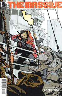
I find myself comparing this to the likes of a new tv show. If the Buffy season 8 & 9 comics can use each small arc as an “episode,” then this 3-parter is definitely a pilot episode. Yet, because it’s a comic series, it’s also already 3 issues in. I’m interested, yes, even though not really engaged…but like most tv shows these days, I’ll wait for word of mouth and reruns or the dvd (or in this case, collected volumes).

There’s something in general about The Massive that puts me in mind of stuff like Y: The Last Man or DMZ, where I have this feeling this is going to go somewhere, and have some strong character development, world-building, and generally be a great overall work. It’s just not working for me in the single-issue format; I’m not interested in (even though it’s less than my hated $3.99 point) paying $3.50/month to get tiny chapters of one greater whole. Assuming this goes on to be one of these longform finite stories, I’ll probably come back to it someday.

While it’s no $9.99 “bargain priced premiere volume” a la Vertigo or some of the Image stuff, I gave this just over $10, and while it’s not the greatest $10 I’ve ever spent, it’s a far cry from the worst.

The Rest of the Stack: Week of May 30, 2012

The Rest of the Stack is my general mini-review coverage of new comics for any given week. It’s in addition to (or in place of) full-size individual reviews. It’s far less formal, and more off-the-top-of-my head thoughts on the given comics than it is detailed reviews.

THE GUILD: FAWKES ONE-SHOT

I missed the original Guild 3-issue mini-series, and though I keep meaning to, as fo this typing have yet to snag the collected edition. However, between when that came out and when these one-shots started coming out last year, I watched the first four seasons of The Guild. A few weeks ago, I watched the whole of Season 5 in one go and greatly enjoyed it. So it was a REALLY pleasant surprise to discover this one-shot, after I thought all the one-shots were done coming out. I’ve quite enjoyed Wheaton’s appearances in The Guild and Big Bang Theory, so as with all the other characters’ one-shots, it’s a real treat to get a lot more spotlight on the specific character. In this case, we get the backstory to Fawkes that fills in the details of how he wound up where he did in season 5. The story’s good, and I liked the art. I especially like that these one-shots are truly that: one-issue stories that you don’t HAVE TO follow one to the next (though as a Guild fan, you’ll WANT to). (8.5/10)

THE WALKING DEAD #98

Not a whole lot to say about this issue. I enjoy this series, I look forward to seeing what happens next and where things go. But individual issues tend to blur together for me, as it’s the overarching stories and developments that stick with me. Of course, the sudden, unexpected death of a major character should ultimately leave this issue sticking out a bit. It’s weird–this character’s been around quite awhile–about half the existence of the series–and yet still never quite felt as familiar to me as the original group of survivors did. But the death definitely fits with the way the series runs. Two more issues to #100, and I’m thinking that after being back in on the single issues for the last several arcs…I may be ready to bow out for awhile to “just” catch up in the collected volumes. (7.5/10)

X-MEN LEGACY #267

I particularly like the focus on Rogue in this issue. Iron Man’s shown up, and starts taking apart the Jean Grey School faculty, until Rogue is convinced to throw down the glove and wade into things, “old school.” Between the previous issue and this one, there’s been a bit of focus on Rogue dealing with her past–which has prompted me to look a bit into her past in the comics myself, and as a result I’ve really enjoyed the relevant emotion of the character here: she got her start fighting the Avengers, and now she’s thrust back into fighting them again, despite years of growth and getting away from that. I’d say that continuity stuff very much fits this series’ title. The art’s not 100% to my liking–but on the whole no great problem with it. I am definitely looking forward to the next issue, and seeing what else develops for Rogue–as well as the rest of the cast. (8/10)

WOLVERINE AND THE X-MEN #11

This issue bridges the gap between panels in AvX #4, following Wolverine and Hope and how they secured transport to the moon. There’s also a bit of checking in on the various plot-points, some of which seem moot by now…feel like I’ve seen ’em play out in other ways in other issues…but I suppose THAT is one of the drawbacks to having jumped in on this AvX thing whole-hog. I don’t care too much about Kid Gladiator here, though it’ll be sorta interesting to see how that stuff plays out. The Iceman/Red Hulk fight reminded me of the Age of Apocalypse Iceman here with the numerous shells or ‘avatars’ of the original…not quite sure I care for that. Definitely like the art MUCH better on this issue than the previous. (7.5/10)

Dark Horse FCBD 2012: Buffy Season 9/The Guild flip-book [Review]

BUFFY SEASON 9

A year ago, I would have probably been thrilled with the Buffy story. As-is, I’ve not followed the Season 9 comics (even dropped the title from my pull list once I realized I hadn’t READ an issue in several months), and have yet to get to finish Season 8. So I don’t know what the deal is with Spike, which really made this issue quite surreal.

Visually, Buffy doesn’t look unlike what I’ve come to expect for the comics, and the art for this story is not bad at all.

Story-wise, I was a bit lost…but certainly appreciated the nods to the Aliens franchise here.

I assume this one’ll be of interest to Buffy fans, who are relatively current, or at least know what the heck’s going on with Spike at this point in the characters’ continuity.

Rating: 6.5/10

THE GUILD

I’ve had a mixed sorta relationship with The Guild. Namely, I tend to go long periods of time without it in my life, followed by short periods of catching up on it. I’ve recently watched what I believe is the most recent season (fifth) in one go, so this story is a real treat.

Torn on where to have their in-person monthly meetup, the Guild has their avatars battle to the death for who gets to decide the location. Clara wins, and opts to have a beach day. The way each reacts to/handles the beach is the height of the story, and keeps quite true to the characters.

Like the Serenity cover (on the other Dark Horse FCBD 2012 issue), this one is really well-done, and really “gets” the characters and the actors. And the interior art is a lot more cartooney…but given the nature of The Guild, it works quite well here.

The story would make a great setting for a partial season of the web series. As-is as a comic, this has me suddenly quite interested in getting the collected edition of the mini-series from several years back.

…Which I suppose is ultimately the goal of something like this: provide an entertaining story, AND send the reader to other existing material.

Rating: 8/10

ALABASTER: SHELTER part 2

This is another 2-pager that really doesn’t do much for me. Story, art…just too short to really be meaningful.

Rating: 3/10

Dark Horse FCBD 2012: Buffy Season 9/The Guild Overall Rating: 8/10

%d bloggers like this: