• March 2023
    S M T W T F S
     1234
    567891011
    12131415161718
    19202122232425
    262728293031  
  • On Facebook

  • Archives

  • Categories

  • Comic Blog Elite

    Comic Blogs - BlogCatalog Blog Directory

All New Fathom #1 [Review]

all_new_fathom_0001All New Fathom Part 1 of 8

Writer: Blake Northcott
Pencils: Marco Renna
Digital Inks: Mark Roslan
Colors: John Starr
Letters: Zen
Editors: Vince Hernandez, Gabe Carrasco
Design & Production: Mark Roslan, Peter Steigerwald, Gabe Carrasco
Cover: Marco Renna, John Starr
Cover Date: February 2017
Cover Price: $3.99

I don’t usually go for comics like this. I’m not a fan of these scantily-clad female leads, running around in bathing suits and–from the outside looking in–seeming to be more flash than substance. But, having followed the writer on social media for a number of years, I’d decided when it was announced that she’d be writing a new iteration of the series, I’d at least check it out…all the more as a female such character in this case being written BY a female, and not just another book to be lumped together, written by a guy about some visual/eye candy.

I then managed to forget the thing was due out this week, until–via social media–I saw her post about it being out, which brought it back to my attention…and I was ok with paying out $3.99 for the issue, as it’s at least NOT DC or Marvel and all that.

So what did I wind up with, for that $3.99?

For one thing, I felt like this was a lengthy read. I did not feel like I just turned a couple pages and was at some to-be-continued or like the issue was too short.

I had no idea what to expect, really…having never (That I can recall) read an entire issue of Fathom or Soulfire or such. The opening page puts us right into the heart of the action, as our heroine–Aspen–is mega-uppercut-punched out of the ocean into the coastal city and does battle with the guy doing the punching. While she fights him–and his mysterious weapon, trying to keep any civilians from being killed–we learn that the narration is from AFTER the battle (so she won), telling her friend about the fight. Finally, she reveals what she’s learned about the mysterious weapon that had been used against her, and how that plays into stuff going forward.

I wasn’t overly impressed with the cover, as I’m not really familiar with even the title character, let alone any supporting cast (new OR long-since-established). The main cover’s not bad, but seems rather generic to me (as opposed to indicating the battle that took place in the issue).

Visually, the issue felt like what I would expect from "an Aspen book" even if I can’t quite quantify what that is, exactly…except that I suppose this looks like it belongs with or fits right in with prior books from the publisher, and so does not look like an oddball or out of place piece that happens to be published by Aspen. The characters all look quite believable, and as much as is possible for a woman basically in a bathing suit, I felt like the issue avoided unnecessary or overly-gratuitous imagery…I didn’t feel "dirty" paging through the issue! I was also reminded a bit of Witchblade, and will be interested to see how coincidental (or not, or far off) that works out to be in coming issues.

Story-wise, I enjoyed how down-to-earth this felt. I figured as a #1 issue, new series and new story, this would feel like just some opening chapter, and just throw a bunch of introductory stuff at me and leave me not really knowing what the heck was going on. However, I found that I got a complete story, really, even as stuff is thrown wide open for subsequent issues! We’re introduced to the title character, her situation, others involved with her, a bit about her background/where she comes from, while seeing the character in action and interacting with her friend. There’s a healthy dose of real-world commentary…particularly in "seeing" how the character is reacted to across various media.

Ultimately, I just enjoyed this issue, and I’m quite glad that I bought it. I checked it out solely based on the writer, and I’m left with an honest interest in getting the next issue to see how things play out.

While it by no means gets into over a decade of "history" with the title character and such, this is still an excellent jumping on point, and one of the stronger, most complete and worthwhile first issues I’ve read in quite awhile.

If you’re a fan of Blake Northcott‘s writing, or Aspen (the character), or the publisher or such, I suspect this will be a fitting bit of enjoyment as well. I’m looking forward to the next issue, and seeing how stuff advances and continues to play out!

Darkwing Duck (2016) #1 [Review]

darkwingduck(2016)001Orange is the New Purple part 1

Storytellers: Aaron Sparrow and James Silvani
Colors: Andrew Dalhouse
Letters: Andworld Design
Assistant Editor: R. Janice Orlando
Editor: Jesse Post
Published by: Joe Books Ltd
Cover Date: April 2016
Cover Price: $2.99

It’s been a few years, but here I am covering a first issue of Darkwing Duck once again. And as with that time, this time finds an issue whose story title is a play off another. Here we have Orange is the New Purple, where back then it was The Duck Knight Returns. As best I can follow, this continues the bulk of the story from that previous series, itself picking up and continuing from the classic (now 25-years-old) animated series of the same name. I don’t truly “get” comic book politics, and was disappointed at the time when Disney‘s purchase of Marvel seemed to spell the end of Boom‘s license and its run on the Disney books. Now, we have another publisher running with the title, but it is not Marvel.

That aside, this works quite well as a first issue.

We open on a parade that is quickly crashed by DW rogue Megavolt, whose attack is quickly dampened by Darkwing. We move on to see DW in his civilian guise, interacting with family and neighbors; while there’s an attack on the transport carrying Megavolt to prison. Later, Darkwing interacts with SHUSH, though things don’t go overly well there with a new assignment. Back at home, DW is flabbergasted at learning that he has not been invited to cut the ribbon at the opening of the new super-max prison that is primarily populated by individuals HE put there. And still later, crashing that particular party, the villain of the piece is (unsurprisingly) revealed and sets the situation to a cliffhanger worthy of any episode of the classic tv series.

As first issues go, this is definitely a solid one. The most noticeable thing for me is the art, which gives us characters that look like they stepped right off the tv screen (albeit with improved, more robust coloring than the cartoon could maintain). This is not some reinterpretations of the characters’ looks; it’s no “new take” or some artist looking to put their stamp on the appearance: it’s just clear, solid work that carries the absolute look and feel of Darkwing Duck and leaves no doubt of what this book is.

The story itself does a great job of things, serving the main points I’d expect FROM a first issue. We’re introduced to the title character; we meet supporting cast members, and associated characters; we see the hero in action, and we get a good taste of where we’re going from this issue. Though this issue is not a singular, complete, contained story, it gets things set up while providing enough in and of itself to satisfy on the single issue level…at least for me. Given how short and formulaic some of the tv episodes could seem, I welcome the longer story that this sets up while still getting the various elements we’d have in a single episode.

This issue feels like a mix of things…it’s a new series, a new first issue, and suitable for younger readers though it hits home for me as an adult reader and long-time fan of the property. It feels like a continuation of the cartoon, and a continuation of the previous comic series that ended several years ago. Of course, part of the latter is that we have some of the same creatives carried over, itself a sort of continuity that I hope is nothing but good.

I enjoyed this issue, and expect I’ll be adding it to my pull list at least for awhile…and might even try to track down the super-sized collected edition ostensibly collecting the previous series if only for a convenient availability of a re-read of that.

If you’re a fan of Darkwing Duck, this is very definitely a comic for you. Maybe best of all…despite never ever having heard of this publisher prior to learning of the collected volume and now this series, they do what it seems most publishers are utterly incapable of: offering a full-sized, full-length comic for “only” $2.99. Like with DC‘s promise of the upcoming price drop back to all-$2.99s, this is as good a price point as one is really going to find in this day and age, and will certainly hold me a lot longer than $3.99 would!

Highly recommended!

Mighty Morphin’ Power Rangers (2016) #0 [Review]

[ UPDATE 1/19/2016: This review was written BEFORE learning that the covers for this issue are NOT equal-ratio. The Green Ranger cover is 1:50 and White Ranger 1:100…and while I enjoyed reading the issue and meant everything said in this review, my feelings and view on it have been sorely tainted, such that I will NOT be buying any future issues of the series, and will be actively avoiding Boom! Studios’ single issues moving forward .]

PowerRangers_000_Cover_GreenWritten by: Kyle Higgins
Illustrated by: Hendry Prasetya
Colors by: Matt Herms
Letters by: Ed Dukeshire
Covers by: Goni Montes
Designer: Jillian Crab
Assistant Editor: Alex Galer
Editor: Dafna Pleban
Published by: Boom! Studios
Cover Date: January 2016
Cover Price: $3.99

It’s rare these days, that I find myself truly “looking forward to” any single comic. I enjoy a handful of series and collected volumes, keep up with some stuff, only “check in” here and there on other stuff, but generally it’s either something I’m “already buying” on an ongoing basis, or a spur of the moment thing, an impulse buy.

Mighty Morphin’ Power Rangers hits a certain “sweet spot,” though. I was 12 or 13 when the original tv series hit–the perfect age for it. And though I lost track of it after only a couple years–losing interest after the movie and the transition to a third set of Zords–in recent years the “nostalgia factor” has been quite significant–from the remastering of some of the original episodes (and a new round of action figures/Megazord to go with them) to the series’ availability on Netflix–I’ve “dabbled” in revisiting the property, old favorite episodes and such.

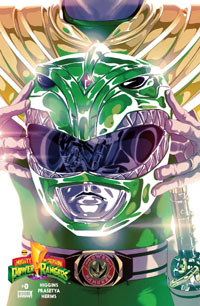
When I first saw some of the art for the covers for this issue, I was blown away–such bright, iconic images while remaining totally simple. Each is the respective Ranger holding his/her helmet, and we see their personal Zord reflected. For any fan of the Mighty Morphin’ crew, the helmets are recognizable, as well as what can be seen of the costumes, and that alone goes a long way. I tend to loathe variant covers, and will typically shy away from series in protest of numerous variant covers (having been beaten into relative submission on the notion of A & B equal-ratio covers for every single issue ever of all series from certain publishers).

I really, trully wish these covers were for this #0 issue and the first six issues of the ongoing series (or back covers, at least, a la Devil’s Due‘s early GI Joe issues). But like TMNT, I’ll make an exception here. The Power Rangers are a TEAM, this is a TEAM BOOK, so singling out each member of the team for their own individual cover usually drives me nuts. These covers are truly spectacular, and none would have the same effect if the images were all smashed together as a single cover. It’s a shame the books don’t come with bound-in posters of the covers–whether only slightly larger (a 2-page size) or significantly larger (4-panel fold-out). I would absolutely buy at least one or two (if not several or all) of these as posters. As-is, I am sorely tempted to track down all the covers to frame as a wall display. So cover-wise…choose your favorite Ranger(s) and go with that…any/all of the covers are fantastic pieces.

Story-wise…getting into the actual content, I’m initially not impressed. I let myself get hyped up, so I was expecting something that would completely and immediately blow me away. This is a new take on something major from my youth, a return, and has 20+ years of nostalgia to measure up to. Checking that extreme level of expectation…I like this. The story is good, and truly, arguably better than the actual execution of most any episode of the MMPR tv series I can recall. (Even at 12/13 I knew stuff was hokey and cheesey…campy). This takes the concepts, the coolness, and renders it in a modern setting (including contemporary smartphones) while keeping what would be expected of the characters.

This picks up early in the group’s tenure–they’ve only just recently defeated the Green Ranger (one of Rita’s bolder plans), and now Tommy has been given a place with the existing group…he is no longer the evil foe of the team…he has been welcomed as a full member OF the team. Yet still, he is haunted by images of Rita–taunting him, goading him, telling him that he’s a fraud, a fool, that he doesn’t belong, can’t belong–in this group. Questioned by Jason–the two are carpooling to school–he admits to anxiety…this will be his first day at school, as part of this group, as a Power Ranger. They meet up with Kim and Zack, and Billy and Trini, and the day begins. Meanwhile, Rita prepares her latest monster–Bullzer–to launch an attack on Angel Grove. As alarms sound and the school goes into emergency mode, our heroes spring into action. Rangers and Zords clash with the monster destroying the city…and amidst self-doubt, Tommy struggles to fit into his new team…as they struggle to work with the new dynamic. After the monster’s defeat, the team debriefs with Zordon and Alpha…while elsewhere, Scorpina and Rita meet…the former delivering a mysterious crystal to the latter, who has a new beginning in mind…which can’t bode well for our heroes, but we have to wait a couple months now for the launch of the ongoing series itself…#1 comes in March.

I really dig the art…this looks like a comic, feels like a comic, and yet the characters are recognizeable. This doesn’t seem to try to capture the exact likeness of the actors from 20 years ago…it works as its own thing, such that it would not be inconceivable to imagine the comic as the source material, with the live action stuff chosen to fit the “on paper” designs. It also looks so much more…authentic, effectively having an “unlimited budget” instead of a small tv budget for stuff. Campy as the tv material is, this can convey the monstrous characters as what they’re supposed to be…without just looking like actors in silly costumes…this is the best-looking I think I’ve ever seen Rita, and I look forward to seeing even more with the Zords and other monsters.


THE ONGOING ADVENTURES OF BULK & SKULL
Written by: Steve Orlando
Illustrated by: Corin Howell
Colors by: Jeremy Lawson
Letters by: Jim Campbell

This is a brief double-page sequence that sees Bulk and Skull in the Principal’s office, being scolded for all the trouble they cause him…just before their latest prank goes into effect. Encountering Kim and Trini as they leave the office and realizing the pretty girls seem to idolize the Power Rangers…Bulk comes up with a new (but sorta familiar-ish) scheme that will change all that.

I can’t say I’m all that “impressed” with this segment–it feels like “filler,” but it’s the sort of stuff we’d see in a tv episode…and I’d much rather have it as a “backup” piece or supplemental than interspersed in the main story, given the different creative team.
The art is a lot more cartoony than the main story…but I’m ok with that given the type of piece this is. It’s more of a comic strip, and works quite well.

WHAT TIME IS IT?!
Written by: Mairghread Scott
Illustrated by: Daniel Bayliss
Lettters by: Ed Dukeshire

This one is a brief 6-page piece depicting a battle between the Green and Red Rangers, and Goldar, while the rest of the Rangers are kept busy elsewhere. As the rest of the team tries to figure out where their troubled friends are, Rita uses her magic wand to “make her monster grow,” enlarging Goldar to a size that competes with the Megazord. As the Megazord burst onto the scene, Goldar gloats…forgetting that he no longer faces just the Megazord…there’s a Dragonzord to contend with, as well.

I’d much rather have the 6 pages as additional content in the main story…there’s really nothing special to this piece. Yet…as absolutely formulaic as the original tv episodes were, having a similarly formulaic (but cutting out the “Rangers out of costume” and “setup” stuff out) works well for me, as we get to start right at the “Rangers in action” stuff that I certainly craved as a kid.
The art is less impressive than the main story, but in the sense of being a general, formulaic piece to simply see the characters in action, it doesn’t bother me.

Final Thoughts

One of the things that stood out most for me in this was that we see Kimberly quickly split off from the Megazord assemblage to go rescue people from a collapsing bridge with her Pterodactyl Zord. I really don’t recall any significant use of the Zords individually in the tv show, aside from the Dragonzord or occasionally the Tyrannosaurus. That the individual machines are supposed to be powerful in their own right is often lost as the tv series would typically see the Zords summoned and immediately combine to form the Megazord. While obviously more exciting as a team, the “unlimited budget” the comic affords the property compared to recycled film opens up a whole new realm of potential that I would love to see explored.

This is “only” a #0 issue–we have to wait, now, until March (~2 months) for the #1 that kicks off the series properly as an ongoing book. The Bulk & Skull and What Time Is It portions of this issue stand alone as one-shot bits. The main story serves as prologue, and ends on a To Be Continued, strongly suggesting the first arc of the ongoing will be this “early adventure” of the group, while Tommy is still new to being the Green Ranger, and new to the team…before he’d gelled with them and become a more central part (and eventually the leader as the White Ranger). I’m glad this issue is only a couple months removed from the ongoing–I would be rather annoyed if there was a longer gap. This works, being available in January, and only one “skip month” before the series proper.

I don’t know that this issue will really “sell” anyone “new” on the notion of the Power Rangers…but the issue is certainly very much worthwhile to anyone who was a fan of the tv series (if only for the covers!), and to get a taste of what’s likely to come, to check out the notion of the MMPR in a comic again. Given that there are subtle updates to set this in the present, I would imagine this would also appeal to fans of other Power Rangers iterations who would enjoy any Power Rangers comic.

As for me…this is well worth the purchase price, and I’m eagerly looking forward to seeing how the ongoing series develops.

Munchkin: Deck the Dungeons #1 [Review]

munchkin_deck_the_dungeons_001Written by: Katie Cook
Illustrated by: Mike Luckas
Colors by: Fred Stressing, Katy Farina
Letters by: Jim Campbell
Cover by: Ian McGinty
Designer: Kara Leopard
Associate Editor: Jasmine Amiri
Editor: Shannon Watters
Published by: Boom! Box (Boom! Studios)
Cover Date: December 2015
Cover Price: $4.99

I’ve never actually READ a Munchkin comic before, though I have a couple issues I’d picked up recently that I’ve been meaning to get to. I have the game, an expansion, and several of the spin-off games (Star Munchkin, Super Munchkin, Munchkin Zombies). And at a whopping $4.99, I should have been totally opposed to this issue. But…it was a light week, the issue is extra-thick, AND it contains a card for the game…plus…’tis the season and all. I’m not buying Marvel or DC, and I was in the mood for something randomish and light, I can’t imagine there’s any serious “continuity” to the Munchkin universe, and banked on this being a standalone issue that I could read even without having read the other comics published thus far.

The issue opens in a tavern, with our hero Spyke and his friend Flower. Spyke realizes that with other adventurers and monsters alike out of the dungeon preparing for Christmas, there’s tons of loot that’ll be easy pickings, and he convinces Flower to join him. We learn that spyke hates Christmas–hence “avoiding” Christmassy stuff in favor of a dungeon crawl–and quickly find the two swept up into a Munchkin-y riff on DickensA Christmas Carol…with an unexpected ending.

I was surprised at the conclusion of the story with so many pages left…after a couple of well-placed ads I appreciated, I found we have some pages from Munchkin vol. 1…so a “preview” or such, which to me is nothing but “filler” here: if I want to read something else, I will–don’t give me a huge chunk of it “free” here and make the “new content” that much more expensive by comparison! (To say nothing of my annoyance at finding “filler” pages to begin with!)

Other than that…I enjoyed this issue. It felt a lot like a longform comic strip to me, which was not surprising. I wasn’t entirely sure what to expect going in, but should have expected pretty much what I got. The story was rather cheesey–I’m not a fan of constant riffs on A Christmas Carol (Public Domain or not!)–and there’s really not much “substance” to the story. But then, frankly, that’s the fun of it, and the point, as it is with the game these characters are from. I have some questions about the characters’ ability to die/come back, but I’m not too concerned there…it’s just a nitpick with me.

The art on the issue was fitting…I’m not familiar with Luckas by name or prior work (perhaps on the Munchkin series, or otherwise) so no preconceived notions. The issue looked like Munchkin, or at least it didn’t NOT look like it, and the style helped really convey that sense of this being a longform comic strip…it seems nicely cartooney and what I’d expect of a strip.

I recognize Katie Cook‘s name from other comics work, though I’m not certain if I’ve read any of it. Taking a game and managing to give the characters a bit of life and stuff to do from the game’s concept is a bit of a feat, and came off well here.

All in all, I enjoyed the issue, it wasn’t nearly as quick a read as I expected, I like the fact it includes a card for the game, and I didn’t feel like I’m missing anything not having read any other Munchkin comic(s) ever.

The price IS a bit much for any comic, and this is not some groundbreaking “key” thing or by any means some “must-read” or such. You’re not missing out on anything by not reading it. That said…if you’re a fan of Munchkin (the game) and/or want a card you can only get from this comic and/or just want a one-off “Christmas Special” to cleanse the palate from other stuff, this is worthwhile if you have the $5 you’re willing to toss at a comic.

This is part of the Boom! Box imprint–I believe aimed at a younger audience–and it fits well in that. As with anything, I’d suggest a parent confirm for themselves that they want their kid(s) reading something like this…but it’s fun for me to read as an adult, and I imagine kids would enjoy it a bit more if they’re into this sorta thing.

Having read this, I definitely want to read the couple issues I already have, and possibly seek out other subsequent issues…which I suppose is the main goal of a comic, at least on the business side of things.

Zorn: The Last Zombie #1 [Review]

zornthelastzombie001Creator/Writer: Joseph A. Michael
Illustrator: Kidbot
Letters: Ydao
Published by: OH Comics
Cover Date: September 2014
Cover Price: $4.99

I saw a copy of this issue on the shelf this week and the cover caught my attention. I couldn’t quite tell if it was “Zorn” or “Z * RN“, but the subtitle The Last Zombie made me curious. I was also curious, not seeing any publisher logo or creator credits, so I picked it up to physically examine the issue. The art on the back was good, though I quickly realized this wasn’t something from any publisher I’m familiar with. And the thing’s a whopping $4.99…but I was curious. And the mood I was in, and realizing this wasn’t something from an established company (and/or one backed by a mega-corporation) I figured ok, but be an indie book, so what the heck, it’s a #1, I’ll give it a shot.

The cover itself being sparse–no UPC on the front, no publisher logo, no creator credits–looks a bit like a graphic with the logo pasted on…looks more like a house ad type of thing than a final cover (but then, I said the same thing about last month’s Ninjak #1 from Valiant!)

Getting to the interior, the art put me very much in mind of something like IDW‘s Ghostbusters book, with a line style and coloring that feels like this could be an adaptation of an animated series. I have mixed feelings in general on that sort of thing, but it worked well here.

I prefer my zombies in the tradition of Romero‘s Night of the Living Dead and Dawn of the Dead, as well as Kirkman‘s Walking Dead and have long specifically avoided zombie stuff reeking of talking zombies, smart zombies, etc. But this issue offers me an exception, which is a very pleasant surprise. And it’s also a pleasant change from the depressing downer that The Walking Dead has (for me) become.

Really, my primary complaint for the issue is that there were a couple points where I’d swear a comma would have been more than appropriate, and the lack of one distracted me.

The story itself follows a zombie who barely escapes zombie-hunters, though his companion is taken down. While this “last zombie” hides we get a flashback to a few months earlier and witness his origin, how he lost his job and to make ends meet signed up to be a test subject for a trial drug. Which, of course, obviously ended quite well for everyone involved–the drug produced zombies, and they’re being hunted down. Yet there’s a twist to things that makes Zorn (subject Z-ORN in the experimental drug process) sympathetic, and leaves me honestly curious about where the story goes from here.

It wasn’t until I sat down to start typing this post that I noticed a September 2014 (SEVEN MONTHS AGO) date for this edition. The copyright dates are are also 2014, which places this as something put together and published some time ago…which kinda throws me off having found it racked with new April 2015 comics. Yet, realizing the issue is not a standard thing from a standard publisher…c’est la vie.

A quick Google search suggests this is something that can be bought digitally from several sources, and I believe ordered directly from the creators as a physical item. This is definitely something that I would not have given a chance as a digital thing…but having a physical copy–even at $5–made it worthwhile for me. What truly ‘sold’ it for me was finding it with all the other new comics this week…it wasn’t pushed on me, I didn’t have to go hunting for it, and it wasn’t just a PDF. (And the paper stock seems quite good…arguably better than what few Marvel issues I’ve handled lately).

If you like zombies, don’t mind smart ones, and are looking for something different…and don’t mind waiting for the next issue (I have no idea when/if it’ll be out) this is certainly worth checking out. As said, I prefer the physical copy, but I also assume many others do not have the issue with digital comics that I do, and digital looks to be less than half the price of the physical edition. As for me…I may have to start giving more of an eye to physical comics I don’t recognize.

Archie vs. Predator #1 [Review]

archievspredator001Script: Alex de Campi
Pencils: Fernando Ruiz
Inks: Rich Koslowski
Colors: Jason Millet
Letters: John Workman
Cover: Ruiz, Koslowski, Millet
Digital Production: Ryan Jorgensen
Design: Jimmy Presler
Assistant Editor: Ian Tucker
Editor: Brendan Wright
Publisher: Mike Richardson
Special Thanks to: Alex Segura, Roberto Aguirre-Sacasa, Mike Pellerito, Archie
Comics Publications
Published by: Dark Horse Comics
Cover Date: April 2015
Cover Price: $3.99

The novelty of this title–that it even exists AT ALL–intrigued me. I mean, really…Archie and PREDATOR?!? That’s on a level like Archie Meets Punisher! It’s totally ridiculous…so of course I had to check it out for myself.

I’m aware of (and read the first couple issues of) the Afterlife With Archie series and such, that there’s been a lot of stuff lately to cast the Archie gang in an adult light beyond the classic pop culture iterations everyone “knows.” So sure, this definitely fits that as a concept. And aside from the sheer ridiculousness of the mashup, I’m a fan of the Aliens and Predator properties (more Aliens than Predator, admittedly) and have enjoyed plenty of Archie fare in my day, so this was certainly not an unreasonable issue for me to pick up and give a shot.

The visual style is quite familiar–rather than recast the Archie gang with a different look that would fit more with Predator, it was the Predator that’s slightly recast to fit into the classic style of the Archie characters. Of course, this is set off by the presence of on-panel blood and one particularly gruesome panel that is truly at home in a Predator comic.

We have the kids preparing for spring break…Jughead wins a cruise and takes the rest of the gang with him; we then shift to the kids on some island with a jungle. As everyone settles in, they realize Dilton’s rather distressed–he’s brought “work” (Yearbook stuff) on the vacation. The others agree to pitch in to help him get his work done so he can relax, too…which includes the Polls (Most Likely to Succeed, Cutest Couple, Most Popular, etc.). This leads to a huge fight that turns physical between Betty and Veronica over Archie (as always), and ends with Betty running off into the jungle. Meanwhile, Cheryl Blossom and her beau had seen a shooting star and investigated, though to a much worse immediate fate than the main gang. They cut the spring break vacation short and head home–back to “normal” little realizing how NOT-normal things are about to get for them.

For this issue at least, this really does feel like a mash-up. Aside from the blood and such, this could be just any other Archie comic. That we do get to see the predator itself, and some gore, and all that–and some panels of things from the predator’s point of view keeps this from being “just” some prologue, and is just enough to keep me from writing this off as some would-be thing or a pointless first issue AS a single issue. Take out the predator panels and this is an Archie comic; take those panels by themselves and it’s a Predator comic with a dig at familiar characters. Put together it’s a solid first issue of a limited series, a finite story.

We get a typical sort of Archie full-issue-length setup, we get to see the Predator, and we get setup for the rest of the series. I’d say this meets my expectation for existing as a single issue of a four-part serialized story, pretty much justifying itself in this format…just slightly more expensive than an Archie Comics-published comic (this is published by Dark Horse Comics).

The story itself feels a bit “off,” surely the presence of the Predator and blood and such, but as a non-Archie Archie comic it works.

I was anxious to check this out for myself, as said a couple times above…but I don’t think I’ll care to pick up the remaining single issues. As a fan of the Aliens and Predator stuff, I tend to prefer the collected volumes to single issues, and this definitely falls into that category–I’d MUCH prefer to simply have an Archie vs. Predator volume to put on the shelf amidst my other Predator books.

If you’re a fan of classic Archie and don’t care for darker, more serious stuff and have any active disinterest in the Predator franchise, you’ll definitely want to avoid this. If you’re a Predator purist you may not care for the lighter tone inherent with the Archie side of things (in this issue particularly) though it looks likely that that’s gonna go downhill in the later issues. But if you’re amused or curious at the concept of Archie of all properties crossing over with the Predator…this is well worth checking out. Despite that, as said–I’m leaning very much toward the collected-edition format myself.

Bill and Ted’s Most Triumphant Return #1 [Review]

billandtedsmosttriumphantreturn001Written by: Brian Lynch
Pencils by: Jerry Gaylord
Inks by: Jerry & Penelopy Gaylord
Colors by: Whitney Cogar
Letters by: Jim Campbell
Cover: Felipe Smith, Rob Guillory
Designer: Scott Newman
Assistant Editor: Alex Galer
Editor: Ian Brill
Published by: Boom! Studios
Cover Date: March 2015
Cover Price: $3.99

I must confess: though I bought the two Bill & Ted movies on dvd awhile back, I have yet to watch those dvds, and it’s possible that I haven’t actually watched either film since my sophomore year of college more than a decade back.

I was vaguely aware that there was to be a new Bill & Ted comic, having noted some press release or headline about Boom! getting the property…but it wasn’t until a few days before this issue’s release that I was actually consciously aware of and looking for it. And even seeing it in the store, I noted that the cover specifies this is "No. 1 of 6," which translates (for me) to "serialized graphic novel." And even the title itself, the emphasis on Most Triumphant Return over Bill & Ted suggests this is a single, finite story and so whether as the comic it is or some tv/movie analogy, after this story it will no longer be a return, and so there’d be some other title there.

But the nostalgia got me, and while the characters look absolutely ridiculous on the cover, just the NOTION of something new and contemporary with Bill & Ted was something I couldn’t bring myself to pass up, at least to check out a first issue. (And in a bit of interesting timing, DC Comics is doing a "movie posters" variant theme for the month, and the Action Comics issue riffing on Bill & Ted was also released this week).

This issue opens basically seconds after the end of the film Bill & Ted’s Bogus Journey. The guys are at the Battle of the Bands, having just won; kids in tow, the babes nearby, Station and Death hanging around, the guys’ destiny has begun. They have a hit song that will eventually bring world peace and all that, they’ve been to hell and back…so where do they go from here? We follow them in the immediate aftermath as they try to settle into some semblance of normalcy with a full apartment, kids, Station, the Good Robot Thems…and time-travelers eager to visit The Great Ones. Realizing they have no idea about their next song (let alone a whole album) or how to deal with facing a future they’re responsible for, the two acquire a phone booth and travel to the future to sit in on a Bill & Ted 101 class. Once there, they make a remarkable discovery.

The cliffhanger comes on the 16th page…but there’s a backup feature.

Bill & Ted and the Bogus Virus

Written by: Ryan North
Illustrated by: Ian McGinty
Colors & Letters by: Fred Stresing

This 6-page short does not seem to be set in any particular timeframe, but given the presence of the Good Robot Thems, presumably is during/after Bogus Journey. Essentially, the Robots get an email from the future, from the Evil Robots, and they’re corrupted to be totally bogus, prompting Bill & Ted to take them to the future where technology should exist to fix their pals. While the technology is iffy, a solution is arrived at that fixes the issue and leaves everyone content.

The art for the main story is solid, though a bit cartooney. It’s a stylized thing, and while I wouldn’t like it for a superhero comic or an adaptation of an existing on-screen thing (such as one of the films) as its own thing taking the characters and telling a new story it works very well and several times actually made me smile just taking in the (exaggerated) looks on faces, etc. I like it as the characters are recognizable and I can follow what’s going on…but it’s not at all trying to capture the actors’ likenesses. This is a comic book, a fictional story about fictional characters, and it doesn’t try to be anything else and just revels in the simple fun-ness of the property.

The art on the backup is even more cartooney/stylized, and something about it just doesn’t work nearly as well for me. It’s not bad in itself, but it’s sorta unexpected and the layouts are rather crowded and after reading the main story (perhaps specifically for following and being in the same issue with it) I don’t care for the look. It’s good art, just not as appealing for me personally.

That said, McGinty‘s style puts me very much in mind of a webcomic, and if this were a Bill & Ted webcomic I’d probably be very happy with it. The story works for what it is, fits the characters and all that, and was an enjoyable read.

The main story is a nice blend of nostalgia and new, taking the familiar and moving things forward…and I really like that this isn’t trying to be Bill & Ted Twenty Years Later, but picks up and draws directly on where the movies left off.

The primary drawback to this issue and series is that it’s not an ongoing, so I’m very resistant to buying single issues when I "know" there will be a collected volume and I can have the entire story in one book. I’m also rather frustrated that the "main" story is a mere 16 pages, and the "backup" brings the total of content pages to the "standard" 22. This is a $3.99 book, a price point I’ve long hated, and the main story doesn’t even reach the 20-page mark. At 16 pages/issue that’ll make a six-issue arc a mere 96 pages…which could easily be done in a mere 3 issues that are slightly oversized.

Competing with the $3.99 price point for me is the issue of variant covers–I’m not a huge fan of this standard cover, but I absolutely have no interest in getting one of a number of variants pushed for this one.

As a whole, this is definitely a good issue, and I’m glad I bought it to check things out. I’ll probably wait for a collected volume, though–knowing this is a finite story I just don’t like the notion of paying $3.99 for 16-page chunks of a single story.

Definitely recommended, format depends on your preference for single issues vs. collected edition.

Turok: Dinosaur Hunter (Dynamite) #1 [Review]

turokdinosaurhunterdynamite001 Writer: Greg Pak
Artist: Mirko Colak
Colorist: Lauren Affe
Letterer: Marshall Dillon
Cover: Bart Sears
Turok Logo Design: Rian Hughes
Packaged/Edited by: Nate Cosby
Published by: Dynamite
Cover Price: $3.99

It wasn’t all that long ago that I learned of Dark Horse relaunching several former Gold Key titles, which grabbed my attention as former Valiant properties that I recognized from the 1990s. I saw it as a good point to jump aboard, as presumably the closest I was gonna get to a Valiant rebirth. Those titles only lasted a few months, and while I rather enjoyed them at the start, my interest trickled off with ’em. SINCE then, though…

Since then, Valiant‘s back, with a number of great titles proving the characters and universe have an audience…and are still going strong nearly 2 years in (a rather large accomplishment, to me, in an age of mini-series and things generally just not lasting).

So it’s with my enjoyment of the Valiant books that I’m checking out Dynamite‘s relaunching of the Gold Key titles. If Valiant itself can do well…then hey, here’s hoping Dynamite can hold it together for a couple years.

Outside of the names and basic premise (that is, humans existing in a world with dinosaurs still around), this seems a wholly fresh start. Where I recall the Dark Horse run being a closer re-telling (and those premiere issues included a reprint of the original series’ first issues), this seems much more like I expected based on the above Valiant comparison.

We’re introduced to a father vowing to protect his child, before being killed. Flashing ahead 16 years, we find that child an outcast, bullied but surviving on his own…to the chagrin of the others. When confronted he refuses to give in–it’s better (to him) to be alone. The latest confrontation is broken up by a surprise attack by large lizard creatures, which Turok and Andal (a name I recall from the Dark Horse iteration) barely survive as we learn what caused the attack.

Along with the general “strength” of the Valiant titles serving as influence to my buying this, I recognize writer Greg Pak from other stuff I’ve enjoyed…most recently Planet Hulk as well as Valiant‘s own Eternal Warrior. This issue and title benefits from my still relative unfamiliarity with Turok and cast–I only remember reading the first issue of the Dark Horse run and can’t honestly recall if I read beyond that.

I appreciated the use of “time” in this issue, seeing the past, present, and the flashbacks…actually following what was going on to pick up on a tone I feel I miss in a lot of comics. As a first issue goes, this definitely hits points I look for: we’re introduced to the main protagonist, to other characters, learn something of the protagonist and their status quo, and are introduced to the conflict. In less generalized terms: We meet Turok, we meet other characters including Andal, we get dinosaurs, and we get Turok fighting dinosaurs. Maybe more importantly to me…there’s no pretentious last-page spread/cliffhanger “revealing” that dinosaurs exist, as if the very title Dinosaur Hunter doesn’t tell us that.

There were several panels I had some trouble following who was who and exactly what was going on at first glance, but that was mainly during a fight sequence and I can’t imagine it being any worse than trying to visually parse out a fast-moving camera sequence for a movie or tv series. By and large the art is good, and I like the look of the characters, and there’s nothing particularly off-putting or distracting to me.

My primary problem with this issue is the variant covers–I’m used to there at least being some sort of notation on the cover declaring it a variant or not so had some frustration at determining exactly which cover of several was the “regular” or “standard” edition…ultimately identifying this by matching the front cover image with the interior cover (only later at home discoverng a 3-page gallery of thumbnails showing off all the variants for the issue). That identification is part of my preference for standard covers: I prefer the cover that is acknowledged in marketing and such and “fits” the issue and story. If a cover image is going to double up incorporated on the interior, I want the aesthetic of matching, not recognizing a difference.

Other than that and on the whole…I enjoyed this issue. As soon as I saw it at the shop, it was the main thing I wanted to get into and read, and it definitely measured up. The aforementioned issue with variant covers makes me hesitant to put it on a pull list, as I don’t want to get stuck with a variant, and I have a far lower tolerance for that with Dynamite than I do Valiant.

You need not have read anything involving Turok before to get in here, though there’ll undoubtedly be familiar elements if you have. This is functionally a new title and character, there’s no pre-existing continuity to know, you only need one copy of this issue to get into the story-so-far.

Definitely recommended.

Letter 44 #1 [Review]

letter44001Written by: Charles Soule
Illustrated by: Alberto Jimenez Alburquerque
Colored by: Guy Major
Lettered by: Shawn DePasquale
Edited by: Jill Beaton
Designed by: Jason Storey
Published by: Oni Press
Cover Price: $1.00

I have a “standing order” at my comic shop: in addition to my “regular” pull-list titles, pretty much anything priced at $1 or less (single-issues) also get pulled. Whether it’s “just” a reprint like the IDW Hundred-Penny Press books, or the Image Firsts or DC What’s Next or a genuine premiere or special issue.

So along with my usual stuff, got a handful of $1 issues today…including this Letter 44 #1. Looking at the cover, and it being from Oni Press (where I stick with DC, Marvel, Image, IDW, Dark Horse, and Valiant, typically) means this almost certainly would not have come to my attention, except that $1 price point.

Only once home and having already read my Valiants for the week, did I look with any interest at the $1 issues…and noticed Soule‘s name on this…a name that came to my attention during DC‘s Villains Month. So I figured this’d be a good issue to “start with”…and it pulled me in.

There’s a new president, who–upon taking office–learns that there’s a LOT going on that renders Earth-bound politics pointless except as a cover for actually preparing the country–if not the world–for potential disaster. Not one day into his presidency, this new president begins to see the tip of the proverbial iceberg as his life–and the way he sees the world around him–is irrevocably changed. The title itself comes from the letter–left from the 43rd president to the incoming 44th–letting him in on the Big Secret..

This very concept plays very well with thoughts I’ve (personally) had in the past, reconciling reality with “comic book reality.” Namely, that while we read about all these huge world-wide/universal threats in (primarily super-hero) comics, since the world has NOT been destroyed and the universe has NOT (that we know of) ended, there’s untold potential of what’s gone on to maintain that. For lack of better phrasing and explanation…this comic immediately fits into what is probably the core “conspiracy theory” I’ll buy into (conceptually, if not the specific situation).

In short…the story grabbed me, kept me reading, anticipating the final page reveal, and I’m very interested to learn what comes next. I was actually so impressed by this issue that–for something I hadn’t even known about seven hours ago–I emailed the comic shop to request it for my pulls, to make sure I don’t miss out on the next issue.

Visually, I’m not blown away by the art, but I’m by no means let down…as this is something I’d not heard of and had no frame of reference for, and is a new property, I have nothing to compare it to, so it just simply looks like it looks; it’s about humans, and they look human, if slightly stylistic and they’re obviously drawings (as opposed to some ultra-realistic/photographic-looking paintings or such, a la Alex Ross).

In short…this surprise issue does what any great #1 issue should do: introduced me to characters and concept, the premise of the series…gave me questions, built anticipation, reveals something of what’s hinted at throughout…and leaves me interested in continuing with the story. Not because it’s some cheesey cliffhanger but because I’m genuinely curious at further development of the characters and the world they live in. It also lets one clearly know the reasoning for the title itself…in this series’ case, the letter left for the new president that changes his perception of the world.

For only $1…I definitely recommend checking this out, if you like non-superhero stories, or want a change of pace. Worst case, you’re out 1/4 of the cost of another full-size issue; best case, you find a new title to follow, having experienced an issue itself and not just some hype.

Molly Danger FCBD 2013 [Review]

mollydangerfcbd2013Story and Art: Jamal Igle
Inker: Juan Castro
Colorist: Romulo Fajardo Jr.
Letterer: Frank Cvetkovic
Editor: Adam P. Knave
Published by: Action Lab Entertainment
Cover Price: $0.00

I was kinda surprised by this issue’s cover, as it seemed at first glance to suggest that Molly Danger could be a more fantasy-esque series than I’d thought, and that she might have a “sidekick” picked up in a story titled “Princeless.”

However, that’s certainly not the case! What happened here is something that I’m not used to, as I’ve stuck pretty much to mainstream stuff from the big publishers of late. That is, with these “independent” publishers, creators get a lot more freedom to work together, and so in this case, Igle‘s Molly Danger can be featured with Whitley‘s Princeless, and it works.

And that’s what this issue is: we get a Molly Danger story, my introduction to the character–and we get a separate Princeless story (that I’ll cover below).

I’ve heard of Molly Danger–I recall there was some sort of Kickstarter campaign awhile back, and I’ve seen stuff posted online. So I was curious…and here, fulfilling one of the greatest things about Free Comic Book Day, I’ve been given a chance to read a story of the character withOUT having to sink $3-$4 into it.

This story opens with a couple pilots responding to an alert, and reference to something called D.A.R.T.–apparently the group they belong to. We see that the city’s under attach by a large mech, and come to realize that D.A.R.T. seems to be a sort of analogue for Marvel‘s S.H.I.E.L.D., and they ‘support’ Molly Danger, that she’s got some sort of super abilities, but can’t (effectively) do it all herself. When the mech surprises her and knocks her over a mile away, she finds herself in a tough spot–with authorities blocking the area off, she needs to get back in–which is where those pilots come in.

There’s something a lot more fun and elegant to the story itself, that my words do not convey…as with any story: the difference between experiencing it, and being told ABOUT it.

The art has a nice quality to it–something I can’t quite put to words. But it’s good, and IS Molly Danger. I enjoyed Igle‘s work on Supergirl a few years ago from DC, and having sampled his creator-owned stuff in this: I’m inclined to seek out the series itself, and look forward to more of this character.

Continue reading

%d bloggers like this: