• December 2025
    S M T W T F S
     123456
    78910111213
    14151617181920
    21222324252627
    28293031  
  • On Facebook

  • Archives

  • Categories

  • Comic Blog Elite

    Comic Blogs - BlogCatalog Blog Directory

General Mills Presents: Justice League #3 [Review]

Sinister Imitation

Written by: Doug Wagner
Art by: Steve Scott & Livesay
Colors by: Tony Avina
Letters by: Wes Abbott
Cover by: Dan Jurgens, Sandra Hope, Carrie Strachan
Associate Editor: Kristy Quinn
Group Editor: Ben Abernathy
Senior Art Director: Larry Berry

This issue is the classic, cliche robot-duplicates story. I’m not all that thrilled with the art…again, not familiar with this artist. By the end of the issue, though, I wasn’t noticing the negatives of the art, though, which I find likely to be that it’s just not art I actively enjoy…but it’s nothing for me to actively dislike, either. The characters are all quite clearly recognizable, and other than being in their “classic” costumes, nothing really looks all that “off” about them.

The writing is a bit more “off” than the art. There’s something that doesn’t really ring true about this league, and while they claim to be friends, it seems more like a surface detail than anything that’s really FELT. It is cool to see that the villain is a familiar one…though there doesn’t truly seem to be any motivation for him, and it seems odd that he’d actually give the whole league this kind of trouble, when typically he’s been a Superman villain.

However, as with the other two issues so far, this is rooted quite strongly in the realm of being for kids, who most likely aren’t going to care for the stuff I look for in my comics at age 30–deeper character moments, stronger stories, etc.

In connection with the first two issues, this adds a little more to the Justice League as we find out Flash is “Barry,” and that he’s friends with “Hal” (Green Lantern), and so on.

All in all…maybe my least favorite of the three, but for (again) something out of a cereal box, not horrible.

Story: 5/10
Art: 5/10
Overall: 5.5/10

General Mills Presents: Justice League #2 [Review]

Artificial Invasion

Written by: Paul Tobin
Art by: Derec Donovan
Colors by: Allen Passalaqua
Letters by: Wes Abbott
Cover by: Dan Jurgens, Sandra Hope, Carrie Strachan
Associate Editor: Kristy Quinn
Group Editor: Ben Abernathy
Senior Art Director: Larry Berry

Though Green Lantern, Flash, Aquaman, and Batman are on the cover and have a one-panel cameo…this issue focuses on Superman and Wonder Woman. Or rather, it doesn’t so much focus on them, as it does star just the two of them.

Metropolis is being swarmed by robots that keep replicating, using mainly car parts they scavenge. Superman and Wonder Woman find themselves in the middle of things, but even their powers aren’t stopping the robotic invasion. As they fight, they’re contacted by someone who manages to get past the robots to tell the heroes how these robots came to be. The robots then manage to catch the heroes…but the end result is not exactly what might be expected.

I’m again unfamiliar with the artist, and the visuals for this issue seem a bit more generic than #1. The art seems a bit more uneven on this issue, though I can’t really say it’s all that bad. It’s not exactly my cup o’ tea, but it’s preferable to some art I put up with in comics I actually buy, so I suppose this ought to be considered good, at least in and of itself.

The story itself is quite generic…but it does allow a SLIGHT glimpse into the motivations of the two main characters, showing a 3-panel flashback for Superman and another 3-panel flashback for Wonder Woman. Being familiar with the characters, I know most of the characters shown…but there’s nothing actually saying who they are, and so I wonder if the impact may be lessened.

In and of itself, this issue isn’t quite as fun as #1…but as another piece in addition to it, there’s a bit more character depth here, at least in us seeing that there’s more to Superman and Wonder Woman than their fists. And by issue’s end, they even realize that and state it explicitly.

My main issue is with Wonder Woman’s utterances of “Great Gaia” and “Great Hera”–they seem quite forced here, and at least a small bit out of character given lack of any other context.

All in all…a decent addition to things, and not nearly as bad as I’d expect a free comic from a box of cereal to seem.

Story: 5/10
Art: 7/10
Overall: 6.5/10

General Mills Presents: Justice League #1 [Review]

Unstoppable Forces

Written by: Scott Beatty
Art by: Christian Duce
Colors by: Allen Passalaqua
Letters by: Wes Abbott
Cover by: Dan Jurgens, Sandra Hope, Carrie Strachan
Associate Editor: Kristy Quinn
Group Editor: Ben Abernathy
Senior Art Director: Larry Berry

It’s been years since there’s been anything worth buying cereal for. Well, that phrasing may not be entirely accurate–I’ve been a cereal guy all through this time. But it’s been a lotta years since there was anything extra–a “prize” or “bonus” or whatever–contained in the cereal box as any true incentive in and of itself. But now, select General Mills cereals include a “free” Justice League comic book, making up essentially a 4-issue mini-series. They’re labeled as 1-4 “of 4,” anyway.

This first issue is rather bland, but in a fun sort of way. You have the various characters–Superman, Batman, Flash, Green Lantern, Wonder Woman, and Aquaman–but virtually nothing of their secret IDs, and the story isn’t all that deep. It’s really a done-in-one, out-of-continuity sorta deal.

Some time back, the heroes manage with some difficulty to subdue something called “The Shaggy Man,” and go on with their lives. Years later, a real estate developer breaks ground on the very spot the Shaggy Man is in stasis…awakening the creature. The Justice League springs into action, and ultimately find a better solution to keep the world safe from this Shaggy Man’s threat.

The art isn’t bad, though it suffers (for me) from a strong sense of being generic–this IS a “free giveaway” in a box of cereal, after all. It also feels rather weird seeing these characters in their “old” costumes–this giveaway comes barely 2 months into the relaunch of DC’s superhero line, so it would seem to have been a better thing to have this wait or at least have featured the new versions of the characters. Heck, make it a four-issue thing detailing some of the backstory of the New 52…or even reprint some prior material (do 2 issues of the Heroes’ origins from 52, and 2 issues of Villains’ origins from Countdown or some such).

The story is self-contained, and aside from that sense of being generic, the art IS NOT bad…though I’m not familiar with this artist. This is definitely something you could give to kids…it skirts deeper issues in favor of vagueness, and there’s no real depth of character for any of the characters here…but that only irks me as a fan of continuity and stronger stories.

The cover features an image by Dan Jurgens which helps offset the interior art; it also features a subtitle “Unstoppable Forces,” and the story is truly a done-in-one, which makes the “1 of 4” a bit strange–there’s no “To Be Continued,” so this didn’t even need a number. Seems the number is there to “legitimize” there being 4 different comics, and make this look more like a “real” comic.

Despite my complaints and whatever negativity…the truth is…this is EXACTLY the sort of thing I would have been THRILLED with at age 8 or 9 or 12 when I was first getting into comics, being exposed to multiple heroes and seeing them doing heroic stuff. Long before I came to care about things like depth of character and the sort of stuff that’s lacking here. The back cover shows all four covers to this “mini-series,” and even has caption “Enjoy reading all 4 comics together as a family!” I don’t know about anyone else, but I figure that would be a splendid idea–you’ve got the cereal, you’ve got the comic, and you can spend some time reading with your kid.

Or if you’re an adult…enjoy the simple stuff about comics that made them a joy to get into when you were a kid.

Story: 6/10
Art: 8/10
Overall: 7/10

JLA/Hitman #1 [Review]

Quick Rating: Good
Story Title: On the Darkside Part One

Faced with the return of an old threat, the JLA finds itself in close quarters with the Hitman!

jlahitman001Writer: Garth Ennis
Art and Cover: John McCrea
Colorist: David Baron
Letterer: Travis Lanham
Asst. Editor: Harvey Richards
Editors: Peter Tomasi & Michael Siglain

Before I sat down to read this, I noticed some doubts had crept in. When this 2-parter was solicited, something about it piqued my interest–I would not have sought it out if it hadn’t. But seeing it sitting on my desk waiting to be read, I asked myself how entertaining it could possibly be. I’ve never read one single issue of Hitman. All I know of it comes from panels reprinted online and/or in Wizard magazine (such as the main character vomiting on Batman) and that the character was (one of?) the only success story to come from the Bloodlines event that ran through the 1993 DC Annuals. And the 90s JLA logo evoking a feel of the 90s-to-Infinite Crisis version of the Justice League–an era I’m not terribly familiar with–left me wondering if I’d care at all for this.

Thankfully, once I started reading, I just kept going.

We open on a scene with someone asking Clark Kent some questions, ultimately leading Kent to divulge a story Superman had shared with him a long time ago. This framing sequence leads into the core story itself. With information discovered about a returning NASA probe, the JLA realizes that a threat from the past is resurfacing, and that they’ll need access to another remnant of the past–and Batman knows just where to find such a person. Unfortunately, this person is Tommy Monaghan–the Hitman, and he doesn’t exactly mesh well with the JLA. Before too much can go down between the two parties, the real threat arrives, and the JLA finds itself in quite the ridiculous predicament, both frightening and yet almost silver-age simplistic.

Ennis crafts a very entertaining tale here, that takes these characters who–on the surface, at least–should have nothing to do with each other and puts them together in a believable fashion, while allowing the absurdity of things to also show through. The two things that stood out most to me and really tripped my geek-meter were the use of footnotes (which have me stoked to track down the referenced issues, not to merely understand what’s going on here–I get that just fine, but to read the original events characters reference and thus enjoy stuff that much more). And the Bloodlines event is mentioned by name and in broad strokes recapped–showing that other than being a generic "origin" for the Hitman, it’s an event that actually DID happen, that these characters DO remember, that actually MATTERED in the grand scheme of things.

Offhand, I’m not familiar with the artist, though the visual style feels familiar. I know that I like the visuals here, overall–the art just works, plain and simple. Though Batman in particular seems just a bit off with the sculpting of the cowl, something about it feels–somehow–like it fits.

This is the first of two chapters, probably "just" a one-off sorta story that while it references and builds on "continuity," will have no lasting impact on it at present. As a package, though, it’s a fun, enjoyable story. There’s a dark humour present here, and the character interactions speak to a fairly rich history. Also, for a guy that grew up on 90s’ comics, this carries the feel of those mid-to-late-90s comics, while the framing sequence seems pretty timeless, such that it could be taking place in the present.

If you’re a fan of the pre-Meltzer incarnation of the JLA, or of the Hitman, this should be a nice romp through familiar-but-now-gone territory. And even if you’re not familiar with one or both sides, this stands decently as its own story…and you could do a heckuva lot worse.

Ratings:

Story: 3/5
Art: 3/5
Overall: 3/5

All-Star Superman #8 [Review]

Quick Rating: Average
Story Title: Us Do Opposite

Superman and Zibarro on the Bizarro World as said world sinks into the Underverse.

allstarsuperman008Writer: Grant Morrison
Pencils: Frank Quitely
Digitally Inked & Colored by: Jamie Grant
Letters: Phil Balsman
Asst. Editor: Brandon Montclare
Editor: Bob Schreck
Cover Art: Frank Quitely
Publisher: DC Comics

Perhaps it’s the timing, or zeitgeist, patience wearing thin or just plain change-of-tastes…this issue is the first that I’ve really felt outright let-down by.

The issue continues from the previous one (which was itself a "To Be Continued…"), picking up with Superman on the Bizarro world with some guy called Zibarro, an imperfect imperfect (read: "perfect") duplicate of Supes. (At least, that’s the impression I got contextually–whether this issue is on-time (bimonthly) or not, it feels like it’s been awhile since the previous issue, and I didn’t recall much detail from that.) The Bizarro world is sinking into the "underverse," and while Superman has gotten the Bizarros off Earth, he himself is trapped on their world, and rapidly losing his powers (the further into the Underverse they get, the more the sunlight is changed to red sunlight, which of course means no more yellow/power for Supes). This forces Superman and Zibarro to get creative for a solution to their problem. Meanwhile, on Earth, Lois and others compare notes on the situation as a whole, leading Lois to a particular revelation that’s been a long-time coming.

Yes, I was let-down by this issue. For one thing, I had wrongly assumed it would conclude the Bizarro story from the previous issue. I’d figured a 2-parter wouldn’t be bad, but I rather like the one-off nature of earlier issues, where you could pick up a single issue and enjoy it start to finish, without needing context of the previous issue(s). That this is also a "To Be Continued…" issue is a disappointment. The "Bizarro-speak" gets extremely frustrating very quickly…I found myself trying to sort it out/logically comprehend it, but quickly gave up, and relied more on tone and visuals to figure out what was going on, as well as context from Supes and Zibarro speaking normally.

I’m also not a fan of the Bizarro concept as a whole…and while I’m sure this story has some nice homage to silver age stories (much as this series as a whole seems to be a modern-age sensibilities / homage to the silver age), it lacks the charm of earlier stories presented in this series, and simply fails to engage me.

The art is good, as usual, for the story…Quitely provides a that distinct, almost simplistic visual style that has defined this series visually so far, taking apparent cues from Superman: For All Seasons without outright mimicking it. The art fits the story, shows what is going on, and in general works quite well; I really have no complaints with it.

With no real recapping, this issue doesn’t seem like the best point for a new reader to jump on-board. While you do get a story of Superman on the Bizarro world, it’s missing much of the context and the "why" presented by the previous issue. If you’ve read the previous issue, you’ll probably want to read this for the obvious story continuation. And if you’re a general Bizarro fan or fan of silver-age type stories in and of themselves, you may just enjoy this, context-be-darned.

Ratings:

Story: 2.5/5
Art: 4/5
Overall: 3/5

All-Star Superman #7 [Review]

Quick Rating: Good
Story Title: Being Bizarro (part 1 of a 2-part adventure)

Bizarre creatures descend on the Earth, duplicating those they come into contact with, while a square world heads toward Earth…

allstarsuperman007Writer: Grant Morrison
Pencils: Frank Quitely
Digitally Inked & Colored By: Jamie Grant
Letters: Phil Balsman
Asst. Editor: Brandon Montclare
Editor: Bob Schreck
Cover Art: Quitely
Publisher: DC Comics

This title continues to be a sort of "modern update" to silver-age stories, with similar elements that seem very familiar from those classic stories, while adding or incorporating a modern twist. Morrison and Quitely deliver another tale that fits well within the continuity established for this title–though it seems almost as if the idea of Supes having been poisoned has been left to the side, with not a mention of it here, nor of the events from the previous issue–in fact, we are plunged directly into the action at this issue’s open.

The issue opens with a P.R.O.J.E.C.T. mission gone bad that may hint at story elements to come, and then we find Superman in space dealing with some unearthly behing before being ambushed by some clay-looking creatures, and witnessing the appearance of a cube planet. Cut to Earth–Metropolis–where more of these creatures crash-land, bringing destruction and chos with them. Upon touching anyone, the creatures take their shapes, and the vocabulary generally recognized as being that of Bizarro. Another one appears, with the costume of Superman, and the battle is on–Superman versus his bizarre duplicate, as well as that for survival amidst the Planet’s staff.

Up-front, this is probably my least-favorite issue of this series–probably largely due to the fact that it’s a 2-parter, so we’ve only got half a story and a decent wait between issues means it’ll be awhile til I get to read the next part.

As stated above, this issue continues very much in line with the previous issues–maintaining both the visual and the written continuity/feel. The story takes the classic Bizarro concept and gives it a mild shove, that seems at once over-familiar and yet inspired. However, I’m not particularly impressed overall. This isn’t bad, but it’s not blowing anything to a new level for me or giving particular "insight" to a character, metatextually or otherwise.

Quitely‘s art keeps the feel I’ve gotten used to for this title, and while I wouldn’t be enthused about seeing it for the "regular" Superman, for this title it works very well; I have no real complaint with it. I was even amused at one panel that made me think "Niiiice…Zombie-Superman!" for a moment.

Unless you’re specifically turned off by Morrison or Quitely and previous issues, you’ll probably find this–like I did–to be another solid (if somewhat disappointing compared to the previous issue) entry in the series. If you’ve not checked the title out before, this may seem a bit more "out-there" than much else, but it IS the start of a new story, so not a terrible point to jump on.

Ratings:

Story: 3.5/5
Art: 4/5
Overall: 3.5/5

All-Star Superman #6 [Review]

Quick Rating: Very Good
Story Title: Funeral in Smallville

Superman deals with the appearance of doppelgangers, and a certain loss…

allstarsuperman006Writer: Grant Morrison
Pencils: Frank Quitely
Digitally Inked & Colored: Jamie Grant
Letters: Phil Balsman
Editorial Assists: Brandon Montclare
Editor: Bob Schreck
Cover Art: Quitely
Publisher: DC Comics

This particular issue doesn’t seem to have the ongoing continuity thread of the earlier issues (as far as Supes being sun-poisoned and dying). It certainly holds up on the "presents a self-contained/issue story" end, though.

Superman/Clark hangs out with his parents, and while it’d be second nature to him to deal with the harvest using his powers, Pa insists on hiring help to get it done the old-fashioned way. This "help" proves to be more than they let on, leading to a rather cliched super-battle that somehow doesn’t come off in THAT bad a way.

Morrison‘s writing here is good, and while the cover pretty much gives away what happens, it’s easy to be occupied with the action, until what happens does. In that way, we see a Superman that is seemingly much younger than the "main continuity" version, as well as almost more realistic. The story itself is nothing new, but it’s the specific presentation that makes it worthwhile: in THIS continuity, for THIS Superman; and in a way it seems to draw from several versions of the character, providing a sort of "merged" handling of the elder Kent. Morrison seems to enjoy dipping toes into a number of swimming pools, giving us glimpses of different ideas or ways to take certain characters: before I’d even read the identity of one future character, I recognized the symbol from that story from 1998 (seems that was a million years ago, doesn’t it?).

Quitely‘s art is good, and just works well with the writing; the style (at least for the moment, coming down off a cold) reminds me of Tim Sale‘s style, particularly from Superman: For All Seasons. (To some degree, the story itself almost seems like it could be fit with that, though it’s been years since I last read it).

As infrequent as this book is, it’s not a favorite exactly, but it’s certainly enjoyable, and well-done. This is the Superman to introduce people to who aren’t terribly familiar with the character and uninterested in a monthly commitment; it gets at some core elements popularly known with the character, without relying heavily on or being expected to use heavy continuity. If you pick up no other Superman book, this would be the one that’s worth getting.

Ratings:

Story: 4/5
Art: 4/5
Overall: 4/5

All-Star Superman #5 [Review]

Quick Rating: Good
Story Title: The Gospel According to Lex Luthor

Clark Kent interviews an imprisoned Lex Luthor…

allstarsuperman005Writer: Grant Morrison
Pencils: Frank Quitely
Digitally Inked & Colored: Jamie Grant
Letters: Phil Balsman
Asst. Editor: Brandon Montclare
Editor: Bob Schreck
Cover Art: Frank Quitely
Publisher: DC Comics

Superman doesn’t show up in this issue. Instead, this is a more character-centric piece looking in on the "All-Star Universe" Lex Luthor, as interviewed by–and interacting with–Clark Kent (who, of course, is actually Superman, but Luthor doesn’t know this.)

Visually, this issue seems–without my having the prior 4 open before me–on-par with those issues. Quitely‘s art seems to capture at once a simplicity often lost to comics, while managing to convey a subtle complexity. That’s not to say this is the most detailed art, nor is it the most simplistic–it’s an interesting blend of both, and for a standalone-continuity incarnation of Superman and the supporting cast, I think it works very nicely.

The story here–Clark Kent interviewing Lex Luthor, encountering The Parasite, and Luthor apparently keeping Kent alive (under his "protection") within the prison)–is, as in previous issues, reminiscent of a silver-age sensibility. However, there’s a complexity going on in Morrison‘s writing that shows those silver-age things in contemporary light. In short, the story can look and feel a bit silver-age, but that’s like a side-effect from a story that is still well-written.

As with the previous issue, this issue includes something between a cameo and a full-blown appearance of an established (in the regular DC Universe) villain, but in a way that isn’t quite the same-old, same-old. The appearance makes good sense given the setting, and provides a bit of impetus in moving the story forward–and perhaps (possibly) setting some stuff up for down the road (especially if we’re to believe Luthor to be quite the smart cookie).

If Superman interests you but you don’t want to get bogged down in years of continuity; or you’re just a fan of Quitely or Morrison, this issue should be a pleaser. The story focus is on the characters, and Superman doesn’t appear in-costume. While disappointing to some, I’m sure…it works for me, given the story.

Ratings:

Story: 3.5/5
Art: 3.5/5
Overall: 3.5/5

All-Star Superman #4 [Review]

Quick Rating: Very Good
Title: The Superman/Olsen War!

On this particular day in the life of Jimmy Olsen, the kid’s got his hands full with an evil Superman and a plan to save the world…question is, what will it cost him?

allstarsuperman004Writer: Grant Morrison
Pencils: Frank Quitely
Digitally Inked & Colored by: Jamie Grant
Letters: Phil Balsman
Asst. Editor: Brandon Montclare
Editor: Bob Schreck
Cover Art: Frank Quitely and Jamie Grant
Publisher: DC Comics

I hardly even remember the previous issue, offhand. Thankfully, due to the nature of this series, one doesn’t really have to remember that issue to "get" and enjoy THIS one.

Jimmy Olsen here is working on a series of "For a Day" columns, in which he takes on certain jobs for a day, following them with a column about his experiences. The focal role he takes on in this issue is as Director of "P.R.O.J.E.C.T."

Of course, Jimmy being Jimmy, trouble ensues, resulting in the summoning of Superman to the scene, to bail everyone outta said trouble…though this, predictably, only leads to more trouble–and ultimately, a certain ‘friction’ between Superman and Jimmy.

The conflict becomes physical, and as the issue’s story-title suggests, we get to see Superman and Jimmy really go at it–while providing a semi-unique interpretation of yet another character, working it into the "All-Star" version of things in such a way that doesn’t interrupt status quo, and is left open to return later.

This issue is yet another example of how both Morrison and Quitely present a Superman comic that greatly differs from the current/ongoing main titles…and yet "gets" a certain essential aspect of the characters, telling stories that are possibly more fun and entertaining than those main titles. This may not be THE Superman that everyone seeks…but this version of Superman should be recognizable by anyone.

The art is clear and distinct–conveying exactly what needs to be conveyed. The visuals may not be "photorealistic," but they don’t need to be–they have a style all their own, that works very well for this issue–and the series as a whole.

While I am personally a fan of "continuity," this issue is argument in itself showing what can be done outside the bounds of "continuity."

Long-time Superman fan or newer reader, this issue–and the earlier issues of the series, as well–are very much worth picking up. If you don’t care for the main Superman books, this series is far enough removed that you needn’t worry about some infinite crossover or anything. Being approximately bi-monthly, the series puts less strain on the wallet, and each issue having a self-contained story, while carrying certain threads from one to another makes for a rewarding, satisfying reading experience.

Ratings:

Story: 4.5/5
Art: 4/5
Overall: 4.5/5

A casual ‘review’ of All-Star Superman

allstarsupermanblurayMonths ago—would’ve been around the release of Superman/Batman: Apocalypse—I was rather surprised to learn that the next feature from the DC/Warner Premiere line of direct-to-home-media features would be All-Star Superman. I just didn’t see it.

The title? That was just an imprint DC was trying. Why not give it some other title to reflect the story a bit more? And being such a niche title years in the past that isn’t really affecting continuity anywhere….

But then, that’s actually the beauty of the thing. A self-contained epic. Nothing came before. Nothing comes after. Just a single, closed arc.

allstarsupermanpageoneI loved the opening. One of the things that jumped out at me initially when I’d read the first issue of the comic series back in late 2004 was the way it took just a handful of panels to sum up all you need to know about Superman’s past.

Doomed planet. Desperate Scientists. Last Hope. Kindly couple.

It was the embodiment of something I’d read during my undergrad years when I was working on a paper; essentially about the way certain elements of key figures in our popular culture are the same through whatever reimaginings.

This film takes that opening—even maintaining the still-shots on the screen, without animation, perfectly (in my mind) capturing that simple opening of the comic…all the more for not feeling the need TO animate the sequence.

allstarsuperman001The rest of the film follows much of the comics’ path, though in far less detail. A lot of time is spent on Lois’ stint as Superwoman. We’re then moved along into Samson and Atlas’ appearance and challenges, to the Kryptonian astronauts, and ultimately back to Luthor for the big finale.

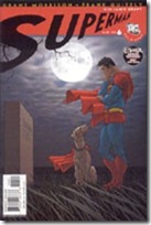
There are slight  nods to other parts of the series—I spotted Bizarro on some sort of chessboard in the Fortress, for example. And we’re given a brief scene in which Clark visits his father’s grave (though that issue when we saw the death of Jonathan was one of the most powerful issues of this series, to me, particularly in retrospect). We also did not get the Jimmy/Doomsday story. allstarsuperman006
The animation itself wasn’t anything spectacular. Watching the blu-ray didn’t make any kind of noticable difference to me. It wasn’t bad, mind you. I did like the “compromise” on the visual style. Quitely’s got a unique visual style that I often like but just as often take issue with, but I didn’t think it was a style I wanted to see mimicked for animation. (To the opposite, I greatly enjoy Ed McGuiness’ visual style used in animation, as on the first Superman/Batman dvd).

Certain touches of Quitely’s art was clearly adapted for this feature, but it was “softened” somehow, for lack of better phrasing offhand. A lot of lines were removed, so that none of the characters appeared lumpy. This made for a sorta different-looking Superman, who seemed a bit older than I’d usually picture, but not in a bad way.

allstarsuperman003The take on Lois was quite good…no complaints there. I was rather interested in how this Lois somehow visually put me in mind of “Bones,” though that comparison may simply be my limited exposure to Bones.

Other than the simplistic fact that we don’t have Tim Daly, Clancy Brown, or Dana Delany, I have no complaints with the voiceacting. In this case, I don’t think I was familiar with any of the voices involved, except perhaps Ed Asner (Perry White). This unfamiliarity allowed me to simply enjoy this for the story and characters, without distraction of visualizing actors behind the characters.

The story overall really felt like it was almost multiple “episodes” made into an overall whole. Coming from having read the comics, and seeing this as an adaptation of the comics, I didn’t mind the way things sort of jump from one to the next—though I was specifically looking for that, having been slightly “spoiled” by comments made on twitter and facebook prior to my watching this—with people expressing frustration at the story jumping and being disjointed.

I can see that, but as said…I took it in stride, and it didn’t bother me, if only for my knowing about it.

mcduffiecreditUnfortunately, especially as excited as I was to pick this up and watch it, news came through online this afternoon that writer Dwayne McDuffie died. I hadn’t even realized that he wrote the  script for this until today. It did seem sorta strange to not see a dedication to him in the end credits…but of course, his passing was so sudden and unexpected.

The package for this film isn’t anything wonderful. The cover image is rather iconic, though, and certainly gets to the heart of the overall story. I’m not at all impressed at the “extras.” I do enjoy the “teaser” shorts for whatever the next film in the line will be (in this case, Green Lantern: Emerald Knights). The Grant Morrison thing wasn’t all that thrilling—it seemed almost “phoned in,” so to speak. Never have been much a fan of commentaries, and this soon after watching, I’m not at all ready to re-watch with the commentary on, so can’t speak to that. If commentaries are you thing…well, there’s that.

I picked up the Target version, which includes a couple episodes of Superman: The Animated Series. One episode was one I’d just watched from the actual Superman: The Animated Series dvd set in the last couple days; and I’m not interested in the other, as I assume that comes later, and plan to watch the series in order.

All in all, HIGHLY disappointed in the “extras,” given how many extra shorts and features and such have been jam-packed into other recent releases—the discrepency between the “special edition” dvd and blu-ray editions with those is what mainly motivated me to go for the blu-ray this time, when I really should have simply stuck to the DVD.

I’d recommend a purchase for the die-hard fans that’ll watch this a few times. For the casual viewer, I recommend a rental. I think if I was going to give this a hard ‘n fast rating, it’s got a good 6.5 or 7 of 10 from me, primarily penalized by the (lack of) extras.