• June 2023
    S M T W T F S
     123
    45678910
    11121314151617
    18192021222324
    252627282930  
  • On Facebook

  • Archives

  • Categories

  • Comic Blog Elite

    Comic Blogs - BlogCatalog Blog Directory

General Mills Presents: Justice League #4 [Review]

Breakout!

Written by: Joshua Williamson
Art by: Bruno Redondo
Colors by: Tony Avina
Letters by: Wes Abbott
Cover by: Dan Jurgens, Sandra Hope, Carrie Strachan
Associate Editor: Kristy Quinn
Group Editor: Ben Abernathy
Senior Art Director: Larry Berry

So…Atlanteans are just like normal humans, except they live underwater. That’s ‘interesting.’ And Batman’s determined that no other family will ever be destroyed by crime. Penguin instigates a prison breakout to keep Aquaman busy, but the rest of the Justice League show up to help Aquaman and Batman. And we get several of the common “nicknames” such as “Big Blue” (Superman) and “Caped Crusader” (Batman).

This issue continues the trend of feeling rather generic, as well as having some stuff that feels a bit ‘forced’ in the course of dialogue or story.

The art’s not bad…also as with the other issues of this “mini-series” I’m not familiar with the artist…but, the art overall isn’t anything I actively dislike, which makes it good in my book.

The story is pretty basic, but it DOES have simple stuff worked in that would help inform someone on aspects of the characters–namely, that Batman’s all about not seeing another family destroyed as his was. This issue’s nothing special in the grand scheme…but as a comic that’s likely to be read by someone much younger than me…this isn’t a bad starting point to get someone interested in pursuing more about these characters.

And as a whole, this issue–and the whole “mini-series”–serves as a very basic introduction to the Justice League and several of the individual characters that doesn’t really contradict what I’m aware of about the characters, but this also makes the “real” comics look that much better.

Best of all, these comics are 24 pages of story–making them 4 pages (20%?) longer than current $3-$4 comics. And while totally separate from actual continuity…these even work a lot of “standard” elements in that give a “physical structure” like that of any contemporary comics–varied panel sizes, and even double-page spreads.

If these issues were to be collected as a full size 96-page one-shot in the $5 realm, I’d probably buy it for the novelty–and it’d be interesting to see if it would attract younger readers.

Story: 7/10
Art: 7.5/10
Overall: 7.5/10

General Mills Presents: Justice League #3 [Review]

Sinister Imitation

Written by: Doug Wagner
Art by: Steve Scott & Livesay
Colors by: Tony Avina
Letters by: Wes Abbott
Cover by: Dan Jurgens, Sandra Hope, Carrie Strachan
Associate Editor: Kristy Quinn
Group Editor: Ben Abernathy
Senior Art Director: Larry Berry

This issue is the classic, cliche robot-duplicates story. I’m not all that thrilled with the art…again, not familiar with this artist. By the end of the issue, though, I wasn’t noticing the negatives of the art, though, which I find likely to be that it’s just not art I actively enjoy…but it’s nothing for me to actively dislike, either. The characters are all quite clearly recognizable, and other than being in their “classic” costumes, nothing really looks all that “off” about them.

The writing is a bit more “off” than the art. There’s something that doesn’t really ring true about this league, and while they claim to be friends, it seems more like a surface detail than anything that’s really FELT. It is cool to see that the villain is a familiar one…though there doesn’t truly seem to be any motivation for him, and it seems odd that he’d actually give the whole league this kind of trouble, when typically he’s been a Superman villain.

However, as with the other two issues so far, this is rooted quite strongly in the realm of being for kids, who most likely aren’t going to care for the stuff I look for in my comics at age 30–deeper character moments, stronger stories, etc.

In connection with the first two issues, this adds a little more to the Justice League as we find out Flash is “Barry,” and that he’s friends with “Hal” (Green Lantern), and so on.

All in all…maybe my least favorite of the three, but for (again) something out of a cereal box, not horrible.

Story: 5/10
Art: 5/10
Overall: 5.5/10

General Mills Presents: Justice League #2 [Review]

Artificial Invasion

Written by: Paul Tobin
Art by: Derec Donovan
Colors by: Allen Passalaqua
Letters by: Wes Abbott
Cover by: Dan Jurgens, Sandra Hope, Carrie Strachan
Associate Editor: Kristy Quinn
Group Editor: Ben Abernathy
Senior Art Director: Larry Berry

Though Green Lantern, Flash, Aquaman, and Batman are on the cover and have a one-panel cameo…this issue focuses on Superman and Wonder Woman. Or rather, it doesn’t so much focus on them, as it does star just the two of them.

Metropolis is being swarmed by robots that keep replicating, using mainly car parts they scavenge. Superman and Wonder Woman find themselves in the middle of things, but even their powers aren’t stopping the robotic invasion. As they fight, they’re contacted by someone who manages to get past the robots to tell the heroes how these robots came to be. The robots then manage to catch the heroes…but the end result is not exactly what might be expected.

I’m again unfamiliar with the artist, and the visuals for this issue seem a bit more generic than #1. The art seems a bit more uneven on this issue, though I can’t really say it’s all that bad. It’s not exactly my cup o’ tea, but it’s preferable to some art I put up with in comics I actually buy, so I suppose this ought to be considered good, at least in and of itself.

The story itself is quite generic…but it does allow a SLIGHT glimpse into the motivations of the two main characters, showing a 3-panel flashback for Superman and another 3-panel flashback for Wonder Woman. Being familiar with the characters, I know most of the characters shown…but there’s nothing actually saying who they are, and so I wonder if the impact may be lessened.

In and of itself, this issue isn’t quite as fun as #1…but as another piece in addition to it, there’s a bit more character depth here, at least in us seeing that there’s more to Superman and Wonder Woman than their fists. And by issue’s end, they even realize that and state it explicitly.

My main issue is with Wonder Woman’s utterances of “Great Gaia” and “Great Hera”–they seem quite forced here, and at least a small bit out of character given lack of any other context.

All in all…a decent addition to things, and not nearly as bad as I’d expect a free comic from a box of cereal to seem.

Story: 5/10
Art: 7/10
Overall: 6.5/10

General Mills Presents: Justice League #1 [Review]

Unstoppable Forces

Written by: Scott Beatty
Art by: Christian Duce
Colors by: Allen Passalaqua
Letters by: Wes Abbott
Cover by: Dan Jurgens, Sandra Hope, Carrie Strachan
Associate Editor: Kristy Quinn
Group Editor: Ben Abernathy
Senior Art Director: Larry Berry

It’s been years since there’s been anything worth buying cereal for. Well, that phrasing may not be entirely accurate–I’ve been a cereal guy all through this time. But it’s been a lotta years since there was anything extra–a “prize” or “bonus” or whatever–contained in the cereal box as any true incentive in and of itself. But now, select General Mills cereals include a “free” Justice League comic book, making up essentially a 4-issue mini-series. They’re labeled as 1-4 “of 4,” anyway.

This first issue is rather bland, but in a fun sort of way. You have the various characters–Superman, Batman, Flash, Green Lantern, Wonder Woman, and Aquaman–but virtually nothing of their secret IDs, and the story isn’t all that deep. It’s really a done-in-one, out-of-continuity sorta deal.

Some time back, the heroes manage with some difficulty to subdue something called “The Shaggy Man,” and go on with their lives. Years later, a real estate developer breaks ground on the very spot the Shaggy Man is in stasis…awakening the creature. The Justice League springs into action, and ultimately find a better solution to keep the world safe from this Shaggy Man’s threat.

The art isn’t bad, though it suffers (for me) from a strong sense of being generic–this IS a “free giveaway” in a box of cereal, after all. It also feels rather weird seeing these characters in their “old” costumes–this giveaway comes barely 2 months into the relaunch of DC’s superhero line, so it would seem to have been a better thing to have this wait or at least have featured the new versions of the characters. Heck, make it a four-issue thing detailing some of the backstory of the New 52…or even reprint some prior material (do 2 issues of the Heroes’ origins from 52, and 2 issues of Villains’ origins from Countdown or some such).

The story is self-contained, and aside from that sense of being generic, the art IS NOT bad…though I’m not familiar with this artist. This is definitely something you could give to kids…it skirts deeper issues in favor of vagueness, and there’s no real depth of character for any of the characters here…but that only irks me as a fan of continuity and stronger stories.

The cover features an image by Dan Jurgens which helps offset the interior art; it also features a subtitle “Unstoppable Forces,” and the story is truly a done-in-one, which makes the “1 of 4” a bit strange–there’s no “To Be Continued,” so this didn’t even need a number. Seems the number is there to “legitimize” there being 4 different comics, and make this look more like a “real” comic.

Despite my complaints and whatever negativity…the truth is…this is EXACTLY the sort of thing I would have been THRILLED with at age 8 or 9 or 12 when I was first getting into comics, being exposed to multiple heroes and seeing them doing heroic stuff. Long before I came to care about things like depth of character and the sort of stuff that’s lacking here. The back cover shows all four covers to this “mini-series,” and even has caption “Enjoy reading all 4 comics together as a family!” I don’t know about anyone else, but I figure that would be a splendid idea–you’ve got the cereal, you’ve got the comic, and you can spend some time reading with your kid.

Or if you’re an adult…enjoy the simple stuff about comics that made them a joy to get into when you were a kid.

Story: 6/10
Art: 8/10
Overall: 7/10

DC Universe Online Legends #1 [Review]


Full review posted to cxPulp.com
.


Story: 3/5
Art: 4/5
Overall: 3.5/5

Deathblow (2006 series) #3 [Review]

Quick Rating: Average (Qualified)
Story Title: And Then You Live! (Part Three)

Deathblow continues his quest for "place" in contemporary society.

deathblow003Writer: Brian Azzarello
Artist: Carlos D’anda
Colors: Carrie Strachan
Letters: Rob Leigh
Asst. Editor: Kristy Quinn
Editors: Scott Peterson
Cover Art: Carlos D’anda Brian Stelfreeze
Publisher: Wildstorm/DC Comics

It’s a bit hard to review this issue…and I feel rather stupid for that fact. I just don’t seem to "get" who these characters are nor exactly what’s going on. At the same time, it’s not a TOTALLY negative thing, but I think there’s something lacking for my not being familiar with the character prior…the positive being that this is "only" the third issue and much of the story yet to go.

This issue sees the character we’ve followed for a couple issues attempting to figure out his place in contemporary society, free to do what he wants as he will when he wants to. After breakfast with his family, Cray sets out to find his friend/his dog at the park. Some less-than-comfortable encounters and violence later, we see some hints at a villain of the piece and what the title character might be facing soon.

While it was a bit hard to follow at points, I generally enjoyed certain chunks of Azzarello‘s Hellblazer work. I’ve read the first trade of 100 Bullets, as well as his arc on Batman several years ago, and the more recent Superman arc. Unfortunately, it seems his writing is a bit hit-or-miss for me, almost on an issue-by-issue/case-by-case basis. This is, despite some early optimism, turning out to be a miss. Those other stories had the benefit of involving characters I was already familiar with, whereas here I’m not only not familiar with the characters, but don’t care about them. Even comparing this to a tv show, the infrequency (though I believe mostly on-schedule for once-per-month) of the story segments and lack of any introductory pages make this an hard read without having dug out previous issues to re-read–though that could be leveled more at the publisher than writer.

The art is just fine, and captures a certain sort of realism without leaving behind the visual "feel" that it is still a two-dimensional series of images on paper. No complaints from me artwise.

While I didn’t much enjoy this issue, I suspect others more familiar with the history of the character, or more patience, or just a better memory may enjoy it. It’s still the middle of an arc, and will very likely be far more understandable in its eventual collected/single-volume format than it is here.

Ratings:

Story: 2.5/5
Art: 3.5/5
Overall: 3/5

Deathblow (2006 series) #2 [Review]

Quick Rating: Average
Story Title: And Then You Live! (Part Two)

The man code-named Deathblow continues to be integrated back into society…

deathblow002Writer: Brian Azzarello
Artist: Carlos D’anda
Colors: Carrie Strachan
Letters: Rob Leigh
Asst. Editor: Kristy Quinn
Editors: Scott Peterson
Cover Art: Carlos D’anda, variant by J.G. Jones & ALex Sinclair
Publisher: Wildstorm/DC Comics

While I liked the previous issue and found plenty of positive points in it despite my unfamiliarity with the character, this issue takes a much different turn for me. The art maintains its quality, and the writing still seems strong in itself–but I find that I don’t really care that much about the main character, the supporting-cast-thus-far feels forgetable, and I don’t really know where in WorldStorm continuity this even fits.

Deathblow is returned to a home and family he doesn’t remember, and pretense on his part is not well-rewarded. There’s some sort of lab experimentation going on, analogous to the character’s re-introduction into New York City society, and a question is raised at issue’s end that looks like it’ll be playing a solid role in coming issues.

In a way, not MUCH happens in this issue, and yet quite a bit. I wasn’t–personally–pulled into the story itself all that much. For one thing, there seems to be a time-jump from what I recall at the end of the first issue, and some potential story-stuff that I expected is not present, which throws me off a bit.

There’s a lot of potential to the character himself, and the series; lots of room for commentary politically and on military stuff, and just the state of the world. There’s lots of room to look at what soldiers get put through and are asked to do, and the issue of being both the victim and causation of trauma. Other than recognization of the "Deathblow" name, I really don’t have anything else to ground me in the story, to know where things are coming from; there’s nothing summing up the first issue, and characters aren’t specifically identified. While this works for the story in and of itself, as someone new to the character without any significant knowledge of what may have come before, nor a clear placement (YET. It may be still to come as WorldStorm continues to unroll) of the story in general continuity (assuming it is in the shared universe) keeps me from being invested here.

Azzarello seems good for writing this sort of gritty, non-pretty story, and I suspect that while things are starting slow, given time, the characters and story will develop into a richer tapestry that’ll draw folks in.

D’anda‘s art is appropriately gritty and dark, capturing the tone of the story and bringing a fairly unique feel to the issue–one’s not going to mistake this for a Superman comic (hero showing up or not), for example.

If one is familiar with the character and history, and not coming in cold, there’s probably stuff that’s a lot deeper that I’m not picking up on. I want to like this series, for some reason. It’s not there yet. The potential is, though. I for one will give another couple issues to get pulled in more. I’ll cautiously recommend this if you bought the first issue. If you’ve not picked the title up yet, there’s nothing I can really point out that would singularly be reason to start.

Ratings:

Story: 3/5
Art: 3/5
Overall: 3/5

Deathblow (2006 series) #1 [Review]

Quick Rating: Good
Story Title: And Then You Live! (Part One)

A new start for the man code-named Deathblow…

deathblow001Writer: Brian Azzarello
Artist: Carlos D’anda
Colors: Carrie Strachan
Letters: Rob Leigh
Asst. Editor: Kristy Quinn
Editors: Ben Abernathy and Scott Peterson
Cover Art: Carlos D’anda, variant by Stephen Platt
Publisher: Wildstorm/DC Comics

This issue has a mix of stuff to it, with a good pacing. We open with the reader apparently being addressed, before we discover we’re seeing things through the eyes of someone being tortured, before flipping to the discussion of a rescue operation, then the rescue operation itself. We’re introduced to the main character, and are left at the issue’s conclusion with a glimpse of what may be to come, as the status quo we’re led to believe is shifted into place isn’t what we–or the title character–thought.

The writing here is good. Before this issue, pretty much the entirety of what I knew of the character or concept, even, of Deathblow was what can be found in Jim Lee‘s "The Stormfront" column in this past month’s Worldstorm books. However, there’s enough here that while there may be an initial sense of genericy, we are not only introduced to the title character in this debut issue, but early enough on that events transpire after his introduction, (which then lead into the issue’s cliffhanger). The art has a gritty edge to it, and with the coloring, a subtle darkness that gives a visual impression of just how un-pretty things are here, story-wise.

As a debut issue, this has a good amount going for it. We get some background that sets up what’s going on here, now, in the present, that leads to the introduction of this Deathblow character. (The fact that the title character actually shows up is a definite plus.) We are introduced to the character in such a way that accounts for (apparently) events that came in the earlier volume of the title (pre-Worldstorm) and presumably gives an extra depth for readers familiar with the character from way-back-when…but it works equally as well in setting the character up for those (like myself) coming in cold.

I didn’t have much of any expectation coming in beyond the usual one would expect of any comic. I’m not absolutely wowed or amazed at the book…but I find in it a solid start with plenty of potential, and I’m willing to give it a go, see how stuff develops.

I’m sure you could find better, but there’s plenty worse out there. As a debut/first issue, this is a good point to jump on and check things out. If you’ve $3 to spare, it probably couldn’t hurt too much.

Ratings:

Story: 3.5/5
Art: 3.5/5
Overall: 3.5/5

Green Lantern Corps #50 [Review]

Full review posted to cxPulp.com.

Story: 3.5/5
Art: 4/5
Overall: 3.5/5

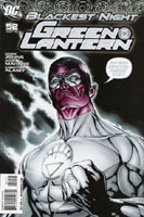
Green Lantern #52 [Review]

Full review posted to comixtreme.com.

Story: 4/5
Art: 4/5
Overall: 4/5

%d bloggers like this: