• January 2026
    S M T W T F S
     123
    45678910
    11121314151617
    18192021222324
    25262728293031
  • On Facebook

  • Archives

  • Categories

  • Comic Blog Elite

    Comic Blogs - BlogCatalog Blog Directory

Booster Gold #0 [Review]

Quick Rating: Great!
Story Title: Blue & Gold chapter 1: The Secret Origin of Booster Gold

Booster and the Beetles encounter Parallax mid-Zero Hour in the timestream, and Booster confronts his past as the heroes are stranded in the future…

boostergold000Written by: Geoff Johns & Jeff Katz
Pencil Art: Dan Jurgens
Finished Art: Norm Rapmund
Colors: Hi-Fi
Letters: Randy Gentile
Asst. Editor: Harvey Richards
Editor: Michael Siglain
Cover: Jurgens & Rapmund
Publisher: DC Comics

You know a book’s good when your primary complaint is a total fan-boy nit-pick with the issue’s cover. As a Zero Hour tie-in (complete with replacing "#7" with "#0"), I had honestly hoped to see the Zero Hour logo on the cover, making the cover fit in with the old 1994 zero issues. We do get the sharp silver coloring in the logo, which keeps it from being a complete bust.

As Booster and the Beetles discuss where to go from here, they encounter fellow time-travellers Parallax and Extant, circa DC‘s Zero Hour: Crisis in Time story from 1994. After a battle with the villains, the heroes find themselves stranded in the future–specifically at a day Booster remembers all too well. They scramble to salvage their mission, while Booster contemplates his role in affecting Time, and an even larger threat quickly becomes apparent.

The story itself here is very good–it keeps things moving forward in a believable way, also allowing the characters to interact with events in a nearly-fourteen-years-old story without seeming implausible (and if you’re not familiar with that story, you’re still in great hands as all you NEED to know is given to you in-context, without coming across as totally cheesey recap-conversation/thoughts!)

Visually, the artistic team–Jurgens, Rapmund, and Hi-Fi on the colors–deliver an excellent product. The Blue Beetles, Booster, even the Zero Hour villains all look spot-on, and really look just about the best I’ve ever seen ’em.

Right now, I’d have to say that Booster Gold is by far my favorite super-hero book out there. It’s smart, it’s funny, it’s serious…it builds off established continuity without being slave to it, and still has plenty of room to keep pushing the characters’ stories forward and open up new territory.

This issue kicks off the 2nd arc of the title, and makes a good jump-on point if you’ve been considering whether or not to pick up the book. Both as something "new" to check out or as a continuing purchase, I highly recommend this issue, and the title in general.

Ratings:

Story: 4.5/5
Art: 4.5/5
Overall: 4.5/5

Booster Gold #2 [Review]

Quick Rating: Excellent!
Story Title: 52 Pick-Up, chapter 2: Leggo My Ego

Booster vs. Sinestro…for the fate of Guy Gardner?

boostergold002Written by: Geoff Johns & Jeff Katz
Layouts by: Dan Jurgens
Finishes by: Norm Rapmund
Colors by: Hi-Fi
Letters by: Rob Leigh
Assistant Editor: Harvey Richards
Editor: Michael Siglain
Cover by: Jurgens & Rapmund
Variant cover by: Art Adams
Booster Gold created by: Dan Jurgens
Publisher: DC Comics

This issue’s mission for Booster? Stop a determined Sinestro from making contact with Guy Gardner. Should he fail, the Sinestro Corps. would come about years sooner than it should, and would lead to Sinestro’s successful conquering of the universe. As Booster attempts to keep the two men from meeting, Rip goes on a field trip, and a figure from Booster’s recent experiential past returns, promising significant trouble.

This is another fine issue of this still-young series. We get a "complete" story in Booster being told what his "mission" is, the context surrounding said mission, and Booster diving in to attend to business, with the conclusion of the mission impacting what’s to come in the next issue, all while several sub-plots (awesome–they still exist!) advance and promise to emerge to the forefront before too terribly long.

As such, it seems that the writing team is in great form here, providing us with an entertaining story, but also laying foundation for the meta-arc that will likely be at least the first TPB…establishing an ongoing story that works in larger form, while making it feel worthwhile to be reading the short-form single issues as they’re released.

The art team is also in great form, providing visuals that convey the story and character emotions in a clear, detailed way without being hyper-detailed nor so realistic one might be tempted to forget that this is, in fact, a comic book.

Blended together, this is another very enjoyable issue that is well worth being picked up. And even if you didn’t nab #1…I would gladly argue that this issue justifies tracking down both issues of this series-so-far to get in on an engaging, enjoyable read!

Ratings:

Story: 4/5
Art: 3.5/5
Overall: 3.5/5

Booster Gold #1 [Review]

Quick Rating: Excellent!
Story Title: 52 Pick-Up, chapter 1: Secret Origins

Booster Gold finds that despite saving the multi-verse, Time is still broken, and it’s up to him to save it–in a rather surprising way.

boostergold001Written by: Geoff Johns & Jeff Katz
Layouts by: Dan Jurgens
Finishes by: Norm Rapmund
Colors by: Hi-Fi
Letters by: Rob Leigh
Assistant Editor: Harvey Richards
Editor: Michael Siglain
Cover by: Dan Jurgens
Variant cover by: Art Adams
Special Thanks to: "Grant Morrison, Greg Rucka, and Mark Waid…but definitely not Keith Giffen!"
Booster Gold created by: Dan Jurgens
Publisher: DC Comics

This issue rocks! It presses a lotta my fan buttons, and is one of very few issues of late that I put down and probably had some silly grin on my face, having just simply enjoyed it that much.

We pick up with Booster Gold a couple months after the events of 52, as he’s working to make it big again and get a shot at joining the current Justice League…even though none of it’s quite the same without his best buddy Blue Beetle (Ted Kord) around. Unfortunately for the would-be hero, other forces–and people–are at work in the timestream, and Booster finds himself drawn back into facing a crisis that threatens to keep him from his public and rise to genuine fame.
Throughout, we get a number of great character moments and interactions that speak to the potential of coming issues and stories, even as they add to the depth of this very story.

The story here seems really solid to me–and if there was a lack of solidity, it didn’t stand out to me. This issue–and series–builds on the events of 52 and takes up some dangling threads to start tying stuff up in one way or another. Booster is written in such a way that he’s not only true to classic/iconic form, but is also given some actual growth, leaving plenty of room for continuing growth as a character, without ditching or disrespecting the past.

We get a lot of what makes a great first issue for a new title: exposition/flashback to catch the reader up or introduce new readers to the state of affairs; prominent use of the title character; introduction of new and old characters for supporting cast; guest-stars to show what it is that makes this character stand on his own; a plausible story that builds on existing continuity without being bogged down; and several bits of foreshadowing and outright teases of what’s to come, that fit right into the context of the story without feeling forced.

The strength of continuity and the feel of the main character himself certainly must come partly from the fact that Johns was one of Booster’s writers from his last adventure.

Visually, the cover stands out immediately, with a fun, iconic sort of picture–and though I hadn’t realized it when I first noticed it and thought about what a cool image it was–the standard cover is by Dan Jurgens, who has had a certain place in Booster Gold history.

The general artwork in the issue is also very good…it captures the sheer fun-ness and energy of things. It’s not the most hyper-detailed, nor is it overly simplified…it clearly shows who’s doing what where and when, gets across what’s going on, and as a whole does a great job of doing what the art in a comic is supposed to do.

While this issue’s story, and perhaps very existence spring directly from 52, you need not have read that story to understand what’s going on here–and the details from 52 that do matter are recapped in the flow of this issue’s story. Though this looks to have elements drawn from all parts of the DC multiverse, and the ability to touch any and all titles that are part of the main stable of DC books, this issue feels very nicely self-contained, and a decent jumping-in point even if you’re not familiar with the DCU.

Taken as a whole, this issue is one of the single most enjoyable reads I’ve had all year, and I definitely recommend it–especially if you’re a fan of the character, of 52, or of the "new" multiverse.

Ratings:

Story: 4.5/5
Art: 4/5
Overall: 4.5/5

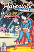
Adventure Comics #0 [Review]

Quick Rating: Decent
Story Title: The Legion of Super-Heroes / Origins & Omens

Superboy meets super-powered teens from the future, and a new Luthor/Brainiac team is introduced.

Writer: (AC247) Otto Binder, (O&O) Geoff Johns
Artist: (AC247) Al Plastino, (O&O) Francis Manapul
Colorist: Brian Buccellato
Letterer: Swands
Associate Editor: Sean Ryan
Editor: Elisabeth V. Gehrlein
Cover: Aaron Lopresti
Publisher: DC Comics

This issue is primarily reprint material, reprinting the story from Adventure Comics #247…a silver-age comic. This was the story that introduced Superboy to a super-hero club–the Legion of Super-Heroes. Encountering several individuals who know that he is Superboy AND Clark Kent, Superboy agrees to go 1,000 years into the future with these super-powered teens, who invite him to join their club as an honorary member if he can pass their initiation.

At the end of the issue is a 6-page sequence–the Origins & Omens story (one of which will be found in each of a number of other DC titles this month). This one continues a thread from the recently-concluded New Krypton story and sets the stage for the earliest issues of this series.

The story and art on the reprint are instantly recognizeable as silver age fare. While I appreciate concepts of the silver-age and greatly enjoyed time spent reading through my grandfather’s collection of comics half a lifetime ago, these days I find such stories in a bit of opposition with my interest. However, this story was decent, and it IS interesting to see the early/original version of the characters that would go on to have so much more depth in the years since this introduction.

The Origins & Omens bit seemed extremely short, but it has me interested in what’s to come. And I couldn’t help but recall Whatever Happened to the Man of Tomorrow? as I read this latest version of a Luthor/Brainiac interaction. The writing’s familiar–it’s Johns, after all–and the art is solid.

However, I’m doubtful that the Origins & Omens sequence is itself enough to justify the cover price. If you want the reprint and/or especially enjoy the Lopresti cover, this issue is well worth the $1. And if you’ve never read this story, there are few better ways to get a piece of history added to your “read” pile.

Ratings:

Story: 3/5
Art:
3/5
Overall:
3/5

Green Lantern #10 [Review]

Quick Rating: Good
Title: Revenge of the Green Lanterns, part one

It’s One Year Later, and Green Lantern is definitely back…but with quite a shadow hanging over him; meanwhile, Hal Jordan prepares to be honored for a past deed…

greenlantern010 Writer: Geoff Johns
Pencils: Ivan Reis
Inks: Marc Campos
Colors: Moose Baumann
Letters: Rob Leigh
Assoc. Editor: Michael Siglain
Editor: Peter Tomasi
Cover Art: Simone Bianchi
Publisher: DC Comics

So…awhile back, Hall Jordan lost his city when it was blown up by an alien bent on having revenge on Superman for failing to save his family and driving him away from Earth. Hal couldn’t handle the strain, went nuts, killed a bunch of other GLs in his bid for control of the central power battery on Oa, became Parallax, tried to wipe out time to set things right, died to re-ignite Earth’s sun when it was put out, stepped forward as a volunteer-host for the Spectre during a spiritual crisis, and ultimately split from the Spectre as the real Parallax stood revealed…huh?

You don’t really need to know all that–though it adds a bit of context to the character. What you need to know for this issue is that Hal Jordan–Green Lantern–has apparently had his past exposed to the world, and/or done something that has led to most people of Earth not trusting him–regarding him as little more than some criminal acting without regard for Earthly laws and regulations.

Of course, this issue takes place a year after the events of the currently-unfolding Infinite Crisis so there’s a lot that’s happened that we–as readers–are not yet aware of. Though Green Lantern has been cast in a negative light (and this seems to extend to Jon Stewart as well, though we don’t actually see him in this issue), Hal Jordan is regarded as a hero for things he’s taken part in during the past year.

On the one hand–at the surface–this story seemed rather boring to me. Looking deeper, though, it’s actually a lot better than I wanted to give it credit for. The one-year jump allows for stories to be beyond the whole "hey…you’re back?!?" sort of situations. Hal’s gotten himself very much involved in life again and rebuilt as well as simply built new relationships. He’s fairly established again within the DC Universe.

Apparent flashbacks give some hint as to a fairly major event in Hal’s past (the missing year) that seems rich in character potential. I also like the fact that a story from the Green Lantern Secret Files & Origins 2005 comes into play here–we saw in that story last year that Hal leaves his ring behind when he flies. It added an extra touch of humanity (and/or recklessness) to the character, and provides context for stuff shown in this issue). That’s not to say that you need to have read that to "get" this issue.

The art gives me little to talk about–it worked for me. Things were clear panel-to-panel as to what was going on, all the more in context of the text. The imagery in general is pretty bright–we’re not mired in shadows here. Characters are recognizable and while they may not be clones of versions from other artists, they don’t at all come across as a reinterpretation, which means we have good art, good story, and a good issue.

There are some definite questions that arise from this issue: exactly what does the world know about Hal Jordan? What do they actually know about Green Lantern that has made GL unwelcome outside the US? (As readers, we have plenty of "dirt" that could place him in that position if the info were common knowledge to the residents of the DCU) And so on.

Having seen (and had it as my computer’s desktop for the last few weeks) the cover to a later issue of this title, I’ve a pretty good idea who the villain of this arc is, which takes away from the "shock" that’s apparent at the end of the issue. But then, anything lost there is replaced by an eager "Why?" to the whole thing.
In the end, this is definitely a good issue, and well worth checking out if you haven’t already. It’s also a good jumping-on point, as it’s the first "One Year Later" issue for this title, and in many ways functions as a new # 1–old and new readers alike are at the same point regarding Hal’s past year or so and his new life.

Ratings:

Story: 3.5/5
Art: 4/5
Overall: 4/5

Young Justice #0 [Review]


Full review posted to cxPulp.com
.


Story: 3.5/5
Art: 4/5
Overall: 4/5

Faces of Evil: Deathstroke #1 [Review]

Quick Rating: Very Good
Story Title: Faces of Evil: Deathstroke

After suffering a humiliating defeat, Deathstroke takes stock of his life and makes plans for moving forward.

facesofevildeathstroke001 Writer: David Hine
Penciller: Georges Jeanty
Inker: Mark McKenna
Colorist: Jo Smith
Letterer: Pat Brosseau
Assistant Editor: Janelle Siegel
Editor: Michael Marts
Cover: Ladronn
Publisher: DC Comics

Last I recall seeing Deathstroke was in the Last Will and Testament special last Fall, when Deathstroke was defeated in combat by Geoforce. After that humiliating defeat, Deathstroke has had some time to recover, and to take stock of his life. This issue opens with him in the hospital–where those attending to him marvel at his very survival. Once he’s awake, Deathstroke arranges a meeting with his daughter, and the two deal with "family issues" they have with one another. Finally, we see Deathstroke beginning to set up what may be his new status quo.

Hine seems to get this character quite well. The story here is believeable and well within what I’d expect of the character despite my limited exposure to him. We have a man who’s been pushed to his limit and forced to reassess what he is going to do with his life. We get to see him contemplative and in action, see what makes him very dangerous.

The art is solid, too. No complaints here–everything’s nice and clear, with no problems following the action. There’s a slight change in the coloring for a flashback scene that sets that sequence apart from the rest of the issue–gives it a bit of a surreal effect without going hokey or cheesey on us.

Next to Meltzer‘s writing of this character in Identity Crisis and Last Will, this has to be the best depiction I’ve seen of Deathstroke. This issue is–at standard cover price, even!–well worth snagging if you’ve any interest in Deathstroke. And if you’ve never dealt with the character before, you could probably still quite enjoy this issue, as it deals with the here-and-now of the title character as he prepares for what he is going to do moving forward from here.

Ratings:

Story: 4/5
Art: 3.5/5
Overall: 4/5

Astro City: Samaritan #1 [Review]

Quick Rating: Great
Story Title: The Eagle and the Mountain

Samaritan and an old foe size each other up in their latest encounter, as we see key moments in both characters’ past.

astrocitysamaritan Writer: Kurt Busiek
Artist: Brent E. Anderson
Colors: Alex Sinclair
Lettering and Design: John Roshell of Comicraft
Asst. Editor: Kristy Quinn
Editor: Ben Abernathy
Cover Art: Alex Ross
Publisher: DC Comics/Wildstorm Signature Series

While I’ve read several of the Astro City TPBs, the first arc of Dark Age, and a couple other AC stories, I don’t feel all that familiar with any specific characters. They’re largely archetypal to me, and I think I read them with other characters in mind, or at least, without much of a vested interest in anyone in particular.

Samaritan to me is a different take on Superman, and this "Infidel" puts me in mind of Lex Luthor, and visually in mind of some character from Hellblazer (Papa Midnight, perhaps).

However, these characters certainly are not the others–they draw from a similar pool of ideas, but hold a rich uniqueness all their own.

The issue opens with a story about an eagle and a mountain, to set things up. The issue is narrated by Infidel, presenting things from his point of view–something that when done on occasion like this, works very well. Though we know that he is the "bad guy" (Samaritan being the "good guy"), it’s easy to see where Infidel is coming from, his motivation and such.

Through the years, Infidel and Samaritan have clashed, and despite the intensity of the battles, neither every truly gained the upper hand, resulting in a truce of sorts, as each watches the other, waiting for a moment to strike. The cordiality between Samaritan and Infidel is a bit off-putting at first, but works very well here. It is in itself a bit archetypal–two bitter enemies interacting civilly, almost friendly, neither seeking to physically confront the other…but the dangerousness of both is felt throughout the interactions, and the characters have a very real feel to them, as more than just some black/white comic-book-supervillain/comic-book-superhero interaction; there’s just more depth to it.

And that seems to me to be a large part of the way Astro City works–standard superheroes and supervillains cast in a "real world" of sorts, offering plausible answers to questions that transpose comic book situations with real world actuality. Of course it’s still a comic itself–but it gets beyond certain cliches.

The art works really well here–Anderson‘s art is clear and mood-suited as usual, conveying both the quieter and the loud, cosmic scenes quite well.

Possibly the best part of this issue is that it stands alone. If you’re a long-time fan of Astro City, it’ll add to your enjoyment of the overall "saga." However, if you’ve never touched an Astro City book, this is a great place to check it out, with a story of one of the main superheroes and maybe his greatest foe. In a world of increasing need of the "previously…" page, this issue acknowledges that with a "previously" box: What You Need To Know Before Reading This Issue! / Uh, nothing, really. Dive on in, the water’s fine.

Check it out–it’s a $4 book, but it’s 40 pages, self-contained, and a very enjoyable read!

Ratings:

Story: 4.5/5
Art: 4.5/5
Overall: 4.5/5

Superman: World of New Krypton #1 [Review]

Quick Rating: Good
Story Title: World of New Krypton Part One

Superman begins his new life on New Krypton by getting to know a bit of his new surroundings as he is tasked with choosing a Guild to belong to.

supermanworldofnewkrypton001 Writers: James Robinson and Greg Rucka
Artist: Pete Woods
Colorist: Brad Anderson
Letterer: Steve Wands
Asst. Editor: Wil Moss
Editor: Matt Idelson
Cover: Gary Frank with Brad Anderson (variant by Ladronn)
Publisher: DC Comics

We open this issue on Superman’s solo journey from Earth to New Krypton. Arriving, Superman is confronted by locals informing him that Zod wishes to meet with him–Superman declares that his family comes first and proceeds to his Aunt’s home. Here he declares his intention to live amongst his people on New Krypton as a Kryptonian, leaving Earth behind. As such, he must choose a guild and in general adjust to Kryptonian customs as just another guy in the crowd, since he’s nothing special on a world where everyone has his super-powers. After exploring a bit and meeting with Zod, his guild is chosen and we’re left with a Superman facing a future as a Kryptonian with other Kryptonians.

The art here is not bad, but I’m not terribly thrilled with it. It just lacks the detail/feel or something that I get from other artists like Jim Lee, Dan Jurgens, and Gary Frank (That the cover is a Frank image allows for that much more an immediate comparison). The story is conveyed, we can see a range of expression in characters’ faces where called for and so on, so the art is simply not to my personal taste/preference.

The story is solid. While I haven’t entirely bought into the seeming suddenness of Superman’s decision to pursue this course of action–it’s felt fairly forced/arbitrary like plopping playing pieces where-ever one decides on a gaming board and then throwing some almost arbitrary reasoning to the placement–I can’t deny the potential this story has. It’s been nearly two decades since we last had a story exploring a world without a Superman–but that story was a world which had lost its Superman to death, not one “deserted” or “abandoned” by its hero. Either way, this is the series that follows Superman as he deals with leaving Earth behind in order to live with his people, seeking to protect them from a threat that they don’t want to acknowledge.

On the one hand, this may not be the best point to jump on-board without the context of Brainiac or the branded New Krypton story, if one understands simply that Superman is beginning another “quest” that involves his going to and living on this planet of Kryptonians, this shouldn’t be too bad a point to start into things.

As only the first issue of twelve, it’s hard to say where things will go. For now, I’m taking this simply as another Superman book, and do look forward to seeing how the character handles this new year-long status quo.

Ratings:

Story: 4/5
Art: 3/5
Overall: 3.5/5

Red Robin #9 [Review]

Quick Rating: Solid
Story Title: Collision (part one of four)

Beginning with apprehending a Killer Moth, Tim reacquaints himself with Gotham before retribution from Ra’s al Ghul begins…

redrobin009 Writer: Christopher Yost
Penciller: Marcus To
Inker: Ray McCarthy
Colorist: Guy Major
Letterer: Sal Cipriano
Assistant Editor: Janelle Siegel
Editor: Mike Marts
Cover: To & McCarthy
Published by: DC Comics

I’ve long been a fan of Tim Drake, and until the One Year Later break and price hike several years ago had followed the character since long before he even had his own series. And though I read a handful of issues toward the end of that series, and the previous 8 in this series…Red Robin #9 is maybe the first issue that has felt like there’s still that same character to be read that was in Robin.

We begin a new 4-parter in this issue. Tim reacquaints himself with Gotham, takes down someone in a Firefly costume (as the costume and person behind the name changes so much), has a moment with Connor (Superboy), catches up with new love-interest Tam Fox, and we see Vicki Vale prying into "Bruce"’s life. When Ra’s al Ghul ruins Tim’s good moment, Tim puts everything else aside to turn for help–pride be darned–and finds someone in the Batcave he had not at all expected.

The art for the issue’s good…my main complaint is that I still don’t like the Red Robin cowl–but I do like the way Tim himself is depicted. The visuals actually look like I’d expect for a comic, which is a definite plus; nothing that’ll blow one away with awesomeness, but significantly better than a lot of art in comics out there.

The story is decent–something about it leaves me wondering how firm a direction there is for this book. In a way, we have Tim–less than a year in–feeling much like the star of the 180-some issue Robin series, and quite unlike the dark, brooding character that began this current Red Robin series…almost like the primary difference is the costume instead of an attitude or specific story/character direction.

At the same time, it’s refreshing to see that a story doesn’t have to be exactly stretched or compressed to six issues for a "graphic novel" collected format–four-parters are ok, too. What’s rather frustrating, is that the four-parter this issue begins appears to continue directly into Batgirl #8…which is, for me, an entirely unplanned-for purchase, to say nothing of the fact that Batgirl #7 isn’t even out yet, I’m told. The cover has zero indication of any crossover…just a fairly "generic" or "iconic" shot of Red Robin, where I would expect a story continuing into another title would have something on the cover to indicate the crossover.

While one would not have the context of the "Eurotrip" and the setup of things from Tim getting on the bad side of Ra’s al Ghul and his League of Assassins, this isn’t the most horrible point to jump on the title. Still, the issue’s fairly standard, and not much here to truly draw someone in outta nowhere if they’ve not already been "on the fence."

Ratings:

Story: 3/5
Art: 3.5/5
Overall: 3/5