• February 2026
    S M T W T F S
    1234567
    891011121314
    15161718192021
    22232425262728
  • On Facebook

  • Archives

  • Categories

  • Comic Blog Elite

    Comic Blogs - BlogCatalog Blog Directory

Green Lantern #39 [Review]

Full review posted to comixtreme.com.

Story: 4/5
Art: 4/5
Overall: 4/5

Batman: Battle for the Cowl #2 [Review]

Full review posted to comixtreme.com.

Story: 3/5
Art: 3.5/5
Overall: 3/5

Booster Gold #19 [Review]

Full review posted to comixtreme.com.

Story: 3.5/5
Art: 3.5/5
Overall: 3.5/5

The Mighty #3 [Review]

Dirge

Story & Words: Peter J. Tomasi & Keith Champagne
Art: Peter Snejbjerg
Colors: John Kalisz
Lettering: Rob Leigh
Assistant Editor: Chris Conroy
Editor: Joey Cavalieri
Cover: Dave Johnson
Publisher: DC Comics

This issue sees Cole move fully into his new leadership position, accepting the “signal-brand” of Alpha One, and learning more about his hero and ally. After being able to relate to a child who Alpha saved but whose parents weren’t, Cole helps Alpha to relate to the kid, and Alpha reveals his own need for Cole’s presence on the job. The two spend some time in Alpha’s home/headquarters (male bonding and all that), and we see a new “normal” settle in for all.

The art for this book works really well, and fits with the characters. I’m not all that familiar with the artist, though, so don’t come in with any expectations…I almost like it better that way, as it contributes to letting the art be the art, with no other expectations of quality or style heaped upon it. There’s a certain feel to it that does not make me think of super-hero comics, and I think that adds to a nice realistic tone to this book, putting my mind in more of a place to see the characters as entities that “could” exist in a real world somewhere that isn’t full of the usual super-hero figures.

The story is surprisingly good. On the one hand, I’d expected this series to be much more generic and like any other comic with a “realistic” super-hero in a world NOT chock full of super-heroes. However, while there is a bit of a generic feel, it seems to be because the title is still so young, and virtually anything new dealing with any kind of super-hero is going to feel like something we’ve seen before. There’s a lot of potential–at least for my own experience–for this to move away from anything I’ve read in super-hero comics in the past.

That the creative team co-created the character and are the ones setting things up–this isn’t just a new team on an established character/series–is a definite bonus. This is only the 3rd issue–if you can find the first couple of issues, this is well worth checking out, and a very good read so far.

Story: 8/10
Art: 8/10
Whole: 8.5/10

The Flash: Rebirth #1 [Review]

Lightning Strikes Twice

Writer: Geoff Johns
Artist: Ethan Van Sciver
Colorist: Alex Sinclair
Letterer: Rob Leigh
Assistant Editor: Chris Conroy
Editor: Joey Cavalieri
Cover: Ethan Van Sciver, Alex Sinclair
Publisher: DC Comics

We open with a mystery in this issue, as someone with a tie to or fixation on the Flashes attacks and kills people in the Central City crime lab. As other police storm the lab, the killer–who was gathering certain chemicals–seems to reenact the accident that gave Barry Allen his powers. We then move to a “welcome back!” parade being held in honor of the recently-returned Barry Allen; while those closest to him also revel in the hero’s return. Barry resists the attention and importance placed on his return. When an old foe returns, Barry is onhand to deal with the foe–though what he gets is far from what he expected.

The art for this issue is quite good…but somehow for me fails to hold up to my expectations for how much I enjoyed the art on the OTHER Rebirth mini. Very solid stuff here, and you’d be hard-pressed to find much better, though!

I’m quite underwhelmed with the story so far. With the exception of a handful of my grandfather’s old comics more than a decade ago, the only instances I’ve ever had reading Barry have been few and far between, with him making brief appearances in Wally’s life…so I don’t know how the characterization holds up (ore doesn’t) by comparison. At the moment, I’m really not interested in Barry, even after this issue, and while the issue’s end leaves me curious as to what’s caused what happened, I can’t help but wonder if it’ll come across more cliched than not.

It was Johns’ focus issue on Zoom a few years back that first really drew me into the world of the Flash, and it’s Johns’ Flash that developed any interest I really have in the character–so I’m holding out hope that my interest will develop a lot more as this series progresses.

Probably the main drawback of this issue as a whole is that it feels–more than a lot of comics–like it IS a story chopped into segments. If you ReallyHaveToKnowRightNowAsItUnfolds what’s going on, jump on this issue. If you’re just looking for what’s hopefully going to be one of THE Flash stories with great art, I suspect you’ll be better off waiting for the collected volume.

Story: 7/10
Art: 8.5/10
Whole: 7.5/10

Justice Society of America #25 [Review]

Black Adam & Isis part three: Family Feuds
Story: Geoff Johns, Jerry Ordway
Pencil art: Jerry Ordway
Ink art: Bob Wiacek & Jerry Ordway
Colors: Hi-Fi
Letters: Rob Leigh
Assistant Editor: Harvey Richards
Editor: Michael Siglain
Cover: Alex Ross (variant by Jerry Ordway)
Publisher: DC Comics

We resume the story with “Black Mary” asserting influence on Billy–creating “Black Billy” and illustrating an interesting point of the nature of the Marvel Family’s use of the power that flows through them. While the Marvels clash with the JSA, Jay Garrick accompanies Billy’s father as things race toward pivotal “Marvel family” events.

The art on this issue is fantastic, and for me works perfectly with this story. In addition to being high quality art, the fact that it is Ordway–who has more than just passing familiarity to the Marvel family–is icing on the cake.

The story itself is accessible to me as a reader who never paid much attention to any of the Marvel family characters until relatively recently, and yet it is so obvious that this draws on continuity put down over the past couple decades (Ordway’s involvement is testament to that!)

As part three of an only four or five-chapter story, this isn’t the best point to simply jump in exactly, but as a whole if you’ve any interest in the Marvel family, this is a story you ought to be reading. And if you’re looking for a crash course or playing some wikipedia-catchup and the cover intrigues you, give this a shot!

Highly recommended.

Story: 9/10
Art: 9/10
Whole: 9/10

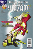
Billy Batson and the Magic of Shazam! #4 [Review]

Words, Pics, Heart: Mike Kunkel
Letters: Steve Wands
Assoc. Editor: Adam Schlagman
Editor: Jann Jones
Cover: Mike Kunkel
Publisher: Johnny DC (DC Comics)

This issue sees the culmination of elements from the first several issues come to a head as Billy and Mary confront Theo Adam with the help of the Wizard. Of course, it’s no easy task since the 7 Deadly Evils are along as part of Black Adam’s gang, and Captain Marvel is seemingly outnumbered.

The art is at once an annoyance and a delight. It’s annoying because I’m not a fan of the exaggerations it embraces visually. At the same time, it’s a delight–it’s far from my usual preference, but this issue (and those before it) make me feel like I’m parked in front of a tv watching a fun cartoon.

The story itself is fairly simplistic on the surface, but carries a lot of deeper stuff if one cares to look deeper. Like a well-crafted cartoon, there’s plenty to be enjoyed here even by adult readers, while holding what presumably would be attractive to the younger crowd. SUre, there’s violence, and sure, there’s fighting…but there’s no cussing, the violence is “cartoon violence” rather than “realistic,” and I daresay one would find much more enjoyment sharing this comic with them than a half hour on the couch with any of a number of contemporary cartoons.

Most comics that I really enjoy migrate to the top of the stack when I sit down with new books. This one makes its way to the bottom–it’s a great “happy book” or “palate-cleanser,” and with all the little panels and dialogue and such takes awhile to read–a great ending to a stack of new comics that otherwise flash by far too quickly. What gets this issue its rating is the overall enjoyment that transcends simply looking at the art or the story/writing.

Highly recommended.

Story: 7.5/10
Art: 7/10
Whole: 9/10

Battle for the Cowl: Commissioner Gordon #1 [Review]

A Cold Day in Hell

Written by: Royal McGraw
Art by: Tom Mandrake
Colors by: Guy Major
Letters by: Sal Cipriano
Asst. Edited by: Harvey Richards
Edited by: Michael Siglain
Cover: Ladronn
Publisher: DC Comics

I came on way late with GOtham Central back in the day, though after reading the first hardcover realized it should have been tops on my list years earlier. Given the nature of that title, I had high hopes for this issue…hopes that weren’t entirely realized, but not really dashed, either.

We begin with Gordon prisoner of one of Batman’s foes, before flashing back a bit to show us how it is that he came to be in this position. It’s not long before Gordonrealizes that his confrontation with this foe comes down to just them–Batman’s “dead,” after all–and we see James Gordon the cop here, not just a figure calling in Batman with a spotlight on top of a building.

The story’s fairly straightforward here; nothing spectacular. But we do get a look at Gordon and how the GCPD is faring without Batman in town. This doesn’t strike me as a definitive Gordon story–but it’s nothing that seems to really counter anything that’s come before. In fact, it seems to affirm many of the elements of the Batman “universe” I enjoy.

The art’s pretty good, and fits the story. I particularly liked that it managed to in a few particular panels take my mind exactly where I think it was supposed to, invoking other comics and even the Batman animated series from the 1990s (a series that absolutely cannot be ignored in the staging of this issue).

All in all, this was a solid issue, but not really integral to anything. It’s a nice look at supporting elements, but it doesn’t seem likely to inform events of the core mini. Well worth it if you’re a fan of the character or want to see the wider scope of the Batman/Gotham “universe” but not something you’d need if you’re just along for the core Battle for the Cowl series.

Story: 7.5/10
Art: 7.5/10
Whole: 7.5/10

Oracle: The Cure #1 [Review]

Home Again, Home Again

Writer: Kevin Vanhook
Pencillers: Julian Lopez & Fernando Pasarin
Inkers: Bit & Hi-Fi’s David Bryant
Colorist: Hi-Fi
Letterer: Steve Wands
Assistant Editor: Harvey Richards
Editor: Michael Siglain
Cover: Guillem March
Publisher: DC Comics

We open on a view from outside Barbara Gordon’s new apartment building, as residents all react to flickering availability of power. We then move into seeing Barbara interact with her father, some other allies, hacker contacts, and so on, showing us much of what makes up the life of Oracle as she adjusts to being back in Gotham City after being gone for quite awhile.

The story isn’t bad, though I’m not terribly enthused by it. Nothing really blows me away…in fact, a couple points actually strike me as extremely cliche. There’s a point that’s brought up several times throughout the issue that screams foreshadowing to me (and cliched foreshadowing at that). Additionally, what happens with one of Barbara’s hacker friends seems laughably unrealistic to me, like a plot point jammed in because there was no other way to have such a point occur otherwise.

The art’s not bad. It seems vaguely generic at points, but comes across smoothly for the most part. Aside from some…questionable angles…you could really find a lot of art in comics out there that is far less appealing. What we have in this issue works for the story, and fits.

The way the foreshadowing pays off in the next two issues will really inform how integral this series is to the Battle for the Cowl story as a whole. For now, this seems to be at least a nice tie-in that takes the context of the overall story and is telling a smaller aspect of that story with a particular focus that needn’t include the entire Bat-verse.

Could be much better, but not a bad read if you’re interested in the character or having all the tie-ins and such.

Story: 7/10
Art: 7/10
Whole: 7/10

Supergirl #39 [Review]

Who is Superwoman? part three: Ticking Clocks

Writer: Sterling Gates
Pencillers: Jamal Igle & Talent Caldwell
Inkers: John Sibal & Talent Caldwell
Colorists: Tom Chu & Nei Ruffino
Letterer: Jared K. Fletcher
Asst. Editor: Wil Moss
Editor: Matt Idelson
Cover: Joshua Middleton
Publisher: DC Comics

This issue picks up on and deals with the ramifications of the “reveal” regarding Superwoman’s point of origin last month. We see her retrieve Reactron (who was earlier menacing his ex), and leave a scene that shows Supergirl that the stakes are quite high in this conflict. Supergirl converses with her mother and with Lana as she ponders her current place in things, and we begin to see the reaction of those who expect Superman and “get” Supergirl instead. Finally, Agent Liberty’s killer seems to stand revealed, prompting Supergirl back into action.

I’m not a big fan of Reactron–newish character I’m not all that familiar with; I wasn’t reading this title when he was introduced. However, I am quite glad to see that we continue to have all parts of Kara’s series/continuity recognized and not simply discarded. Though not a fan of Reactron, I can see how this character can come to be quite the menace for Supergirl, perhaps even on an ongoing basis (depending on how all the New Krypton stuff shakes out, ultimately). It’s interesting to see the continuing relationship between Kara and Lana, as well as the development of Kara’s relationship with her mother of late. I have no real complaint in terms of the story itself.

The art for this issue comes from two sources, and while that’s often not a big deal with me, it was quite noticeable, which is something I’m not all that thrilled with. Neither batch of art is bad or anything; it’s just that each is different enough that it’s a bit of a distraction (especially in catching myself curiously looking to see how Caldwell draws characters’ ears, since ears are the only thing I’m not all that thrilled with from Igle’s art).

The issue’s story holds true to the characters involved, and continues to build on stuff not only from New Krypton but also from stuff going on in the other Superman books, and makes for a nice, satisfying read. You need not be following the other books to “get” this one as this series’ stories can work on their own. There’s a lot more to “get” and enjoy out of this with knowledge of the other books, and having this as just another part of the much larger ongoing story being told across all the Superman books.

Story: 7/10
Art: 6.5/10
Whole: 7/10