• June 2023
    S M T W T F S
     123
    45678910
    11121314151617
    18192021222324
    252627282930  
  • On Facebook

  • Archives

  • Categories

  • Comic Blog Elite

    Comic Blogs - BlogCatalog Blog Directory

Batman Beyond (2015) #1 [Review]

batmanbeyond(2015)001Brave New Worlds, part 1

Writer: Dan Jurgens
Artist: Bernard Chang
Colors: Marcelo Maiolo
Letters: Dave Sharpe
Cover: Chang with Maiolo
Editors: Dan Didio & David Pina
Published by: DC Comics
Cover Date: August 2015
Cover Price: $2.99

I truly had no intention of buying any DC stuff in June, let alone trying any of the nearly-half-as-many-as-the-New-52-launch-not-even-four-years-ago new titles. Yet, despite not yet reading most of New 52 Futures End, I had stuff spoiled for me, namely the death of Terry McGinnis and that Tim Drake was the new Batman Beyond…and given it’s Tim Drake, from the present shunted out of his time into the future (not the Tim Drake seen in Batman Beyond: Return of the Joker that progressed to the time in a linear fashion), I was interested.

Add to that that this is "only" $2.99 cover price (and I feel like I haven’t seen a $2.99 comic in AGES!), I figured I’d check it out….AND show SUPPORT for the price-point!

We open on some Jokerz, and a fight with Batman…excuse to show off the time period a bit, the Bat-suit’s abilities, the Alfred AI (think Iron Man’s Jarvis in the Marvel Cinematic Universe), and that the character now is a man out of time. The Jokerz were stealing a device that would reveal Gotham to Brother Eye, which would allow the city to be targeted and destroyed. Batman goes to the closest thing he now has to "home" and interacts with a new supporting cast–Nora and Matt. Matt is Terry’s younger brother, who appears likely to have some definite "issues" with Tim, and Nora took Matt in after the Brother Eye attacks. Tim then heads out to see if there’s more left of the world than Gotham, and winds up fighting a Brother Eye cyborg Superman, and then meets an old ally who is in the present through linear progression.

The story works…and definitely does well for me AS a first issue. We’re given a good structure for an introductory issue: shown a dangerous, criminal act in progress (one that actually threatens the entire city), we see the hero in-costume enter the situation and defeat them, saving the city. We see the man behind the mask, we’re introduced to a couple of major supporting-cast characters, and exposition gives us some background on recent goings-on and status quo details. We’re given a larger, more dangerous situation for the hero with some story threads tying back to the big story that led to this title existing, and then we’re introduced to another likely supporting character with a cliffhanger to leave us wondering how this character will factor into things. We see the title character, we see him in action as well as downtime, meet supporting characters and touch on the general status quo, elements to play into the larger arc (if not series in general) are seeded, and we’re given cause to come back for the next issue.

I applaud Jurgens‘ work here, and would like to say that I’ll definitely be back for the next issue…but I’m honestly not sure about that, and I’ll detail why below.

The art is very good–the issue’s a treat to look at; character designs are good, the flow of action is easy to follow, and it does what the art should without calling attention to itself AS art.

Probably my biggest problem was the double-half-page candy bar ad breaking this up…it was annoying and distracting, and very unwelcome in an age where I’m not mentally trained to "expect" such ads. I pointedly ignored it as best I could but it was a case of "the more you try to ignore it, the more you notice it."

I should want to come back for the next issue on price point combined with Jurgens‘ writing combined with the nostalgia factor for the classic Batman Beyond cartoon combined with this being actual DC Universe combined with THIS Batman Beyond being Tim Drake, a key character I have grown up with in comics since his very introduction. If any of those reasons are of interest to you, I certainly recommend this.

But on a personal level I’m not really interested in contemporary New 52 DC stuff (which this is, even if the branding/label has been dropped), and I’m reading between the lines on things that shunting Tim Drake into the future is a means to remove him from "present-day" continuity where his presence has been quite problematic for the established timeline and would run counter to the use of Damian as Robin (Dick is presumed dead and now works as a spy, Jason is off doing his own thing as Red Hood, and now there’s no longer a Robin/Red-Robin running around to muddy up Damian’s claim to the title).

If Batman Beyond remains a self-contained title and all, I may try keeping up with it for a bit just for the Dan Jurgens and Tim Drake factor. That will be an issue by issue basis and be heavily influenced by its ship-week and however many other issues I’m picking up and how interested I am "in the moment."

Convergence #0 [Review]

convergence000The God Machine

Writers: Dan Jurgens & Jeff King
Art: Ethan Van Sciver
Colors: Marcelo Maiolo
Letters: Travis Lanham
Cover: Van Sciver with Maiolo
Editors: Dan Didio and David Pina
Published by: DC Comics
Cover Date: April 2015
Cover Price: $4.99

This issue is an appalling $4.99, for “only” 30 story pages. Yea, that beats the heck outta 20 pages or so for a $3.99 book, but that’s STILL $5! The cover seems to be the shinier/glossy higher-quality (physically) stock, so at least there’s that, too. There are several pages of backmatter, basically showing off a bunch of different “cities” that will be part of this event, and a tidbit about them, along with a classic (-ish) cover image to go with them…some of the covers more relevant than others. This certainly is not as hefty as an Annual or other special issue. At $4.99 weekly, this would be an absolute no-go for me. However, a bit of internet digging yields the notion that this is an oversized issue as a prologue, and next week’s #1 is oversized as well kicking things off, but then will drop down to the $3.99 for fewer pages.

The story of the issue is basically filling in a “gap” of time from the end of Superman: Doomed, where Superman found himself elsewhere/elsewhen, but then found himself back in regular space/time with no memory of what he experienced. Turns out that what he experienced was meeting numerous incarnations of Brainiac and seeing a number of versions of Metropolis, domed cities on a strange/alien world and railing against the notion of the people within being held prisoner…while learning from the Brainiacs that the main entity has apparently grabbed these cities from just before their timelines would have been destroyed and preserving them.

While it felt (and in my summary above probably sounds) extremely “basic,” it works as a prologue. I’d read Doomed last year, so this sorta adds a little bit to that. It also sets things up for Convergence as an event over the coming weeks.

I can’t help but think that Jurgens’ involvement on the writing side is why certain scenes and versions of Brainiac got shown as they did. I’m not familiar with King though the name is familiar (further internet digging suggests this is his comics-writing debut though he’s worked on tv stuff like White Collar that I’m familiar with). Given the co-writing credit, and not having read other comics stuff by him, too early to tell if I like King’s work or not. I suppose if I continue with this series I’ll be finding out as it looks like he’s got the reins for the main run of the series.

I’ve long enjoyed Van Sciver‘s art, going back a good decade-plus now with his Green Lantern work. While there’s a bit of a “feel” to me in this issue that’s “off” just a bit, I really enjoyed most of the art in this issue. I think the “off” stuff is a combination of things, including Superman’s armor looking strange to me compared to the classic (non-armor) suit. Despite that, I was thoroughly struck by the depiction of the classic Death of Superman scene, and really dug the bearded Superman look by issue’s end–if you look closely, he starts the issue clean-shaven but sports a short beard by the end.

While I was certainly glad to see the classic, “true” (to me) Superman and Doomsday in that one scene, I was quite disappointed to not “meet” any of the non-New 52 Supermen in this issue. I was desperately hoping to get at least a “live” glimpse of “my” Superman. But this proved equal parts Superman: Doomed and Convergence : Prologue…either way a Superman story.

I do not relish the notion of EIGHTY $4 issues (on top of the main Convergence mini)…and though this issue has me chomping at the bit for more non-New 52 DC stuff, I’m truly torn on buying into this as single issues, or waiting for the inevitable collected volumes. Given my “giving in” on Villains Month in 2013 and Futures End Month last year…I may just say the heck with it and see what grabs my attention with the covers of #1s, what most rings that nostalgia bell for me and makes me think “ok, that’s freakin’ cool and I really wanna read that!”

Though this sets stuff up, I haven’t a clue how essential it’s actually gonna be in the long run. However, it’s served its purpose in grabbing my attention (against better judgment). Now having #0–and as such essentially the first issue of the series–I’ll probably grab the big #1.

If you’ve no interest in Superman, or only intend to pick up select 2-issue minis due to favorite characters and such and don’t care or intend to follow the core Convergence story, I’d skip this. If you’re considering the series, dipping in…and can stomach the $5 price…Convergence has technically started with this.

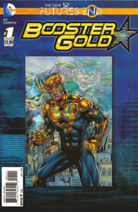
Futures End: Booster Gold #1 [Review]

Futures End Booster Gold #1Pressure Point

Written by: Dan Jurgens
Art by: Moritat, Dan Jurgens, Norm Rapmund, Will Conrad, Steve Lightle, Stephen Thopson, Mark Irwin, Ron Frenz, Scott Hanna, Brett Booth, Norm Rapmund
Colors by: John Kalisz
Letters by: Taylor Esposito
Cover by: Jurgens, Rapmund & Hi-FI
Editor: Joe Cavalieri
Asst. Editor: David Pina
Group Editor: Matt Idelson
Published by: DC Comics
Cover Price: $3.99

[———- Please note: I will spoil this issue’s ending below, denoted by a further note. ———-]

I wasn’t going to cover any of these Futures End one-shots as a singular/full review, but then, that was partially due to the fact that all these others have just been the month’s iteration of an ongoing monthly book. But to the best of my knowledge, Booster Gold has not had an ongoing series since that final issue that tied into Flashpoint pre-New 52; and I haven’t a clue where he wound up via Justice League International and whatnot.

But knowing his creator–Dan Jurgens–was the writer on this issue in that way alone made it a no-brainer for me to pick this up, once I’d given in on getting ANY of these one-shots. I wasn’t sure what to expect of the issue and hadn’t seen anything for it in promotional stuff outside of the title itself. So seeing the cover was a thrill–this is definitely one of my favorite covers of the month. I’ve always loved the blue-and-gold contrast…the pairing of Booster and the Ted Kord Blue Beetle as well as simply the contrast of the two colors against each other. That makes for a striking cover. It’s also great to see the same title logo used as the last ongoing series…it lends an extra bit of recent-nostalgic familiarity to this.

As this isn’t just the month’s “five years later” glimpse of an ongoing character/series, we actually get a look at a Booster bouncing through time/dimensions trying to remember a mission, as we see Booster imprisoned, being interrogated for something…and eventually see that rather than some disjointed story there’s more going on than it seemed initially…and certainly gives me a “selling point” to catch up on and keep up with Futures End.

I was initially put off looking at the issue’s credits seeing a number of artists credited with ranges of pages…couldn’t one person (say, Dan Jurgens himself) do the entire issue? But I almost immediately realized then that hey…multiple worlds/dimensions…different artists lend some variance to the worlds, and contrary to my initial snap-judgment, I quite enjoyed that element here.
Booster himself looked familiar, yet there was something a bit different to the character that I couldn’t place…I vaguely recalled that he’d had a “new” costume in the New 52, so I wasn’t sure where this fit. Thankfully, that actually worked with the story.

After all these years, I really enjoy seeing Jurgens work on the character–particularly the story, but the art as well. There’s also that Booster Gold is one where time-travel is an intrinsic part of the character himself…which adds to the logic of this issue’s existence. Even if the character does not have an ongoing and may or may not (for my ignorance) be a regular part of any ensemble cast of an ongoing book–for anything involving time travel, I’d expect him to be a part of it in some form.

[——————————— Spoilers below ———————————]

By the end of this issue it became apparent that this was not a matter of Booster being imprisoned and the bouncing-through-time-and-worlds-and-dimensions being merely a mind-thing with someone screwing with him to convince him to give up a secret. We’re actually dealing with the New 52 Booster Gold as well as another version…and it seems to me that this other version is either THE pre-52 version or darned close to it. I don’t know where DC officially stands anymore on stuff, but this “hint” that the DC Universe *I* grew up on is still out there is a welcome treat, whether isolated to this title, this issue alone, or something bigger.

[——————————— Spoilers above ———————————]

All in all, like the Swamp Thing issue and the Supergirl issue, I ultimately found this to be an issue independently interesting and engaging (particularly by the ending and the “new view” of the earlier pages it generated for me), and very well worthwhile to have bought and read.

The “hope,” the potential weightiness of this single, short issue’s story…the possibility that I’ve just read a new Dan Jurgens story involving “my” Booster Gold…the attractive cover, the sturdiness of the physical cover…this all lends to the issue justifying itself and the $3.99 cover price (at least in this modern age of lesser-quality physical products for the price). Very definitely one of THE best issues of the month, and one I’d certainly recommend–whether the 3D edition or the standard cover edition.

%d bloggers like this: