• January 2026
    S M T W T F S
     123
    45678910
    11121314151617
    18192021222324
    25262728293031
  • On Facebook

  • Archives

  • Categories

  • Comic Blog Elite

    Comic Blogs - BlogCatalog Blog Directory

Captain America: Reborn #6 [Review]

By: Ed Brubaker, Bryan Hitch and Butch Guice
Colors: Paul Mounts
Leters: VC’s Joe Caramagna
Designer: Rian Hughes
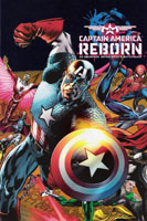
Covers: Hitch and Mounts; John Cassaday and Laura Martin; Joe Quesada, Danny Miki and Richard Isanove
Assoc. Editor: Lauren Sankovitch
Editor: Tom Brevoort

Before I read a single page of this issue, I was impressed by a stark difference I’m entirely unused to. This issue–at least, for the version of the cover that I bought, keeping with the visual style of the covers I’ve chosen since issue #1–sports not only a wrap-around cover, but a gatefold as well. That is, we have a 3-“panel” cover that folds out to the width of 3 comic covers, as a single, large image. Meanwhile, the latest Justice League of America issue from DC features HALF of a two-panel image as each of two different editions of the same exact issue. I dislike variants, but have a much easier time tolerating them when each is at least its own complete image. And the “build-an-image” motif where covers connect to form a larger image is cool, so long as it is multiple different issues–whether consecutive issues of a series/mini-series, or of a crossover/story arc.

Picking up where the previous issue left off, this issue finds Steve Rogers in his Captain America uniform, his body in control of the Red Skull’s consciousness, ready to murder his old partner Bucky, now the current Captain America. Meanwhile, a number of friends/allies fight for not only the rescue of Steve but also of those who have become entwined with the Red Skull and his machinations. Steve battles for control of his body, and unsurprisingly (especially given the title of this series) Steve wins out, the Skull is dispatched, and Steve is left–stable and no longer being bounced throughout his own history–in the present, to deal with a world in which he’s been absent and missed the Secret Invasion and most of Osborne’s Dark Reign.

The art on this book is high quality stuff. While it’s not perfect or anything, It really brings a lot to the story, enhancing the story and never particularly distracting from the reading experience. There are a couple of “iconic” full-page shots that were a little distracting as a result (in a good way, though). Despite the distraction–of noting the enormity of the moments depicted–they were a couple of my favorite moments of the entire issue. One shows Steve and Bucky rushing into battle side-by-side…two Captain Americas existing side-by-side. The other is Steve leaping into the fray, shield raised, the sunlight glinting off it, as many of the characters realize that THEIR Captain America is back.

While I tend to enjoy Brubaker‘s writing, this issue seemed so anticlimactic as to lack any real enjoyment for me. The enjoyment I found was in the art, in those images mentioned above. It doesn’t help that there wasn’t much to “wonder” about in this series. The title itself gave away the ending: Captain America would be reborn…and as we’d pretty much JUST wrapped up an 18-month mega-arc introducing a NEW Captain America into things (Bucky’s transformation from enemy agent to Shield-bearer)…it was pretty darned obvious. This issue in particular was spoiled by the fact that its first “epilogue” shipped some 4-5 weeks ago. Why that couldn’t have simply been held is beyond me–but it gave us an issue of Steve obviously back, obviously no longer bouncing through time, obviously alive, and Bucky alive as well. All that was left was the exact, specific details as to how things would wrap up.

If you’ve been following the series so far, it’s worthwhile to snag this issue to wrap up and such. Otherwise, wait for the collected edition–which will HOPEFULLY contain not only this 6-issue mini, but BOTH epilogues: Who Will Wield the Shield? and Who Will Not Wield the Shield?

Story: 5/10
Art: 8/10
Overall: 6.5/10

So sick of Variants!

Edited to add: a previous rant/example of this topic.

I was rather excited to realize that the new ONGOING Incredibles series would have its first issue out today.  At the comic store, it was the first thing I looked for…lo ‘n behold, there was one single copy of the issue left, so I grabbed it right up.

But something looked just a bit “off” by it.  It’s a first issue.  It’s THE INCREDIBLES.  But…it ONLY showed Mr. Incredible himself, and Dash.  What about his wife, daughter, and the baby?!? Then I noticed two hands on the cover, coming from off-panel…flipped the book over hoping, Hoping, HOPING it was a wrap-around…but no such luck.  Finally, noticed in small type “Cover B” on the cover, and with disgust, I put the book back on the shelf.

I was so actively disgusted that I texted this to my Twitter feed before I turned the car on to leave:

Boom just lost me on The Incredibles…on principle. Variants by splitting 1 image to 2+ covers of the SAME issue is NOT cute.

Now, taking one image and splitting it into two, each being the cover to issues 1 & 2 respectively…THAT”s not my ideal, but I’m ok with that. Buy issue 1, buy issue 2….ooooh! look! A bigger image!

But for one to have to buy MULTIPLE COPIES of the SAME ISSUE just to get a FULL IMAGE is ridiculous! And this isn’t the first case of something like this zapping my interest in something on principle…there were a couple issues of Justice League, and even Justice Society that had this stunt pulled.  The current Justice League: Cry for Justice did this.  Heck, the Incredibles’ own 4-issue mini-series that I was ALSO stoked for had this stunt with ITS first issue, which I thus refused to buy.

It’s frustrating ENOUGH to have variants AT ALL…but at least even the fairly common 50/50 variants are full images. (There WAS the case of New Avengers 1-6 having variants that when put together formed a single image–but the “poster variants” were ratioed variants (1:6 or 1:10 or 1:25 or such) which was an issue all its own).

I’ve read reviews of The Incredibles’ comics by reviewers whose opinions I not only trust, but they’ve turned me on to a NUMBER of comics/books/films through the years who have offered glowing reviews of these comics.

And I want to like ’em, want to support ’em as single issues…stuff enjoyable for adults yet appropriate for kids.

But these variants?

It’s a principle.

I won’t support this practice. And by not getting the first issue, I won’t be getting the 2nd issue. And so on.

Bleh.

Tomorrow: should have several new reviews up; tentatively Deadpool #16, World of New Krypton #8[at cX], Haunt #1, and Batman & Robin #5 [at cX].

Randomish thoughts

– I’ve passed on buying the Cry for Justice JLA mini-series partially for the cover price…but mostly because I am So. Freaking. Frustrated. with the FREQUENT use of splitting singular images across multiple covers…of the same stupid ISSUE. Make issues 1-2 go together for a single image. Spread an image across issues 1-3.  Spread an image across chapters 1-2, or chapters 1-3, or however many “panels” the image is made of. But darnit, DC…quit doing it across multiple single-panel/front-covers of the same issue!

– I’ve lost track of all the Marvel comics that I have passed on due to the $3.99 price.  Marvel, I assume you’re making plenty of money to cover for what I’m NOT buying. But I’ve been tempted a lot of times by random Marvel issues–whether Dark Wolverine #75 for a couple reviews I read, issues of Old Man Logan where I’ve contemplated picking up all the issues available so far, or any of a number of one-shots when I just want to add an extra comic to my stack or whatever. But I always put the issue(s) back or neglect to touch them when I realize/recall that hey…they’re $3.99, and that’s TOO MUCH in my mind for a standard (Marvel) comic.

– I’ve passed on the single issues of Astro City: Dark Age this time around…though I was sorely tempted to snag issues 2-3 this week just because they were there.  But they’re $3.99 and I see no point to the cardstock covers…just give me a paper cover and newsprint interior so I can read the darned story…save the high-quality cover stock and paper for the collected volumes!

– I’m debating whether or not to “pre-order” a “subscription” to the upcoming “Archie gets married” arc kicking off with Archie #600.  Saw an ad on facebook–one that was PROPERLY targeted (I’ve clicked on more comic-related and new-books-related ads than I have anything else–wish they’d get the hint and stick to those instead of the assinine personals/etc. ads!). Probably going to opt for the singles, provided I can find ’em. Missed on the Freshman Year arc because no one ever had the 1st issue of the arc, or a middle issue was missing (i’m NOT going to buy parts 2 and 4-5 without 1 and 3 at the same time, for example). If it was chapters 1-4 or 2-5, I might go for it and hunt the missing chapter as a single.

Trinity #52 cover is how it SHOULD be done

Over at DC’s blog, The Source, there’s a sneak-peek at the cover to Trinity #52. Apparently, this triple-sized cover will be a “gatefold” image–that is, the front and back covers, and an extra panel folding in at the front–will open up to reveal this FULL image, all on the single issue.

WHY this couldn’t be done with Justice Society of America #26 (also a 3-panel image) is BEYOND me…and is incredibly annoying.  (More annoying still when DC–or any other company, for that matter–puts out a TWO-panel image as two separate covers, rather than as a non-gatefold wrap-around!)

I don’t mind so much if, say, 3+ covers for DIFFERENT issues can all be placed together as a single image–but breaking the image up into multiple covers for the exact same issue is something I call shenanigans on.