• June 2014
    S M T W T F S
    1234567
    891011121314
    15161718192021
    22232425262728
    2930  
  • On Facebook

  • Archives

  • Categories

  • Comic Blog Elite

    Comic Blogs - BlogCatalog Blog Directory

Superman (2011) #32 [Review]

Superman #32

Men of Tomorrow – Chapter One: Ulysses

Writer: Geoff Johns
Penciller: John Romita Jr.
Inker: Klaus Janson
Colorist: Laura Martin
Lettering: Sal Cipriano
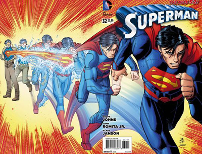
Cover: Romita Jr., Janson, Martin
Published by: DC Comics
Cover Price: $3.99

I wasn’t going to buy this issue. I’d been annoyed by the ads the last couple months, and wasn’t a fan of the art from previews…to say nothing of being annoyed AT the previews themselves (having never been a particular fan of the 5-page or so previews masquerading as chosen content in any given issue).

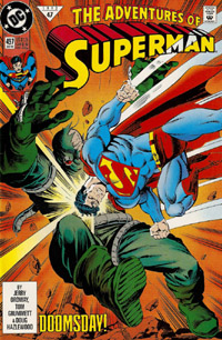
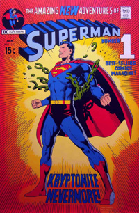
But at the shop, the coloring of the cover caught my attention: It’s not an image I recognized from the ads (the ads’ image I’d thought for SURE was the COVER IMAGE for this given its use all over the place!). While I’m not a fan of the linework, the image caught me–the red of the cape, the blue of the main suit, and maybe all the more, the orange and yellow background. It’s reminiscent of two VERY familiar covers in my mind: the Kryptonite Nevermore issue, and Adventures of Superman #497 from 1992.

Where usually the cover and art are not the primary influencing factor in my buying a comic, in this case, it definitely “sold” me on at least this issue alone.
I also quite like the fact that the visual style fits the interior; it sometimes feels like the covers can be a distinctly different thing, giving one impression while the interior is a completely different visual style.
I recall liking Romita‘s art some 12/13 years ago on Amazing Spider-Man, JMS‘ run, but as I’d noticed from the previews and now having been through the actual issue, I’m not terribly thrilled with the style with Superman. It’s certainly not bad–and loads better than anything I could ever dream of being able to draw myself–just that for this first issue it doesn’t fit with my preferred visual take on Superman (a la Dan Jurgens, Jim Lee, Ed Benes, to name a few). The art certainly does its job…I’m never really left wondering what’s going on, and there’s nothing that jars me out of the story scratching my head at anatomy or some other quirks that different artists’ styles sometimes have done to me. If you’re a fan of Romita‘s style, this would seem to be a solid example of that, except it’s with DC characters instead of Marvel.

While Janson‘s name sticks out quite a bit to me, I’m honestly not one that particularly consciously notices inking–linework tends to go together as one thing, with the penciller getting much of the credit. In this case, given just how recognizeable the art is to me as Romita’s style, I’d say the inking maintains the style, complimenting it quite well…it certainly doesn’t detract in any way I notice.

If I’m correctly recalling, the last time Johns came onto a Superman book was in Action Comics, beginning the Last Son arc with Donner, and I was none too thrilled with elements reintroduced to the Superman story during that run. I was also not all that thrilled with the Secret Origin arc and what THAT reintroduced.
However, this is an entirely different DC universe, an entirely different Superman, and as such, I’m along for the ride and whatever elements are brought in. I’ve not been particularly invested in the New 52 Superman, at this point having read barely 1/3 of the run.
Johns introduces us to Ulysses, a boy sent from his dying world by his parents to another place in the hopes that he would live…an origin quite parallel to that of Kal-El. Years later, Superman takes down Titano, a giant (mechanical) ape troubling Metropolis. Not long after, we spend some time at the Planet with Perry, Jimmy, and a visiting Clark. Perry offers to bring Kent back in, and offers a bit of a ‘speech’ that will surely impact the young reporter/blogger/super-hero. A new threat hits the city, and though Superman intervenes, it takes the intervention of a new  figure to temporarily resolve the issue, as the man believing himself to be the Last Son of Earth discovers he’s not nearly as alone as he’d thought.
Frankly, I don’t want to be interested. I don’t want another $3.99 book on my slate each month, especially with the title being what seems to me arbitrarily bumped to the higher price, when Superman started as a $2.99 book and Action Comics was the $3.99 book.
But Johns has done it–I’m interested in spite of myself. I may not be enthused with the art, but the story more than makes up for it. I haven’t a clue how LONG Johns will be on the book, and this strikes me as likely “graphic novel” fodder (without getting much into the issue of stories “written for the trade”) so it remains to be seen if I pick up the next issue.
I’m not ready to add this to my pull list by any means…but I’m not disappointed in having spent the $3.99 that I did, I’m interested in what comes next within the story, and it’s highly likely that if I don’t pick up the rest of this arc in single-issue format I’ll definitely look at picking up the inevitable hardback.

adventuresofsuperman497      superman233

superman0032

Bargain Bin Haul: Kid Eternity

Flipping through the quarter-bin today, I found two volumes of the Grant Morrison Kid Eternity mini-series. A bit furtrher into the bin, I found the third. I thought I was missing a fourth until I saw the “of 3” and satisfied, pulled all three.

kideternity1to3

I didn’t even notice until I got the issues home and was taking the photo seen above that the three covers form a singular image. Definitely an added “bonus” of sorts. This is ALSO the way such things SHOULD be done, in my opinion–any multi-part non-wrap-around cover image should be DIFFERENT ISSUES, not multiple variants of the SAME issue. But then, these were published some 23 years ago, before all that cropped up.

kideternity1to16

Along with the original mini, I also found the full 16-issue run of the Vertigo ongoing series. The first issue of this is the first Vertigo comic I remember ever being “aware of” AS Vertigo, as an “adult” or “mature readers” comic.

And while I almost left these in the bin, I figured 16 issues was a pretty good chunk of the series. Come to realize looking in the back of #16 that it was the series finale, thus giving me the full series.

This entire run cost me $4.75…hardly more than a Marvel, and cheaper than the cover price of one of the Morrison issues, even all these years later.

More Than Doubling my GI Joe Collection

full_stackThough I had limited exposure as a younger kid, I consider my true “introduction” to GI Joe to be the Image/Devil’s Due relaunch back in 2001 (as a friend pointed out, it was interesting timing, debuting September 12th, 2001).

Even letting the series go after a few issues, I got pulled back in for the Serpentor story around issues 22-25, and stuck around as Devil’s Due struck out on its own, its logo replacing the Image “I” on the covers. I was going to let it go again, but my friend suckered me with a copy of GI Joe: Master & Apprentice #1, and I was hooked through into the early few issues of America’s Elite before I did trail off.

I dabbled with jumping back in when the license moved to IDW (though I was rather irked at “losing” the Devil’s Due continuity and the property “starting over”). Of course, my aversion to $3.99-priced books led to my refusing to follow MULTIPLE ongoing series, and I lapsed.

Interesting as things seemed to be from “watching from the outside,” I just couldn’t talk myself into the investment, thinking “someday” I might get the paperbacks…but IDW‘s pricing on their paperback volumes rivals Marvel‘s these days in the “excessive pricing” area, so I’ve stuck to bargain bin finds.

I hit the figurative “jackpot” this week.

day1_old_joes

I decided to flip through some issues in the bargain bin, despite a heavy week of “regular” new comics, and noticed a number of GI Joe comics, and figured hey, why not? Maybe I’d find a small run, a full story.

day1_misc01

After a handful of scattered issues, I noticed a bunch of issues of the GI Joe: A Real American Hero (ARAH) series (that continues the numbering from the classic Marvel series).

day1_arah01

As I was pulling these, the owner–still sorting through a collection–said something about maybe finding someone interested in all the GI Joe comics, which caught my attention…as if my mind had been read.

day1_arah02

So I wound up with most of the issues of ARAH from #162-190 or so…

day1_gijoe

Most of the first year of the GI Joe relaunch from Cobra Civil War…

day1_snakeeyes

Most of the first year of the Snake-Eyes series…

day1_cobra

And most of the first year of the Cobra series from Cobra Civil War including the 2012 Annual.

day2_arah

Given my interest in them, the rest of the GI Joe comics from the collection were held for me, and I picked them up Thursday. A scattering of ARAH issues, that filled in what I was missing, giving me a run of #162-191 (30 issues).

day2_gijoe

What turned out to be the latter half of the GI Joe run from the Cobra Civil War era, giving me a full run of #s 0-21.

day2_snakeeyes

The latter half of Snake-Eyes, which co-starred Storm Shadow for most of the latter issues, giving me a complete run of #s 1-21.

day2_cobra

And the latter half of Cobra, for a complete run of #s 1-21.

day2_misc1

I also wound up with both of the Infestation 2: GI Joe issues, a couple of the “classic” Image/Devil’s Due series, and the GI Joe: Retaliation Prequel, as well as early issues of the next relaunch of the franchise post-Cobra Civil War era…

day2_misc2

GI Joe #s 1-3 or so; GI Joe Special Missions #s 1-4 or so, and the first couple issues of GI Joe: Cobra Files.

full_stack

All told, just over 100 GI Joe comics–over $399.00 cover price–for just over $26. That’s less than the price of two PAPERBACK collections from IDW (or for that matter, Marvel).

Not a bad haul, and now I’m truly interested in the earlier issues of the pre-Cobra Civil War books, and might consider picking up the more current stuff. Of course, time will tell in the end…

TMNT: Turtles in Time #1 [Review]

tmntturtlesintime001Turtles in Time (part 1)

Writer: Paul Allor
Artist: Ross Campbell
Colorist: Bill Crabtree
Letterer: Shawn Lee
Editor: Bobby Curnow
Published by: IDW
Cover Price: $3.99

Two TMNT comics in one week? I’m not a fan of the $3.99 being doubled-up in the single week, but it IS TMNT, and this is a fun issue, so I’m not about to complain about “more TMNT” than less!

We pick up with the turtles randomly running from dinosaurs and utroms–either on prehistoric Earth or a planet much like it. The group is quickly split, with Raph captured by utroms, and the others chased off by the dinosaurs. As Raph recruits a baby Triceratops (he’s named her “Pepperoni”), the others mount a rescue operation that doesn’t go too badly…until the utrom military arrives. The turtles get some clue as to what’s going on when Renet shows up, but she’s not as helpful as she could be. Finally, the utroms’ military leader sees potential in what’s to be found on this world.

Visually, the Peterson cover is awesome…even if it is a bit misleading. It was rather jarring to go from that beautiful cover to the interior, which is a much different style. That gave me a bit of pause, and it took several pages to “adjust” but once I did, I quite liked the interior art as well. Though This is presumably set within current IDWTMNT-verse continuity, their was something to the look that struck me as being almost more like the current animated series than the ongoing IDW book.

There’s a blurb on the inside of the cover explaining that this series takes place after the 2014 Annual, but that Annual is not yet out. Perhaps that’d be a bigger deal to me on other stuff, but for the TMNT, it doesn’t bother me too much. The “spin” of it being a “time malfunction” is just cutesy enough to be amusing, and could loosely be seen as a bit of “augmented reality” or whatever buzzword folks want to use for trying to immerse a reader in stuff related to the issue.

Story-wise, this actually ALMOST functions as a sort of one-shot. We’re as readers already thrown off a bit by being tossed into the middle of a situation-in-progress, and we end on a similar note in such a way that it sort of brings things full circle, even though the story whole is continuing into the next issue.

I like the characterization, particularly Mikey and Raph in this issue. I “heard” the voice of the current animated series’ Mikey in this, and chuckled at an amusing bit where an utrom unknowingly repeats something Mikey did, allowing readers to make an assumption as to what happened off-panel.

I don’t recall seeing any solicitation info or any blurbs in the back of any TMNT issues I’ve read mentioning this series, so its appearance this week was a pleasant surprise and definite “treat.” While it seems this story will spin out of the upcoming TMNT 2014 Annual, there’s certainly enough in-story context to bring one up to speed on what matters to the current story. Really, other than involving utroms and a mention of Krang this seems to sit alone quite well, not contradicting anything in continuity but not drawing from any specific moment in the ongoing series…so it’s well worth jumping in on this mini-series at least, even if you’re not following the ongoing in particular. And if you do follow the ongoing, this is a fun side-adventure that’s an enjoyable read…whether or not it plays much into the ongoing book.

Highly recommended!

Let’s Try This Again: New Line of DC Toys

Total_Heroes_June_16th

Back in 2008, I got in “at the beginning” of Mattel’s Infinite Heroes line of 3.75″ DC toys. Sadly, lack of selection and other factors seemed to quickly doom that line (whereas the Marvel 3.75″ figures from another company are doing quite well, or at least are still around with a much more significant presence than DC stuff).

Several weeks ago, I happend across this new line of DC character figures for quite a great price: larger than the 3.75″ figures, but still “only” $9.99. I wound up buying the three that I’ve found thus far: Batman, Superman, and Sinestro. I look forward to finding Flash, Green Lantern (Hal Jordan), and Aquaman…as well as hopefully plenty of other DC characters.

Total_Heroes_Batman_Front

Total_Heroes_Superman_Front

Total_Heroes_Sinestro_Front

While VERY basic, I do appreciate the cards being unique to the figures, including a brief/minimal profile:

Total_Heroes_Batman_Profile

Total_Heroes_Superman_Profile

Total_Heroes_Sinestro_Profile

And I know of the existence of Flash, Green Lantern, and Aquaman because of the gallery on the figures’ cards:

Total_Heroes_More_01

Total_Heroes_More_02

Total_Heroes_More_03

Here’s hoping the other characters come out relatively quickly without shortpacking, and without any single character becoming a “peg warmer” and all that. I’m in at the beginning for now–give me a steady pace of figures that I can get for $9.99 at Warlmart/Target/Meijer, and I’ll probably keep buying…

Great Find: ‘The Batman Vault’

I’d come across this volume at Barnes & Noble quite unexpectedly. It was on a bargain table labeled as “up to 75% off publishers’ prices.” For the price of 3-4 single issues, this is a $50 volume, and though it’s rather outdated (2009 copyright), it has proved its worth alone in the time I spent unwrapping and “flipping through” the thing.

batmanvaultfrontcover

While it hasn’t always been reflected in my following the character in contemporary comics–having left off partway into the post-R.I.P. Red Robin run and only stuck with the New 52 Teen Titans for a couple issues–Robin is arguably one of my favorite characters in comics (well, the Tim Drake / Robin III version). It was actually the “promise” of the inclusion of a promo piece from the early Tim Drake solo stuff that truly “sold” me on this volume. Not intending to spend a lengthy time reading initially, I paged through, but really look forward to “digging in” on the Robin section.

batmanvaultrobinpage

The volume includes a number of these archival pocket pages (right-hand side above) with removable “artifacts,” from that piece to a DC promotional mobile sent to comic shops to replicated brochures, booklets, and so on…even a reprint of the “infamous” Batcave “poster” from an issue of All-Star Batman and Robin…something I never got to hold, having never bought the issue in question (that I can recall).

batmanvaultbackcover

Though a lot of the general info is “old news” to me, it’s interesting to see such a broad overview of Batman’s history (to 2009) encompassed in a single publication. As of this typing (though it probably won’t actually translate to purchases) I’m considering tracking down some of the DK volumes, as this reminded me a lot of what I’ve seen from a couple of those when I’ve flipped through them in stores or a library.

I don’t know if there’s a Superman volume like this–if there is, I’ll certainly be on the hunt–but in the middle of the 75th anniversary year of Batman, this was far too great an opportunity to have passed up, and I’m quite glad to have spent the money.

Armor Hunters #1 [Review]

armorhunters001regArmor Hunters / Part I: Quarry

Writer: Robert Venditti
Artist: Doug Braithwaite
Colorist: Laura Martin
Letterer: Dave Sharpe
Cover Artists: Jorge Molina, Clayton Crain, Trevor Hairsine, Doug Braithwaite
Assistant Editor: Josh Johns
Editor: Warren Simons
Published by: Valiant
Cover Price: $3.99 ($5.99 Chromium Cover)

It’s definitely safe to say that this is an issue I’ve been looking forward to specifically for quite a few weeks now. Valiant‘s done a great job with “pushing” their titles, and as someone who’s already “all-in” for present, an event like this is well-suited for me. Though I believe the “main” story will be contained to this 4-issue mini-series, there are some tie-ins with X-O Manowar and Unity, as well as several tie-in mini-series. As the opening/first chapter in the event itself, this issue stands alone fairly well while sitting in the midst of established continuity.

This issue opens with an attack on a Russian facility where suits of armor are being developed in as-close-as-possible approximation to Aric’s X-O armor. The aliens attack the base, killing those within, having located the place due to the armors. While no sentience is detected, the armors are destroyed, and the aliens left baffled as to why humans would seek to duplicate such dangerous things. After this attack, Aric finds his people’s new homeland invaded by US forces–though said forces claim to be there to protect them, not to invade. Aric is brought up to speed from the US forces’ side, and seeks further counsel from Malgam (the alien he fought in the Armor Hunters Prelude in X-O Manowar #s 23-24). The alien “hunters” then unleash an attack that leaves little doubt as to their power, and the devastation possible on Earth if the X-O armor is not turned over to them.

As said, this issue sits in the midst of estabished continuity–particularly in references to goings-on in the X-O Manowar title. While readers of that title will have a fuller appreciation of Aric’s attitude and and what led to the present status quo, reading this issue by itself one is simply presented WITh the present status quo. Said status quo can be accepted at face value, but those interested in more can seek out the earlier stories to get the details.

By and large, this issue reads like an issue of X-O Manowar (which makes sense, given Venditti is the writer on both). The aliens are presented as the antagonists, yet don’t come off entirely as ‘villains’–moreso they come off as a “Federation” with no “Prime Directive” and no qualms about razing planets to make sure the apparently sentient armors are eradicated. The characterization seems consistent with the X-O Manowar title, and I have no issues with the story so far as “merely” the opening chapter.

Visually, I don’t have much to say except that I really enjoyed the issue, and nothing to the art really put me off or distracted me from the story. I know Braithwaite‘s art from Unity at the least, which adds to the consistent familiarity of the issue’s look/feel. I like the aliens’ design–they look suitably alien, while also being distinct individuals.

While this issue in and of itself doesn’t seem to justify the huge crossover, its ending does show how the crossover works quite organically as the impact of the issue is not limited to a single facility or base and truly will affect the entire planet.

Though one could presumably “jump in blind” with this issue and reasonably follow stuff, the full enjoyment (at least for me) of the issue comes from its growth out of continuity.

As there are a couple covers/editions, I recommend sticking with the standard cover…I was not suitably impressed at the “enhanced” “chromium” cover, finding it did not have the same boldness of the classic ’90s Valiant Chromium covers.

If you’re reading X-O Manowar, this definitely works as an extension of the title. It’s also worth picking up if you’re planning to follow any of the tie-in minis to get what I imagine will be the larger/broader context. And if you’re just looking for a mini-series to “dabble” in Valiant, this is also worthwhile on the whole.

Valiant Chromium Returns: Armor Hunters #1

It’s been some twenty years since I first got a copy of the original X-O Manowar #0 from the original Valiant. It was the first “chromium” cover I recall, though it was soon followed by the likes of Superman #82 (the “return” of Superman), X-Men: Alpha, X-Men: Omega, Ninjak #1, and others.

In more recent years, such “enhanced covers” have been pretty few and far between, in my observation (though can’t go two steps without tripping over variants!). [EDITED TO ADD: Last September’s 3-D covers from DC obviously were a huge quantity of such covers, but that was a specific event and really beside the point of this post]

When Valiant announced it was bringing back the chromium covers for Armor Hunters #1 and several of the tie-ins…I was actually sorta enthused (QUITE the exception to my usual attitude toward variants and such). But then, these chromium covers hold a certain nostalgia for me beyond all the other gimmicky/”enhanced” covers.

both_armor_hunters_covers

Unfortunately, I found myself rather disappointed in this particular version of “chromium.” Taken side-by-side, I feel like there’s clearer detail on the regular cover (pictured above on the right).

compare01

Comparing this new Armor Hunters #1 to X-O Manowar #0, I feel like the classic takes the win as well, between the two with brighter, bolder detail and coloring. Granted, that may not be so much the fault of the chromium effect, but it’s there.

compare02

At an angle, the new seems more reflective, picking up glare from an overhead light in a way that somewhat obscures details where the old does not…

…to say nothing of the imprinting showing through on the new where it doesn’t the old.

ah01shiny

Armor Hunters #1–at an angle in the light–gets this dotted, sparkly effect going on.

xo00shiny

At the same sort of angle, X-O Manowar #0 does not give that effect.

To me, part of what made chromium covers what they are was being able to see the outlines on the inside/back of the cover. Armor Hunters does have that effect, so unlike Marvel‘s Age of Ultron #1 last year, I can’t really “disqualify” it from my own personal “chromium collection.” But the muted coloring/subdued tones, the “flat” reflectiveness, and the thicker cover stock of Armor Hunters leaves me truly disappointed, and planning on sticking with the regular covers from here on out.

A New Gundam Phase Begun

oldgundams11-some years ago (my senior year of college) several friends and I would meet up pretty much weekly for Friday dinner and a trip to at least one of three local game/toy stores. Toward the latter part of spring semester, we found a deal on a couple basic Gundam models for about $2/ea. So thoroughly enjoying putting them together, I bought a couple more expensive ones (the $2 bait models worked, apparently), and eventually tracked down a couple more that I assembled that summer after graduation.

Those fell by the wayside, though, until this year. A few weeks ago I came across a couple models at a Barnes & Noble that caught my eye. A couple weeks later at another B&N I saw another, and seeing them triggered something for me.

A couple weeks ago I decided I was going to try another model, so I went to JC’s, knowing he had a much better assortment of models than B&N. Looking through them, I found one that I thought looked cool (and by “looked cool” I mean “basis of choosing which one to buy”) and bought that.

shenlonggundam_box

Of course, while I recalled all the tiny bits ‘n pieces, I’d forgotten just how many…though I believe this one’s one of the larger models I’ve (yet) assembled.

shenlonggundam_pieces

I spent awhile one weekend getting the legs assembled; spent time over a couple lunch breaks at work with further assembly, and then this past weekend finally finished assembling the thing.

shenlonggundam_assembled

And somewhat predictably, I’m rather eager to get another to assemble…though I’m forcing myself to wait til my next payday and when I’m more likely to actually have and take the time to put one together, rather than the immediate gratification of buying one “now” but then not even starting assembly for another week or two.

Rise of the Magi #s 0 & 1 [Review]

riseofthemagi001Writer: Marc Silvestri
Artists: Sumeyye Kesgin & Marc Silvestri
Colorist: Betsy Gonia (#0 – Jasen Smith)
Letterer: Troy Peteri
Editor: Betsy Gonia
Art Assists: Bridget Silvestri
Cover: Marc Silvestri & Betsy Gonia (#0 – Silvestri & Andy Troy
Published by: Image/Top Cow
Cover Price: $3.50 (#0 – Free)

Rise of the Magi is one of the Free Comic Book Day comics that seemed to jump out more than most…though at present whether that was internet “hype” or the logo and cover of the issue itself catching me, I’m not sure. I hadn’t gotten around to reading that issue, but saw the first issue of the series itself out this past week, so decided to give it a chance. (While not the $2.99 that anymore is a quick-sell for me, the 0-issue having been free and this first issue being $3.50 at least kept it under the frustrating $3.99 price point).

riseofthemagi000The 0-issue’s cover was a bit deceptive…I can’t quite put my finger on it, but it led me to believe the main character was going to have some sort of agenda against witches (and warlocks?) or otherwise be opposed to magic/etc. in general. However, the issue begins with a page of mostly text setting up the situation–all magic is contained in a small orb, and doing something to the orb would affect the entire universe. A boy whose brother is part of some sort of guard unit protecting the orb stumbles across a situation threatening the orb, leading into the #1 issue.

In Rise of the Magi #1, we get some further context of the magic orb, the Spellguard, and what’s going on that threatens the orb. As the threatening scenario plays out, the boy is drawn tightly into the situation, and ultimately thrust into a world he’s going to have to learn to operate in as the series moves forward.

Visually, I was more impressed with the first issue–brief as it was. The second issue had a bit of a jarring visual shift, though at least it came with a “chapter break” in the story rather than just shifting with no apparent rhyme or reason. Given this is not an “established property,” I have no visuals to compare it to–simply the archetypal fantasy setting given the primarily-fantasy setting of the story. That lack of comparison leaves the art to stand on its own, with no preconceived notions on my part with the specific characters. Given I’ve liked Silvestri‘s art in the past on X-Men stuff in particular, I had rather high expectations for this, but found myself a bit disappointed. The art was not bad, it just didn’t live up to whatever my expectations had set.

Story-wise, I found myself rather “iffy” partway into #1, figuring this to be “just another” fantasy thing, but the ending of the issue gave a bit of a twist to that…yet, it’s a twist that also feels like “just another” of its kind. The characters and specifics may be a bit different, but it’s definitely not the first such story I’ve seen/read of its kind, and I’m not entirely sure what to make of it.

I can’t say I’m exactly “impressed,” but to again use the passive: it’s not bad. If you like Silvestri or any of the other creators involved, it’s definitely worth taking a look. All in all, I think it’s safe to say that if I happen to notice the next issue I’ll pick it up, giving the series another issue to really hook me, but it doesn’t yet have me enough to want to put it on my pull list.

%d bloggers like this: