• January 2026
    S M T W T F S
     123
    45678910
    11121314151617
    18192021222324
    25262728293031
  • On Facebook

  • Archives

  • Categories

  • Comic Blog Elite

    Comic Blogs - BlogCatalog Blog Directory

The ’90s Revisited: Uncanny X-Men #325

uncannyxmen325Generation of Evil

Writer: Scott Lobdell
Penciler: Joe Madureira
Inkers: Townsend & Ryan
Colors: Steve Buccellato & Electric Crayon
Leters: Richard Starkings and Comicraft
Editor and Chief: Bob Harras
Published by: Marvel Comics
Cover Price: $2.95
Cover Date: October, 1995

This issue always throws me, just from the cover. This is from that period of time when Marvel apparently thought the covers’ numbers didn’t matter and would have the issue’s number in tiny print somewhere in the UPC box, at the bottom of the cover, rather than somewhere near the upper part with the cover logo. For this cover, they actually hide all of that–the title logo folded to the inside, and the UPC to the back cover, so all you have is Storm, Colossus, and Wolverine attacking someone off-panel, and a tiny banner at the top specifying this as a Special X-Men Anniversary Issue. (20th anniversary of the “All-New” X-Men from Giant-Size X-Men #1)

While the issue opens on the X-Men playing baseball, the bulk of the issue features a “return” of Morlocks, apparently in the wake of some of their number taking on the name “Gene Nation” or such and executing terrorist acts around the city. Leader of the Morlocks Callisto shows up and explains it’s the “younger generation” that feels the older has failed them, failed to act–and seeks to rectify the issue. This also brings up Storm’s “history” as a former leader of the Morlocks (having once challenged and beaten Callisto FOR said leadership), and what that means for her in the face of the current situation.

Story-wise this is a solid issue; nothing horrible about it to me; but nothing fantastic, either. However, having the baseball game is a great moment…the sort I recall truly enjoying in the X-books…just seeing the characters relax and not have to be fighting the villain of the month/issue…I’d probably thoroughly enjoy a full issue that’s nothing but the characters just being who they are, interacting with each other; no villains or any particular antagonist, period. I like that the issue is definitely set in continuity, dealing with the history of the Morlocks, as well as keeping several subplots moving (Gambit, and Rogue/Iceman).

Visually this is a mixed thing for me: the style is a bit cartoony at points and feels a bit “off” to my sensibilities with these characters, and yet it totally brings back (good) memories OF this era of X-Men comics, and works in that regard.

For an issue fished out of a 25-cent bin, certainly well worth the purchase and reading. There’s no funky foiling on this copy, so I think this is the “newsstand” edition where the original copy I bought when it came out new I’m pretty sure was the “direct edition” or otherwise had shiny-ness about it. (Which works for my interest in “converting” FROM shiny covers to standard/newsstand editions for my various “runs” of series). It’s also worth noting that these days, this would probably be at least 2-3 variant covers, rather than the 4-panel wrap-around/fold-out this actually carries.

Given the lengthy role Marrow (I believe) went on to play in the X-Books, this is a good jumping-on point to see where she comes from and (presumably) changes. All in all quite a high-quality bargain-bin purchase!

Valiant: Coming in August

I don’t like variant covers, I don’t like 5-5+ page “previews” of other comics in the backs of my books, I don’t like $3.99 as a price point, and I don’t like “clumping” or “clustering” of books.

But I’ve stuck with Valiant for over a year now, and despite some practices I don’t like, they do a lot right.

And one of the things I really like is that the backs of their comics keep me apprised as to what’s coming out when, showing cover imagery for the next month’s books.

I find this to be a rather attractive design, and as a person who is presently maintaining a pull list that includes “all Valiant single-issues,” informative. When–across the prior month–I see these images regularly, I know what I’m looking for when the issues DO come out, and there’s a certain familiarity that I like.

Though these can be a bit spoilery (at least in who’s gonna show up or survive), that familiarity means when I get to a new issue, the cover’s not a surprise, but I don’t have to have read solicitation text for it, either. And sometimes I find myself guessing at what’s going to be going on in an issue or otherwise just looking forward to it because of the cover imagery.

valiant-coming-in-august

For example, that Bloodshot image looks very interesting, I like the coloring, and I’ve got time between these back covers and the inserted checklists that’ve been coming with some issues (whether packed that way or the comic shop tucking them in, I’m not sure) to come to really associate that Bloodshot image with the #0 issue, which goes a way toward making it somewhat “iconic” without being some chromium/foil-enhanced anything.

I also find myself quite amused lately at the Archer & Armstrong covers, as they seem to carry a certain sort of “humor” to them, given what we know of the characters, and that alone adds a little extra something to the title. Seeing the image so small, I look forward to the “full size” cover, and it keeps me wondering just how literal the cover may be–will that scene be in the book, or is it just drawn as a parallel to the book’s story?

And frankly, these collages “do” a lot more for me than any other ad on the back of a comic; sure, they’re not getting the outside advertising dollars for this house ad, but they gain a bit of good will from me as a reader, and set themselves apart from being “just” another Marvel or DC.

Infinity [Checklist]

AUGUST 2013
Infinity # 1
Avengers # 18
New Avengers # 9
Avengers Assemble # 18 [tie-in]
Captain Marvel # 15 [tie-in]
Thunderbolts # 14 [tie-in]

SEPTEMBER 2013
Infinity # 2
Infinity # 3
Avengers # 19
Avengers # 20
New Avengers # 10
Avengers Assemble # 19 [tie-in]
Captain Marvel # 16 [tie-in]
Infinity Heist # 1 [tie-in]
Infinity: The Hunt # 1 [tie-in]
Mighty Avengers # 1 [tie-in]
Nova # 8 [tie-in]
Superior Spider-Man Team-Up # 3 [tie-in]
Superior Spider-Man Team-Up # 4 [tie-in]
Thunderbolts # 15 [tie-in]

infinity_checklist_01a

infinity_checklist_01b

source: promotional postcard (pictured above)

Batman/Superman #1 [Review]

batmansuperman001Crossworld

Writer: Greg Pak
Artists: Jae Lee, Ben Oliver
Colors: June Chung, Daniel Brown
Letters: Rob Leigh
Cover: Jae Lee with June Chung
Associate Editor: Rickey Purdin
Group Editor: Eddie Berganza
Published by: DC Comics
Cover Price: $3.99

I bought this issue to meet a credit card minimum. Of everything on the “new” shelf, it was the only thing that really grabbed my attention for a one-shot purchase with potential. Other than setting this apart from the Loeb-launched Superman/Batman from a decade ago, I do find myself mildly curious as to any significance to the title, having Batman listed first. At least BOTH characters are spotlighted on the standard cover…you don’t have to track down two covers to get both title characters in one shot.

Unfortunately, it was a lot more disappointing than I expected. I’d avoided it on Wednesday–I just had zero interest in it from the start. ANOTHER “Superman meets Batman for the FIRST TIME” story. And that’s where it goes wrong; where I go wrong. I am absolutely NOT the “target audience” for this book: I’m bored and put-out by the New 52 at this point…and to ME, the “first meeting” between Superman and Batman happened “One Night in Gotham City” in the 1980s’ Man of Steel #3.

Leaving nostalgia and such aside, I have a real problem with a young Superman–Superboy???–being so…arrogant, angry, violent. To say nothing of the fact that I did read the first-ever New 52 issue, Justice League #1. And I’m recalling a scene in which Batman and Green Lantern talk about some alien in Metropolis, and meet Superman “for the first time.” So that makes this issue essentially a fairly big plothole to a casual such reader as myself.

Clark Kent visits Gotham, and realizes he really does not fit into this dark city. When he confronts some kids bullying another, he meets a drunk, stinking boy billionaire with more street sense than he’d’ve expected. Turns out Clark was looking for Bruce, to see what he knew of several Wayne employees murdered recently. The two part on neutral terms, neither impressed with the other. The murderer strikes again, and Batman leaps into the fray, surprised at the identity…before Superman busts in, throwing around violence and making a bad situation worse. Another entity joins the situation, and just makes things confusing…though that seems to set up what may be the plot for the next few issues.

Visually I’m not all that impressed…Lee‘s art is not particularly “up my alley,” it’s very stylized and just not what I would choose. Because it’s so…what it is, this feels like it ought to me some sort of Elseworlds book, or some intercompany crossover in the vein of these characters meeting the Aliens or Predators. I’ve never really cared for the jeans, t-shirt and cape get-up for Superman; the look is done no favors here, in my eyes. There’s also something to the way Lee depicts the “S” that bugs me–like it’s trying to be a mash-up of the overly-lined Man of Steel film logo and the more stylized Superman Returns film logo.

Lee‘s art gets the job done, though…even depicting the violence fairly disturbingly (something Lee‘s style does well with). So while it’s not my cup of tea and I have nitpicky issues, I won’t fault it too heavily in and of itself.

I don’t care for the art shift toward the end of the issue. It fits reasonably well given the shift in scenery and all–but I find myself wondering if this is an issue of timing or a planned function to serve the story itself (or just happened to work as it is).

The story itself roughly fits a fairly standard mold for these characters…the idea that while they come to work together when more seasoned at the whole “super-hero” thing, they clash in the early days of their careers is not new. What little I know of the New 52 incarnation of Superman kinda fits, though again I don’t like it much. Batman I’m less sure on–this Bruce Wayne sorta fits with Year One, and probably perfectly fits with the upcoming Zero Year stuff. Given Clark’s readiness to cut loose with his powers it’s sort of astonishing that he doesn’t (seem to) recognize Batman as a mortal man and “reveal” him or at least peek under the cowl with X-ray vision. (Then again, I realize I don’t know the origin of this version of Superman, so maybe he didn’t have access to that power yet).

All in all, I imagine that if you’re a fan of Jae Lee‘s art, of the New 52 early Superman, and/or Pak‘s writing, and have no particular “attachment” to ’80s/’90s Superman and Batman, you’ll probably enjoy this. You might have to overlook that this is yet another $3.99 book…but hey? $2.99 seems to be an exception rather than the rule, these days.

Captain Midnight #0 [Review]

captainmidnight000frontWritten by: Joshua Williamson
Art by: Victor Ibanez and Pere Perez
Colors by: Ego
Letters by: Nate Piekos of Blambot
Cover by: Raymond Swanland
Back Cover by: Steve Rude
Designer: David Nestelle
Editor: Jim Gibbons
Published by: Dark Horse Comics
Cover Price: $2.99

Captain Midnight #0 has a lot of things going for it.

First (and primarily, for me) it is only $2.99, but it’s a “full size” issue. Looks like a full issue, feels like a full issue, reads like a full issue.

Secondly, it has a really nice-looking cover that grabbed my attention in spite of myself. Often, the cover is not going to grab me–I’m solely looking for the TITLEs (which is how I often wind up with an UNwanted variant edition: I simply see a title logo and issue number, and it’s not til I’m home about to read that I realize it’s NOT the image I wanted.) Additionally, there’s ANOTHER full-cover image on the BACK of the issue: instead of being a whole separate EDITION to have too purchase to have, this cool image is included with the “standard” cover, but I still get to look at it, in-print, ON the issue I bought!

Thirdly, this is a #0, but not proclaimed on the cover to be “of ____” and so it more effectively stands alone–it’s not specifically saying that it’s the first issue of a mini-series. It may be a prologue, a foundation-stone, a beginning that sets up a mini-series or ongoing series, but in and of itself it’s just a single, one-shot stand-alone issue.

And this is all without even getting to the contents of the issue itself.

captainmidnight000backThis issue made it to the bottom of my (admittedly small 4-issue stack) of new issues for the week. Yet–much as I enjoy TMNT stuff from IDW these days–this wound up being my favorite issue of the week. I’d bought it on a whim–see paragraphs above–but had found myself with second thoughts, ready to write it off as a stupid extra purchase in an otherwise “small week.”

We open with a World War II-ear plane suddenly appearing…and present-day military is not at all thrilled at this out-of-the-blue Bermuda Triangle invader. They’re even less thrilled when the pilot does more than parachute out of the plane–he’s dressed in a unique uniform–with “wings”–allowing him extreme maneuverability beyond any expectation.

Complicating things further, their new “guest” refuses to give up information about what he is doing–his mission–claiming that to be “top secret” information. He is recognized as looking like a hero who disappeared during WWII, but most of those involved can’t believe him to be the same man, the “legend” or “fairy tale” they’ve heard about for years. A past associate of the man is brought into things, which opens the door to other revelations.

I’m not familiar with the artist for this issue–not consciously, anyway–and truthfully, I hardly even NOTICED the art as I read…which in this case means it did its job extremely well. It simply gets the story across, I’m not left wondering what’s going on or wasting extra time trying to piece together the action from what I see in any given panel. The art IS the visual of the story, it flows smoothly, and I have no problems with it whatsoever.

The story itself is engaging, well beyond any best-expectations I had for the issue. Though I mentioned earlier this made it to the bottom of my stack, that was words unread, visuals unseen but for the cover. When I started reading the issue, I immediately “assumed” this was going to be yet another WWII-era story somehow, and one way or the other resigned myself to something I wouldn’t particularly enjoy. Yet, I quickly found myself, page after page, hoping the next page was not a cliffhanger, not the end of the issue. And when I did reach the end of the issue, little as I even now know of the characters, even cliché as the situation is (think: Captain America via different ‘delivery’ to the Present), I’m interested.

Though this is largely prologue-type material, quasi-origin-issue and such, and doesn’t answer a whole lot or really have a particular ending (keeping it from being a fully self-contained issue), it’s well worth checking out; if it’s going to hook you, it will…else, it’s still something “new” “tried” for one issue at 25% less on the cover price of the umpteen double-shipping Marvel books.

Combined with the relative “bargain” pricing of $2.99 and being such an enjoying read without me feeling suckered, I have every intention of picking up #1 next month, regardless of whether Captain Midnight is “only” a mini-series or an actual ongoing series.

10 Favorite Superman Covers

I’m not much of an art person when it comes to comics–I tend to prefer story over art…but that’s not to say that art doesn’t play a huge factor! And through the years, there have been a number of Superman comics whose covers have particularly stood out to me, for one reason or another. In this series, I presented 10 of my favorites and why they are favorites. Click the covers below to go to the original posts.

01  02  03

04  05  06

07  08  09

10

I posted this series for 10 days from Wednesday, June 5 through Friday, June 14–opening day of Man of Steel. Click any of the covers above to see the full post for that issue.

Trinity War [Checklist]

JUNE 2013
PRELUDE: Trinity of Sin: Pandora #1

JULY 2013
PART 1:
Justice League #22
PART 2: Justice League of America #6
PART 3: Justice League Dark #22
TIE-IN: Constantine #5
TIE-IN: Trinity of Sin: Pandora #2

AUGUST 2013
TIE-IN:
Trinity of Sin: The Phantom Stranger #11
PART 4: Justice League of America #7
TIE-IN: Trinity of Sin: Pandora #3
PART 5: Justice League Dark #23
PART6: Justice League #23

trinitywarchecklistfront

trinitywarchecklistback

source: promotional postcard (pictured above)

Digitally Unchained: Superman on Comixology

Comixology has provided a nice alternative to my frustration with contemporary Superman comics: a bunch of digital back-issues–favorites–that I can now read on my tablet!

Where I’m not interested in newer stuff, I’m quite enjoying being able to go back and re-read favorite stories/issues without rootin’ through all my boxes at present.

I haven’t read For All Seasons in ages:

comixology-supermanforallseasons

And I’ve long held Secret Identity as one of my all-time favorite Superman stories…in large part due to having looked forward to sharing it with my Grandpa.

comixology-supermansecretidentity

I was surprised (pleasantly) to find Superman #1 “free,” (I may yet break down and snag Action Comics #1). The Annual is For the Man Who Has Everything, one of the earliest “modern” Superman stories I’d ever read, the first I’d learned of Mongul, and likely the first thing I ever read by Alan Moore.

comixology-superman1939

For the price, not about to buy one chapter of Whatever Happened to the Man of Tomorrow and not buy the conclusion. I also used this sale to fill in my digital Death of Superman collection.

comixology-actioncomics1938

I decided to go ahead and snag the Supergirl Saga and what issues are available of Krisis of the Krimson Kryptonite as well:

comixology-adventuresofsuperman1986

I’m fairly certain this Superman #1 was also free…

comixology-superman1987

Superman: The Man of Steel got me on Doomsday and the first issue…I’d bought the #0 last year during a Zero Hour sale, but only recently downloaded it to my tablet.

comixology-supermanthemanofsteel1991

So…I have plenty of reading, just with Superman stuff…makes it that much easier to “pass” on current stuff that I’m not enjoying.

Not a Poster (and where are the chains?)

supermanunchained001variant001While I was quite impressed by Man of Steel, I found myself rather disappointed (to say the least) in Superman Unchained #1. I think THE primary problem for me with Superman Unchained was the issue of the extra $1 to the cover price (already going to be $3.99, the poster’s inclusion bumped the price an entire $1 to $4.99!)

And yet…the poster is not at all what I personally would consider an actual poster. To me, a poster is a stand-alone image, where the art speaks for itself. It might be an oversized (or same-sized) cover image, or reproduced from interior art–a panel or splash-page.  It might be a wholly original image, perhaps an artist’s work not usually associated with a character. And if it is captioned, it’s intended as a stand-alone.

What we got with this issue is simply a detachable fold-out to allow for two panels at 4 times the usual page-size (or double the size of a 2-page splash).

supermanunchainedposter01

The first side is simply a falling satellite with Superman smashing through…but just looking at the image, I can’t even tell what it’s supposed to be. Some sort of spaceship exploding or otherwise breaking apart…but no CONTEXT. Can’t even tell that it’s Superman there…and it’s certainly no poster-worthy Superman depiction–no heroic pose, nothing that truly “says” Superman here.

supermanunchainedposter02

On the reverse side, we do get a MUCH closer-up view of Superman…you can tell that it’s Superman, that he’s punching…something, so we’re a little closer to expectation. But the image is spoiled by the awkward, off-center pose, and all those text boxes. They may not be overly noticeable at first glance from a distance…but while that MIGHT be a slight strength at first, it leads into another problem: you have to get up close to the poster to read anything on it, and it’s hard to un-notice the text once you notice it.

supermanunchained001variant002And since this comes from within the issue itself, is a part of the story, this does not at all stand alone–you lose the context of that story that ties to the text boxes. It also means that you’re missing these details from any later re-read of the issue itself if you’ve removed and hung the poster, rather than tucking it back into the issue where it–obviously–is intended to belong.

Basically, the reader is asked to pay extra so that the artist can have art shown off at an abnormally over-sized perspective for no real gain to the story itself (to say nothing of losing all flow of story by having to take the time and hassle to remove the thing from the issue in the first place! Why not a clear polybag? DC already uses those for the “combo pack” editions, I believe!)

Then, the issue is swamped with variants–many actually appealing for their nostalgia factor AS a comic book. Rather than simply having a different image under the company logo, title logo, and UPC box…the entire trade dress of the cover is redone in the classic styles, with the classic company logos and so on.

Granted, the visual style would evoke different periods of the comics. But going with the different logos and trade dress, you truly wind up with an entirely different comic by the cover alone–whether something that looks like it came out of my grandpa’s cabinet, or from the midst of the era of Superman I most enjoy.

supermanthemanofsteel050But the variants aren’t stopping with the “celebration” of this first issue–nope, they’re continuing with the next issue at minimum, if not beyond. And while I’d thought to “give in” and give the issue a “pass” for being a #1…keeping this up–especially with RATIOED variants–is absolutely not gonna keep me around (in fact, it’s soured me entirely!)

Add to all of the above that I didn’t pick up on anything within the first issue to really warrant the title Unchained, vs. the long-rumored Man of Steel or something else. Depending even on where the story goes based on the first issue’s cliffhanger, I don’t see Unchained coming from that–perhaps if we actually saw a Superman breaking free of SOME sort of imprisonment (chains or otherwise)–or being imprisoned (and so having something to break free from) it would make sense.

The standard cover at least has debris and sorta looks like chains on it at a glance…but unless that’s a requirement for every standard cover to justify the title, even that sort of gimmick will likely wear thin its welcome in quite a hurry.

In the end, I suppose all of this is simply further indication that I’m not the target audience. And since I’m not enjoying what’s being done at present–I’ll stick to my back issues.

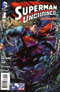
Superman Unchained #1 [Review]

Superman Unchained #1The Leap

Writer: Scott Snyder
Penciller: Jim Lee
Inker: Scott Williams
Colors: Alex Sinclair
Letters: Sal Cipriano
Cover: Jim Lee, Scott Williams, Alex Sinclair
Assoc. Editor: Chris Conroy
Group Editor: Matt Idelson
Published by: DC Comics
Cover Price: $4.99

So…$4.99 for this Superman Unchained #1. It’s functionally a 20-page story with a 2-page “epilogue” or “backup” or “extra feature.” 22 pages for $4.99. BUT there’s what was billed as a “tipped-in POSTER” included. This poster is just a double-sided foldout allowing for two single images roughly 4x the size of a normal-sized page, the most “poster-like” loaded with caption boxes. Maybe technically this counts as an extra 8 pages…but that STILL only brings the pagecount to 30…for $4.99. Removing this so-called “poster” involved peeling it off a bound-in piece of tagboard–something which I would assume complicated the printing/binding process in itself to put in, plus the folding, placement of the glue, and the placement of the “poster.” And the “poster” itself had a couple dots of this glue, keeping it from flapping open.

All this hassle, and it’s basically for one side of a “poster” being this huge image of Superman crashing through a satellite, and then an extra-large image of him narrating the situation on the other side. Hardly something that would really make sense on the wall as a poster, more just some comic page pulled out of an issue and stuck on the wall.

$4.99. Five dollars. And while I read the first arc of Superman when the New 52 began–so have a BIT of context of Lois, Perry, and Clark’s relationships…I’m not even that clear on what things are here. And the issue’s big “reveal,” the thing that’s such a big deal, isn’t. Not to me. It doesn’t fit. It doesn’t interest me. It doesn’t change things.

So, objects are falling to Earth. Superman’s trying to stop them, letting one go since he sees it’ll fall “harmlessly” while he stops this huge “Lighthouse” satellite that’s gonna hit like a gigantic nuclear bomb. He confronts Lex Luthor, who has an alibi, and as he seethes over this, learns someone stopped that object he’d let go–but if it wasn’t him, Wonder Woman, or Green Lantern–then who, exactly, WAS it that stopped the thing? We learn of General Lane’s involvement, and of a secret weapon against Superman that goes back to the beginning of things.

Visually…the art’s good. It’s Jim Lee, whose art I’ve tended to almost always enjoy. Maybe I’m just irked about the “poster,” and/or the price and/or my own lack of context for not keeping up with Superman the last 15 months, but the art doesn’t blow me away. It’s good, but it’s not the “great” that I’d’ve hoped for. It’s not the Jim Lee art that a decade ago prompted me to NOT drop the Superman titles but rather keep up a few more months until Lee‘s run on an Azzarello story would begin.

Story-wise, I’m just not interested. I know a lot of people are loving Snyder‘s work, and will consider this to be great Superman…but unfortunately, this is NOT “my” Superman. Perhaps the collected volume(s) will end up being my thing, if I myself hear enough good about it to warrant checking them out. But for now…this issue just doesn’t do anything (positive) for me.

I have no intention of grabbing the next issue, and it’ll depend on others’ reviews whether or not I even bother returning to this title in any form, outside proper bargain bins. For your page count, you’d be better off grabbing the first Superman: Earth One graphic novel and reading that, especially if you’re looking for a specific tie-in to the Man of Steel film.