• June 2023
    S M T W T F S
     123
    45678910
    11121314151617
    18192021222324
    252627282930  
  • On Facebook

  • Archives

  • Categories

  • Comic Blog Elite

    Comic Blogs - BlogCatalog Blog Directory

Young Justice (2019) #1 [Review]

young_justice_(2019)_0001Seven Crises

Script: Brian Michael Bendis
Art: Patrick Gleason
Colors: Alejandro Sanchez
Letters: DC Lettering
Cover: Gleason & Sanchez
Associate Editor: Jessica Chen
Editors: Mike Cotton & Andy Khouri
Group Editors: Brian Cunningham & Mark Doyle

I wasn’t going to get this. I vaguely remember it being announced, as well as seeing SOMETHING about these Wonder Comics and thinking hey…yet ANOTHER new imprint to not get into!

As to the property itself–the title Young Justice–I remember ads for the World Without GrownUps or whatever back in 1998 or so, and the premiere of the original Young Justice ongoing series. I mostly missed out on that at the time–I was getting a lot of Marvel at that point (with the Heroes Return titles) and mainly just the Superman titles from DC, offhand. The END of that Young Justice series (and Titans) came in the Titans/Young Justice: Graduation Day mini-‘event’, which I picked up just after my OWN graduation day from college. The event led away from Young Justice and Titans and into two "new" series–a new iteration of Teen Titans and Outsiders, both of which I followed (getting in at #1 for lengthy runs) up to Infinite Crisis or so. I dove deep into DC continuity just after Young Justice. So I never had the nostalgia of the title or the particular iterations of the characters. When the animated series was out, I enjoyed the first several episodes, but lost track of it due to episode scheduling (as I do most animated series, it seems). So I had no huge attachment there to the title, either.

But somewhere along the way between this series being announced and this issue’s release, I found out (online) that Tim Drake would be Robin again, and that "my" Superboy–Connor Kent–the one introduced during 1993’s Reign of the Supermen–would be back. Seeing Superboy in particular on a cover image, I was "sold."

Maybe the first thing about this actual issue to note is the hefty $4.99 price point. I tend to DESPISE $4.99 #1 issues, particularly because of the way I feel that Marvel has abused the practice over the last few years. This issue felt thicker, though, and I’m more forgiving toward DC (though they have squandered a lot of the goodwill they earned from me with Rebirth). It is an extra-sized issue, with 30 story pages (an extra 1/3 content for the price of 1/4), so the "value" is technically there.

We open the issue on Gemworld, with someone relaying information about seven crises and Earth. We then jump to Earth, and a young woman’s arrival in Metropolis. This is Jinny Hex…new to the big city. As she’s dealing with having been pulled over for a busted taillight on her vehicle…agents of Gemworld invade, causing quite a ruckus. Jinny finds herself face to face with Robin (Tim Drake) and seems rather awe-struck. A flashback shows us an interaction between Tim and Cassie Sandsmark minutes earlier, also in Metropolis, as the two catch up briefly before Tim leaps into action with the invasion. Joining the action is Impulse–Bart Allen; he is clearly excited to be in action and interacting with the others while facing the invasion. Before long, Wonder Girl joins in as well as a Green Lantern Ring Construct…and Bart declares that Young Justice is back! It looks as if the heroes may have prevailed, and then they’re caught up in some sort of energy, and Robin comes to on Gemworld facing Amethyst…while Impulse finds himself facing a certain missing teammate to end the issue.

This issue provoked a reaction in me that I haven’t had in awhile from any comic, and that I don’t know entirely how to describe. But to try…in short, I flat-out enjoyed this comic, I loved seeing Tim referred to as Robin again, and something about these characters–even though I lack a huge amount of context for the grouping–really hit my nostalgia buttons. Perhaps because this is the first time it seems Tim Drake has properly–without likelihood of reprint revision–been referred to as Robin since 2009 or so. Perhaps it’s seeing Connor Kent Superboy again for the first time since at least 2011. Perhaps it’s that this feels like something from before the New 52, period.

Likely all of the above and that the issue was just…FUN. I mean, an invasion, the destruction of property and all that…sure, that’s not something to celebrate, but this IS a comic book, and we’re not beaten over the head while reading about the destruction itself or how it’s impacting some random character or bystander. We just get heroes in action, and saving people, and no real focus on dark, grim, gritty stuff.

I know I’ve had issues with Gleason‘s art in the past–I think to the point that I even came to dislike seeing his name on stuff; it was a sign that I would likely dislike the art. His art won me over a bit during the Rebirth run of Superman; and maybe I’m just so thrilled to see Robin and Superboy again, but I really dug the art on this issue! Gleason‘s style seems very well-suited for this sort of frenetic fun and the energetic nature of much of the issue–from Robin laying into Gemworlders to Bart completely enjoying himself in action…and even working in more serious stuff without coming off with stylistic things that’d get me complaining on some principle. There are several double-page spreads, and other than the "Young Justice is BACK!" bit, I could do without them. I tend to feel that most double-pagers are "cheats" and go by way too quickly for taking up multiple full pages, lowering the "value" in terms of per-page story content.

Story-wise, this seems like a pretty good first issue. I’m not at all current on Tim Drake stuff, nor Bart or Cassie; I vaguely recall something about Jinny being in a Walmart-exclusive comic, but she comes off as fresh and new here, as does Teen Lantern; I also lack any real familiarity with Amethyst and Gemworld except that they exist. But I was still able to enjoy the issue, with everyone getting introductions or otherwise at least being named on-page…no need to go online to hunt down "who" someone was or be left scratching my head. (And the lettering had a great touch, working character names in as logos in a way that doesn’t seem to be used much lately and reminds me quite a bit of ’90s comics). This isn’t a perfect story by any means…I didn’t really "get" the invasion or anything much from that–it was more incidental, an excuse for "big action" and something to bring the characters together, to get stuff from Point A to Point B and such. That it included these particular characters being pulled together, though…it worked for me.

This is certainly no done-in-one issue, and it really only serves so far to move pieces around to begin to move toward whatever the full story will eventually be. The issue is significant in itself as a single issue for bringing the characters together (if only certain characters in virtual cameos) and being the first time we’ve seen several in years–or at least, seemingly years. But this is just the opening chapter of a serialized graphic novel, that presumably will be the standard-ish 6 issues in length.

There’s a certain on-page authenticity to the various characters, that both looks and feels like what I’d expect of a Bendis-helmed comic. His work can be hit or miss for me, but this issue is definitely a hit. I got this for the characters involved, and was not disappointed. That Bendis is the writer is incidental to me, and something I’m fine with, based on this issue. Whether that holds for future issues remains to be seen! But for now, I’m definitely onboard for this title in particular…and having thoroughly enjoyed this, I may even consider checking out the other Wonder Comics titles.

If you’re a fan of Tim Drake, Bart Allen (at least as he was pre-2003), early Connor Kent Superboy, and so on…this is definitely worth jumping in on. Especially if you’ve been "away" from the characters for awhile or not staying current with DC‘s continuity. This does not feel like it relies on anything else going on…it’s just the world these characters inhabit and them coming together and working together. This is not spinning out of some other event or title…no prologue in Detective Comics or one of the Justice League titles or some other mini-series. And even if you’re not specifically a fan of a specific character in a particular role, if you enjoy teen heroes, enjoy seeing Robin/Wonder Girl/Impulse/etc. together in a title…I’d say this is worthwhile to check out.

I have every intention myself of picking up the next issue, and if I enjoy it the way I did this issue, I may be onboard for awhile!

young_justice_(2019)_0001_blogtrailer

ForgedBy4: The Man of Steel (2018) #1 – A New Era Begins

forged_by_4_logo

The Man of Steel (2018) #1 – A New Era Begins

man_of_steel_2018_0001Man of Steel Part 1

Script: Brian Michael Bendis
Pencils: Ivan Reis
Inks: Joe Prado
Art (pp21-22): Jay Fabok
Colors: Alex Sinclair
Letters: Cory Petit
Cover: Reis, Prado, Sinclair
Associate Editor: Jessica Chen
Editor: Michael Cotton
Group Editor: Brian Cunningham
Published by: DC Comics
Cover Date: July 2016
Cover Price: $3.99

This is a good point to jump in if you’ve not been following Superman stuff for awhile, and especially if you are a fan of Bendis’ writing. As said above, I’m a Superman guy–so in that regard, I wasn’t going to pass this up. For what this issue and mini-series are…I think it’s well worth picking up…and this six issue "event" seems like it will definitely be cluing us in on what to expect when the ongoing series come back. That said, there’s not really enough to this to "only" get this issue–one pretty much needs to commit to the entire 6 issues. I’m on board, and I’ll be interested in my own thoughts on it once all 6 are out.

Full Article posted over at ForgedBy4!

Doomsday Clock #1 [Review]

doomsday_clock_0001_supermanThat Annihilated Place

Writer: Geoff Johns
Illustrator: Gary Frank
Colorist: Brad Anderson
Letterer: Rob Leigh
Cover: Gary Frank & Brad Anderson (Lenticular based on existing art by Dave Gibbons)
Associate Editor: Amedeo Turturro
Editor: Brian Cunningham
Published by: DC Comics
Cover Date: January 2018
Cover Price: $4.99 ($5.99 Lenticular variant)

It’s been a long time, offhand, since I read a comic quite so dense as Doomsday Clock #1. And I use the word dense as a good thing overall–in this age of $4.99 comics that hardly take any longer to read than a $3.99 or $2.99 comic, where everything is written to flow seamlessly as a 4 or 5 or 6-issue "graphic novel," it’s great to have a comic that just wants to be a single issue.

I was rather frustrated to learn that the image I’ve seen MOST USED in association with this issue (the Gary Frank Superman cover pictured above) is actually a VARIANT and not the "main" cover. The main cover seems to be a generic "The End is Here" cover (that leads into the issue itself as the classic Watchmen covers did!). In keeping with my usual, though, wanting the cover I’ve most seen advertised and such with an issue, I managed to get the Superman cover. Of course, then I saw a lenticular variant, one I had probably heard of/read about, but not paid attention to (again: VARIANT)…but it being lenticular, and "cover price" (albeit $1 more than the standard issue to account for the lenticular-ness) and me really getting a kick outta the design–Rorschach’s face goes from just the blobs to the symbols of "the trinity" (Superman/Batman/Woder Woman), I went ahead and got that one as well. It’s certainly no worse than having bought a Marvel lenticular, where the lenticulars were entirely different images from their "regular" covers.

I don’t know what I expected from this issue. Being that it’s an obvious follow-up to Watchmen, and apparently integrating those characters into DCU canon (if not continuity, then perhaps affecting continuity from the outside), and seems to have been "timed" to release at the 25th anniversary of Superman’s death (real-world, that is–November 17-20ish 1992), and stuff previewed or "leaked" online indicated an in-issue reference to that date…I had extremely high expectations for this issue. It’s honestly been a long time since I feel like I actually was taken in by "the hype," usually seeing the hype entirely for what it is and maybe "choosing" to "give in," say, on actually getting a variant cover, or actually getting an issue of something I don’t normally get, or diving into an event I’d intended to stay away from. Here, it’s more of an emotional hype…one that left me feeling rather let down.

As said above–this is a dense story–one that would take a long time to really summarize, and for my own reading experience, get well beyond the initial reading I tend to do for reviews. Essentially, we meet a new Rorschach, who is piecing stuff together, much as the original did, starting out the original series. We get glimpses of this current world–late 1992, about seven years after the original’s 1985 setting, as we meet various characters and are re-exposed to older/originals. We also learn that Ozymandias has a sort of countdown clock of his own going this time, but in a much different way than before. Finally, the last several pages give us a glimpse into a non-Watchmen DCU, and an extremely familiar-looking take on the Kents…which makes sense, given Frank was the artist on Superman: Secret Origin, that laid out a particular vision for the characters.

While this has a lot as a single issue, and certainly many layers with stuff that’d be picked up after a second or third or FIFTH reading, still more to be picked up on STUDYING the art beyond the words, and even more on top of that to be noticed after subsequent issues come out and shed more light on stuff…on my single-read-through I hit the end and thought "Wait…that’s IT?" and was starkly reminded of similar disappointment with Grant Morrison‘s Final Crisis.

This is not a "casual" issue, apparently. Picking it up and reading it "cold," even if you’ve read Watchmen, there doesn’t seem to be all that much to it. It’s a first issue, and world-building or re-world-building. It’s surely a strong foundation on which the rest of the issues will draw. But for me, in just picking it up, after all the months of hype, I just did not enjoy it or get much out of it. And I’m steeped in comics history, especially DC, and even more specifically Superman.

Visually, it’s a very good issue–I’m quite a fan of Gary Frank. I felt like there was a lot that was recognizable and familiar here, despite Frank not being Gibbons, and outside of not seeing a Superman costume or a Batman costume or a Wonder Woman costume–really, it felt like there was virtually nothing actually DC in this issue–I felt like this was set in the world I recalled from reading the original Watchmen all those years ago. There’s also a LOT crammed into this issue: it seems to me that the lowest panel-count on any given story-page was five…which is a far cry from the all-too-often-used "cheats" of full or DOUBLE-page splashes with barely a word to go with the art. I welcome the "grid" layouts of the pages, the actual panels and "traditional" gutters–both for squeezing in more content as well as mimicking the style of the original.

Basically, this seems like a really slow start to something, and that it was vastly overhyped, as well as being quite "confusing" as far as the covers go–once again, a major problem with doing variants AT ALL. The $4.99 cover price is rather steep, even with 30 pages of story (if a 20-page issue is $2.99, another 50% would be only $4.50!) but I suppose it’s a bit offset by some of DC‘s issues being $3.99 (the 1-per-month books) so this actually fits that rate.

I wanted more–I wanted something brighter and splashier out the gate than what I got here–but I’m still looking forward to the next issue, looking forward to see how things build, though I suspect this will be a far more impressive story in larger chunks or as a whole rather than as a single-issue-at-a-time monthly (or less-frequent) journey.

doomsday_clock_0001_blogtrailer

Constantine: The Hellblazer #1 [Review]

constantinethehellblazer001Going Down

Writers: Ming Doyle, James Tynion IV
Artist: Riley Rossmo
Colorist: Ivan Plascensia
Cover: Riley Rossmo
Letterer: Tom Napolitano
Group Editor: Brian Cunningham
Assistant Editor: Amedeo Turturro
Editor: Andy Khouri
Published by: DC Comics
Cover Date: August 2015
Cover Price: $2.99

I was planning on skipping this. I don’t much care for a watered-down version of the Vertigo/Mature Readers take on the title character, gave up on Justice League Dark early-on for not “starring” Constantine, and generally figured there’s more “history” for the New 52 Constantine than I really care to spend money playing catch-up on. But…this is a #1. New creative team (far as I’m aware), and it’s “only” $2.99. So I figured I’d check it out, give it an issue or so to show me what it’ll be…might as well for the price.

We open on a naked Constantine in a store, using his abilities to “con” a fresh set of clothes out of the employee. When John’s ghost-friends cause a stir, he ultimately finds himself in the company of a female demon who he finds is arranging to have a “soul farm,” so he winds up working the situation to a fairly predictable conclusion through his usual means.

Of course, that “usual” is based on my knowledge of the character from the past, from the original Hellblazer title (that was part of the initial Vertigo line and long anchored the imprint until a couple years ago) moreso than I know of the “mainstream” New 52/DC version.

The art for this issue was a bit off-putting for me when I opened the issue…particularly as I wasn’t even sure the character on the first page was actually John Constantine or not. Granted, I’m not used to seeing the character in the Birthday Suit, and some of the blame probably could be placed on the writing as well, the issue opening as it did. Once things move along a few pages, the art grew on me a bit, to where I’ll accept it much as any other Constantine or Hellblazer artist. Though, with only this single issue, I cannot say I’m likely to count Rossmo among my favorite who’ve worked on the character. However, I can definitely say that I enjoyed a 10-panel double-page spread with a sideways layout…it was different, engaging, effective in conveying so much in that part of the story, and really stood out to me for not just being more of the same.

The story was pretty good overall, and other than the obfuscated colorful language, this really felt like it could be a Vertigo issue. Though we do get left with a cliffhanger, and join the story “in progress” in and of itself the issue does give a “complete” story: We’re introduced to Constantine, his ghost entourage, and see a bit of his personality and nature by his actions, obvious intent, narration, and characters’ commentary. We’re introduced to a particular threat/situation, see his reaction to it, and get a resolution. Then we’re given a question that (ideally) hooks us into coming back for the next issue. Or in short: this is an effective first issue, doing what I would expect of a first issue.

While a first issue is not much to go on, the fact that this issue is devoid of superheroes/superheroics (only a passing mention that they even exist) is a welcome thing. My hope with this title is that it’ll be DC‘s way to have their cake and eat it, too: a solo title featuring John Constantine, BEING John Constantine, without the superheroes’ interaction…just Constantine doing his thing in his own world of sorts. But he’s part of the “main universe,” too, and thus remains available for stories that would call for his brand of involvement. I enjoy seeing him dealing with the superhero crowd…but when I pick up a book starring him, I’m not doing so for superhero stuff.

This title’s “subtitle” of The Hellblazer seems tacked-on and like some afterthought given its size and rather obviously being “just” a font rather than a focused part of the title logo. That strikes me as being a sort of appeasement, like saying “Ok, ok, we get it, y’all want a monthly comic with Hellblazer in the title!” (Granted, I understand the title Hellblazer was only ever initially used because Hellraiser was not available).

As a first issue and not knowing how dark the title may go, how long it’ll last, whether it will cross over directly with and mingle with the superhero stuff…taken by itself I think this is as close as we’re gonna get to a return to the classic Hellblazer book. As a fan of that series, I do recommend giving this a shot. I suspect readers of the recently-ended Constantine will appreciate this as well. And overall–in this day and age of seemingly EVERYTHING being $3.99+, this is a $2.99 book for the moment, so I’d recommend getting this even just to “support” the price point if you’re a single-issue buyer.

I’ll probably be back for the second issue and go from there. For my $2.99 this time, the issue was definitely worth the purchase and read, and my buying any more issues at all will be due to this fact, as I’d had every intention of outright ignoring anything DC put out for the foreseeable future.

R.E.B.E.L.S. #4 [Review]

Quick Rating: Decent
Story Title: From Beyond

Dox’s team is coming together, and the villain is revealed!

REBELS Cv4 dsWriter: Tony Bedard
Penciller: Claude St. Aubin
Inker: Scott Hanna
Colorist: Jose Villarrubia
Letterer: Swands
Asst. Editor: Rex Ogle
Editor: Brian Cunningham
Cover: Ed Benes and Rob Hunter
Publisher: DC Comics

Dox’s team is coming together, and we as readers find out a bit more about what’s set current events into motion, and who it was that took over LEGION.

The story feels like it’s loaded with potential, particularly on the cosmic side of the DCU; drawing from older characters and concepts but placing them well within current events of continuity and whatnot. However, even four issues in, I’m not really feeling like I have much to care about with these characters nor their situations. The "main villain" for this arc is one of my least-favorite in the DCU, and even being revamped a bit visually still doesn’t interest me. I’m not familiar enough with these characters to know how their depiction here works with prior versions of them, but they do seem consistent within this series, at least. We’re only four issues in, so hopefully a lot of this is simply foundation-laying, building toward some solid payoff in the near future.

The visuals maintain a nice consistency from earlier issues (even with a different artist). Visually, I can’t help but feel that this is to "cosmic DC" what the earlier issues of the 2003-launched Outsiders series was to the more traditional DCU. The art may not be for everyone, but as what it is, it certainly works for this book and gives it a style that sets it apart from a lotta other books.

Bedard seems to have a good grasp of the cosmic stuff, and if you’re a fan of his stories or of the old LEGION characters, this book’s probably right up your alley. Otherwise, it doesn’t seem like anything terribly essential as yet.

Ratings:

Story: 3/5
Art: 3/5
Overall: 3/5

R.E.B.E.L.S. #3 [Review]

Quick Rating: OK
Story Title: A World of Hurt

Dox continues to assemble his grouping of individuals to assist reclamation of his former organization…with little regard for his methods, focusing on the end result.

rebels003Writer: Tony Bedard
Artist: Andy Clarke
Colorist: Jose Villarrubia
Letterer: Swands
Asst. Editor: Rex Ogle
Editor: Brian Cunningham
Cover: Andy Clarke
Publisher: DC Comics

This issue continues to show Dox as he acts on the information he’s been given, but doesn’t really let anyone else in on it. He’s building a new team, focused on the final result and apparently not all that concerned about what steps he’s gotta take to achieve it. After changing someone into an energy-being, Dox heads off with her to see some old allies and recruit them–after explaining that he did not orchestrate the attacks on them that they recently survived. Ultimately, they find that they face quite a formidable foe.

The art on this is quite good, and very consistent with the earlier issues. Its style fits the story, while adding its own "flavor" to the overall product. There’s a sort of dirtiness to it that contributes to the atmosphere, setting this apart from other books visually.

You could do much worse than this book, but then, I’m also finding myself quickly losing interest. While the nostalgia factor prompted my initial interest in the book, I’m not finding these characters to be familiar to me (other than by name/concept), and really not connecting or engaging with ’em. Something about this story feels like it will be much better when read as a complete arc, but on the issue by issue basis, I’m just not feelin’ it.

I suppose if you’re enough of a fan of the writer or artist this’d be worthwhile; ditto if you’re particularly interested in or informed as far as the characters go. As a casual reader, this doesn’t really seem to be anything essential.

Ratings:

Story: 2/5
Art: 3.5/5
Overall: 2.5/5

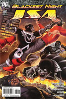
Blackest Night: JSA #3 [Review]

Full review posted to comixtreme.com.

Story: 3/5
Art: 4/5
Overall: 3.5/5

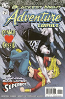
Adventure Comics #7 [Review]

Full review posted to comixtreme.com.

Story: 2.5/5
Art: 3/5
Overall: 3/5

Blackest Night: JSA #2 [Review]

Full review posted to comixtreme.com.

Story: 3/5
Art: 3.5/5
Overall: 3/5

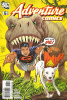
Adventure Comics #6 [Review]

Full review posted to comixtreme.com.

Story: 3/5
Art: 4/5
Overall: 3.5/5

%d bloggers like this: