• January 2026
    S M T W T F S
     123
    45678910
    11121314151617
    18192021222324
    25262728293031
  • On Facebook

  • Archives

  • Categories

  • Comic Blog Elite

    Comic Blogs - BlogCatalog Blog Directory

X-Men Series 1 Revisited, Part 1

This is definitely a strange set to look back to, having come out in 1992…22 years ago! At the same time, it’s rather cool to look back this far, as this is the X-Men just shy of my discovering them originally, and it’s cool to revisit what these characters’ status quo was then, given everything that’s come about SINCE.

It’s also a bit odd to consider the publisher of these cards–Impel–as I am almost certain they aren’t even around anymore, and that they passed the torch (so to speak) for the next series of X-Men cards that was published in 1993.

Especially compared to the Marvel Universe Series IV set, this seems rather amateurish in a way…with some of the cards being landscape oriented, others portrait, and seemingly not organized within the set with an awareness of the standard 9-pocket card pages these would often be stored in.

All of these first 9 are oriented the same way, but as we’ll see next week, the next 9 switch to virtually all portrait orientation, where much of the set remains before a switch back. The coloring on some of the cards–as we’ll see in later posts–also does not all go together for single pages. And yet the final 9-card grouping does make a single larger image.

This first grouping introduces us to a mix of characters from several of the then-current teams: the X-Men themselves, as well as X-Factor, X-Force, and Excalibur.

I don’t much care for the power grid on the backs of the cards–I’ve never cared for this sort of stat with characters, as stories are constantly changing things and these never seem–to me–to remain accurate. All the more for comparing the characters.

The short snippets are nice as a bit of introduction to the characters, and I like the note of their first appearance…a rather handy piece of information to have, even these 20-odd years later. The “X-tra Fact” is also a neat piece of info to have…particularly to help set these cards within the time they came out, as I’m looking back on them now.

I actually hadn’t realized until going through these for this post that Siryn first appeared in Spider-Woman and not a “regular” X-book somewhere.

Nothing too spectacular about these, though I do rather like the Jim Lee art, as well as the use of DIFFERENT art on the backs of the cards rather than a re-use of the front…showing that there was a bit of thought put into these.

[Click below to see the individual cards…]

Continue reading

Not a Poster (and where are the chains?)

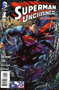
supermanunchained001variant001While I was quite impressed by Man of Steel, I found myself rather disappointed (to say the least) in Superman Unchained #1. I think THE primary problem for me with Superman Unchained was the issue of the extra $1 to the cover price (already going to be $3.99, the poster’s inclusion bumped the price an entire $1 to $4.99!)

And yet…the poster is not at all what I personally would consider an actual poster. To me, a poster is a stand-alone image, where the art speaks for itself. It might be an oversized (or same-sized) cover image, or reproduced from interior art–a panel or splash-page.  It might be a wholly original image, perhaps an artist’s work not usually associated with a character. And if it is captioned, it’s intended as a stand-alone.

What we got with this issue is simply a detachable fold-out to allow for two panels at 4 times the usual page-size (or double the size of a 2-page splash).

supermanunchainedposter01

The first side is simply a falling satellite with Superman smashing through…but just looking at the image, I can’t even tell what it’s supposed to be. Some sort of spaceship exploding or otherwise breaking apart…but no CONTEXT. Can’t even tell that it’s Superman there…and it’s certainly no poster-worthy Superman depiction–no heroic pose, nothing that truly “says” Superman here.

supermanunchainedposter02

On the reverse side, we do get a MUCH closer-up view of Superman…you can tell that it’s Superman, that he’s punching…something, so we’re a little closer to expectation. But the image is spoiled by the awkward, off-center pose, and all those text boxes. They may not be overly noticeable at first glance from a distance…but while that MIGHT be a slight strength at first, it leads into another problem: you have to get up close to the poster to read anything on it, and it’s hard to un-notice the text once you notice it.

supermanunchained001variant002And since this comes from within the issue itself, is a part of the story, this does not at all stand alone–you lose the context of that story that ties to the text boxes. It also means that you’re missing these details from any later re-read of the issue itself if you’ve removed and hung the poster, rather than tucking it back into the issue where it–obviously–is intended to belong.

Basically, the reader is asked to pay extra so that the artist can have art shown off at an abnormally over-sized perspective for no real gain to the story itself (to say nothing of losing all flow of story by having to take the time and hassle to remove the thing from the issue in the first place! Why not a clear polybag? DC already uses those for the “combo pack” editions, I believe!)

Then, the issue is swamped with variants–many actually appealing for their nostalgia factor AS a comic book. Rather than simply having a different image under the company logo, title logo, and UPC box…the entire trade dress of the cover is redone in the classic styles, with the classic company logos and so on.

Granted, the visual style would evoke different periods of the comics. But going with the different logos and trade dress, you truly wind up with an entirely different comic by the cover alone–whether something that looks like it came out of my grandpa’s cabinet, or from the midst of the era of Superman I most enjoy.

supermanthemanofsteel050But the variants aren’t stopping with the “celebration” of this first issue–nope, they’re continuing with the next issue at minimum, if not beyond. And while I’d thought to “give in” and give the issue a “pass” for being a #1…keeping this up–especially with RATIOED variants–is absolutely not gonna keep me around (in fact, it’s soured me entirely!)

Add to all of the above that I didn’t pick up on anything within the first issue to really warrant the title Unchained, vs. the long-rumored Man of Steel or something else. Depending even on where the story goes based on the first issue’s cliffhanger, I don’t see Unchained coming from that–perhaps if we actually saw a Superman breaking free of SOME sort of imprisonment (chains or otherwise)–or being imprisoned (and so having something to break free from) it would make sense.

The standard cover at least has debris and sorta looks like chains on it at a glance…but unless that’s a requirement for every standard cover to justify the title, even that sort of gimmick will likely wear thin its welcome in quite a hurry.

In the end, I suppose all of this is simply further indication that I’m not the target audience. And since I’m not enjoying what’s being done at present–I’ll stick to my back issues.

Superman Unchained #1 [Review]

Superman Unchained #1The Leap

Writer: Scott Snyder
Penciller: Jim Lee
Inker: Scott Williams
Colors: Alex Sinclair
Letters: Sal Cipriano
Cover: Jim Lee, Scott Williams, Alex Sinclair
Assoc. Editor: Chris Conroy
Group Editor: Matt Idelson
Published by: DC Comics
Cover Price: $4.99

So…$4.99 for this Superman Unchained #1. It’s functionally a 20-page story with a 2-page “epilogue” or “backup” or “extra feature.” 22 pages for $4.99. BUT there’s what was billed as a “tipped-in POSTER” included. This poster is just a double-sided foldout allowing for two single images roughly 4x the size of a normal-sized page, the most “poster-like” loaded with caption boxes. Maybe technically this counts as an extra 8 pages…but that STILL only brings the pagecount to 30…for $4.99. Removing this so-called “poster” involved peeling it off a bound-in piece of tagboard–something which I would assume complicated the printing/binding process in itself to put in, plus the folding, placement of the glue, and the placement of the “poster.” And the “poster” itself had a couple dots of this glue, keeping it from flapping open.

All this hassle, and it’s basically for one side of a “poster” being this huge image of Superman crashing through a satellite, and then an extra-large image of him narrating the situation on the other side. Hardly something that would really make sense on the wall as a poster, more just some comic page pulled out of an issue and stuck on the wall.

$4.99. Five dollars. And while I read the first arc of Superman when the New 52 began–so have a BIT of context of Lois, Perry, and Clark’s relationships…I’m not even that clear on what things are here. And the issue’s big “reveal,” the thing that’s such a big deal, isn’t. Not to me. It doesn’t fit. It doesn’t interest me. It doesn’t change things.

So, objects are falling to Earth. Superman’s trying to stop them, letting one go since he sees it’ll fall “harmlessly” while he stops this huge “Lighthouse” satellite that’s gonna hit like a gigantic nuclear bomb. He confronts Lex Luthor, who has an alibi, and as he seethes over this, learns someone stopped that object he’d let go–but if it wasn’t him, Wonder Woman, or Green Lantern–then who, exactly, WAS it that stopped the thing? We learn of General Lane’s involvement, and of a secret weapon against Superman that goes back to the beginning of things.

Visually…the art’s good. It’s Jim Lee, whose art I’ve tended to almost always enjoy. Maybe I’m just irked about the “poster,” and/or the price and/or my own lack of context for not keeping up with Superman the last 15 months, but the art doesn’t blow me away. It’s good, but it’s not the “great” that I’d’ve hoped for. It’s not the Jim Lee art that a decade ago prompted me to NOT drop the Superman titles but rather keep up a few more months until Lee‘s run on an Azzarello story would begin.

Story-wise, I’m just not interested. I know a lot of people are loving Snyder‘s work, and will consider this to be great Superman…but unfortunately, this is NOT “my” Superman. Perhaps the collected volume(s) will end up being my thing, if I myself hear enough good about it to warrant checking them out. But for now…this issue just doesn’t do anything (positive) for me.

I have no intention of grabbing the next issue, and it’ll depend on others’ reviews whether or not I even bother returning to this title in any form, outside proper bargain bins. For your page count, you’d be better off grabbing the first Superman: Earth One graphic novel and reading that, especially if you’re looking for a specific tie-in to the Man of Steel film.

The New 52! #1 [Review]

The New 52! #1

Writer: Geoff Johns
Art: Jim Lee, Scott Williams, Ivan Reis, Joe Prado, Kenneth Rocafort, Gene Ha
Color: Alex Sinclair, Rod Reis, Blond, Art Lyon
Cover: Jim Lee, Scott Williams, Alex Sinclair
Letterer: Sal Cipriano
Assistant Editor: Kate Stewart
Editors: Dan Didio & Eddie Berganza

This issue is mostly teaser, and seems especially designed more for those following DC‘s The New 52 for the past 9 or so months moreso than a brand-new reader that might be sucked in for Free Comic Book Day 2012.

We’re shown a sentencing for a trio of characters, all of whom–if not off the bat, then by their fates–have a certain familiarity, as we see the origin of “Pandora,” who we see here has a much larger role to play in the new DCU in the near future. These three characters have been condemned by The Wizard (as in Shazam), punished for contributions to harm of mankind. In the present day, Pandora stirs up some trouble stealing back her box as she seeks to unravel her curse, and we’re then shown a glimpse into the near-future of the DCU, and the coming “event” due out “next year.”

There’s a whole mix of art to the issue, culminating in a fold-out posterlike 4-page spread by Jim Lee spotlighting the main Justice Leaguers in the “near future.” Overall, given this is essentially a sampler issue and I had no idea what to expect of it, the art didn’t stand out all that much to me. Some characters are familiar, others not so much, and I’m not sure if the unfamiliarity I have is with the New 52 in general, or with concepts being “introduced” in this issue.

Story-wise, there’s not a whole lot; this is like having the “origin” of Pandora (and a couple other characters) thrown in front of us to pull one in, like “hey, remember these guys? Here they are! See! Now you HAVE to read the coming event!”

As a free issue…yeah, this is worthwhile. If it weren’t for the credits taking up much of the bottom of the image, I’d be inclined to pull the center out of the issue and stick it on the wall as a small poster, at least. Almost half this issue is a section of 2-ish page “previews” of the second wave of DC titles, and I skipped over ’em. I already bought Earth 2 #1, and NOT being an art person, have no interest in the 5-7+ page previews DC‘s often stuck in the back of its books, and 1-2 pages mean even less.

Probably for the worse (to me), this issue makes it clear that The New 52 is building toward some huge event (coming next year, though), and since I’m not willing to invest in a bunch of titles as-is, I have even less interest now.

Story: 4/10
Art: 8/10
Whole: 6/10

Justice League #1 [Review]


Full review posted to cxPulp.com
.

Story: 3.5/5
Art: 4.5/5
Overall: 4/5

Spawn #200 [Review]


Full review posted to cxPulp.com
.


Story: 3/5
Art: 3.5/5
Overall: 3.5/5

Thoughts on Wonder Woman’s new costume

So, given that everyone else is chiming in on Wonder Woman’s new costume, figured I might as well weigh in myself.

I like it.

Maybe it’s not as “iconic” (partially for the fact that it’s NEW and there’s only been a week or so since it was unveiled to the public)…but it’s a darned sight more practical than the traditional one-piece bathing-suit look.

I’ve NEVER been one to gravitate toward comics’ “bad girl” comics or the obvious ‘cheesecake’ comics (see: Lady Death, pre-Marz Witchblade, Vampirella, etc).

And though I’ve picked up a few issues here and there of the Wonder Woman titles…I’ve always felt funny about reading them in public, as it seemed likely someone not so much into comics would look at it and see a late-20-something male reading a comic with an admittedly less-than-fully-garbed female superhero…especially when certain artists will accentuate certain…anatomical details. There’s also the classic question: HOW exactly does she avoid “wardrobe malfunctions” every time she fights the bad guys, etc?

This getup fits. You have the red and blue and yellow (same colors Superman wears without catching flack for lack of white). The “W” is maintained, the wristbands, belt, and tiara…and of course the lasso.

If I hadn’t already decided to wait out the single issues to read JMS’ arc in collected format, I’d be picking up Wonder Woman #601 to get more of a look at how the costume fits the character in more than just the several prologue pages that we’ve already got from Wonder Woman #600.

I’d be shocked if this is permanent, anyway. Perhaps the costume’ll last the duration of JMS’ run on the book…but as with any character death or other major change…give it time. Someone’s gonna “have to” bring something old back, because they want to “restore” something that they miss that has been changed about a character. Whether it takes just a few months, a couple years, or manages to last 20 years.