• January 2026
    S M T W T F S
     123
    45678910
    11121314151617
    18192021222324
    25262728293031
  • On Facebook

  • Archives

  • Categories

  • Comic Blog Elite

    Comic Blogs - BlogCatalog Blog Directory

The ’90s Revisited: The Incredible Hulk #444

incrediblehulk444Cable Vision

Writer: Peter David
Penciler: Angel Medina
Inker: Robin Riggs
Lettering: Richard Starkings and Comicraft
Colors: Glynis Oliver
Enhancement: Malibu
Assistant Editor: Polly Watson
Editor: Bobbie Chase
Published by: Marvel Comics
Cover Price: $1.50
Cover Date: August, 1996

It’s amazing how much “context” can play a role in a random issue working or not. This issue is labeled as Onslaught: Impact 1, meaning it was an “impact” issue of the first month of Onslaught. From what I recall, there were two types of issues associated with Onslaught: the Phase 1/2/3 issues, and the Impact 1/2/3 issues. Phase were main parts of the “core” story, while the Impact issues were much looser tie-ins…literally “impacted” by Onslaught, but not having much to do with the main story.

I pulled this issue from the quarter bin for that Onslaught tag. Reading it reminded me just how “loose” the tie-in could be. The basic premise of this issue is that Onslaught has basically wiped the Hulk’s mind, setting him on killing Cable. Banner’s been blocked out, so there’s just the mindless, mission-centered beast. The issue opens with Cable already beaten and barely conscious…the only other ally trying to save him is X-man Storm. The issue is basically one long fight-scene, as Storm turns the elements on the Hulk, and a death-ready Cable rallies and does what he can in his state. Eventually the two manage to develop a risky plan to break Onslaught’s control, and restore the Hulk.

Story-wise, there’s not exactly a lot to this issue. And yet, it shows that David “gets” the X-characters, writing a decent Cable and an impressive (at least power-wise) Storm. But, being a big fight sequence, there’s not exactly much character development…moreso we seem to have had a plot point (Onslaught possesses Hulk) that had to be dealt with to get the Hulk from there to the next plot point (back to being himself again, but Really Very Ticked-Off At Onslaught).

Visually, the art’s not bad, though nothing wonderful. The coloring seemed somehow kinda dull, and the Hulk’s shade of green especially a bit different, more subdued, than what I’m used to for the character. I’m also not all that familiar with this particular interpretation of the Hulk…but knowing this was the “Banner’s consciousness/Hulk’s body” era…and the mid-’90s (and this being a single, isolated issue I’m reading) that mostly gets a pass.

Overall, not a bad issue, but nothing spectacular. I don’t believe I’d ever read this back in the ’90s when originally published, so it was interesting to read a loose tie-in to Onslaught, and getting a single-issue “feel” for the “impact” of that story on this title prior to the bigger shakeup of losing Banner but keeping the Hulk that was the status quo once Onslaught ended.

As a 25-cent issue in an age of $3.99 comics, this was a decently enjoyable issue…but I’m not sure I would care for it without already having a working knowledge of the “main” Onslaught story. Taken by itself as a random issue and being a big fight scene, it’s not really something to specifically seek out unless you’re looking for all the Onslaught issues, or a complete PAD run on this title.

The ’90s Revisited: Uncanny X-Men #325

uncannyxmen325Generation of Evil

Writer: Scott Lobdell
Penciler: Joe Madureira
Inkers: Townsend & Ryan
Colors: Steve Buccellato & Electric Crayon
Leters: Richard Starkings and Comicraft
Editor and Chief: Bob Harras
Published by: Marvel Comics
Cover Price: $2.95
Cover Date: October, 1995

This issue always throws me, just from the cover. This is from that period of time when Marvel apparently thought the covers’ numbers didn’t matter and would have the issue’s number in tiny print somewhere in the UPC box, at the bottom of the cover, rather than somewhere near the upper part with the cover logo. For this cover, they actually hide all of that–the title logo folded to the inside, and the UPC to the back cover, so all you have is Storm, Colossus, and Wolverine attacking someone off-panel, and a tiny banner at the top specifying this as a Special X-Men Anniversary Issue. (20th anniversary of the “All-New” X-Men from Giant-Size X-Men #1)

While the issue opens on the X-Men playing baseball, the bulk of the issue features a “return” of Morlocks, apparently in the wake of some of their number taking on the name “Gene Nation” or such and executing terrorist acts around the city. Leader of the Morlocks Callisto shows up and explains it’s the “younger generation” that feels the older has failed them, failed to act–and seeks to rectify the issue. This also brings up Storm’s “history” as a former leader of the Morlocks (having once challenged and beaten Callisto FOR said leadership), and what that means for her in the face of the current situation.

Story-wise this is a solid issue; nothing horrible about it to me; but nothing fantastic, either. However, having the baseball game is a great moment…the sort I recall truly enjoying in the X-books…just seeing the characters relax and not have to be fighting the villain of the month/issue…I’d probably thoroughly enjoy a full issue that’s nothing but the characters just being who they are, interacting with each other; no villains or any particular antagonist, period. I like that the issue is definitely set in continuity, dealing with the history of the Morlocks, as well as keeping several subplots moving (Gambit, and Rogue/Iceman).

Visually this is a mixed thing for me: the style is a bit cartoony at points and feels a bit “off” to my sensibilities with these characters, and yet it totally brings back (good) memories OF this era of X-Men comics, and works in that regard.

For an issue fished out of a 25-cent bin, certainly well worth the purchase and reading. There’s no funky foiling on this copy, so I think this is the “newsstand” edition where the original copy I bought when it came out new I’m pretty sure was the “direct edition” or otherwise had shiny-ness about it. (Which works for my interest in “converting” FROM shiny covers to standard/newsstand editions for my various “runs” of series). It’s also worth noting that these days, this would probably be at least 2-3 variant covers, rather than the 4-panel wrap-around/fold-out this actually carries.

Given the lengthy role Marrow (I believe) went on to play in the X-Books, this is a good jumping-on point to see where she comes from and (presumably) changes. All in all quite a high-quality bargain-bin purchase!

Angel & Faith #1 [Review]


Full review posted to cxPulp.com
.

Story: 4/5
Art: 4/5
Overall: 4/5

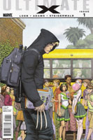
Ultimate Comics X #1 [Review]

His Father’s Son

Writer: Jeph Loeb
Pencils: Arthur Adams
Colorist: Aspen MLT’s Peter Steigerwald
Digital Inks: Aspen MLT’s Mark Roslan
Letters: Richard Starkings & Comic Craft’s Albert Deschesne
Production: Irene Y. Lee
Assistant Editor: Sana Amanat
Senior Editor: Mark Paniccia
Cover: Art Adams
Published by: Marvel Comics

Okay…so, I can hardly remember the last time I read an Ultimate comic. After reading from issue #3, I let Ultimate Spider-Man go around issue 80 when I gave in on the realization that the stories just weren’t being written for the single-issue format, and I wasn’t enjoying the pacing for the price per issue. I’m pretty sure I gave up on The Ultimates before that due to lateness, and I don’t recall sticking with Ultimates 2 more than a couple issues. All the hype over Ultimatum and the Ultimate Comics relaunch didn’t pull me in. I read Ultimate Iron Man 2 when I scored the hardback for the $6.

I’m not even sure what intrigued me with this issue. The teaser ads? Perhaps in small part–after all, WHAT is there to be done with Wolverine that’s NEW? Would this be something interesting like the Mary Jane and Spider-Man Loves Mary Jane series? Would a book about a teenaged Logan in modern high school (thinking “Wolverine” instead of “Sparkly Vampire”) come across well?

So, despite my extreme dislike of the $3.99 cover price, I grabbed the issue–choosing the cover whose image I recognized from the teaser ad. Behind Siege #2 (which was spoiled for me via twitter prior to reading), this was near the top of my stack this week–bypassing Deadpool and even a couple Blackest Night issues.

One of the things that Marvel has done well for many years is “The ‘Previously…’ Page” at the start of their issues. This is a page that is basically prose or just non-story content that serves to get a reader up-to-speed on stuff, contextualizing the story that’s about to begin; it also serves to have the issue’s credits all in one place, so that when this page is omitted, a collected volume flows as one long work, uninterrupted by titles and credits every chapter or so.

Opening this issue, we have a series of images with seven simple sentences that serve to place this story. Context provided–whether as wholly new information, or to catch one up. I’d read The Ultimates, and Ultimate Spider-Man, followed a bit of Ultimate Fantastic Four, and even some of the Ultimate X-Men. The pictures and words tell all I need to know–and the world in this issue is apparently the same as I’d read before, but much changed by Ultimatum. The world exists, but even though I haven’t read in years, I’m not lost.

This issue’s story begins with narration from James Hudson, talking about his son–a son brought to him by an old friend years earlier. That old friend wasn’t able to raise the boy, but knew James and his wife Heather could, and so entrusted them with the child. Now a teenager, and running concurrent with the narration of how the boy came to be Hudson’s son, we see this son discovering what he is, and how his being different changes his life. Kitty Pryde–a name and character I’m somewhat familiar with from both the Ultimate comics and mainstream Marvel continuity–enters, with a classic trapping of such stories: the message from a person to their loved one, recorded shortly before dying. This child–Jimmy Hudson–is confronted with the image of his father, and the reality of who he really is. We also learn the difference in his mutant ability from that of his father.

The story, surprisingly enough as I have really not enjoyed Loeb‘s work for years–is relatively engaging. It’s not perfect, but I remained interested throughout the issue, and that’s quite the achievement in my eyes. As a long-time comic reader familiar with much of the Marvel universe in general throughout much of the last couple decades, names were familiar, but as this is not the mainstream Marvel universe, I had zero problem with the Hudsons being different than the characters I knew before this issue, and rather enjoyed the reference to how James’s codename is come about. There was also something to the realization of who the main character is that is at once obvious and yet not exactly what I expected–and any duplication of a similar character in the main Marvel books works so much better to me here.

The issue reads like an origin issue. We have the introduction of characters who are (presumably) going to be much of a supporting cast. We’re introduced to who assumably is the main character of the book. We learn where he came from, how he is seen by his family and others. We see his discovery of his identity, and what that does to him. We’re left on an ending that both provides actual conclusion to this specific single issue’s story, and yet it is clear this is by no means the end–the issue is not a one-shot.

The art isn’t the greatest I’ve ever seen, but–except for one panel that really put me in mind of Millar‘s Kick-Ass–never really took me out of the story. It’s clear what’s going on throughout the issue, even the effect as we find out Jimmy’s “other” mutant ability. Particularly with no previous issue to go on, Adams’ art actually stakes itself as definitive to me for this character, and does quite a good job of it.

Again–I despise the $3.99 price point, particularly for a mere 22-page issue. As I’d already compromised my principle (avoiding all Marvel $3.99 books) with Siege and Siege: Embedded, I allowed myself a further compromise to pick this up, since it’s a debut issue of a new series, and I was actually somewhat intrigued.

What I got was a very enjoyable issue, that really does what a first issue of any series ought to do…and it stands alone. I won’t be picking up future issues, as I refuse to pay $3.99 as a regular, ongoing price for a “standard” comic.

In and of itself, though, this was a good read, and actually mostly worth its cover price for the experience. While I don’t plan to purchase future single issues…provided the inevitable collected volume is reasonably priced, I expect I’ll have some interest in picking that up to read this story and go from there.

Story: 8/10
Art: 7.5/10
Overall: 8/10

Haunt #2 [Review]

Co-creator/Writer: Robert Kirkman
Layouts: Greg Capullo
Pencils: Ryan Ottley
Co-creator/Inks: Todd McFarlane
Color: FCO Plascencia
Lettering: Richard Starkings/Comicraft
Cover/Variants Artists: Todd McFarlane, Ryan Ottley
Publisher: Image Comics

I’m actually enjoying this series. We’re only two issues in, and there’s still a lot of questions about the main characters, and I still have to look back into the issue to remember character names and such. But it’s a pot brewing a good deal of potentil to come.

The brothers from the previous issue must literally work together to stay alive and protect their friend–the dead brother takes control of their “merged” body and explains to the living brother that he can do what needs done, but needs to not be fought.

Father Kilgore–the surviving brother–is none to pleased at the current state of affairs and wants to be left out of things. As his brother makes clear, though, he’s already involved. They wind up fighting a mercenary who seems to almost be played for dark humour more than actual threat. Finally, the brothers–as “Haunt” (though I don’t think the name’s been given yet for their merged form) begin to move toward some answers, with a fairly cliche sort of cliffhanger.

As said, there’s a lot of potential here. Backstory to both of the brothers and their friend will be interesting to discover in coming issues. Seeing how the cliffhanger will likely add greatly to the status quo, and that development will be cool.

And whether the visual style and tone or something else, I can’t help but be reminded somehow of both Spawn and Spider-Man; though this character seems like he’s much more at home in a Spawn world, obviously. He could also almost work in an Invincible sort of world. (Though as yet, I don’t believe there’s anything to say this takes place in one, the other or either).

Taken as a whole, the writing and visuals make for an interesting issue, and I find myself intrested in and planning on pickin up the next issue to see how that one is.

For now, especially if you can still get ahold of the first issue, I recommend this for fans of McFarlane, Spawn, Kirkman, or Invincible…and casul fans somewhere in between.

Story: 6.5
Art: 8.5
Overall: 7.5

Haunt #1 [Review]

Co-creator/Writer: Robert Kirkman
Layouts: Greg Capullo
Pencils: Ryan Ottley
Co-creator/Inks: Todd McFarlane
Color: FCO Plascencia
Lettering: Richard Starkings/Comicraft
Cover/Variants Artists: Todd McFarlane, Ryan Ottley, Greg Capullo
Publisher: Image Comics

OK, so call me a sucker. This is a first issue, yeah. And I recently missed out on the debut of Chew, which had seemed interesting from an ad or two I’d seen. The Todd McFarlane and Robert Kirkman co-creation Haunt also seemed like a sorta interesting thing–again, from an ad. I’d pretty much forgotten about it entirely, though, until I received an email yesterday (the day before the comic’s release) about its release. I don’t know what landed me on this particular email list, but at least it was targeted, and did its job very, very well. Take these factors: two big names–creators whose books I’ve enjoyed recently, and a cheap-in-today’s-market cover price (this book’s only $2.99 cover price)–and combine them with “notice” or “attention” and you have a combination sufficient to get me to pick the book up. (Unfortunately, though I should’ve realized, there is the taint of variant covers, which I didn’t even consider…I wasn’t paying attention and am not particularly thrilled with the cover I wound up with).

So…what’s this Haunt thing all about? It’s only the first issue, so there’s plenty to wonder at. We’re introduced to a handful of characters and how they’re related to one another…and find out that one of them is actually dead, apparently a figment of his brother’s imagination. Only, there’s something more to it than “imagination.” When the surviving brother looks in on a woman both brothers had been involved with in the past–he’s got some less than wonderful history with her, it seems–he doesn’t think there’s anything to protect her from, though is soon proven wrong. When a couple of armed individuals enter the scene, a bit of a transformation occurs, and we meet the title character of the series.

I doubt much of it will stick as interesting to me long-term. But for the moment, there’s something interesting about the title character to me–the relationship between the brothers and the transformation that leaves one facing “Haunt.” I was put in mind of the Kevin Green transformation into Prime (for those few of you who remember the character). There’s also the slight twist on a quasi-archetype that I won’t get into as it’d be pretty serious spoiler territory.

The art team’s pretty familiar, and yet brings something new to the table. There’s a difference in visual style from Invincible and Spawn, but also a similarity to both…sorta like it has the grittiness of Spawn softened by the brighter style of Invincible. And honestly…works very well to me.

On the whole–for both the story and the visuals–this feels very much at-home in the same universe as Spawn (it remains to be seen if it is, actually) while not entirely out of place in a universe that has Invincible in it. With or without the comparisons…it’s got a fairly generic premise mixed with an intriguing twist sufficient to hook me and leave me interested in seeing what the next issue brings.

I bought this issue thanks to the initial hype/marketing and the names attached to it.

The package itself–the story, the hook–will bring me back for another look-see.

As something new, to get in at the beginning of what’s likely a major project with either Kirkman or McFarlane, this is well worth checking out…if only for this first issue.

Story: 7/10
Art: 8/10
Whole: 8.5/10

Whatmen?! [Review]

Whatmen?!

Written by: Scott Lobdell
Pencils by: Alejandro Figueroa
Inks by: Aldo Giordanelli
Colors & text page design by: Amber Shields
Lettering by: Richard Starkings & Comicraft’s Albert Deschesne
Edited by: Chris Ryall & Scott Dunbier
Publisher: IDW

I wasn’t going to buy this book–I enjoy some parodies/spoofs, but was going to avoid the various Watchmen spoofs. I also tend to avoid IDW because I refuse to pay $4 for a standard-size comic, and care nothing for cardstock covers and high-quality sturdy gloss pages. I just want to read a good story from a comic, and I’ll get a collected volume if I’m interested in a high-quality version that’s not going to sit in a box for years.

But this is a one-shot, and felt thicker than usual, so against better judgment I bought it. If you know the story of Watchmen, you know the basic elements found in this book. We follow along roughly the same story, but at breakneck pace and with a “_________ Movie” twist to numerous elements (including a nice use of Dr. NYC “spoiling” a couple of subplots since there’s not room in a single issue to adapt a 300-page graphic novel).

Given that this IS a spoof, not too much to be said story-wise, except that it hits on some of the main “moments” fans of Watchmen would probably expect to see in any abridgment.

The art is good, and actually does in most places remind me of Gibbons’ work on the source material. The art certainly goes with the story, and I have nothing here to complain about. There are some amusing sight-gags: watch for Spider-Man, and Snoopy clones, among others–when one looks past the “simple” exterior of these gags, there’s further amusement to be had realizing what they stand in for.

All in all, this is a fairly amusing book. I don’t think it’s on the level of being a “must-read!” or anything, but if you’ve an extra $4–and don’t mind spending $4 for 28 pages of visual story and 4 text-pages (all in the general style of Watchmen)–you’ll find yourself with a decent comic if you snag this.

Story: 7.5/10
Art: 7.5/10
Whole: 8/10

Marvels: Eye of the Camera #1 [Review]

Just One Little Thing

Writer: Kurt Busiek
Artist: Jay Anacleto
Colors: Brian Haberlin
Letters: Richard Starkings & Comicraft
Associate Editor: Jeanine Schaefer
Editor: Tom Brevoort
Cover: Jay Anacleto
Publisher: Marvel Comics

I’ve been looking forward to this series for years. I mean, we’re talking at least a decade. It’s been rumoured for many years, with apparently a couple of false-starts, and now after all this time, this series is here. Now what?

From the cover we immediately see this is different from the original. Different artist, different look…separate entity. No real attempt is made to have the cover evoke the feel of the original series–the “cover dress” with the black border/negative space over a full single image might have worked very well here, with the subtitle Eye of the Camera along the bottom.

The first page is an introduction by the main character, Phil Sheldon; and the issue’s creator credits somehow make me think of some “event” ticket, indicating who is involved for the night and all that. Not bad–I don’t think I’ve seen/held a ticket like that…well, ever–so it helps to indicate this story is not set during my lifetime.

The story follows Sheldon in the opening of the 1960s as he begins to realize that some of his “marvels” may be monsters, unlike the heroes during the war. He also considers that as a family man, perhaps he needs to lay down the freelance photography in pursuit of a steady/full job so that he knows he’s got provision for his family and isn’t still playing at his youth. Through this, we also see the arrival of the Fantastic Four on the scene and the “man on the street” reaction to the super-team’s unveiling.

The art is a very clear departure from that of painter Alex Ross from the original series. I’m not familiar with this artist at all offhand–ntohing comes to mind and I have nothing prior to compare the work to. In and of itself–and I’m sure credit must be given to the colorist in tandem here–has a look that while apparently not painted, has just the right feel to suggest painted, and very nicely captures the look of the characters I recall from the original. By itself, I’d deem this very good art; I honestly think the only thing that may keep it from that is the unfortunate fact that as a sequel, this has got to be compared to the original…and as such, the comparison to Ross must come up.

That said, I found this to be an excellent issue. It seems to be “sequel” in that it is a follow-up; though time-wise, it seems to be coming between the pages of the original story. As the first of six issues, I have no idea how the other issues will play out in that regard–are these meant to be taken as “between issues” stories from the original, between pages, or just another story from the same period, much as one could tell two independent stories that both follow the same life, the difference simply being the events chosen to focus on and unpack in each story.

Without Ross, I can think of no artist who would have done better than Mr. Anacleto; and I trust Busiek–who wrote the original series–with whatever he’s choosing to do here.

A very worthwhile issue…though with about a decade and a half of having the original story available in full under a single cover, I can’t help but wonder if this sequel will read better in the same way–as a whole, rather than split into six segments across half a year.

If the rest of the issues hold up to this one, this could be one of those rare sequels that at least matches its original.

Story: 8/10
Art: 9/10
Whole: 8.5/10