• December 2025
    S M T W T F S
     123456
    78910111213
    14151617181920
    21222324252627
    28293031  
  • On Facebook

  • Archives

  • Categories

  • Comic Blog Elite

    Comic Blogs - BlogCatalog Blog Directory

The Five Valiant Chromiums

I was going to pass on the later ones after not being particularly thrilled with the initial Armor Hunters #1 Chromium cover, comparing it thoroughly to my favorite “old-school” Valiant chromium cover: 1993’s X-O Manowar #0.

valiant_chromiums_2014_armor_hunters

But I’d requested them, and though the store owner gave me an out–I went ahead and snagged ’em all.

Yeah, I loathe variants on principle, but even I have to make exceptions here or there, and these go with the “old school” “regular and collectors’ editions” format, rather than different images.

Whether one goes with the regular cover or the chromium cover…it’s still the same image and such…one’s “just” paper and the other’s this much thicker, sturdier material. But the fairly “iconic” images–Armor Hunters #1 and X-O Manowar #26–are still consistent. There’s not some random cover by a random artist, or some “theme of the month” or such.

Of course, now that I do have these…it’s back to standard most regular “A” cover available for the foreseeable future!

The Weekly Haul – Week of July 30th, 2014

This week’s haul was rather moderate–not tiny, but not particularly huge or overwhelming in either cost or quantity.

weeklyhaul20140730a

Since I’d requested them sight unseen, I’ve continued with the Chromium covers, and with these being a VERY RARE EXCEPTION to my usual no-variants rule, I’ve got both editions of Armor Hunters: Harbinger. And I’ve continued with Futures End and Batman Eternal

weeklyhaul20140730b

I half-heartedly flipped through the quarter-bins for anything new or interesting. I probably already have the X-Factor issue, but not certain–it’s from near the end of the original run, where my collection remains sparser than earlier in the series. I don’t consciously remember the War Story issue, but had the first couple “waves” of War Story issues, so why not. And several Werewolf issues that I believe will make a fine addition to the Vampire issues I bought last week.

weeklyhaul20140730c

And because–at 90% off cover, Scalped vols. 2 & 3 (I got vol. 1 back in 2007) cost less than $4–I figured why not? I don’t recall how long the series ran, but I haven’t (yet) read the first volume, even, so these’ll add to a hopefully good, interesting reading when I get around to it. And with the discount I’d had on that one seven years ago, I don’t think I’ve topped $12 for the 3 so far.

I am going to have to decide soon if I *really* want to keep up with the DC Weeklies. They’ve not been bad, but I’ve had no problem going several weeks without READING, between actually reading the issues. And with Zero Year ending, I don’t know if the Batman Eternal will start having more direct tie-ins to the main title or not, and I don’t want to be forced (or enticed) into buying yet MORE series on a regular bases, especially when they’d likely be $3.99 to the weeklies’ $2.99.

Armor Hunters #1 [Review]

armorhunters001regArmor Hunters / Part I: Quarry

Writer: Robert Venditti
Artist: Doug Braithwaite
Colorist: Laura Martin
Letterer: Dave Sharpe
Cover Artists: Jorge Molina, Clayton Crain, Trevor Hairsine, Doug Braithwaite
Assistant Editor: Josh Johns
Editor: Warren Simons
Published by: Valiant
Cover Price: $3.99 ($5.99 Chromium Cover)

It’s definitely safe to say that this is an issue I’ve been looking forward to specifically for quite a few weeks now. Valiant‘s done a great job with “pushing” their titles, and as someone who’s already “all-in” for present, an event like this is well-suited for me. Though I believe the “main” story will be contained to this 4-issue mini-series, there are some tie-ins with X-O Manowar and Unity, as well as several tie-in mini-series. As the opening/first chapter in the event itself, this issue stands alone fairly well while sitting in the midst of established continuity.

This issue opens with an attack on a Russian facility where suits of armor are being developed in as-close-as-possible approximation to Aric’s X-O armor. The aliens attack the base, killing those within, having located the place due to the armors. While no sentience is detected, the armors are destroyed, and the aliens left baffled as to why humans would seek to duplicate such dangerous things. After this attack, Aric finds his people’s new homeland invaded by US forces–though said forces claim to be there to protect them, not to invade. Aric is brought up to speed from the US forces’ side, and seeks further counsel from Malgam (the alien he fought in the Armor Hunters Prelude in X-O Manowar #s 23-24). The alien “hunters” then unleash an attack that leaves little doubt as to their power, and the devastation possible on Earth if the X-O armor is not turned over to them.

As said, this issue sits in the midst of estabished continuity–particularly in references to goings-on in the X-O Manowar title. While readers of that title will have a fuller appreciation of Aric’s attitude and and what led to the present status quo, reading this issue by itself one is simply presented WITh the present status quo. Said status quo can be accepted at face value, but those interested in more can seek out the earlier stories to get the details.

By and large, this issue reads like an issue of X-O Manowar (which makes sense, given Venditti is the writer on both). The aliens are presented as the antagonists, yet don’t come off entirely as ‘villains’–moreso they come off as a “Federation” with no “Prime Directive” and no qualms about razing planets to make sure the apparently sentient armors are eradicated. The characterization seems consistent with the X-O Manowar title, and I have no issues with the story so far as “merely” the opening chapter.

Visually, I don’t have much to say except that I really enjoyed the issue, and nothing to the art really put me off or distracted me from the story. I know Braithwaite‘s art from Unity at the least, which adds to the consistent familiarity of the issue’s look/feel. I like the aliens’ design–they look suitably alien, while also being distinct individuals.

While this issue in and of itself doesn’t seem to justify the huge crossover, its ending does show how the crossover works quite organically as the impact of the issue is not limited to a single facility or base and truly will affect the entire planet.

Though one could presumably “jump in blind” with this issue and reasonably follow stuff, the full enjoyment (at least for me) of the issue comes from its growth out of continuity.

As there are a couple covers/editions, I recommend sticking with the standard cover…I was not suitably impressed at the “enhanced” “chromium” cover, finding it did not have the same boldness of the classic ’90s Valiant Chromium covers.

If you’re reading X-O Manowar, this definitely works as an extension of the title. It’s also worth picking up if you’re planning to follow any of the tie-in minis to get what I imagine will be the larger/broader context. And if you’re just looking for a mini-series to “dabble” in Valiant, this is also worthwhile on the whole.

Valiant Chromium Returns: Armor Hunters #1

It’s been some twenty years since I first got a copy of the original X-O Manowar #0 from the original Valiant. It was the first “chromium” cover I recall, though it was soon followed by the likes of Superman #82 (the “return” of Superman), X-Men: Alpha, X-Men: Omega, Ninjak #1, and others.

In more recent years, such “enhanced covers” have been pretty few and far between, in my observation (though can’t go two steps without tripping over variants!). [EDITED TO ADD: Last September’s 3-D covers from DC obviously were a huge quantity of such covers, but that was a specific event and really beside the point of this post]

When Valiant announced it was bringing back the chromium covers for Armor Hunters #1 and several of the tie-ins…I was actually sorta enthused (QUITE the exception to my usual attitude toward variants and such). But then, these chromium covers hold a certain nostalgia for me beyond all the other gimmicky/”enhanced” covers.

both_armor_hunters_covers

Unfortunately, I found myself rather disappointed in this particular version of “chromium.” Taken side-by-side, I feel like there’s clearer detail on the regular cover (pictured above on the right).

compare01

Comparing this new Armor Hunters #1 to X-O Manowar #0, I feel like the classic takes the win as well, between the two with brighter, bolder detail and coloring. Granted, that may not be so much the fault of the chromium effect, but it’s there.

compare02

At an angle, the new seems more reflective, picking up glare from an overhead light in a way that somewhat obscures details where the old does not…

…to say nothing of the imprinting showing through on the new where it doesn’t the old.

ah01shiny

Armor Hunters #1–at an angle in the light–gets this dotted, sparkly effect going on.

xo00shiny

At the same sort of angle, X-O Manowar #0 does not give that effect.

To me, part of what made chromium covers what they are was being able to see the outlines on the inside/back of the cover. Armor Hunters does have that effect, so unlike Marvel‘s Age of Ultron #1 last year, I can’t really “disqualify” it from my own personal “chromium collection.” But the muted coloring/subdued tones, the “flat” reflectiveness, and the thicker cover stock of Armor Hunters leaves me truly disappointed, and planning on sticking with the regular covers from here on out.

Not a Poster (and where are the chains?)

supermanunchained001variant001While I was quite impressed by Man of Steel, I found myself rather disappointed (to say the least) in Superman Unchained #1. I think THE primary problem for me with Superman Unchained was the issue of the extra $1 to the cover price (already going to be $3.99, the poster’s inclusion bumped the price an entire $1 to $4.99!)

And yet…the poster is not at all what I personally would consider an actual poster. To me, a poster is a stand-alone image, where the art speaks for itself. It might be an oversized (or same-sized) cover image, or reproduced from interior art–a panel or splash-page.  It might be a wholly original image, perhaps an artist’s work not usually associated with a character. And if it is captioned, it’s intended as a stand-alone.

What we got with this issue is simply a detachable fold-out to allow for two panels at 4 times the usual page-size (or double the size of a 2-page splash).

supermanunchainedposter01

The first side is simply a falling satellite with Superman smashing through…but just looking at the image, I can’t even tell what it’s supposed to be. Some sort of spaceship exploding or otherwise breaking apart…but no CONTEXT. Can’t even tell that it’s Superman there…and it’s certainly no poster-worthy Superman depiction–no heroic pose, nothing that truly “says” Superman here.

supermanunchainedposter02

On the reverse side, we do get a MUCH closer-up view of Superman…you can tell that it’s Superman, that he’s punching…something, so we’re a little closer to expectation. But the image is spoiled by the awkward, off-center pose, and all those text boxes. They may not be overly noticeable at first glance from a distance…but while that MIGHT be a slight strength at first, it leads into another problem: you have to get up close to the poster to read anything on it, and it’s hard to un-notice the text once you notice it.

supermanunchained001variant002And since this comes from within the issue itself, is a part of the story, this does not at all stand alone–you lose the context of that story that ties to the text boxes. It also means that you’re missing these details from any later re-read of the issue itself if you’ve removed and hung the poster, rather than tucking it back into the issue where it–obviously–is intended to belong.

Basically, the reader is asked to pay extra so that the artist can have art shown off at an abnormally over-sized perspective for no real gain to the story itself (to say nothing of losing all flow of story by having to take the time and hassle to remove the thing from the issue in the first place! Why not a clear polybag? DC already uses those for the “combo pack” editions, I believe!)

Then, the issue is swamped with variants–many actually appealing for their nostalgia factor AS a comic book. Rather than simply having a different image under the company logo, title logo, and UPC box…the entire trade dress of the cover is redone in the classic styles, with the classic company logos and so on.

Granted, the visual style would evoke different periods of the comics. But going with the different logos and trade dress, you truly wind up with an entirely different comic by the cover alone–whether something that looks like it came out of my grandpa’s cabinet, or from the midst of the era of Superman I most enjoy.

supermanthemanofsteel050But the variants aren’t stopping with the “celebration” of this first issue–nope, they’re continuing with the next issue at minimum, if not beyond. And while I’d thought to “give in” and give the issue a “pass” for being a #1…keeping this up–especially with RATIOED variants–is absolutely not gonna keep me around (in fact, it’s soured me entirely!)

Add to all of the above that I didn’t pick up on anything within the first issue to really warrant the title Unchained, vs. the long-rumored Man of Steel or something else. Depending even on where the story goes based on the first issue’s cliffhanger, I don’t see Unchained coming from that–perhaps if we actually saw a Superman breaking free of SOME sort of imprisonment (chains or otherwise)–or being imprisoned (and so having something to break free from) it would make sense.

The standard cover at least has debris and sorta looks like chains on it at a glance…but unless that’s a requirement for every standard cover to justify the title, even that sort of gimmick will likely wear thin its welcome in quite a hurry.

In the end, I suppose all of this is simply further indication that I’m not the target audience. And since I’m not enjoying what’s being done at present–I’ll stick to my back issues.

Vexed by Variants

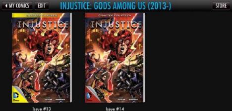
injusticegodsamongus1314I just posted the other day about my enthusiasm toward the Injustice: Gods Among us digital-first series. However, turns out the 4th “print edition” came out this week…and I’ve not had much luck toward finding early issues.

I did make it to another comic shop (that I don’t get to all that often) where I found issues 2 & 3. I don’t remember much about 3, except that I’m NOT buying a #3 when I don’t know for certain if #4 or #5 are even out yet or not…and certainly not when I can’t get #1 and #2.

BUT…this shop had #2…just not the first print.

Which normally wouldn’t bother me…but the printing they had in-stock was one of these horrible “sketch variant” or “pencils/inks-only” non-first-print deals, basically black and white linework with the logo…DC couldn’t even be bothered to provide COLOR with the thing.

So now, rather than almost cheerfully double-dipping or at least following the more expensive print format…I’m ready to say ok, fine, had my one-shot reading of this series-so-far…and now my “demand” is not being met, so I’m done.

injusticegodsamongus01to06If I can’t get ANY printing (for cover price) that actually looks like it belongs with the series in general–especially when a series otherwise has a fairly consistent look/feel/tone…you’re gonna lose me.

I am so sick of variants as-is already just with the “first print” of issues. So here, rather than “satisfying a demand” for the issue…I’ve refused to buy an issue BECAUSE the cover is an “inferior product” to me. And further–that’s one less issue to have, and so one more hurdle to actually converting me to a customer.

If they’d do something “simple,” like putting a small Roman numeral somewhere on the cover to make it clear to the caring eye that the thing’s NOT the “first print” or “first edition,” that’d satisfy the collector, and the reader like me who just wants the cover that matches the marketing (and the Comics app).

(That’s what turned me off completely to House of M back in the day: the rare/”ratioed” variant cover’s image was used for advertising, and the “regular” cover seemed boring and generic by comparison; seemed Marvel thought so, too, given they didn’t even use it for much advertising that I remember).

I’m not buying into a series at #4 or #5 or even #6 and going from there–if I can’t get #1 that looks like the #1 in the app (image itself and the image’s coloring) I’m not likely to buy #2. No #2, no #3, and so on. If I have to wait for the collected edition…well, so be it–but I’m done with the series until then.

One last digital purchase (chapter 15, ending what will likely be issue #5) and then it’s a crapshoot from there–if the collected edition comes out on a slow week and I feel like splurging for the purchase then, or if I get around to ordering it from Amazon or such for a discount. Had that #2 been a fully-colored cover, matching the image I see in the app, I might have bought #2-3 then, bought #4 when it hit the other day, and then be that much more interested in tracking down #1, and going from there. Instead, a crappy variant–rather than encourage a sale–has DIScouraged me not only from that issue, not only from the issues so far…but from the series itself: print AND digital.

I prefer the collected volumes. I’m not going to support the single issues when I feel like I’m getting the raw end of the deal.

Ruining a couple comics and falling victim to a Valiant variant

ImageSaturday night, I had an experience I hadn’t had in quite awhile: I managed to spill something on a comic.

I honestly can’t remember the last time that happened–I’m not OVERLY “careful” anymore about comics–but I’m not going to intentionally set one in standing liquid, or use ’em as a coaster or anything like that. But I knocked a (virtually empty) pop can off its perch and it landed upside-down on my copy of Archer & Armstrong #9. I quickly grabbed the can off, and attempted to gather up the comics to get them away–which resulted in my (stupidly) stacking X #0 on top of A&A, and not realizing it until the damage to both issues had been done.

While I don’t “collect” for profit/”value” I do like my comics to be in good condition–and I’m certainly not gonna want damp/formerly-damp paper to be stacked in with other (dry) paper–so I determined I was going to consider this a costly lesson, and replace the two issues. When I went to the closest comic shop (Comic Heaven in Willoughby, OH), they had several copies of the A&A issue left and one copy of X, so I grabbed one of each, grabbed a another “sale” hardcover (see post later this week on sale acquisitions), paid, and walked out.

When I got home, I realized to my great dismay, that I’d grabbed the VARIANT cover for A&A…which honestly just totally ticks me off. I’m NOT used to grabbing the singles “off the shelf,” and my standard “pull list” includes a request for the “standard/regular” covers of everything, so I thought nothing of just grabbing a copy of the issue, having identified the series from the logo–which was the main part of the cover that was visible. Functionally this was to be a simple replacement of something I’d already bought a copy of the other day, already read, so there was no “need” to examine the cover.

I am so incredibly sick and tired of variant covers, though. And now, even the “equal ratio” variants–50/50–have become troublesome because they’re not separated out (no reason to, it’s the same issue, no “special version” of a cover, etc) so nothing calls attention to it being a variant without looking at the UPC box to find its designation.

So at this point, to get the cover that I actually want–the REGULAR cover!!!–I’m going to have paid $11.97 for ONE COMIC that stays in my collection. I can accept the $7.98 because I’m the clumsy guy that knocked a can of pop onto my original copy. But to pay that $7.98 ON TOP OF the copy I ruined just bugs the crap outta me.

Perhaps “making a mountain of a molehill” or some such, but this has me once more/yet AGAIN contemplating a radical shift to collected volumes. At least then I’m (so far/to my knowledge) not going to be dealing with near-constant variants for each volume. And the collected volumes often have the art from the variants included anyway, so I can still see the art in-person.

Typically, I quite enjoy Valiant, and have been sticking with ’em in part BECAUSE they’re Valiant. But between their ridiculous “clustering” of titles and so many variants…it’s enough to leave me contemplating dropping the line and waiting just for the collected volumes, despite the otherwise quality stories/art.

Image

More Shiny Comics

After a momentary re-kindling of my fascination with “shiny covers” last week, I had the chance to raid bargain bins at a local Half-Price Books store as well as another comic shop, Comic Heaven a few days later over the weekend.

Got these six “shiny covers” at Half-Price Books:

moreshiny01

And then at Comic Heaven, snagged these as part of a 15/$5 deal:

moreshiny02

And while not of the shiny variety, found a full set of the Milestone #1s still bagged (I’ve seen these occasionally in bargain bins, both bagged and unbagged, but I don’t recall ever finding all 4 at once, bagged). I can finally build/complete the 16-panel poster now, as each of these comes with 4 panels of the whole.

milestone01s

Best part is, all the comics shown in this post, shiny covers, polybags, and all?
Cheaper than buying any 2 NEW comics today!

A Multi-Panel cover image done RIGHT

Rediscovered this over the weekend: the covers to Batman: Battle for the Cowl #s 1-3 fit together to make a single, large 3-panel image.

And thankfully, rather than serve as 3 variants to any single image of the mini-series…each stands on its own and serves as a single cover for DIFFERENT issues each.

I only had to purchase ONE copy of EACH issue, and by getting the entire 3-issue mini, I got the entire image.

REALLY wish this practice was followed in general.

TMNT: The Exception, My Weakness

tmntidw001leoMy “origin story” with comics involves the Letter People, and Superman. And while Superman (and Batman, and a stack of silver-age DCs from my grandpa) were my first real introduction to comics; the first comics I ever owned were Superman/Batman…

I’ve been “into” the TMNT slightly longer.

First it was the classic cartoon. Some of my friends were into it, so I wound up “having to” see some of it (the original 5-episode mini-series/1st season). And things went from there. The toys. The films. The Archie comics. The original Mirage comics. teenagemutantninjaturtlesidw001Eventually I gave up the toys for the comics, and then eventually the comics went away, too. My freshman year of college I discovered the Image series, but to this day only have a scant handful of issues.

Then in 2001 I discovered that Peter Laird had launched a new series. I spotted #2 on the shelf, and the comic shop had one last copy of #1…which the owner graciously sold to me at cover price. I’ve been “up” on the comics since. I loved the debut of the 2003 animated series, though that eventually fell away due to scheduling and reruns and life getting in the way.

But…the TMNT have been there longer than comics have been in my life.

Continue reading