• February 2026
    S M T W T F S
    1234567
    891011121314
    15161718192021
    22232425262728
  • On Facebook

  • Archives

  • Categories

  • Comic Blog Elite

    Comic Blogs - BlogCatalog Blog Directory

Batman ’66 #2 [Review]

batman66002Emperior Penguin & Chandell’s Chanteuse

Written by: Jeff Parker
Art by: Ty Templeton & Jonathan Case
Colored by: Wes Hartman
Lettered by: Wes Abbott
Cover art by: Michael and Laura Allred
Edited by: Jim Chadwick
Published by: DC Comics
Cover Price: $3.99

When I first heard of this digital-first series, I wasn’t that impressed. New comic stories based on the campy 45-year-old tv series? Where’s the fun in that? Yet, due to the price point–only 99 cents for the first digital chapter–I gave it a try anyway, and something about it pulled me in. I went ahead and bought the second chapter, but then discovered that unlike others, the print edition and third digital chapter would hit the same week–so I decided I’d “go print” on this.

The same issues I had with the first–particularly the art–are present here. I can “appreciate” the visual style for trying to evoke the ’60s and such, but it’s not that appealing to me personally. Yet, it certainly fits the story, so in and of itself I don’t really have much complaint. The character designs certainly bring back memories of the characters as played by the real-life actors, which I would say means goal achieved, placing these stories as fitting the classic series.

Story-wise, the plot definitely fits. A giant iceberg floats into Gotham harbor, blocking shipping traffic. Turns out the block of ice is ruled by The Penguin–now recognized as Emperor Penguin–as the iceberg’s been declared its own country (legally binding and all that!). Batman and Robin get involved where the police can’t, and the duo quickly discovers the Penguin’s ally–Mr. Freeze! Of course, things go cold before warming up, and the dizzying duo of detectives declares fowl (er…foul) and things come to a head.

In the back part of the issue, Bruce flies solo on a date with Kathy Kane, and winds up facing someone called the Siren as Batman, who eventually winds up benefiting from Kane’s assistance. I have no idea if this character ever appeared in the classic series or not, but I have no interest in the Siren, and this sort of story especially comes as a turnoff for me–in this comic as well as the way it always did in the tv series.

All in all, not a bad issue on the whole, though at only 2 issues, some of the novelty is already wearing off. If this were a mini-series there might be more appeal for me, but I have to wonder how long this will hold my attention as an ongoing. Despite that…if only for wanting to support what I see as one of the few things DC‘s doing “right” lately, I added this to my pull list, and hope to give it at least a few more issues before I’m “driven” to dropping it.

TMNT New Animated Adventures #2 [Review]

tmntnewanimatedadventures002Story: Kenny Byerly
Art: Dario Brizuela
Colors: Heather Breckel
Letters: Shawn Lee
Edits: Bobby Curnow
Cover: Dario Brizuela
Published by: IDW
Cover Price: $3.99

Snakeweed is probably the most memorable of my least-favorite characters introduced in the new TMNT series. He may have also been the first–I don’t quite recall for sure. So while I was looking forward to another issue of the New Animated Adventures…the fact that it featured Snakeweed as the mutant du jour was rather dismaying.

This issue’s well in line with fitting the tone of this series so far (the FCBD and #1 issues), but for Snakeweed it’s certainly my least-favorite issue so far.

Leo’s been looking forward (for weeks!) to a marathon airing of the entire Space Heroes series and exposing his bros to the show. The power cuts out, and while he complains, Splinter suggests a reverence for nature rather than a railing against nature’s storms. Eventually the power is restored, only for the turtles to learn of a plant infestation in the city. They investigate and discover Snakeweed’s involvement and a new plan–to release spores in a storm to spread more Snakeweeds and overtake the humans, returning the planet to a vegetative state. The turtles split up–two to tackle the mutant himself and two to contain the spores.

I continue to enjoy Brizuela‘s art on this, and really like the visual take on these characters. They’re quite recognizable as being based on the tv series, yet maintain a comic book feel that avoids looking like some straight “adaptation” or “imitation”…it’s truly its own thing.

Story-wise, as said, I have a strong dislike for Snakeweed, so I’m not impressed there. In and of itself, the story works, and everyone seems “on” to what one would expect within this shared tv/comic continuity, so objectively this is definitely another solid issue. Long-time TMNT fans will also likely note a surprising yet obvious “Easter Egg” with April partway into the issue that brings back memories.

I’m looking forward to the next issue–the cover preview suggests the involvement of Kraang Prime, which is all the more appealing for my dislike here of Snakeweed, as well as having just a few days ago finally having watched the tv series’ season one finale.

If you’re enjoying the tv series, but don’t want to venture into the full-blown comics continuity of IDW‘s ongoing series, this is certainly a great book to jump into for some TMNT comics’ enjoyment. And if you just enjoy TMNT comics, this is well worthwhile…more color adventures, and it stands by itself (alongside the tv series) offering a “different” take on these characters.

Quantum and Woody (2013) #1 [Review]

Quantum and Woody (2013) #1World’s Worst part 1

Writer: James Asmus
Art: Tom Fowler
Color Art: Jordie Bellaire
Covers: Ryan Sook, Marcos Martin, Andrew Robinson and Tom Fowler
Letters: Dave Lanphear
Editor: Jody LeHeup
Created by: M.D. Bright & Priest
Published by: Valiant
Cover Price: $3.99

I don’t know when it was that I first heard of Quantum and Woody, but I’m pretty sure it was at least a decade ago. Of course, I didn’t know their significance at the time–no, the appreciation I’ve developed has come only in recent months and thanks to Comixology’s 99-cent sale of the classic material a few months back.

I also don’t recall now if my Comixology purchase of the entire classic series preceded knowledge of this new series, though I’m pretty sure my interest was actually sparked by knowing there’d be new material and wanting to read some of the original.

Whatever the case–I’m familiar with the first half of the original run, which I think made this new #1 actually more enjoyable for me.

That being said, like what I’ve read of the original, the reader is kinda thrown into things here, to pick up information through flashbacks and such.

We open on a scene of our heroes, Quantum and Woody, falling from a building and making the news, basically seen as the world’s worst super-heroes, if indeed that’s what they are. We then flash back to their past as adoptive brothers, before moving to the present where the pair learns of the death of their father. As things unfold they learn that all was not as it seemed–and they seek answers that throw them together into a rather explosive situation leading to the obligatory To-Be-Continued.

Visually I’m quite pleased with this issue…no real complaints or negatives for me on the art side of things.

Story-wise, I rather enjoy the maintenance of the “chapter headings” Priest made popular back in the day on the original series as well as in his Black Panther run for Marvel Knights. While stylistically different from the other Valiant books, it gives a certain familiarity to this that is welcome and appreciated…it also keeps this book fairly unique, providing a different “voice” than the other Valiant titles right now.

Though the bulk of the issue is essentially “origin” stuff, I the non-linear narration allows for an appearance of the characters AS Quantum and Woody in this issue; introduces the characters behind the hero-guises, and sets up the motivation that drives them…which to me is quite good for being the first issue of a brand new series.

While this is a Valiant #1, retains the standard trade dress of all the contemporary Valiant titles, etc. you don’t need to have any background whatsoever with other Valiant books in order to “get” and enjoy this issue. If you were merely handed the pages to read and had never heard of the property before, there’s nothing whatsoever here that requires you to have read anything else.

I will probably never like the $3.99 price point on any standard-size comics, but as only the sixth one-issue-per-month Valiant title, I can handle this a lot better than double-shipped $3.99 titles from other publishers, and I consider this a welcome addition to my own pull list and definitely look forward to the next issue. (And while I wait, I have half of the classic run yet to read to keep me busy!)

Astro City (2013) #2 [Review]

Astro City (2013) #2Welcome to HumanoGlobal

Writer: Kurt Busiek
Artist: Brent Eric Anderson
Cover: Alex Ross
Lettering & Design: John G. Roshell & Jimmy Betancourt of Comicraft
Color art: Alex Sinclair
Editor: Kristy Quinn
Assistant Editor: Jessica Chen
Published by: Vertigo/DC Comics
Cover Price: $3.99

$3.99 sucks. I’m really, really very tired of this price point. I think I’m going to keep making sure that’s extremely well-documented in these reviews and other blog posts until I eventually give up on new comics altogether.

That said, if you’re going to pay $3.99 for a single issue of a comic, there are few better series out there than Astro City. Even when you don’t know what the issue will be about or it deviates from the previous issue or whatever…it’s hard not to look back on a given issue without a bit of a smile and some disbelief at how much it was enjoyed and sheds different light on superhero stuff typically taken for granted or outright not often considered.

This issue focuses on a new employee of a hotline–said hotline turns out to be for a call center that weeds out the truly important calls for the Honor Guard, and in other cases outright makes connections allowing Honor Guard to be sent after villains/terrorists before they have a chance to enact plans that would otherwise leave the heroes reactive rather than proactive. We see bits of her training, the sorts of calls she takes, and the excitement with her teammates when they manage to catch a big call and be part of the overall “process” that leads to the saving of so many lives. Though they largely have to keep the true nature of their work secret from family and non-work friends, they find certain perks within their work…but also learn that one mistake can be very costly.

The art is strong as usual for an Astro City issue; everyone who should look familiar does, and those that don’t still look quite good. While the story itself isn’t your usual fare, the sequences with superhero action look as one might expect (if not a bit on the higher end quality-wise) while the normal people look…normal.

Story-wise, this is another great outing, showing that Busiek knows his stuff–and does very well giving us a look at the human side of things, as “normal humans” interact in a world filled with super-powered beings and threats, and how the culture itself is impacted by their very existence.

While I missed this issue on Wednesday and thought “oh well” I quickly realized that no, I actually really wanted to read this, and it became the entire reason of going back to a comic shop Friday rather than simply waiting and picking it up with next week’s books. There really aren’t many series that do that for me.

Provided you have any background at all with Astro City–I’d especially recommend the first TPB Life in the Big City (there’s even a new edition out now)–you’d actually be fine jumping in on this issue without even having read #1…which is another strength of this series: there are a lot of short arcs and done-in-one issues, rather than the “standard” fare from DC and Marvel necessitating 4-6 issues’ investment just for a single story.

I’d largely prefer to hold off for the collected volumes, but for now, this return of Astro City is such a welcome thing, I’m likely to keep going with the single issues for at least a few more months.

TMNT New Animated Adventures #1 [Review]

TMNT New Animated Adventures #1Story: Kenny Byerly
Art: Dario Brizuela
Colors: Heather Breckel
Letters: Shawn Lee
Edits: Bobby Curnow
Cover: Dario Brizuela
Published by: IDW
Cover Price: $3.99

I’ve been quite looking forward to this premiere issue for a couple months now, since at least the FCBD issue back in May. In many ways, this is sort of a #2 issue, as it fits excellently with the FCBD issue (which was itself a full issue and not just a few pages’ preview or a short one-off amidst so-called “dvd-style extras” or such.

As I’d said then and hold with this issue, this truly feels right at home within the continuity of the Nickelodeon animated series–the characterization is consistent, and I even “hear” the voices from the show as I read this.

The visuals are a great blend of simply “comic book art” and “adaptation form another medium” as the characters are very recognizeable as based on the CGI designs of the animated series…yet Brizuela‘s art is distinctive and does not seem to “try too hard” to BE what it is not–it’s 2-D art and works very well, and avoids being particularly “cartooney” or over-simple.

Story-wise, this is an April-centric issue, focusing largely on her integration into the turtles’ family unit, and showing her increasing skills unter Splinter’s tutelage while we see her equally as fallible as the turtles themselves–also teens.

After showing off her stealth and receiving praise from Splinter, April accompanies Donatello to a junkyard to track down a piece of of tech for his inventions. Unfortunately, the junkyard turns out to be a bit more than they bargained for, and April is captured by the military, and the turtles have to intervene. Ultimately, a lesson is learned by all, and things continue on.

I’ve enjoyed the main/”real” TMNT continuity from IDW these past couple of years, and despite not being entirely enamored with the animated tv series, I did enjoy reading this issue. As long as I’ve been into TMNT in general, I very fondly remember the original Archie-published TMNT Adventures, so this TMNT New Animated Adventures is a bit reminiscent of that in intent, it seems. It remains to be seen if this will branch off into its own individual continuity, but I’m content to follow this as an extension to the tv series’ continuity.

As with the tv series, this story is a done-in one/self-contained story…you get a full story in one issue, and there’s no need to get the next issue to FINISH this story…which is another nice thing about this. Though the next-issue ad indicates one of my least-favorite characters of the series, I’ll happily give it a chance simply for being TMNT, and of course Brizuela‘s art.

The ’90s Revisited: Action Comics #761

actioncomics761For a Thousand Years…

Writer: Joe Kelly
Penciler: German Garcia
Inker: Joe Rubinstein
Colorist: Glenn Whitmore
Seps: Wildstorm
Letterer: John Costanza
Associate Editor: Maureen McTigue
Editor: Edddie Berganza
Published by: DC Comics
Cover Price: $1.99
Cover Date: January, 2000

This is one of those fairly “one-off” issues, the sort I tend to quite enjoy, despite being one who thoroughly enjoys a rich “continuity.” While cover-dated as January 2000, this came out in 1999, and is one of the later issues of the ’90s run on the Superman titles that has really and truly stuck with me through the years.\

While there’s stuff with ongoing plot details, the heart of this issue is about Wonder Woman recruiting Superman to assist an ongoing battle of the gods. Unfortunately, the two find themselves stuck–they cannot return home until the war is over…and they learn that war can last for a very, very, very long time.

I quite like the cover of this issue…at least compared to the main interior art. The art isn’t bad, mind you–but it’s a bit less detailed and more cartooney than I remembered. Beyond that, I’m neither put off nor enamored by the art–it does what it should conveying visuals of the story, it just doesn’t blow me away in and of itself.

The story is what really makes this issue stand out in my memory, such that I had but to see the cover to know this was the issue the story was in, and recall the overall plot. This is the Superman I grew up on, and hold to be “my” Superman: the one who is great friends with Wonder Woman, but extremely sure of himself and his relationship with Lois. That what he had with Lois was essential to who he was, and not something casually set aside for some woman who also happened to be “more than mortal” or some such.

I like the epic-ness of the issue, though it’s a bit far-fetched in a lotta ways, especially in this “era” of Superman. At the same time, it fits–as there had already been hints–if only in Kamandi: At Earth’s End and the DC One Million stuff–that suggest Superman would go on to have an extremely long lifespan. I honestly don’t recall how much “fallout” there was from this issue–but there was some, I’m almost certain.

Despite plenty of attention given to the supporting cast, this issue is a fairly good stand-alone issue, if plucked by itself from a bargain bin. For me, it’s one of the stand-out issues of the 1990s-era Superman run, of all the ongoing titles, simply FOR its dealing with the Superman/Wonder Woman/Lois “triangle” and (to me) strongly affirming where the characters stand with each other.

The ’00s Revisited: Captain Marvel #17

captainmarvel017Cheating Death

Writer: Peter David
Pencils: Jim Starlin
Inks: Al Milgrom
Colors: Steve Oliff
Letters: RS/Comicraft’s Wes Abbot
Assistant Editor: Marc Sumerak
Editor: Tom Brevoort
Published by: Marvel Comics
Cover Price: 2.50
Cover Date: May, 2001

This issue grabbed my attention because of Thanos on the cover. Besides Thanos himself, there’s just something to the cover’s colors that I really dig…it’s so colorful without being gaudy or even all that bright…it’s just really nicely drawn and colored; the generic background sets Thanos, Thor, and Genis off quite well; and the coloring of the logo and such even fit nicely…though I might’ve gone with more of a gold for Captain Marvel to better match Thanos’s gold coloring.

This was another quarter-bin discovery, at least this copy of the actual issue–I’d bought and read it as a new issue back in 2001, and still have that copy…somewhere. So I do vaguely recall some context, both prior and subsequent to this issue, once I got to reading. But even sticking solely to this one issue by itself, I rather enjoyed the Thor/Thanos bickering, and even the dynamic with Rick and Genis and having to be aware of the environments they’re in when the swap places. And of course, the now-iconic “Klang” that I’ve come to appreciate in context of Quantum & Woody from Valiant.

We find Thanos recruiting Thor for some part of a larger plan…of course, Thor is not at all a happy camper, given his recent tussles with Thanos. But he’s convinced of his necessity in things, and goes along grudgingly. Meanwhile, Marlo (Rick’s wife) is being haunted by the ghost of…a friend, or coworker, I don’t recall exactly, she’s just here (the details were in earlier issues of this run). Rick finds himself in a bit of trouble, as the entity that has Thanos recruiting Thor to begin with makes his appearance, and the “big guns” duke it out.

Visually, I very much enjoyed the interior art. Starlin has–for me–defined these characters to the extent that just seeing his name on the cover would have drawn me in. As far as I’m concerned, “Marvel cosmic” doesn’t get much better than sharing involvement from Starlin.

Story-wise, David always did have a great feel for the characters he involved in this series, making them his own, and giving them quite a memorable voice. There are elements from this series that settled into the core of my thinking about comics, and this take on Captain Marvel remains my absolute favorite.

This issue reminds me of how much I’d enjoyed this run on the series, and has me remembering rather fondly other issues, and a bit of a rekindled interest in re-reading the entire run…and certainly wishing Marvel would put out an omnibus collecting this entire first run of PAD‘s Captain Marvel.

Batman/Superman #1 [Review]

batmansuperman001Crossworld

Writer: Greg Pak
Artists: Jae Lee, Ben Oliver
Colors: June Chung, Daniel Brown
Letters: Rob Leigh
Cover: Jae Lee with June Chung
Associate Editor: Rickey Purdin
Group Editor: Eddie Berganza
Published by: DC Comics
Cover Price: $3.99

I bought this issue to meet a credit card minimum. Of everything on the “new” shelf, it was the only thing that really grabbed my attention for a one-shot purchase with potential. Other than setting this apart from the Loeb-launched Superman/Batman from a decade ago, I do find myself mildly curious as to any significance to the title, having Batman listed first. At least BOTH characters are spotlighted on the standard cover…you don’t have to track down two covers to get both title characters in one shot.

Unfortunately, it was a lot more disappointing than I expected. I’d avoided it on Wednesday–I just had zero interest in it from the start. ANOTHER “Superman meets Batman for the FIRST TIME” story. And that’s where it goes wrong; where I go wrong. I am absolutely NOT the “target audience” for this book: I’m bored and put-out by the New 52 at this point…and to ME, the “first meeting” between Superman and Batman happened “One Night in Gotham City” in the 1980s’ Man of Steel #3.

Leaving nostalgia and such aside, I have a real problem with a young Superman–Superboy???–being so…arrogant, angry, violent. To say nothing of the fact that I did read the first-ever New 52 issue, Justice League #1. And I’m recalling a scene in which Batman and Green Lantern talk about some alien in Metropolis, and meet Superman “for the first time.” So that makes this issue essentially a fairly big plothole to a casual such reader as myself.

Clark Kent visits Gotham, and realizes he really does not fit into this dark city. When he confronts some kids bullying another, he meets a drunk, stinking boy billionaire with more street sense than he’d’ve expected. Turns out Clark was looking for Bruce, to see what he knew of several Wayne employees murdered recently. The two part on neutral terms, neither impressed with the other. The murderer strikes again, and Batman leaps into the fray, surprised at the identity…before Superman busts in, throwing around violence and making a bad situation worse. Another entity joins the situation, and just makes things confusing…though that seems to set up what may be the plot for the next few issues.

Visually I’m not all that impressed…Lee‘s art is not particularly “up my alley,” it’s very stylized and just not what I would choose. Because it’s so…what it is, this feels like it ought to me some sort of Elseworlds book, or some intercompany crossover in the vein of these characters meeting the Aliens or Predators. I’ve never really cared for the jeans, t-shirt and cape get-up for Superman; the look is done no favors here, in my eyes. There’s also something to the way Lee depicts the “S” that bugs me–like it’s trying to be a mash-up of the overly-lined Man of Steel film logo and the more stylized Superman Returns film logo.

Lee‘s art gets the job done, though…even depicting the violence fairly disturbingly (something Lee‘s style does well with). So while it’s not my cup of tea and I have nitpicky issues, I won’t fault it too heavily in and of itself.

I don’t care for the art shift toward the end of the issue. It fits reasonably well given the shift in scenery and all–but I find myself wondering if this is an issue of timing or a planned function to serve the story itself (or just happened to work as it is).

The story itself roughly fits a fairly standard mold for these characters…the idea that while they come to work together when more seasoned at the whole “super-hero” thing, they clash in the early days of their careers is not new. What little I know of the New 52 incarnation of Superman kinda fits, though again I don’t like it much. Batman I’m less sure on–this Bruce Wayne sorta fits with Year One, and probably perfectly fits with the upcoming Zero Year stuff. Given Clark’s readiness to cut loose with his powers it’s sort of astonishing that he doesn’t (seem to) recognize Batman as a mortal man and “reveal” him or at least peek under the cowl with X-ray vision. (Then again, I realize I don’t know the origin of this version of Superman, so maybe he didn’t have access to that power yet).

All in all, I imagine that if you’re a fan of Jae Lee‘s art, of the New 52 early Superman, and/or Pak‘s writing, and have no particular “attachment” to ’80s/’90s Superman and Batman, you’ll probably enjoy this. You might have to overlook that this is yet another $3.99 book…but hey? $2.99 seems to be an exception rather than the rule, these days.

Captain Midnight #0 [Review]

captainmidnight000frontWritten by: Joshua Williamson
Art by: Victor Ibanez and Pere Perez
Colors by: Ego
Letters by: Nate Piekos of Blambot
Cover by: Raymond Swanland
Back Cover by: Steve Rude
Designer: David Nestelle
Editor: Jim Gibbons
Published by: Dark Horse Comics
Cover Price: $2.99

Captain Midnight #0 has a lot of things going for it.

First (and primarily, for me) it is only $2.99, but it’s a “full size” issue. Looks like a full issue, feels like a full issue, reads like a full issue.

Secondly, it has a really nice-looking cover that grabbed my attention in spite of myself. Often, the cover is not going to grab me–I’m solely looking for the TITLEs (which is how I often wind up with an UNwanted variant edition: I simply see a title logo and issue number, and it’s not til I’m home about to read that I realize it’s NOT the image I wanted.) Additionally, there’s ANOTHER full-cover image on the BACK of the issue: instead of being a whole separate EDITION to have too purchase to have, this cool image is included with the “standard” cover, but I still get to look at it, in-print, ON the issue I bought!

Thirdly, this is a #0, but not proclaimed on the cover to be “of ____” and so it more effectively stands alone–it’s not specifically saying that it’s the first issue of a mini-series. It may be a prologue, a foundation-stone, a beginning that sets up a mini-series or ongoing series, but in and of itself it’s just a single, one-shot stand-alone issue.

And this is all without even getting to the contents of the issue itself.

captainmidnight000backThis issue made it to the bottom of my (admittedly small 4-issue stack) of new issues for the week. Yet–much as I enjoy TMNT stuff from IDW these days–this wound up being my favorite issue of the week. I’d bought it on a whim–see paragraphs above–but had found myself with second thoughts, ready to write it off as a stupid extra purchase in an otherwise “small week.”

We open with a World War II-ear plane suddenly appearing…and present-day military is not at all thrilled at this out-of-the-blue Bermuda Triangle invader. They’re even less thrilled when the pilot does more than parachute out of the plane–he’s dressed in a unique uniform–with “wings”–allowing him extreme maneuverability beyond any expectation.

Complicating things further, their new “guest” refuses to give up information about what he is doing–his mission–claiming that to be “top secret” information. He is recognized as looking like a hero who disappeared during WWII, but most of those involved can’t believe him to be the same man, the “legend” or “fairy tale” they’ve heard about for years. A past associate of the man is brought into things, which opens the door to other revelations.

I’m not familiar with the artist for this issue–not consciously, anyway–and truthfully, I hardly even NOTICED the art as I read…which in this case means it did its job extremely well. It simply gets the story across, I’m not left wondering what’s going on or wasting extra time trying to piece together the action from what I see in any given panel. The art IS the visual of the story, it flows smoothly, and I have no problems with it whatsoever.

The story itself is engaging, well beyond any best-expectations I had for the issue. Though I mentioned earlier this made it to the bottom of my stack, that was words unread, visuals unseen but for the cover. When I started reading the issue, I immediately “assumed” this was going to be yet another WWII-era story somehow, and one way or the other resigned myself to something I wouldn’t particularly enjoy. Yet, I quickly found myself, page after page, hoping the next page was not a cliffhanger, not the end of the issue. And when I did reach the end of the issue, little as I even now know of the characters, even cliché as the situation is (think: Captain America via different ‘delivery’ to the Present), I’m interested.

Though this is largely prologue-type material, quasi-origin-issue and such, and doesn’t answer a whole lot or really have a particular ending (keeping it from being a fully self-contained issue), it’s well worth checking out; if it’s going to hook you, it will…else, it’s still something “new” “tried” for one issue at 25% less on the cover price of the umpteen double-shipping Marvel books.

Combined with the relative “bargain” pricing of $2.99 and being such an enjoying read without me feeling suckered, I have every intention of picking up #1 next month, regardless of whether Captain Midnight is “only” a mini-series or an actual ongoing series.

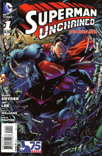
Superman Unchained #1 [Review]

Superman Unchained #1The Leap

Writer: Scott Snyder
Penciller: Jim Lee
Inker: Scott Williams
Colors: Alex Sinclair
Letters: Sal Cipriano
Cover: Jim Lee, Scott Williams, Alex Sinclair
Assoc. Editor: Chris Conroy
Group Editor: Matt Idelson
Published by: DC Comics
Cover Price: $4.99

So…$4.99 for this Superman Unchained #1. It’s functionally a 20-page story with a 2-page “epilogue” or “backup” or “extra feature.” 22 pages for $4.99. BUT there’s what was billed as a “tipped-in POSTER” included. This poster is just a double-sided foldout allowing for two single images roughly 4x the size of a normal-sized page, the most “poster-like” loaded with caption boxes. Maybe technically this counts as an extra 8 pages…but that STILL only brings the pagecount to 30…for $4.99. Removing this so-called “poster” involved peeling it off a bound-in piece of tagboard–something which I would assume complicated the printing/binding process in itself to put in, plus the folding, placement of the glue, and the placement of the “poster.” And the “poster” itself had a couple dots of this glue, keeping it from flapping open.

All this hassle, and it’s basically for one side of a “poster” being this huge image of Superman crashing through a satellite, and then an extra-large image of him narrating the situation on the other side. Hardly something that would really make sense on the wall as a poster, more just some comic page pulled out of an issue and stuck on the wall.

$4.99. Five dollars. And while I read the first arc of Superman when the New 52 began–so have a BIT of context of Lois, Perry, and Clark’s relationships…I’m not even that clear on what things are here. And the issue’s big “reveal,” the thing that’s such a big deal, isn’t. Not to me. It doesn’t fit. It doesn’t interest me. It doesn’t change things.

So, objects are falling to Earth. Superman’s trying to stop them, letting one go since he sees it’ll fall “harmlessly” while he stops this huge “Lighthouse” satellite that’s gonna hit like a gigantic nuclear bomb. He confronts Lex Luthor, who has an alibi, and as he seethes over this, learns someone stopped that object he’d let go–but if it wasn’t him, Wonder Woman, or Green Lantern–then who, exactly, WAS it that stopped the thing? We learn of General Lane’s involvement, and of a secret weapon against Superman that goes back to the beginning of things.

Visually…the art’s good. It’s Jim Lee, whose art I’ve tended to almost always enjoy. Maybe I’m just irked about the “poster,” and/or the price and/or my own lack of context for not keeping up with Superman the last 15 months, but the art doesn’t blow me away. It’s good, but it’s not the “great” that I’d’ve hoped for. It’s not the Jim Lee art that a decade ago prompted me to NOT drop the Superman titles but rather keep up a few more months until Lee‘s run on an Azzarello story would begin.

Story-wise, I’m just not interested. I know a lot of people are loving Snyder‘s work, and will consider this to be great Superman…but unfortunately, this is NOT “my” Superman. Perhaps the collected volume(s) will end up being my thing, if I myself hear enough good about it to warrant checking them out. But for now…this issue just doesn’t do anything (positive) for me.

I have no intention of grabbing the next issue, and it’ll depend on others’ reviews whether or not I even bother returning to this title in any form, outside proper bargain bins. For your page count, you’d be better off grabbing the first Superman: Earth One graphic novel and reading that, especially if you’re looking for a specific tie-in to the Man of Steel film.