• January 2026
    S M T W T F S
     123
    45678910
    11121314151617
    18192021222324
    25262728293031
  • On Facebook

  • Archives

  • Categories

  • Comic Blog Elite

    Comic Blogs - BlogCatalog Blog Directory

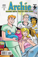
Archie #605 [Review]

Will You Marry Me? part 6 of 6 – Archie Marries Betty: “Happily Ever After”

Script: Michael Uslan
Pencils: Stan Goldberg
Inks: Bob Smith
Letters: Jack Morelli
Colors: Glenn Whitmore
Managing Editor: Mike Pellerito
Editor/Editor-in-Chief: Victor Gorelick
Published by: Archie Comics

I bought into the hype from two angles. One…it was Archie #600…and the title had gotten there legitimately. No reboots or restarts and funky number-playing across multiple series that were intentionally made distinct for the purposes of renumbering, mistake or otherwise. Two…it was the story of Archie FINALLY choosing one of the girls, and doing the right thing by her. He was choosing Veronica, for better or worse (I’ve always rooted for Betty). So imagine my surprise when the story swerved at the end of Chapter 3, showing that instead of 6 issues of Archie marrying/being married to Veronica, we were actually getting two 3-parters under the banner of “__ of 6.”

Also of note is the title of the story. I’d initially thought it was “Archie Marries Veronica” based on the cover; but as said above, obviously that changed halfway through. This issue states on the cover “Archie Marries Betty” and the chapter title, as well as the “Part 6 of 6.” Inside the issue, however, we find an ad for the graphic novel Archie in “Will You Marry Me?” billed as “The complete 6-issue story arc!” at the top of the page. There’s also the fact of that ad existing–here, in the final issue of the story, the company is trying to get the reader to order the collected volume of the story they’re holding. Sure, I expected this–I bought these single issues despite knowing full well there’d be a collected edition–I had to wait for that edition on the recent Freshman Year arc, and if they collected that I knew they’d collect this. Still…the Archie books being what they are, chances are that many people buy just a random issue here and there, and so would not have all 6 chapters.

“Gripey” as that may sound, it’s not much of a gripe. This is a decent conclusion to a decent story. Why it’s not “great” is that it’s something that can’t truly matter long-term in the Archie comics without radically altering the status quo and the nature of the series. This puts me in mind of the silver-age Superman stories focusing on one of many alternate Earths; such as the one with the “Super Sons” or any where Superman actually married Lois. So, this is an “imaginary story” within the Archie universe. And as has been said of these “imaginary stories”… “Aren’t they all?”

Archie and Betty have returned to Riverdale after their year away…both to teach at the high school. They reunite with old friends, and discover a number of other changes. Jughead and Midge are married (and Jughead bought Pop’s as Pop was retiring); Moose is calm and mature…and Reggie and Veronica just got engaged. The story follows the young couple dealing with these events, and then the birth of their twins, Veronica and Reggie’s wedding, as well as life afterward–dealing with “grown-up stuff” in the form of juggling work, the kids, and some sort of social life. And then the story ends on the reverse note the 6-parter opened with…perfectly fitting.

The story is fairly simplistic and formulaic, of course. There’s some drama, but nothing that’s really drawn-out (if it were, I could imagine this one issue getting stretched to 6 issues itself!). There’s a lot of character stuff and forward momentum, and even time for that ending. While hardly complex–and certainly not apologetic about the means by which the story was achieved and then left behind–I really don’t feel cheated nor let down. Heck, this story is one that would make a great tv mini-series of sorts…basically do a pair of movies that make the one big movie. One movie for each of the girls as the bride of Archie. It’d be great if the story was “timeless,” but there are some elements thrown in that date the story–including a reference to “stimulus money,” which firmly roots this in the present. Aside from those references, though, the story is fairly timeless, not actually giving any hard dates for things…just a walk on Memory Lane.

The art is standard Archie style; none of the “New Look” stuff (good as those stories are). The only real complaint I have with the art is the cover–something about Archie’s proportions seems “off” a bit, and overall, he doesn’t look quite right, and I’m not sure why.

I don’t recommend specifically seeking this issue out if you haven’t either been following since #600, or #603. However, if you’re at all a fan of Archie, Betty, and/or Veronica…I highly recommend considering the graphic novel.

Story: 3.5/5
Art: 3.5/5
Overall: 4/5

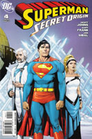
Superman: Secret Origin #4 [Review]

Writer: Geoff Johns
Penciller: Gary Frank
Inker: Jon Sibal
Colorist: Brad Anderson
Letterer: Steve Wands
Covers: Gary Frank, Brad Anderson
Asst. Editor: Wil Moss
Edior: Matt Idelson

Lex Luthor has a lottery. Each day, he’ll pick one person from the assembled crowd outside his building, and attempt to make their dreams come true, putting his expansive resources to full use. The latest “winner,” Rudy Jones, has already been shown to be a bit of a parasite, leeching off those around him. Thanks to his disgusting disregard for things better left to common sense, he finds himself victim of a chemical spill that transforms him into the being that will become known as The Parasite. Amidst this, Luthor has summoned Lois and Clark to question them about the “flying man” spotted around Metropolis. As The Parasite’s threat escalates, Clark bows out and the “flying man” returns, saving many and yet winding up looking questionable to the city as Luthor hurls accusations at him. When he takes some time for himself atop the Daily Planet building, he finds he’s not alone–young Jimmy Olsen is there, saying goodbye to the city he’s failed to become a part of…not realizing what an important friendship he’s about to enter into with another necomer to the city…and reaps the reward of taking a chance and asking a favor.

There’s something that’s lost by this being an origin tale in years-old continuity where much has already been questioned. We’ve already seen much of the change this origin would essentially set up, losing any real discovery, revelation, or chance to follow a huge, unfolding story. While Byrne‘s Man of Steel significantly altered the details of Superman’s beginnings in the mid 1980s, it was also the opening chapter, the actual foundation, of the official Superman story. This series, while altering the details of Superman’s beginnings yet again, feels like more of a plug-up-the-holes sort of thing than a foundation.

This issue doesn’t feel quite like the earlier issues. We have some origin-like stuff in terms of The Parasite, but there’s not much character development. Parasite’s an unlikable, uninteresting character to me–rather two-dimensional, really–and seems to serve little more here than plot device to give Superman something to fight, to punch…and to be more directly “outed” as existing to the public of Metropolis.

The art by Gary Frank, of course, is stellar…on the whole, I really enjoy his art, and it brings a great look to this series and this issue. My primary gripe is the seemingly obvious use of Christopher Reeve as a “model” for this depiction of Clark/Superman…there are panels–such as on page 7 where Clark suggests to Perry’s question of the man actually flying “Um, up, up and–away”–where the imagery just SCREAMS Christopher Reeve. On the one hand, a fitting tribute, and acknowledgment of the man’s legacy and impact on this character, especially in the eyes of the public in and outside of comics. On the other hand…it seems another sign of Superman being “stuck” and unable to really grow and develop beyond a decades-old image that’s clung to, returned to, after decades of actually growing and developing the character beyond simplistic and hokey stories/concepts.

If I were a new fan of Superman, or at least new to the comics, I suspect I would find this a great, thrilling issue and enjoy it very much. As it is, as a longtime DC reader watching the character I’ve grown up on over the past two decades being phased into something of an amalgamation of every possible version of the character…it’s frustrating and discouraging. Johns is a great writer, and obviously has a knowledge of much that is Superman–from the comics, from tv, from the movies–and I can appreciate that effort’s being put forth to reconcile many versions into one cohesive whole.

Usually for me it’s the story that makes the issue…but in this case, the art’s the primary draw for me. I don’t like where the Superman books are headed, nor the revamping and loss of “my” Superman–but this is at the very least the best-looking Superman book out there these days.

Story: 7/10
Art: 9/10
Overall Enjoyment of the issue: 6/10

Captain America: Reborn #6 [Review]

By: Ed Brubaker, Bryan Hitch and Butch Guice
Colors: Paul Mounts
Leters: VC’s Joe Caramagna
Designer: Rian Hughes
Covers: Hitch and Mounts; John Cassaday and Laura Martin; Joe Quesada, Danny Miki and Richard Isanove
Assoc. Editor: Lauren Sankovitch
Editor: Tom Brevoort

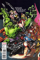
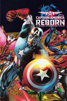
Before I read a single page of this issue, I was impressed by a stark difference I’m entirely unused to. This issue–at least, for the version of the cover that I bought, keeping with the visual style of the covers I’ve chosen since issue #1–sports not only a wrap-around cover, but a gatefold as well. That is, we have a 3-“panel” cover that folds out to the width of 3 comic covers, as a single, large image. Meanwhile, the latest Justice League of America issue from DC features HALF of a two-panel image as each of two different editions of the same exact issue. I dislike variants, but have a much easier time tolerating them when each is at least its own complete image. And the “build-an-image” motif where covers connect to form a larger image is cool, so long as it is multiple different issues–whether consecutive issues of a series/mini-series, or of a crossover/story arc.

Picking up where the previous issue left off, this issue finds Steve Rogers in his Captain America uniform, his body in control of the Red Skull’s consciousness, ready to murder his old partner Bucky, now the current Captain America. Meanwhile, a number of friends/allies fight for not only the rescue of Steve but also of those who have become entwined with the Red Skull and his machinations. Steve battles for control of his body, and unsurprisingly (especially given the title of this series) Steve wins out, the Skull is dispatched, and Steve is left–stable and no longer being bounced throughout his own history–in the present, to deal with a world in which he’s been absent and missed the Secret Invasion and most of Osborne’s Dark Reign.

The art on this book is high quality stuff. While it’s not perfect or anything, It really brings a lot to the story, enhancing the story and never particularly distracting from the reading experience. There are a couple of “iconic” full-page shots that were a little distracting as a result (in a good way, though). Despite the distraction–of noting the enormity of the moments depicted–they were a couple of my favorite moments of the entire issue. One shows Steve and Bucky rushing into battle side-by-side…two Captain Americas existing side-by-side. The other is Steve leaping into the fray, shield raised, the sunlight glinting off it, as many of the characters realize that THEIR Captain America is back.

While I tend to enjoy Brubaker‘s writing, this issue seemed so anticlimactic as to lack any real enjoyment for me. The enjoyment I found was in the art, in those images mentioned above. It doesn’t help that there wasn’t much to “wonder” about in this series. The title itself gave away the ending: Captain America would be reborn…and as we’d pretty much JUST wrapped up an 18-month mega-arc introducing a NEW Captain America into things (Bucky’s transformation from enemy agent to Shield-bearer)…it was pretty darned obvious. This issue in particular was spoiled by the fact that its first “epilogue” shipped some 4-5 weeks ago. Why that couldn’t have simply been held is beyond me–but it gave us an issue of Steve obviously back, obviously no longer bouncing through time, obviously alive, and Bucky alive as well. All that was left was the exact, specific details as to how things would wrap up.

If you’ve been following the series so far, it’s worthwhile to snag this issue to wrap up and such. Otherwise, wait for the collected edition–which will HOPEFULLY contain not only this 6-issue mini, but BOTH epilogues: Who Will Wield the Shield? and Who Will Not Wield the Shield?

Story: 5/10
Art: 8/10
Overall: 6.5/10

Green Lantern Corps #44 [Review]

Red Badge of Rage part 2

Story & Words: Peter J. Tomasi
Penciller: Patrick Gleason
Inkers: Rebecca Buchman, Tom Nguyen, Keith Champagne & Gleason
Colorists: Randy Mayor & Gabe Eltaeb
Letterer: Steve Wands
Cover: Gleason, Buchman, & Mayor (Variant by Greg Horn)
Editor: Adam Schlagman

We left off in the previous issue with the arrival of Mogo at Oa. Mogo, of course, being the Green Lantern that “don’t socialize,” due to…well, being a planet. Gravitational pull and all that. Of course, the Black Lanterns devouring will, intent upon destruction of the central Green Power Battery, seems to be enough of an emergency to bring Mogo. While the GLs deal with the arrival of their largest representative, they also have a rage-fueled Red Lantern Guy Gardner to contend with…and the fact that Guy is currently filling the role of the Red Lantern he and Kyle initially sought to unleash upon the Black Lanterns. Though one problem gets at least a temporary solution…the GLs are left with the other problem, which is ready to do them great bodily harm.

The story here is interesting enough, if not entirely entertaining. I certainly appreciate Tomasi’s keeping focused on the events of Oa–while other Blackest Night books focus on Earth and other individual characters, much of the battle at Oa unfolds in this series. If the Sinestro Corps War applied significant change to Guy and Kyle, Blackest Night will certainly leave a mark on them, and the potential–at the very least–is exciting.

Unfortunately–as I seem to be commenting on with every single issue I review of this book–the art is not to my liking. It’s not bad in and of itself, but it is very stylistic, and I just don’t care for the look. A double-page spread of Guy flying at the reader, for example, seems so much like a caricature that I have to remind myself that it is supposed to be Guy Gardner.

Important as the issue’s events are, this is hardly the best chapter tying in to Blackest Night. Obviously if you’re following the event as a whole, this’ll be worth picking up; ditto if you’re following the series itself. As a new entry point, though, I definitely cannot recommend this issue.

Story: 7/10
Art: 4/10
Overall: 5.5/10

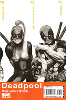
Deadpool: Merc With a Mouth #7 [Review]

Writer: Victor Gischler
Art: Bong Dazo, Jose Pimentel, Matt Milla, Kyle Baker, Rob Liefeld, Das Pastoras
Letters: Jeff Eckleberry
Cover: Arthur Suydam
Production: Rev. Paul Acerios
Asst. Editor: Sebastian Girner
Editor: Axel Alonso

Since the announcement of the Deadpool Corps mini-event some time back, I’ve looked forward to this issue, as it promised to set things up for that, introducing (in particular) Lady Deadpool. Does it measure up to expectation? Hate to say it, but…nope.

Issue 6 pretty much wrapped up the first arc, as a dimensional portal was open, and Deadpool was set to follow “Headpool” to see that the zombie head was returned “home.” This issue follows the two on their journey (leaving Dr. Betty behind). First, the duo meats “Major Deadpool,” that reality’s Deadpool. Of course, fighting ensues, particularly when Deadpool discovers this counterpart is NOT scarred and in general the ugly specimen he is. Leaving that world behind, Deadpool and Headpool next make the acquaintance of Lady Deadpool–obviously a female counterpart. After a fairly disturbing scene, we’re off to yet another world–where a Western feel is to be had, and The Deadpool Kid is encountered. Finally, the journey concludes with the arrival of someone whose presence signifies something big about to go down.

The art for this extra-sized issue is shared, with different creative talent covering each “world.” The art for the Major Deadpool segment is decent, but something sorta out there about it–it simply LOOKS like it was computer-edited, with a combination of art styles being forced together. The Lady Deadpool segment features art by Liefeld, and gives off mixed vibes. Deadpool and Lady Deadpool–in costume–work quite well here visually. The other characters…well, the visual style doesn’t work quite so well for me. The Deadpool Kid segment reminds me of early issues of the current Cable series, and while it isn’t bad, also somehow doesn’t seem to quite “fit.” The framing sequence seems to be the best of the book, visually, and seems the most “traditional” in style.

Despite the overall not-so-thrilled sentiment regarding the book’s visuals, I do like the conceit. Rather than simply having a myriad of talent on the book, having each creative team cover a specific alternate reality allows the differences in art styles to give each reality a distinction from the others.

Story-wise, this seems little more than an excuse to introduce the alternate Deadpools–the issue both starts and finishes at the same point, albeit the addition of the character appearing on the last page. While those characters are introduced, the story itself is not moved forward in any meaningful way. The introduction of three new characters AND their surroundings doesn’t allow for a whole lot of depth–but there’s a lot of potential here…especially with knowledge that these characters are slated to star in the Deadpool Corps stuff in a couple months.

This issue is “extra sized”–don’t let yourself be fooled by any claims that it is “double sized.” The issue is also $3.99 compared to the usual $2.99 for this series, accounting for the extra pages…but I’m not convinced it was worth it.

On the whole, a rather disappointing issue, that I really can’t recommend to new readers, or those planning to dive into the Deadpool Corps stuff, as this likely is basically a prologue or prequel or whatever that comes before the actual series.

Story: 4/10
Art: 6/10
Overall: 5/10

Superman/Batman #68 [Review]

The Big Noise, part one: Rumble Face

Writer: Joe Casey
Pencils: Ardian Syaf
Inks: Vicente Cifuentes & David Enebral
Color: Ulises Arreola
Letters: Rob Leigh
Cover: Syaf, Cifuentes and Arreola
Assistant Editor: Rex Ogle
Editor: Eddie Berganza

I wanted to like this issue. I was even looking forward to it, on hearing the book would come back into continuity with stories revisiting previous events. In this case, Summer 2001’s “Our Worlds at War” crossover event. I couldn’t remember which issue would begin this new “format” or “focus” of the series, but when I saw the Our Worlds at War banner across the top, I was excited. A bit of nostalgia flooded in seeing the tag “Casualties of War!” included–several of those Casualties of War issues back in 2001 were among the most powerful comics I read that year. So to say that I had high hopes for this issue would probably be an understatement.

And as one might expect from my phrasing…this issue was extremely disappointing in its execution. Other than the time-frame it’s supposed to be set in, and references to the world having just been through a war, there’s not much that seems to solidly place this issue’s events as coming on the heels of Our Worlds at War itself.

I suspect this is another “standard” story arc…that is, six-issues and well-paced for the eventual “graphic novel,” which might even have some sales crossover with the 2-volume collected edition of the event, or the large “omnibus” TPB. As a single issue, though…this is entirely forgettable.

The story doesn’t even begin to hook me–the “hook” was the OWAW tie-in. The hope that I’d see something that would make this feel like a long-lost chapter of that story. That expectation never did deliver. I’m confident that once all 6 issues are assembled, and read in one-go, possibly following a re-reading of the original event…the OVERALL story is likely to come across much better.

The art is very solid throughout, and not at all a bad depiction of Superman nor Batman. I really have no complaint with the visuals…they’re actually quite good overall. Nothing memorable, exactly…just good, clean work.

Unless you don’t mind a slow build, and an issue that’s nothing more than introduction to a standardized-arc format, I’m highly disinclined to recommend this issue.

Story: 4/10
Art: 8/10
Overall: 5/10

Action Comics #885 [Review]

Divine Spark, part 3

Writers: Greg Rucka and Eric Trautmann
Artist: Pere Perez
Colorist: Javier Mena
Letterer: Rob Leigh
Cover: Cafu with Santiago Arcas
Asst. Editor: Wil Moss
Editor: Matt Idelson

With Chris safe (for now) from the aging that was killing him, Nightwing and Flamebird confront The Guardian and his Science Police as well as Mon-El. The confrontation sees revelations shared as to what the two are doing on Earth, and new alliances as the “true” “enemy” emerges. Lois confronts her father, and everyone’s lives are in jeaopardy at issue’s end.

I continue to hope for another spark of enjoyment of this title like I had during the Brainiac arc. While I still don’t like that Jonathan was killed off, there was something to Johns’ story then, and Frank’s art, that as a whole made for a very enjoyable product. Fair or not, that’s the standard I find myself holding this title to, and it’s a standard that–for me–is not met.

The story itself is fairly straightforward, and well within the bounds of the overall story being played out in the Superman family of comics from the past year-plus. It continues to hold potential, but somehow just doesn’t quite fully take off and actually do anything with it.

The visuals also are pretty solid, but not much to my liking–but as with all art, that can be very subjective. Characters are all recognizeable and no one comes across as particularly abnormal-looking, and there’s little trouble following the action. The art certainly fulfills its role that way…it just doesn’t have anything that leaves me in awe or particularly marveling at the issue’s visuals.

Taken in a vacuum, the story’s worn thin and worn out its welcome with me–I’m ready to see Superman restored to the blue and red as well as to his own title and this one. Taken in context of solicitations, previews, and the like…it’s great to know that the “status quo” is about to change, if only to see what the next “phase” of the overall Superman corner of the DCU will be like.

Captain Atom, Chapter Seven
Writer: James Robinson
Artist: Cafu
Colorist: Santiago Arcas
Letterer: Rob Leigh
Asst. Editor: Wil Moss
Editor: Matt Idelson

In this issue’s second feature slot, Captain Atom battles a number of other DC super-heroes in typical fashion before ultimately having a chance to explain himself and what he’s doing here. Others then step in, leaving us on a “cliffhanger.”

Visually, this segment isn’t all that bad, though the characters all come off with a somewhat generic appearance, almost a lack of some sort of detail I can’t quite put my finger on. The story is typical and seems to break no new ground, and really just serves to fill in a continuity hole, bridging events involving this character over the past six years.

While Captain Atom’s story is presently tied to the Superman books by story itself as well as being a second feature, it seems that his segment shortchanges the lead story, taking valuable space from that. It’d be preferable to have a separate bi-monthly or quarterly regular-sized-issues series to tie this character into things.

As a whole, this is another standard issue of the title. If you’re already following things, it’s worth continuing. If you’re on the fence…I can’t say this issue would really convince you to hop on in. I’m obviously not blown away by the issue…but neither am I convinced to drop it. Just disappointed that this doesn’t in any way feel like required Superman reading.

Action Comics
Story: 4/10
Art: 5/10

Captain Atom
Story: 4/10
Art: 5/10

Overall: 4.5/10