• March 2023
    S M T W T F S
     1234
    567891011
    12131415161718
    19202122232425
    262728293031  
  • On Facebook

  • Archives

  • Categories

  • Comic Blog Elite

    Comic Blogs - BlogCatalog Blog Directory

Ultraverse Revisited: Hardcase #6

ultraverse_revisited

hardcase_0006Friends and Enemies, Part Two: Returning Favors

Writer: Jim Hudnall
Penciller: Scott Benefiel
Inkers: Mike Christian & Jordi Ensign
Letterer: Tim Eldred
Color Design: Moose Baumann
Interior Colorists: Family Fugue
Editor: Hank Kanalz
Cover Date: November 1993
Cover Price: $1.95

After being stabbed and looking like he was bleeding out, we open this issue with Hardcase having an out of body experience, watching Choice find his body, fend off Hardwire, and try to get Tom to a hospital. While having this experience, Hardcase–Tom–is told by Linda (Starburst) to go back while he can. After waking in a hospital bed, Tom and Choice are visited by an old friend…who turns out to be an "old friend" in The Alternate. She claims she’s trying to help them survive, while "The Man Who Isn’t a Man" prepares to send agents to the moon to get something for him that he can destroy all Ultras with. Thanks to his remarkable healing, Hardcase is up and ready before long to re-confront Hardwire, and being prepared this time, succeeds. When police show up, Hardcase dislocates both of the villains arms, so that he can’t use his fingers against them. After this all wraps up, Tom lays in bed with his mind in overdrive, reflecting on the evening–Choice, as well as what he actually saw while dying.

The art for this title has been rather uneven…but it worked well in this issue, taken alone. The cover is nicely detailed, with Hardcase looking like Hardcase…even though it has him seemingly deliberately looking AWAY FROM the attacking villain. Within the issue, the art seems good as a whole. It seems slightly "off" to me–but then, my primary memory of the title and its art comes from the first issue, so that’s what I tend to judge a lot of the art against. It’s better than a couple of the other early issues, though, and better than I remember some of the later issues. The story’s not hard to follow–the action of what’s going on–and that’s the main thing. It’s nothing to write home about, but nothing I’m gonna really complain about.

Story-wise, we get some solid follow-up on Hardcase’s injury–and that while he’s nearly invulnerable, he can be hurt; but he also heals much faster, so even dire damage isn’t necessarily fatal. That said, we get some hints at forthcoming answers for Choice, and knowing what I do of the Ultraverse, it’s easy to pick up on the references to the moon and such (all the more after seeing them in Prime–which is another "core" Ultraverse title as one of the three originals). We get some resolution to this initial encounter with Hardwire; foreshadowing of stuff to come, and generally have a decently well-rounded ’90s comic that moves everything forward as an "episode" rather than being just a 1/6th slice of some singular graphic novel the way most modern/2018/2019 comics seem to be.

As with many ’90s comics and other Ultraverse issues, one could pick up on context simply reading this issue…but it’s not one I’d recommend in isolation or as some singular target issue. It bridges the previous issue and what’s to come in Break-Thru, contributing a bit of setup for that event and preparing us for Hardcase joining the greater stage of the Ultraverse as a whole. This is well worth a 25-50 cent purchase to have along with the earlier issues…but you’re better off grabbing the first issue than this if you just want a single issue of Hardcase.

hardcase_0006_blogtrailer

Ultraverse Revisited: Freex #5

ultraverse_revisited

freex_0005Up Against the Wall

Writer: Gerard Jones
Penciller: Ben Herrera
Inker: Larry Welch
Letterer: Tim Eldred
Color Design: Robert Alvord
Interior Color: Violent Hues
Editor: Hank Kanalz
Cover Date: November 1993
Cover Price: $1.95

Beginning with the cover of this issue, it wasn’t quite what I expected. I didn’t recognize the presumed-villain on the cover…a bit grotesque, and apparently new. But on opening the issue, I remembered that–Oh, yeah–the Freex are dealing with the "Master of the Hunt" and his hounds. And the bulk of the issue is really just a lengthy fight scene, as the individual Freex have to draw on their powers–working through the pain, even–in order to come together and stop this "Master." Despite their challenges, the group eventually defeats him–as he’s first burned (turns out, that was him on the cover!) and then taken down by his own hench-hounds. The Freex escape, and all’s well that ends well…right?

The art for this issue seems a bit "off." While I mostly recognize the various characters, they have a sort of generic, non-regular-artist look…and unfortunately, that was a bit off-putting for this issue. The characters look–for one thing–a bit "older" than they did before, and I’m just not a fan of this specific iteration of them.

At least the writing is consistent, where we’ve gone from seeing these characters absolutely not working together to where they finally do draw together and push their powers to help each other and overcome (a bit) certain fears. It’s like as of this fifth issue the team finally becomes…a team.

This remains an iffy title for me–I don’t love it (especially after this issue) but I don’t hate it. I haven’t gotten used to it, but continue to see the potential it holds both as a title and with its individual characters. Best way for me to put it for my repetitive vagueness is that when I think of the title, see one of its covers…it doesn’t bring back fond memories nor does it really grab my interest such that I actively want to jump in and read. When I put it off or "dread" getting into an issue…I tend to either truly enjoy it or at least realize it’s not horrible. I’ve been interested from cliffhangers to see where it goes next, but by the time I get to the next issue I’m usually back to a passive-ish not really caring.

All that said…if you can get several issues as a run…particularly for now, these first five issues–and cheaply (say, 25-50 cents each ideally, under $5 for sure) they’re definitely well worth the read for an early-’90s team of abnormal misfits shunned by society…and serving as a sort of X-Men parallel but instead of being the ’60s, it’s "in the ’90s!"

freex_0005_blogtrailer

Ultraverse Revisited: Solution #3

ultraverse_revisited

solution_0003The Hunted

Writer: James Hudnall
Penciller: Darick Robertson
Inker: Barbara Kaalberg
Letterer: Tim Eldred
Color Designer: Tim Divar
Interior olor: Foodhammer!
Editor: Hank Kanalz
Cover Date: November 1993
Cover Price: $1.95

Once again, looking at an issue of The Solution I find myself wondering how, exactly, I managed to #1 miss this series entirely as a kid and #2 not pick up on this sooner even as an adult.

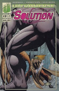
This issue opens with a young woman being stalked by a couple of menacing figures that we come to realize (along with her) are aliens–Darkurians–as they “morph” into their true form of hulking, monstrous beasts ready to devour her. Then another figure enters, first playing music from a harmonica, and then wielding fantastic weapons that are quite effective against these Darkurians. The next day, we join in with several members of The Solution as they debate publicity, with everyone but Lela having reasons for NOT wanting to be in front of any cameras. Vurk, impatient and edgy, prepares to leave. Lila asks Aera to put a “trace” on him–using her magic so that they’ll be able to locate him, should the need arise. Vurk hits the town, looking for some excitement–though what he finds interesting and what a cab driver finds interesting don’t exactly intersect. He’s in luck, though, when he stumbles across a figure he recognizes–a certain harmonica-player (incidentally, apparently named “Harmonica”). Shifting to his large, brutish (alien) form, Vurk leaps into battle with Harmonica…the two are old opponents. Harmonica’s weapon/harmonica seems to be able to transform into whatever he declares–laser, flight-belt, sword, whatever–and he more than holds his own against Vurk. The fight is inconclusive, halted first by police and then by the Solution (having located Vurk via that “trace”). We shift to the Solution meeting with a client…and learning that they’ll be working with someone. We see on the final page: Hardcase and Choice!

This issue’s story seems so simplistic in a way. Show some aliens mugging a random woman on the street, they get killed to show how bad-ass this Harmonica guy is. Touch base with the Solution–they are the team this title’s about, after all–then Vurk goes off on his own. He fights Harmonica, giving us an extended fight scene that shows us how bad-ass HE is, before stuff is brought to an abrupt halt with neither being victorious…this leaves things open for later. And we end with the setup for a “crossover” with Hardcase to leave us ready for what comes next. Nothing’s all that deep, but we get our title characters present in the issue, while the focus is on one particular member…and we get a bit of a sense of history for him with encountering Harmonica, as well as development in his admitting his own people want to kill him. As He’s a “tank” on the team, Harmonica being able to take him on, having taken out the Darkurians earlier, and getting away here without issue sets Harmonica up to be a bigger player in future issues.

And I absolutely love the art in this issue! It’s clean, and detailed, the character designs definitely have that nostalgic, ’90s “vibe” but without seeming hokey or rushed. I’m sure this is thanks not only to Robertson‘s pencils, but also Kaalberg‘s inks with Divar and Foodhammer!‘s coloring. I don’t know if it’s my personal color preference or other details, but I especially like Lela’s appearance and costume. I feel like I’m all over the place with enjoying or being “iffy” on Ultraverse issues’ art…perhaps it’s other comics’ art I’ve looked at since my last Ultraverse coverage.

My enjoyment of this issue is largely that it’s nothing “deep,” and even picturing the issue’s opening a la Law & Order or CSI, with a brief intro to set something up, then a jump to the actual main characters and them dealing with stuff after the events of the initial sequence. Having read a couple issues of the series before this also laid some groundwork, so while I’m not great with characters’ names yet (especially being a couple months–at least–since reading the previous issue) but recognize them visually and having seen them, it’s easy to “go with the flow” of things.

As “just some ’90s issue,” this would probably work pretty well overall as a standalone issue…it has the feel of a random issue trying to set something up without being itself bogged down with stuf from prior issues. The cover itself isn’t all that interesting; and I never really paid it much attention, focusing mainly on the title logo and issue number. Essentially we get naked-backside-of-Vurk fighting against Harmonica-with-a-sword…boring as a cover for only reading previous issues, but at least “fitting” given the actual interior contents of this issue.

If you find this for 25 cents or so–bottom-price bargain bin, basically–it’s worthwhile if only for “exposure” to the title and such. Generally-speaking, it’ll work better with the context of the first couple issues (admittedly, also ideally bargain-priced).

While I’ve been iffy with this title on lack of knowledge…it’s quickly becoming a high-quality, enjoyable favorite…which I feel like I didn’t expect when I started this deep-dive into the Ultraverse.

solution_0003_blogtrailer

Ultraverse Revisited: Firearm #3

ultraverse_revisited

firearm_0003American Pastimes Part Three

Writer: James Robinson
Penciller: Cully Hamner
Inker: John Lowe
Letterer: Tim Eldred
Color Designer: Moose Baumann
Interior Color: Foodhammer!
Editor: Hank Kanalz
Special Thanks to: Larry Welch
Cover Date: November 1993
Cover Price: $1.95

The previous issue ended with Swan a bit out of his depths, and being rescued by a flying Ultra. Here, he wakes up in a room full of Ultras…and finds some answers he’s been looking for…and a new threat! Retaining a hostage–that Swan is determined to save–these Ultras reveal that they’ve got a certain interest in hunting. Human prey. While they’ve denied him his own particular firearm, they give Swan a slight head start, and then the hunt is on! We see Swan take them on–fighting for his life–and ultimately see what kind of man he is, when he catches a break, and can completely escape…or head back in to save the hostage.

I feel like this story is a bit repetitive. The "eccentric rich folks buying property and importing humans to hunt" feels like something I’ve seen at least a couple other places, albeit originally published a number of years apart, probably. I’m thinking there’s at least a Batman story like that, and can’t really imagine there’s not a Green Arrow story like that. Of course, this is the first time I’ve seen it as super-powered people–Ultras–hunting a normal human! And there are only so many stories to be told…what keeps many fresh is a shift in particulars. So while I observe this, it’s not something I’d truly count against the issue/story itself.

The art is quite good, and feels entirely consistent with the earlier issues. Nothing really jumps out as "strange" or "new," nor as any great distraction. Nothing particularly stood out as singularly amazing or awesome…but I’d put that to simple quality of the art! It’s serving the story, conveying the action, and allowing the story to be experienced, rather than calling attention to itself needlessly. In other words…I like the art and the way it’s presented!

As a story, this is a "part three," but has a different "feel" from the first couple of issues to me. For one thing, it feels a bit more frenetic and action-packed…with less "building blocks" and more "doing" in general. In that way, this pays off the first couple issues that introduced us to Swan and his part of the world and set things up for him to wind up in this situation. I really like that this also mostly feels like its own thing, its own "episode," as we just start with Swan waking up and then having to think on his feet…we don’t have pages of exposition/recap…we basically just get launched into the action. I don’t recall (if I ever knew anyway) and haven’t "looked ahead" to see if American Pastimes is carried as a 4 or more chapter arc…but this feels like it could well be a 4-parter or even 5, and structurally I’d probably be happy with either.

While there’s definite nuance to be caught reading this issue out of the first two issues and the ending leads me into wanting to read the next issue…I think this stands pretty well by itself. I’d miss some stuff and have less of an overall context for the feel of the character of Alec Swan (and less of the sense of wanting to see him portrayed "live" by Jason Statham)…this works decently as a one-off issue. "Ultras with powers hunt a human who is really good at fighting back."

All in all, this would be a decent issue to snag randomly from a bargain bin. It’s best matched with issues 1 & 2, but especially if one can get it for 25 cents, it’s worth getting and reading even in "isolation." As part of the ongoing series, I definitely enjoyed it, and I look forward to the next issue!

firearm_0003_blogtrailer

Ultraverse Revisited: Solitaire #1

ultraverse_revisited

solitaire_0001The Pleasure Principle

Writer: Gerard Jones
Penciller: Jeff Johnson
Inker: Barb Kaalberg
Letterer: Tim Eldred
Color Design: Keith Conroy
Editor: Hank Kanalz
Interior Color: Foodhammer
Published by: Malibu Comics
Cover Date: November 1993
Cover Price: $2.50

I’ve acquired this issue a number of times–out of its bag, with and without the bag, with and without one of the cards. But in all these years, I’d never gotten around to actually reading this this! In this particular case, I’m reading a bagless copy with a $2.50 cover price.

We open on a couple of thugs beating a woman, and see her rescued by a guy in a purple and blue costume–an obvious vigilante figure. He claims he’s "hard to hurt," and he’s looking for someone called "The King." Though he takes a bad gunshot wound–with the original victim he rescued actually approaching him to help HIM–he gets up under his own power, proving what he said about being hard to hurt. The scene cuts to the so-called King, quite angry about the intervention of this Solitaire into his plans. We see and learn that he considers himself King Pleasure–if it feels good, DO it. Back with Solitaire, we see the vigilante deliver the victim to safety while he continues tracking King’s men. We see that Solitaire’s HQ is in an old movie theater, that he’s good with computers, and he’s got an established network of people to help him with his crusade…and that he has issues with his father and isn’t surprised to learn that King Pleasure has some sort of tie to his Father. Solitaire puts a plan in motion, and is able to get into King Pleasure’s inner sanctum, rescue a couple of his captives, and END this King’s reign. We also see Solitaire reveal his identity to King…he is Nicholas Lone, son of the crime lord Anton Lone. While the King’s "palace" burns and the rescued victims watch, Solitaire speeds off in his car, brooding over his origin, silently vowing to himself that "this fight" has only just begun.

In a way, this issue feels too quick and simplistic. But that’s (as often the case for me in 2018) most likely due to being trained for most of the last 17-some+ years to read stuff for the larger story, for the 6-issue "graphic novel," as it seems that modern comics have mostly lost the "art" of the single-issue story.

Though this is the premier issue of an ongoing/12-issue series (in 2018 I know this as a 12-issue finite series, but do not recall if it was originally intended as such or if it was intended as an open-ended ongoing series) it feels like it could be simply a one-shot, a single issue introducing a character, showing him off, introducing and resolving an immediate story, and leaving him to "the universe" to be used or not as any creators might choose.

This works very well as a setup-issue, a foundation-laying issue. We meet the title character, see him in action, see what he’s about, see what he’s capable of, meet supporting characters/locations, see him resolve a case, and have a decently-proper sort of ending…all in one single issue. Which makes this great "pilot" for a series.

I like the structure of the issue, the way this story is presented. In tandem with the art itself, this looks and feels like a ’90s comic in general.

Visually, the art is good–though there seem to be panels where there’s some shortcutting going on, it’s nothing not seen elsewhere, and doesn’t detract from the story. One is easily able to read along and keep up with what’s going on, and there are some nice, dynamic layouts that move the story along fairly cinematically. Simply looking at the art, it doesn’t stand out to me in a "this is my favorite artist ever" sort of way, but it’s not bad, and I especially like the colors for Solitaire’s outfit!

I’m very pleasantly surprised at how much this issue seems to work as a one-shot and "first issue" together. It’s very solid as a first issue, and on my first reading seems to be independent of all the other Ultraverse titles thus far, with no real reference to Ultras, other Ultras, and so on. Solitaire’s own "hard to hurt" nature reminds me a lot of the Bloodshot character from Valiant, and I’m interested to see how far those similarities go in future issues of this book.

Buy this for the "bagged" gimmick, for the trading card…buy it because it’s a #1, buy it because you like the cover art, buy it for whatever reason…you don’t need previous issues, and there’s no actual "To Be Continued" and thus for this one-off issue you don’t even "need" any future issues–though the fact that there are later issues mean there’s more material for you to get if you liked this issue!

Given the nature of the issue…I absolutely recommend it if you find it in a bargain bin (25-50 cents for sure, with the bag/card insert, certainly up to $1 or so!). It’s a good read, and as with many of the other Ultraverse titles, I’m curious and looking forward to reading additional issues.

solitaire_0001_blogtrailer

Ultraverse Revisited: The Solution #2

ultraverse_revisited

solution_0002Showdown

Writer: James Hudnall
Penciller: Darick Robertson
Inker: Mike Miller
Letterer: Tim Eldred
Color Designer: Tim Divar
Interior Color: Violent Hues
Editor: Hank Kanalz
Published by: Malibu Comics
Cover Date: October 1993
Cover Price: $2.50

Rex Mundi realizes he and his people are being magically spied on…by The Solution! The scene then moves to the Shinjuku district in Tokyo…where we see The Solution in action! They’ve got a plan, and everyone seems to be in place as things unfold. Dropkick and Tech communicate, while Shadowmage  sits by to use her powers in a room next to the group’s target, who is dealt with by Lela Cho–Tech–herself. As Tech begins to realize something’s wrong, Shadowmage confirms that someone’s there, and both Outrage and Dropkick are forced into immediate action away from the building. Shadowmage fights an opponent named Book, while Dropkick deals with a red-clad woman with swords…who seems to recognize his fighting style. Outrage’s opponent seems to be of his own alien race (I guess Outrage is another alien…I did not remember that!), and he’s got some sort of bounty on his head. While Tech gets her client out of the building and we see them trying to escape this ambush, the unfolding battles of the other three unfold as well. In the end, their client is killed, so while The Solution survives, their case is a bust.

This issue is largely a huge fight scene. The previous issue really being the first time I’d ever read an issue of this series (despite owning issues and being aware of the team–mainly from getting Rune #0 and it coming with The Solution #0 as well) I’m still figuring out the characters. And of course, that’s not helped by the way I’m undertaking this reading project–trying to read ALL titles in release-month order, rather than zeroing in on just one series at a time.

So this issue served to really “show off” a lot more with the team. We already know Shadowmage can use magic, but we see more of that here. Lela Cho has a certain skill set, which is also shown off. We see Dropkick in action, and some hints at him being more than he appears. And we see Outrage similarly, as he faces someone that knows more about him than we do, which leaves another question in the air, further details to be sussed out presumably in subsequent issues.

Visually, I thoroughly enjoyed this issue. The detail’s great, the layouts are dynamic, the characters seem consistent and it’s easy enough to follow the general action of it all. Seeing that it’s Darick Robertson art, though, I suppose I should not be surprise, enjoying his work on the likes of Transmetropolitan. I can’t quite figure out a better phrasing, but I felt like the main characters especially were “full” while “sleek” in the way they’re depicted in this issue. Ultimately, the issue in general is nice to look at, as it also totally carries a ’90s vibe.

Story-wise, there’s not a lot: the characters fight, their client is killed, everyone goes home. That’s the broad strokes view. The details are where the depth is, and I’m definitely interested in learning more about these characters. Maybe I’m the odd guy out, but I’m pretty sure I’d totally enjoy several issues of the characters simply interacting with each other and learning of them that way, without even needing a lot of action.

rune_0kRune [K]: The Fury – Part Two
Plotted by: Barry Windsor-Smith & Chris Ulm
Drawn & Colored by: Barry Windsor-Smith
Scripted by: Chris Ulm
Inked by: John Floyd
Computer Color by: Albert Calleros
Lettered by: Patrick Owsley
Text Pages Designed by: Jim Chadwick
Edited by: Steve Gerber

Wayyyy back (it seems) with the start of the Rune stuff (Sludge #1), the cover showed the open mouth with fangs, and the words “The Stones are Cast…” Here in the final issue, we again have that cover image (the 9 issues between being the “poster image” pieces) but with the text “…And Death Walks the Earth.” A fitting sort of symmetry. “The stones are cast and death walks the Earth.” That’s Rune.

This final chapter of the Rune #0 issue, we see a kid named Erik talking with his Dad…as they discuss nightmares, monsters, and keeping things at bay; an incident with Erik forgetting to take his pills, and this hint at there being something more to the kid. Their conversation is largely narration boxes overlaid on scenes of destruction, as Rune gets through the last barriers between himself and Erik, leaving us with Rune perched in a tree outside Erik’s house, apparently preparing to attack.

The art continues to be consistent with prior chapters, as the creative team did not change…this is “merely” three more pages of the same issue, so no surprise there. After all these previous “chapters,” we finally see Rune where he wants to be, after bitter disappointment and destructive confrontations…poised to  take in some incredible power that might restore or maintain his wasting body.

As prologue, as setup, as a #0 issue, it provides an introduction to the character, and leads into what I recall of the Rune #1 issue, such that one certainly can better appreciate things with the main series having read this first, and yet, this isn’t absolutely required reading for that.


I enjoyed this issue. It’s been nearly 25 years since my initial $2.50 was spent on it (that’s less than one penny per month from then til now, I think!) so while I’d be less than thrilled with an issue that’s basically a massive fight scene for a full/premium price in 2018, I’m ok with this 1993 issue being this way…all the more for so enjoying the art.

Yet again, the Rune chapter is an identifying mark on the issue, dating it at a glance to one of the October 1993 issues; and as with others, it is not singularly a selling point in my eyes, as far as this issue in isolation. It’s certainly a selling point for getting all 11 serialized chapters of Rune #0, or the coupons for the mail-away, and such.

But along with most of the “early Ultraverse” issues, I routinely see the issues in bargain bins, so don’t consider them to be worth one paying more than $1 for as of 2018; but that’s also easy enough for me to say, owning all the single issues myself already, and not being on the hunt for them.

I would definitely recommend pairing this issue with the first issue to have SOME context of stuff…and though I didn’t do it myself, I think this issue probably reads a lot better in context of being read immediately after the first issue, rather than with 17+ other issues read in-between.

solution_0002_blogtrailer

Ultraverse Revisited: Firearm #2

ultraverse_revisited

firearm_0002American Pastimes Part Two

Writer: James Robinson
Penciller: Cully Hamner
Inker: John Lowe
Letterer: Tim Eldred
Color Design: Moose Baumann
Interior Colorists: Foodhammer
Editor: Hank Kanalz
Published by: Malibu Comics
Cover Date: October 1993
Cover Price: $2.50

It seems like such a long time since I covered the first issue of this series, and here I’m only at the second!

The cover’s a bit generic–I truly don’t think I’ve really paid it much attention over the years. I’d had the issue originally solely for the RUNE coupon, and just recognize the overall image with the trade dress as the second issue of Firearm. Looking at it more closely this time and actually "taking it in," it’s Firearm fighting a couple of armored suits, aiming one’s weapon to blast another upward where the title falls. It’s also interesting to me the "design" stuff I’m seeing, that have always been there, but with a class I’ve been taking, there’s a lot that I’m really "seeing" for the first time or at least in a new light! And I’ve always liked and easily recognized the way the Ultraverse titles’ trade dress started with the inner border, the ULTRAVERSE logo across the top with the actual title logo under, and the upper left corner logo and issue info/price.

Getting into the issue itself, we find Alec Swan waking up, feeling the results of the previous issue/recent events. He follows up on some information, and is led to Hardcase…who he finds in the midst of a fight with some thugs in high-end power/exo-armor suits. He gets involved ostensibly only because Hardcase may have information he needs. Among other things, part of Swan’s contribution is grabbing one and aiming its blaster at another…different angle, but showing that the cover actually depicts something from within the issue itself! (A true rarity as of 2018). After the fight, he and Hardcase talk–and neither likes the other, but at least they don’t–themselves–fight. While Hardcase doesn’t consciously have any recollection of the guy Swan’s trying to find information on, he does say something that gives him a lead. As he parts ways from Hardcase to follow up, he’s attacked by another ultra…and saved by still another…which is something he’s getting really tired of.

The story itself is good, and follows well on the first issue. This also reads relatively decently on its own–it’s been weeks since I read #1 and I didn’t remember much concrete detail from it, but didn’t have much problem getting into this issue. We see Swan continuing to work the case he took on in the first issue, and the continuing repercussions from stuff begun in the first issue. We see a bit more of him at work, and in action, solidifying the "codename" Firearm, as well as the fact that he hates that name. Though it’s in no way advertised as such and there’s no cover indication, we see him interact with Hardcase. It’s not an "event" or "crossover," it’s just a natural thing of Swan living in a world of ultras, which includes Hardcase. Though we still don’t have resolution, we can surmise that Swan’s getting closer to his goal, with continued attacks, and now being saved by an ultra…hints that something bigger is going on that he hadn’t bargained for, but now finds himself immersed in. I think my main problem with the story/writing is that though Hardcase mostly looked like Hardcase and is supposed to BE Hardcase…his appearance here made him feel like just some impersonal plot device, with a different sort of "voice" and lacking the sort of "heart" from his own title or the crossover with his title and the Strangers in the September issues.

Visually, this wasn’t a bad issue on the Firearm end…but I really strongly noticed some weirdness in the visual interpretation of Hardcase. The face especially just looked weird, with odd lines around the mouth and generally carrying the basic core visuals, but looking more like "a version of" Hardcase rather than a singular THE Hardcase. Otherwise, the art’s good and no real complaints from me…it fits this title and the main character and carries the story.

rune_0iRune [I]: The Hunted
Plotted by: Barry Windsor-Smith & Chris Ulm
Drawn & Colored by: Barry Windsor-Smith
Scripted by: Chris Ulm
Inked by: John Floyd
Computer Color by: Albert Calleros
Lettered by: Patrick Owsley
Text Pages Designed by: Jim Chadwick
Edited by: Steve Gerber

As Rune gets closer to a goal–a power source his stones have foretold, we find someone investigating another death from the vampiric creature. This investigator apparently is an ultra, able to sense things…though he’s not quite finely-tuned enough in use of his power to realize that his sensing Rune was because the creature was right there. As Rune attacks, the folks on the other end of the agents connection are helpless to do anything.

We’ve continued to see a bit more of a development in the Rune story, from just brief glimpses at the creature in different time periods, to seeing him attacking various ultras for power, as well as discovering Aladdin and moving in on this secretive agency. Including this chapter, we’re at 27 pages now–the full Rune #0 is a 33-page thing, making it about the equivalent of a 2018 Marvel Annual with 32-ish pages. Except here it’s serialized on the backs of each of the 11 October 1993 Ultraverse titles.

Something to this chapter has a bit of a different look than earlier chapters seemed to–probably the darker, rain-soaked setting of the chapter. We do have a panel with one of the more horrific glimpses of Rune…clearly an image out of a nightmare. Same creative team as all the other chapters, so despite the darker tone visually, this is still quite consistent with previous chapters!


This is not a standalone issue of Firearm…though it works well despite not having a recap page and I didn’t remember much in the way of specifics from the previous issue by the time I read this, with going through around 16 other issues between.

The Rune chapter is somewhat on its own, yet builds on earlier chapters.

As with the other issues from October 1993, there’s nothing really to make this an issue to single out in isolation. Especially as only a second issue, if you’re going to get this, I highly recommend ALSO getting the first issue, and probably also the third.

Firearm #2 is a solid Ultraverse issue, moving Alec Swan’s story forward, showing us that he really is in the same universe as the other Ultras thanks to the Hardcase appearance, yet still manages to stick to itself, not really drawing on nor impacting other titles.

This is certainly worth 25-50 cents as a purchase in isolation or otherwise, and like other "early" Ultraverse comics, I wouldn’t suggest spending more than $1-$2 on it unless it’s an elusive issue to fill a specific gap. It’s good quality, just not something that should command any significant pricing.

firearm_0002_blogtrailer

Ultraverse Revisited: Freex #4

ultraverse_revisited

freex_0004Hounded

Writer: Gerard Jones
Penciller: David Williams
Inker: Michael Christian
Letterer: Tim Eldred
Color Design: Keith Conroy
Interior Color: Violent Hues
Editor: Hank Kanalz
Published by: Malibu Comics
Cover Date: October 1993
Cover Price: $2.50

This opens where I think I remember the previous issue leaving off–with some group of Ultras pursuing the Freex–this group being the "Hounds." The opening narration is from the point of view of the leader–who calls himself the "Master of the Hunt." He’s been maligned, so how dare these freaks think THEY can just go off the grid and be left alone? Speaking of the Freex, they’re gathered around the lifeless robotic "body" Michael left behind, trying to figure out what they’re supposed to do. Val and Ray fight, she blasts his book…though feels bad about it once realizing she’s done exactly what his mother had done in taking everything away from him. meanwhile, Michael–in electronic form–discovers the police don’t actually know where they are; they’re still safe, but doesn’t know who’s actually hunting them. He’s intercepted on his way back to his friends, which causes his thoughts/focus on Angela to manifest on a computer screen in the police office. The Hounds engage the Freex, who eventually escape. As they seek a place to hide for awhile, Val separates–with Ray thinking she’s being selfish, but it turns out she broke into a bookstore to get a replacement copy of his book she destroyed. As a group, the Freex then do find safety in some shop…invited in by its owner, Ruby. She offers Ray an insight: he taught HIMSELF how to read, which is NOT dumb or stupid. As the group starts to settle in…the peace is disrupted when someone blasts Ruby…the Master of the Hunt has found them!

Maybe it’s the covers, but I’ve a couple times now found myself almost "dreading" a Freex issue because of the cover. Maybe it’s that I’ve seen the image too many times with no real context, maybe it somehow doesn’t fully convey something the way I’d like…I don’t know. This issue’s cover shows us a hound blasting Val…looking to me like a singular villain; and the blast hitting her head making it look like he’s extracting knowledge or zapping her with some sort of mind-control ray or something. We can kind of make out some of the other characters looking in on the situation, but they’re hardly a focus, and not overly apparent at first glance.

That being said…I didn’t hate this issue. We get the continued development of our "Freex" gang, as the characters are still learning to work together and BE together, even having decided to stick together–safety in numbers and such. Michael’s still learning his own powers, and we see here that there’s someone else able to tap into stuff and influence the electronic interface–not just him. The kids behave like kids, and continue getting to know each other and how they all fit together.

The art on this isn’t bad, but doesn’t really blow me away. I like the interior art a lot more than the cover. It’s not hard to follow what’s going on from the visuals, and no one seems specifically unrecognizable or oddly proportioned in any unexpected ways. Again–the art is not bad, but it’s nothing that stands out to me singularly…it does exactly what it’s supposed to, but doesn’t feel above-and-beyond or such. Nothing in this issue strikes me as poster-worthy, and no singular image stands out as anything iconic.

rune_0eRune [E]: The Cursed
Plotted by: Barry Windsor-Smith & Chris Ulm
Drawn & Colored by: Barry Windsor-Smith
Scripted by: Chris Ulm
Inked by: John Floyd
Computer Color by: Albert Calleros
Lettered by: Patrick Owsley
Text Pages Designed by: Jim Chadwick
Edited by: Steve Gerber

Once again, we have a starts-abruptly "scene"–this time telling us the date: June 24, 1993…the day the Jumpstart Effect hit the cable car creating the Strangers and the resultant cable car crash to injure Johnny Domino. But we diverge, following Edwin Doyle–another passenger on the car. He has a bad headache attributed to the incident, but as he’s guided home by a frail individual that just showed up, he transforms–as does his new "friend" and we see that it’s a frail, sickly Rune guiding him…supposedly helping him, but it’s not hard to see that Rune intends to feed on this newly-created Ultra.

This is the first of these chapters to really feel like it has a narrative to itself, to be a bit of a story rather than a stretched out "moment" or other vignette. It’s still only 3 pages, but there’s a lot of narration  on the full single page that opens, and lots of dialogue, broken up amidst 4 and 5 panels on the second and third pages. We meet Edwin, are given context of where this is and what’s happened, get to see him meet Rune, see him transform into an Ultra-form…and presumably see his end. A very brief but nearly-complete "hero’s journey" of sorts.

Visually this fits with the other chapters–obviously, given the creative team doesn’t change with each segment of what’s essentially a single issue serialized. I like that we essentially have a beginning, middle, and end here…it’s the most "actually-a-story" so far. As I think I suspected–and indeed noticed–the first couple chapters were just there, with nothing more to go on, so there wasn’t enough to really pick up on as far as any sort of story or narrative. As we’ve now seen Rune use his stones to learn he’ll live, seen him in ancient times feeding on a human offering, consult Nikola Tesla on energy sources, get caught in a nuclear explosion, now we see him about to capture some Ultra-energy.


All in all, this is a solid issue–well worth getting if you’re collecting the series and/or can get this along with the first 3 or (presumably) the next several issues. Nothing here stands out as this being some singular stand-alone thing worth hunting down in isolation. It’s worth a quarter or so to read "a Freex issue" or to fill in a run, of course.

The Rune chapter works pretty well as a standalone-within-a-whole: it’s by no means a sole selling point of the issue, either. That this is a Rune Month issue is sorta incidental…that marks it as October 1993 at a glance even without the cover date, but the issue doesn’t seem integral to anything other than the Freex title.

I continue to be interested in where things go with these characters, even if I don’t have quite as much "champing at the bit" excitement for the title.

freex_0004_blogtrailer

Ultraverse Revisited: Hardcase #5

ultraverse_revisited

hardcase_0005Friends and Enemies Part One: The First Cut

Writer: James Hudnall
Penciller: Scott Benefiel
Inker: Mike Christian
Letterer: Tim Eldred
Color Design: Moose Baumann
Editor: Hank Kanalz
Published by: Malibu Comics
Cover Date: October 1993
Cover Price: $2.50

This issue’s cover has long stood out to me. Our hero kneeling in a pull of his own blood, obviously distressed? Gotta wonder what happened! And that we see what’s done to Hardcase in the issue itself, that stuck with me, and surely got transposed to the cover. I didn’t remember the specifics of the story, and back in ’93 did not have the context–I’m sure at least on reading, I had read #1, and then this, so I’d missed everything from 2-4 and the Strangers crossover.

We open on a drug dealing being warned someone’s coming to kill him. Confident that one lone assassin can’t possibly do anything, he’s ready to disregard this–but finds out his guys have already been taken out. We then cut to a photo of the slain dealer in Detective Brown’s hands, as he’s pondering the case, and Hardcase walks in with Choice. They want a meeting with the Choice Corporation, but ideally without the trouble that there’d be with them just walking into the HQ. Getting an appointment made by the police shows that they have ‘friends’ and such, as well. Once there, some sort of control is exerted, showing that Choice is definitely NOT free; she and Hardcase get outta there. Meanwhile, a couple of kids find the head of NM-E in a dried-out flood channel in LA…and it attaches itself to one, and as the other runs away, blasts him. NM-E is composed of molecule-sized machines, and has been rebuilding itself, and is still on-mission. As Hardcase and Choice head back to Hardcase’s place, we see a meeting between a major power broker and Rex Mundi. At Hardcase’s, he and Choice meet someone calling herself The Alternate, who has a warning for them. They head out on the town anyway, needing time away from everything. They’ve been followed by an assassin hired by Mundi’s broker–the same assassin that killed the drug dealer. While Choice is in a restroom, he attacks Hardcase, and quickly surprises the hero by being able to badly cut him. He then stabs him in the gut, and leaves him for dead, as Choice emerges to see what’s going on, and finds Tom dying.

This issue is another art change…I can definitely say that I’m not caring a lot for the lack of singular, steady art team on this title. The art’s not bad…but I’d much prefer consistency! The characters are recognizable without much issue, though, so the art does its job. I know I did not particularly notice the art change when I originally read this, having missed 3 issues. And something about the cover for this issue reminds me that if nothing else, I can look at this like the ’90s Superman titles, where every week was a different art team (4 and then 5 different titles)…so this issue has art by an art team that’s not my favorite/preferred, but is not inherently bad or anything like that! I think I prefer Callahan‘s art because of getting it in the first issue in particularly, and having had a second issue of it in Hardcase #3.

On the story, we continue to move forward with Hardcase and Choice, as he plays hero to her, trying to help her escape the Choice Corporation. We also have Detective Brown and a bit of a throwaway mystery (for the moment) of someone impersonating him, which likely means something’s coming up later relating to that. We also have the reappearance of the NM-E creature, as another brief subplot that surely will be coming back into play eventually (I remember covers later in this series with the rematch!). Having been more aware of Hardcase in a loose sense, not truly following his title "back in the day," I’ve not had much idea of the fine details of the character within his own title or any recurring characters and such–so I’m enjoying seeing stuff with Choice, as well as Det. Brown. I’m also really liking the existence of "subplots" as I’m getting back into these very-much-of-their-time ’90s comics…reminding me that comics used to be ongoing stories that might be punctuated with specific finite (named) arcs, but they were not specifically geared for a 4-6 issue collected volume…they were serialized stories, not serialized graphic novels.

rune_0dRune [D]: The Power of Gods
Plotted by: Barry Windsor-Smith & Chris Ulm
Drawn & Colored by: Barry Windsor-Smith
Scripted by: Chris Ulm
Inked by: John Floyd
Computer Color by: Albert Calleros
Lettered by: Patrick Owsley
Text Pages Designed by: Jim Chadwick
Edited by: Steve Gerber

This fourth chapter of Rune continues to build a bit on stuff–now being up to 12 pages of the story, a little more is taking shape. The previous segment showed Rune meeting with Tesla and learning about an energy source; here in this chapter we find Rune nearly 60 years later at the heart of an atomic blast–getting a heckuva lot more than he bargained for. An incredible energy, sure–but rather than energize him, it devastates his body, leaving him a mere shell of his former self!

Yet again, the art is perfectly consistent with the earlier chapters as this is all the same creative team. We met the sickly shell that Rune has become in the first chapter, then witnessed him as a god-figure, found him in a more recent setting seeking information about power, and now see him caught in a nuclear blast that leaves him needing energy just to survive, to say nothing of getting more powerful or such.

While this flip-book feature has started a bit slow and a bit choppy, and I’d felt there wasn’t much to be gleaned story-wise, it’s shaping up to be a series of scenes, showing us apparently-key moments throughout Rune’s existence, such that we’ll have a general idea of the character by the end of these 11 pieces, even if it’s not some tightly-woven single-issue chunked into 3-page pieces.


I remember having read this Hardcase issue back in 1993 when it came out. I enjoyed and appreciated it far more this time around, now having had the in-between issues read so that I know more about Choice and why they visit this Choice Corporation; and I have context for Detective Brown; and I’m generally just more invested in the story and able to appreciate the stuff that was way over my head as a kid with the missing issues.

And I’m beginning to really enjoy the Rune stuff in a way that I didn’t even as a kid–and Rune was one of the main titles I followed even then! I’m thinking that as neat as it is to have 9 of the 11 flipbook covers making up a large image, different full images might have been a bit more appropriate to accentuate the various time periods/points in the character’s long existence in the Ultraverse as a universe.

Whatever the case…this is the fifth issue of an ongoing series…there’s really not much to this to make it worth seeking out in isolation, but this is definitely worth getting as part of a "run" of issues. As I’ll keep pointing out, this is an issue I’ve seen in bargain bins plenty of times, so I wouldn’t recommend paying much for it–I consider it a 25-cent book, but depending on where one gets their comics, that could mean 50 cents to $1. I would definitely suggest getting this as part of a run–perhaps the first few issues, or as the start of the next few issues. As a cheap 25-year-old comic, some of that’s almost a moot point, though, as the bulk of the entire series could be had for less than what a couple of modern comics might cost.

hardcase_0005_blogtrailer

Ultraverse Revisited: The Night Man #1

ultraverse_revisited

nightman_0001The Night Man

Writer: Steve Englehart
Penciller: Darick Robertson
Inker: Andrew Pepoy
Letterer: Dave Lanphear
Color Designer: Paul Mounts
Interior Colorists: Foodhammer!
Editors: Chris Ulm & Hank Kanalz
Published by: Malibu Comics
Cover Date: October 1993
Cover Price: $2.50

I think this issue’s cover is one of my favorite #1s of the Ultraverse. I really like the gradient from dark purple to a pink for the background, as well as the full moon, a bit of city architecture, and the gargoyle at the foreground with our title character perched on it, looking quite ready for action. The visual is rather striking, and seems quite "iconic" to me, despite being a generic pose or such–perhaps because this is the (only/main) cover for a #1 issue officially introducing the character. batman_608_2nd_printThis single image is truly "selling" the thing–visually and conceptually. This is no Batman, but perhaps borrows a bit of the imagery (though the most "iconic" Batman-and-a-gargoyle image I can think of–at age 37 in 2018–is the Jim Lee cover to Batman #608, which came nearly a decade after this cover). The fact of this being a #1 likely also lends to the "iconic-ness" of the cover…it’s simply a first issue, and carries a whole other sort of significance as such.

We open on a black-clad figure with goggles coming at us, apparently leaping down from above; the figure is narrating, informing us that he’s not who he was, and that he is (and this gives us the title of the issue itself) The Night Man. Our hero’s about to hit a roof, and flashes back to earlier. First, an accident he was in (this is "Johnny Domino," and he was in the car hit by the cable car when the Strangers got their powers back in Strangers #1). Then when he got out of the hospital, he now needs to shield his eyes from bright light…and discovered that he could "hear" evil thoughts. We follow him trying to deal with that and realizing the ridiculousness of the premise, eventually settling on having to do something himself. His first foray into thwarting evil leaves him banged up and this initial costume quite damaged. During the day, he meets with his father, and we see their interaction, and get a bit of setup for what’s likely coming later. Johnny continues his ‘detective’ work, and tries to save the woman who’s been threatened. Unfortunately, we find that he’s too late–when he gets to her place, she’s already been killed, and the killer has literally stolen her face. A chase ultimately leads to a fight on a boat, and the villain winds up in the water, apparently eaten by the shark. And of course, Johnny didn’t sense any evil from the shark–it’s just a shark looking for food. Closing out the story, having survived a couple of nights AS The Night Man, he takes full ownership of the role, that this is his duty, put on him by the cable car accident, and he is The Night Man! (and then a menacing fist with a knife sticks out of the water–the villain’s apparently not completely dead).

This is a strong first issue. We have ties to the larger Ultraverse–the story universe in general–as Johnny first showed up in Strangers #1. That was a nice bit of detail that at the time was sorta throwaway, but comes into play here in a major way–what was "just some guy in a car" is a major character with powers and his own series, now! But while those details are great for tying this to the larger universe…they’re conveyed in such a way that you don’t have to have read Strangers or other issues…you just get a better appreciation for the details if you have. In typical/trope-ic fashion, we’re tossed into the action and essentially given the "…see that guy? That’s me. You’re probably wondering how I got here…" thing. We get Johnny’s name, what he does, what’s happened to him, his current status quo, meet his father, see that he’s the owner of an amusement park resisting a takeover, get plenty of exposition to flesh out the relationship between father and son, etc. We see the character discover his power, start figuring it out, make decisions based on it, don multiple iterations of a costume (learning from near-fatal experience); we’re introduced to a "super villain" or potential "arch enemy" (at least "first major enemy who might be a recurring figure"), and generally have all this stuff packed into this one issue.

In 2018, this issue alone would probably be spread across some special issue/one-shot(s) and no less than 6 issues, each with umpteen variant covers.

That it’s all crammed into one issue makes it a very good value, and a strong stand-alone piece that sets you up to want to find the "sequel" in the form of subsequent issues.

Visually, I really like the issue. The art is quite appealing, with a great sense of realism, while not trying to be something other than a comic book. That is, it’s not particularly cartoony, nor is it hyper-realistic. There’s a good amount of detail throughout, with an assortment of page layouts that change things up nicely, keeping stuff from being just a bunch of pictures placed evenly on a page. The coloring also plays a huge part, and like with the cover, I particularly like the night-time stuff with the purple skies, full moon, and dark water.

rune_0cRune [C]: The Sorcerer
Plotted by: Barry Windsor-Smith & Chris Ulm
Drawn & Colored by: Barry Windsor-Smith
Scripted by: Chris Ulm
Inked by: John Floyd
Computer Color by: Albert Calleros
Lettered by: Patrick Owsley
Text Pages Designed by: Jim Chadwick
Edited by: Steve Gerber

I feel like this is the most detailed piece of the Rune story so far. We’re given visuals to go along with what is essentially a journal entry or letter written by Tesla–presumably the actual historical Nikola Tesla–used here in fictitious context. He writes about someone coming to him for information about energy, and muses on who or what the figure was, figuring it must have been a vision…except for a stone he found on his desk with a particular rune on it, that meant "fire" or "sorcerer."

Essentially, this segment shows us that Rune met with Tesla…and that he has the ability to influence how he is perceived. In this case, perceived as quite the cleaned-up, respectable figure. This could be interpreted as shape-shifting, but the detail of Tesla noting that he could almost see something else, suggesting that this truly was his being influenced to see one thing despite the actuality of Rune’s true appearance. The emphasis on the word "sorcerer" gives us a bit more insight into Rune; that where once he was worshipped as a god, as time went on he’s gone from being a god to being a sorcerer, as an explanation for "what" he is and how he’s beyond human.

As a stand-alone piece, I feel this is the most effective so far, as it is an entire thing within three pages. We have Tesla’s letter/thoughts/recollection and the visuals show us both what he saw and what was actually there; the entire episode is conveyed right here. The lengthy wordiness really helps, given the limited page count, making it seem like more than just taking in a page, turning the page, and being at the end of the segment.

Since this is a serialized piece of a single issue and the creative team remains entirely the same, the consistency of visual style keeps this feeling like the next bit, without some jarring change. Where the first chapter was just there to be taken as itself, and then a drastic change in setting for the very next segment, and now another here…at least at this third part the "story" begins to take a bit more shape or pattern as it grows clearer that we started in the present with Rune, and now are seeing moments from the past, leading us to the present, perhaps.


nightman_dvdThis issue comes off like a pilot episode of a tv series, and while there’s the Firearm #0 thing advertised in the Sptember 1993 Ultraverse titles–giving a short live-action piece that continues in a comic, this feels more like something that would fit as an ongoing live-action thing, like a tv series…

…which is rather fitting, as there actually WAS a tv series of The Night Man, that ran 44 episodes across two seasons! (And is freshly available on DVD!)

With the Rune piece on the flipside of this issue feeling a lot more substantive than the previous couple of segments and working nicely as its own standalone unit…The Night Man #1 as a whole is an excellent single issue! Most of the Ultraverse #1s make strong jumping-on points, but this one seems like one of the best so far (if only for being the one I’m currently taking in). This issue’s definitely worth 25 or 50 cents in a bargain bin…and really, is one I’d even consider worthwhile to get for up to its original $2 cover price…especially given the tv series is now (June 2018) out on dvd. This is a great piece to read to get a sense of the original comic and the comic-version’s origin for the character, before perhaps diving into watching the tv series.

I’m feeling like I definitely missed out on something special by not having followed this series back in the day–I definitely remember GETTING this issue, and reading (but not caring for it) back then…but now it seems like this would have been one of my favorite Ultraverse titles! I’m looking forward to getting into the coming issues as well as hopefully getting and digging into the tv series.

nightman_0001_blogtrailer

%d bloggers like this: