• April 2023
    S M T W T F S
     1
    2345678
    9101112131415
    16171819202122
    23242526272829
    30  
  • On Facebook

  • Archives

  • Categories

  • Comic Blog Elite

    Comic Blogs - BlogCatalog Blog Directory

Ultraverse Revisited: Solution #3

ultraverse_revisited

solution_0003The Hunted

Writer: James Hudnall
Penciller: Darick Robertson
Inker: Barbara Kaalberg
Letterer: Tim Eldred
Color Designer: Tim Divar
Interior olor: Foodhammer!
Editor: Hank Kanalz
Cover Date: November 1993
Cover Price: $1.95

Once again, looking at an issue of The Solution I find myself wondering how, exactly, I managed to #1 miss this series entirely as a kid and #2 not pick up on this sooner even as an adult.

This issue opens with a young woman being stalked by a couple of menacing figures that we come to realize (along with her) are aliens–Darkurians–as they “morph” into their true form of hulking, monstrous beasts ready to devour her. Then another figure enters, first playing music from a harmonica, and then wielding fantastic weapons that are quite effective against these Darkurians. The next day, we join in with several members of The Solution as they debate publicity, with everyone but Lela having reasons for NOT wanting to be in front of any cameras. Vurk, impatient and edgy, prepares to leave. Lila asks Aera to put a “trace” on him–using her magic so that they’ll be able to locate him, should the need arise. Vurk hits the town, looking for some excitement–though what he finds interesting and what a cab driver finds interesting don’t exactly intersect. He’s in luck, though, when he stumbles across a figure he recognizes–a certain harmonica-player (incidentally, apparently named “Harmonica”). Shifting to his large, brutish (alien) form, Vurk leaps into battle with Harmonica…the two are old opponents. Harmonica’s weapon/harmonica seems to be able to transform into whatever he declares–laser, flight-belt, sword, whatever–and he more than holds his own against Vurk. The fight is inconclusive, halted first by police and then by the Solution (having located Vurk via that “trace”). We shift to the Solution meeting with a client…and learning that they’ll be working with someone. We see on the final page: Hardcase and Choice!

This issue’s story seems so simplistic in a way. Show some aliens mugging a random woman on the street, they get killed to show how bad-ass this Harmonica guy is. Touch base with the Solution–they are the team this title’s about, after all–then Vurk goes off on his own. He fights Harmonica, giving us an extended fight scene that shows us how bad-ass HE is, before stuff is brought to an abrupt halt with neither being victorious…this leaves things open for later. And we end with the setup for a “crossover” with Hardcase to leave us ready for what comes next. Nothing’s all that deep, but we get our title characters present in the issue, while the focus is on one particular member…and we get a bit of a sense of history for him with encountering Harmonica, as well as development in his admitting his own people want to kill him. As He’s a “tank” on the team, Harmonica being able to take him on, having taken out the Darkurians earlier, and getting away here without issue sets Harmonica up to be a bigger player in future issues.

And I absolutely love the art in this issue! It’s clean, and detailed, the character designs definitely have that nostalgic, ’90s “vibe” but without seeming hokey or rushed. I’m sure this is thanks not only to Robertson‘s pencils, but also Kaalberg‘s inks with Divar and Foodhammer!‘s coloring. I don’t know if it’s my personal color preference or other details, but I especially like Lela’s appearance and costume. I feel like I’m all over the place with enjoying or being “iffy” on Ultraverse issues’ art…perhaps it’s other comics’ art I’ve looked at since my last Ultraverse coverage.

My enjoyment of this issue is largely that it’s nothing “deep,” and even picturing the issue’s opening a la Law & Order or CSI, with a brief intro to set something up, then a jump to the actual main characters and them dealing with stuff after the events of the initial sequence. Having read a couple issues of the series before this also laid some groundwork, so while I’m not great with characters’ names yet (especially being a couple months–at least–since reading the previous issue) but recognize them visually and having seen them, it’s easy to “go with the flow” of things.

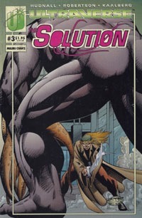
As “just some ’90s issue,” this would probably work pretty well overall as a standalone issue…it has the feel of a random issue trying to set something up without being itself bogged down with stuf from prior issues. The cover itself isn’t all that interesting; and I never really paid it much attention, focusing mainly on the title logo and issue number. Essentially we get naked-backside-of-Vurk fighting against Harmonica-with-a-sword…boring as a cover for only reading previous issues, but at least “fitting” given the actual interior contents of this issue.

If you find this for 25 cents or so–bottom-price bargain bin, basically–it’s worthwhile if only for “exposure” to the title and such. Generally-speaking, it’ll work better with the context of the first couple issues (admittedly, also ideally bargain-priced).

While I’ve been iffy with this title on lack of knowledge…it’s quickly becoming a high-quality, enjoyable favorite…which I feel like I didn’t expect when I started this deep-dive into the Ultraverse.

solution_0003_blogtrailer

Ultraverse Revisited: The Solution #2

ultraverse_revisited

solution_0002Showdown

Writer: James Hudnall
Penciller: Darick Robertson
Inker: Mike Miller
Letterer: Tim Eldred
Color Designer: Tim Divar
Interior Color: Violent Hues
Editor: Hank Kanalz
Published by: Malibu Comics
Cover Date: October 1993
Cover Price: $2.50

Rex Mundi realizes he and his people are being magically spied on…by The Solution! The scene then moves to the Shinjuku district in Tokyo…where we see The Solution in action! They’ve got a plan, and everyone seems to be in place as things unfold. Dropkick and Tech communicate, while Shadowmage  sits by to use her powers in a room next to the group’s target, who is dealt with by Lela Cho–Tech–herself. As Tech begins to realize something’s wrong, Shadowmage confirms that someone’s there, and both Outrage and Dropkick are forced into immediate action away from the building. Shadowmage fights an opponent named Book, while Dropkick deals with a red-clad woman with swords…who seems to recognize his fighting style. Outrage’s opponent seems to be of his own alien race (I guess Outrage is another alien…I did not remember that!), and he’s got some sort of bounty on his head. While Tech gets her client out of the building and we see them trying to escape this ambush, the unfolding battles of the other three unfold as well. In the end, their client is killed, so while The Solution survives, their case is a bust.

This issue is largely a huge fight scene. The previous issue really being the first time I’d ever read an issue of this series (despite owning issues and being aware of the team–mainly from getting Rune #0 and it coming with The Solution #0 as well) I’m still figuring out the characters. And of course, that’s not helped by the way I’m undertaking this reading project–trying to read ALL titles in release-month order, rather than zeroing in on just one series at a time.

So this issue served to really “show off” a lot more with the team. We already know Shadowmage can use magic, but we see more of that here. Lela Cho has a certain skill set, which is also shown off. We see Dropkick in action, and some hints at him being more than he appears. And we see Outrage similarly, as he faces someone that knows more about him than we do, which leaves another question in the air, further details to be sussed out presumably in subsequent issues.

Visually, I thoroughly enjoyed this issue. The detail’s great, the layouts are dynamic, the characters seem consistent and it’s easy enough to follow the general action of it all. Seeing that it’s Darick Robertson art, though, I suppose I should not be surprise, enjoying his work on the likes of Transmetropolitan. I can’t quite figure out a better phrasing, but I felt like the main characters especially were “full” while “sleek” in the way they’re depicted in this issue. Ultimately, the issue in general is nice to look at, as it also totally carries a ’90s vibe.

Story-wise, there’s not a lot: the characters fight, their client is killed, everyone goes home. That’s the broad strokes view. The details are where the depth is, and I’m definitely interested in learning more about these characters. Maybe I’m the odd guy out, but I’m pretty sure I’d totally enjoy several issues of the characters simply interacting with each other and learning of them that way, without even needing a lot of action.

rune_0kRune [K]: The Fury – Part Two
Plotted by: Barry Windsor-Smith & Chris Ulm
Drawn & Colored by: Barry Windsor-Smith
Scripted by: Chris Ulm
Inked by: John Floyd
Computer Color by: Albert Calleros
Lettered by: Patrick Owsley
Text Pages Designed by: Jim Chadwick
Edited by: Steve Gerber

Wayyyy back (it seems) with the start of the Rune stuff (Sludge #1), the cover showed the open mouth with fangs, and the words “The Stones are Cast…” Here in the final issue, we again have that cover image (the 9 issues between being the “poster image” pieces) but with the text “…And Death Walks the Earth.” A fitting sort of symmetry. “The stones are cast and death walks the Earth.” That’s Rune.

This final chapter of the Rune #0 issue, we see a kid named Erik talking with his Dad…as they discuss nightmares, monsters, and keeping things at bay; an incident with Erik forgetting to take his pills, and this hint at there being something more to the kid. Their conversation is largely narration boxes overlaid on scenes of destruction, as Rune gets through the last barriers between himself and Erik, leaving us with Rune perched in a tree outside Erik’s house, apparently preparing to attack.

The art continues to be consistent with prior chapters, as the creative team did not change…this is “merely” three more pages of the same issue, so no surprise there. After all these previous “chapters,” we finally see Rune where he wants to be, after bitter disappointment and destructive confrontations…poised to  take in some incredible power that might restore or maintain his wasting body.

As prologue, as setup, as a #0 issue, it provides an introduction to the character, and leads into what I recall of the Rune #1 issue, such that one certainly can better appreciate things with the main series having read this first, and yet, this isn’t absolutely required reading for that.


I enjoyed this issue. It’s been nearly 25 years since my initial $2.50 was spent on it (that’s less than one penny per month from then til now, I think!) so while I’d be less than thrilled with an issue that’s basically a massive fight scene for a full/premium price in 2018, I’m ok with this 1993 issue being this way…all the more for so enjoying the art.

Yet again, the Rune chapter is an identifying mark on the issue, dating it at a glance to one of the October 1993 issues; and as with others, it is not singularly a selling point in my eyes, as far as this issue in isolation. It’s certainly a selling point for getting all 11 serialized chapters of Rune #0, or the coupons for the mail-away, and such.

But along with most of the “early Ultraverse” issues, I routinely see the issues in bargain bins, so don’t consider them to be worth one paying more than $1 for as of 2018; but that’s also easy enough for me to say, owning all the single issues myself already, and not being on the hunt for them.

I would definitely recommend pairing this issue with the first issue to have SOME context of stuff…and though I didn’t do it myself, I think this issue probably reads a lot better in context of being read immediately after the first issue, rather than with 17+ other issues read in-between.

solution_0002_blogtrailer

Ultraverse Revisited: The Night Man #1

ultraverse_revisited

nightman_0001The Night Man

Writer: Steve Englehart
Penciller: Darick Robertson
Inker: Andrew Pepoy
Letterer: Dave Lanphear
Color Designer: Paul Mounts
Interior Colorists: Foodhammer!
Editors: Chris Ulm & Hank Kanalz
Published by: Malibu Comics
Cover Date: October 1993
Cover Price: $2.50

I think this issue’s cover is one of my favorite #1s of the Ultraverse. I really like the gradient from dark purple to a pink for the background, as well as the full moon, a bit of city architecture, and the gargoyle at the foreground with our title character perched on it, looking quite ready for action. The visual is rather striking, and seems quite "iconic" to me, despite being a generic pose or such–perhaps because this is the (only/main) cover for a #1 issue officially introducing the character. batman_608_2nd_printThis single image is truly "selling" the thing–visually and conceptually. This is no Batman, but perhaps borrows a bit of the imagery (though the most "iconic" Batman-and-a-gargoyle image I can think of–at age 37 in 2018–is the Jim Lee cover to Batman #608, which came nearly a decade after this cover). The fact of this being a #1 likely also lends to the "iconic-ness" of the cover…it’s simply a first issue, and carries a whole other sort of significance as such.

We open on a black-clad figure with goggles coming at us, apparently leaping down from above; the figure is narrating, informing us that he’s not who he was, and that he is (and this gives us the title of the issue itself) The Night Man. Our hero’s about to hit a roof, and flashes back to earlier. First, an accident he was in (this is "Johnny Domino," and he was in the car hit by the cable car when the Strangers got their powers back in Strangers #1). Then when he got out of the hospital, he now needs to shield his eyes from bright light…and discovered that he could "hear" evil thoughts. We follow him trying to deal with that and realizing the ridiculousness of the premise, eventually settling on having to do something himself. His first foray into thwarting evil leaves him banged up and this initial costume quite damaged. During the day, he meets with his father, and we see their interaction, and get a bit of setup for what’s likely coming later. Johnny continues his ‘detective’ work, and tries to save the woman who’s been threatened. Unfortunately, we find that he’s too late–when he gets to her place, she’s already been killed, and the killer has literally stolen her face. A chase ultimately leads to a fight on a boat, and the villain winds up in the water, apparently eaten by the shark. And of course, Johnny didn’t sense any evil from the shark–it’s just a shark looking for food. Closing out the story, having survived a couple of nights AS The Night Man, he takes full ownership of the role, that this is his duty, put on him by the cable car accident, and he is The Night Man! (and then a menacing fist with a knife sticks out of the water–the villain’s apparently not completely dead).

This is a strong first issue. We have ties to the larger Ultraverse–the story universe in general–as Johnny first showed up in Strangers #1. That was a nice bit of detail that at the time was sorta throwaway, but comes into play here in a major way–what was "just some guy in a car" is a major character with powers and his own series, now! But while those details are great for tying this to the larger universe…they’re conveyed in such a way that you don’t have to have read Strangers or other issues…you just get a better appreciation for the details if you have. In typical/trope-ic fashion, we’re tossed into the action and essentially given the "…see that guy? That’s me. You’re probably wondering how I got here…" thing. We get Johnny’s name, what he does, what’s happened to him, his current status quo, meet his father, see that he’s the owner of an amusement park resisting a takeover, get plenty of exposition to flesh out the relationship between father and son, etc. We see the character discover his power, start figuring it out, make decisions based on it, don multiple iterations of a costume (learning from near-fatal experience); we’re introduced to a "super villain" or potential "arch enemy" (at least "first major enemy who might be a recurring figure"), and generally have all this stuff packed into this one issue.

In 2018, this issue alone would probably be spread across some special issue/one-shot(s) and no less than 6 issues, each with umpteen variant covers.

That it’s all crammed into one issue makes it a very good value, and a strong stand-alone piece that sets you up to want to find the "sequel" in the form of subsequent issues.

Visually, I really like the issue. The art is quite appealing, with a great sense of realism, while not trying to be something other than a comic book. That is, it’s not particularly cartoony, nor is it hyper-realistic. There’s a good amount of detail throughout, with an assortment of page layouts that change things up nicely, keeping stuff from being just a bunch of pictures placed evenly on a page. The coloring also plays a huge part, and like with the cover, I particularly like the night-time stuff with the purple skies, full moon, and dark water.

rune_0cRune [C]: The Sorcerer
Plotted by: Barry Windsor-Smith & Chris Ulm
Drawn & Colored by: Barry Windsor-Smith
Scripted by: Chris Ulm
Inked by: John Floyd
Computer Color by: Albert Calleros
Lettered by: Patrick Owsley
Text Pages Designed by: Jim Chadwick
Edited by: Steve Gerber

I feel like this is the most detailed piece of the Rune story so far. We’re given visuals to go along with what is essentially a journal entry or letter written by Tesla–presumably the actual historical Nikola Tesla–used here in fictitious context. He writes about someone coming to him for information about energy, and muses on who or what the figure was, figuring it must have been a vision…except for a stone he found on his desk with a particular rune on it, that meant "fire" or "sorcerer."

Essentially, this segment shows us that Rune met with Tesla…and that he has the ability to influence how he is perceived. In this case, perceived as quite the cleaned-up, respectable figure. This could be interpreted as shape-shifting, but the detail of Tesla noting that he could almost see something else, suggesting that this truly was his being influenced to see one thing despite the actuality of Rune’s true appearance. The emphasis on the word "sorcerer" gives us a bit more insight into Rune; that where once he was worshipped as a god, as time went on he’s gone from being a god to being a sorcerer, as an explanation for "what" he is and how he’s beyond human.

As a stand-alone piece, I feel this is the most effective so far, as it is an entire thing within three pages. We have Tesla’s letter/thoughts/recollection and the visuals show us both what he saw and what was actually there; the entire episode is conveyed right here. The lengthy wordiness really helps, given the limited page count, making it seem like more than just taking in a page, turning the page, and being at the end of the segment.

Since this is a serialized piece of a single issue and the creative team remains entirely the same, the consistency of visual style keeps this feeling like the next bit, without some jarring change. Where the first chapter was just there to be taken as itself, and then a drastic change in setting for the very next segment, and now another here…at least at this third part the "story" begins to take a bit more shape or pattern as it grows clearer that we started in the present with Rune, and now are seeing moments from the past, leading us to the present, perhaps.


nightman_dvdThis issue comes off like a pilot episode of a tv series, and while there’s the Firearm #0 thing advertised in the Sptember 1993 Ultraverse titles–giving a short live-action piece that continues in a comic, this feels more like something that would fit as an ongoing live-action thing, like a tv series…

…which is rather fitting, as there actually WAS a tv series of The Night Man, that ran 44 episodes across two seasons! (And is freshly available on DVD!)

With the Rune piece on the flipside of this issue feeling a lot more substantive than the previous couple of segments and working nicely as its own standalone unit…The Night Man #1 as a whole is an excellent single issue! Most of the Ultraverse #1s make strong jumping-on points, but this one seems like one of the best so far (if only for being the one I’m currently taking in). This issue’s definitely worth 25 or 50 cents in a bargain bin…and really, is one I’d even consider worthwhile to get for up to its original $2 cover price…especially given the tv series is now (June 2018) out on dvd. This is a great piece to read to get a sense of the original comic and the comic-version’s origin for the character, before perhaps diving into watching the tv series.

I’m feeling like I definitely missed out on something special by not having followed this series back in the day–I definitely remember GETTING this issue, and reading (but not caring for it) back then…but now it seems like this would have been one of my favorite Ultraverse titles! I’m looking forward to getting into the coming issues as well as hopefully getting and digging into the tv series.

nightman_0001_blogtrailer

Ultraverse Revisited: The Solution #1

ultraverse_revisited

solution_0001The Problem

Writer: James Hudnall
Penciller: Darick Robertson
Inker: John Lowe
Letterer: Tim Eldred
Editor: Hank Kanalz
Color Design: Keith Conroy, Tim Divar
Interior Color: The ‘Bu Tones
Special Thanks to: Brandon McKinney, Mike S. Miller
Published by: Malibu Comics
Cover Date: September 1993
Cover Price: $1.95

This is definitely an issue I know I have not read before…in fact, I’m honestly not sure that I’ve read any issues of this series–I’ve only been "aware of" it, and perhaps read the several-page Rune segment that would have been a flipbook on one of the issues. I do not remember having this issue initially, or even seeing it when it first came out.

We open on someone just before he’s killed…this is our introduction to a huge, hulking Ultra named Meathook. Then we’re introduced to a much more graceful Ultra with finesse (and a sword) in Deathdance. We’re quickly introduced to a teleporting member of this group called Gate…and then a fourth–Book. Having killed all the guards at this base, they steal a bunch of nukes, which leaves the former owners–Russians–none too happy. Later, the Russians speak to contacts at a group called Aladdin, and are referred to yet another group called The Solution. The scene shifts and we’re introduced to more souped up ’90s-style henchmen for hire, protecting a drug shipment. As they’re ambushed by none other than The Solution, we meet Incoming, Dropkick, Shadowmage, and leader Tech (Lela Cho). After defeating Black Tiger, the Solution heads back to one of their secret bases to decompress, and Tech reflects on all that’s happened in barely six months. Another member of the group–Outrage–shows off by smashing, to the amusement of the others. As they begin looking into the Russian nukes situation, Shadowmage uses her magic to let them spy on the perpetrators…but she’s "sensed" by them, and her surprise leads to our cliffhanger, and the Solution might be in trouble.

From the cover itself, I really enjoyed this issue! There’s something to the cover–perhaps the colors involved, with the shades of purple, blue, pink, and white on an orangey background–that just really works for me. And of course, it’s a typical ’90s shot of a group rushing at the viewer, the leader shooting ahead. I imagine another factor for this standing out to me is–as generally tends to be the case on all these early Ultraverse books–this is the only cover I’ve known for The Solution #1.

The interior art is quite striking, albeit strongly conveying the general ’90s vibe that I’m realizing–or re-realizing–I picked up on as a kid more than I realized. It’s sort of interesting to me seeing Darick Robertson as the penciller, as (offhand) I really only know his name from his Transmetropolitan work. Seeing it here is cool, and I really like the visual style. Though a bit gratuitous, there’s a panel of Tech in the shower while the Solution is at their base that stood out more than the scene in Mantra #1 where Lukasz wakes up in Eden Blake’s body. Given the way the Mantra scene stuck with me as a kid, the fact I don’t remember this instance from back then is how I know I never read this as a kid.

On the story side, this issue moves at a pretty fast pace. By modern (2018) sensibilities, it’s way too fast and leaves far too much unsaid and is rather choppy, leaping from one thing to the next. But this is from 1993, and frankly…I really dig the pace. This is "only" a first issue, and it introduces us to all sorts of characters–essentially two teams of villains along with the protagonists making up the titular team, and still other characters. There’s even plenty of room for violence and blood, which is a bit on the messy side but in ’90s shorthand shows off just how "bad-ass" the villains are and how good the Solution is in being able to take them on at all, let alone have victory.

In the modern lens, this would easily cover 3-5 issues…that we get it all crammed into one makes for a jam-packed first issue that is well worth its cover price even now, despite being something I’d typically associate solely as yet another quarter-book.

This is my first real look outside of the initial "core" of Ultraverse titles, and though it might not fly with me if it were new in 2018, I definitely like it as something from 25 years ago. Running with my usual, this issue is absolutely worthwhile if found in a cheapo-bin; easily up to $1. If you dig the art alone, this could even be worthwhile for a bit more. While I know I’ve seen many of the other Ultraverse #1s in bargain bins…I think this is the first I’ve gotten to that I have NOT. Perhaps it is just "that good" that fewer people have gotten rid of it; perhaps it had a smaller print run; I don’t know.

I’m looking forward to getting into the next issue and seeing where things go, and hopefully better associating character names with actual characters.

solution_0001_blogtrailer

The ’90s Revisited: The Phoenix Resurrection – Genesis

90s_revisited

phoenix_resurrection_genesisGenesis

Writrs: Ian Edginton, Dan Abnett
Pencillers: Darick Robertson, Mark Pacella, Greg Luzniak, Rob Haynes
Inkers: Tom Wegrzyn, Art Thibert, Larry Stucker, Bob Wiacek, Philip Moy
Letterer: Vickie Williams
Color Design: Robert Alvord
Interior Color: Malibu Color
Asst. Editor: Scott Bernstein
Editor: Hank Kanalz
Published by: Malibu Comics
Cover Date: December 1995
Cover Price: $3.95

As Marvel publishes Phoenix Resurrection in the present, 22 years ago it published The Phoenix Resurrection through Malibu ComicsUltraverse line. Malibu Comics, which Marvel had purchased in order to keep DC Comics from buying the smaller publisher. And with the smaller publisher in-hand…looking back through this issue at least, it seems Marvel had no idea what to do or have done with the small superhero universe it now had in addition to its own.

This Genesis issue was preceded by a month-long promotion in which each of the 7 then-current Ultraverse titles had a 3-page flipbook segment showing the characters encountering some kinda reference to a phoenix, though taken as a whole that made for a disjointed mess. The seven chapters were reprinted/collected into a single issue in The Phoenix Resurrection: Red Shift.

Getting into the main/actual story of the "event" now with this issue, we get a prologue of the Phoenix Force being discovered by some probe from another universe. Before long, through machinations of the Gateway character, a squad of X-Men find themselves once more in a parallel universe that they’ve become increasingly familiar with (a footnote reference to the Mutants vs. Ultras special issue, itself collecting several previously-exclusive American Entertainment editions such as Prime vs. Hulk, Wolverine vs. Night Man, and All New Exiles vs. X-Men).

While bystanders and news media are focused on something coming from the sun, Ultra hero Prime engages the X-Men in combat, because of course they’ve gotta fight. The source of the aforementioned probe–a mother ship that’s buried in the ocean–reunites with a counterpart in the sun, and brings the Phoenix Force to this Earth, and then tries to drain its energy–its life–causing the Phoenix entity to be driven insane with pain. The entity bonds with Prime as a host body, and continues to fight the X-Men, as other Ultras are brought to the scene. (It should be mentioned that apparently the mutants’ powers are severely dampened in this reality…but that’s a crutch that doesn’t much matter for discussion of this particular issue). Eventually, the Phoenix and Prime are separated, and the Phoenix takes a new host, as the issue ends (to be continued in Phoenix Resurrection: Revelations).

Maybe it’s that I look back on the likes of Prime, Mantra, and Rune with memory of more complex, authentic-sounding stories and characters, as well as the same from the X-Men books from the early/mid-’90s (particularly stuff like Fatal Attractions or the Age of Apocalypse and immediate aftermaths) but this just does not feel like it has much depth, nor is there–even in an extra-sized issue like this–much characterization. It’s like the characters were chosen for the book by "popularity" and "mainstream-ness" (plus, of course, being characters appearing in books that survived into the pared-down 7-book line of Black September-onward), and not really for much else. We have a squad of X-Men and some major Ultraverse characters thrown together, but I get no real sense of depth, development, or motivation. The probe and mother ship have a far-too-convenient means of getting the Phoenix to Earth, Gateway seems nothing but "convenience" personified, and we’re told rather than shown that the mutants’ powers are lessened here. Prime comes off as nothing but some petulant kid–while he IS a kid, he’s lacking a depth I feel like I remember from his own original title. Bishop seems to be present for appearance’s sake, and with the mutants not even really trying to use their powers, there’s no particular point to any specific character’s presence…they’re interchangeable.

With the art, I recognize Darick Robertson and Art Thibert as names if not an actual art style here; but having numerous artists on this single issue doesn’t particularly do it any favors…at least for me reading it in a fair bit of isolation here–perhaps they’re the artists on the main books, in which case I’d welcome that (in idea at least), but just jumping into this issue after the Red Shift collection of 3-page shorts, I’m not thrilled with the visuals. I recognize the various characters–there seems to be an attempt to have them all look a certain way, perhaps using a "house style" or such–but virtually nothing stands out to me. Everyone is for the most part a generic iteration of iconic appearance (for lack of better phrasing). The only real stand-out bit for me was the large image of the Phoenix-possessed Prime (though zero mention or visual reference from the Ultraverse side OR X-Men side of the Prime body being healed/repaired after an obvious significant slash from Wolverine’s claws and Jubilee’s reaction to the green goop).

Ultimately, offhand, I didn’t so much "not enjoy" this as I "didn’t ENJOY" it. It’s cool–at least conceptually–to see the mix of characters thrown together and all. But after 17+ years of having "decompressed stories" that are clearly serialized graphic novels, I definitely am expecting much more depth of character and stuff from two sides like this to be brought out.

This is a definite novelty, one certainly worth 25 cents or so as a bargain-bin purchase, if only for the time it takes to read making it more worthwhile than most anything of its size published in present-day. You can definitely dive into this issue withOUT reading anything before it…the "crossover" stuff from the Red Shift 3-page segments are little but token reference-points thus far, making this a better "starting point" if only for having a big chunk of a single story that’s not jumping to a new setting/character every 3 pages. You could do worse than this issue…but much as I’m down on modern Marvel, if you’re looking for "return of Phoenix" stuff, you’d be better served with the contemporary Return of Jean Grey story in the 2017/2018 Phoenix Resurrection, or in 2012’s AvX event series.

phoenix_resurrection_genesis_blogtrailer

Fatal Attractions Revisited: Excalibur #71

Crossing Swords

Writer: Scott Lobdell
Pencilers: Ken Lashley, Darick Robertson, Matthew Ryan
Inkers: Cam Smith, Randy Elliot, Randy Emberlin, Mark Nelson
Letterers: Bill Oakley, Pat Brosseau, Dave Sharpe
Colorist: Joe Rosas
Editor: Suzanne Gaffney
Group Editor: Bob Harras
Cover: Joe Madureira and Joe Bennett
Published by: Marvel Comics
Cover Date: November, 1993
Cover Price: 3.95

After Nightcrawler confronts one of the Acolytes and–thanks to Kitty–narrowly avoids killing him, the X-Men burst into things, “recruiting” the remanants of Excalibur’s help in a particular task: they want to “fix” Colossus. After an injury he’d suffered, he was unable to revert to human form, and they figure that’s the cause of his ‘defecting’ to Magneto’s camp. If they can heal him, surely that’ll fix him and any brain issue, and he’ll return to them.

The various characters react to stuff–some for, some against. While they do, Cable shows up for Colossus, and winds up confronting Phoenix (Rachel Grey) in a less than pleasant battle. Once Colossus arrives (thinking Kitty wants to return to Avalon with him), the “trap” is sprung and the plan revealed. Though Colossus declares he does not want the help of the X-Men, they “help” anyway, and his ability to shift back and forth between human and metal forms is restored. Though he has a touching moment with Kitty, he still opts to return to Avalon with the Acolytes.

Finally, as all of this has been going on, an idea has been building for Nightcrawler, and he decides that with the “old team” basically no more, he’ll have a “new team,” a new Excalibur, that will operate at Muir Isle with Moira.

After rereading X-Men 25 and Wolverine 75, this issue was a bit of a letdown. I’m probably least-aware of ’90s Excalibur of all the X-teams of the time, at least prior to Age of Apocalypse. Reading this, I had a vague sense of deja vu, that I’d read this before. Yet I can’t honestly say with certainty that I’d read the issue any time before reading it for this posting. I know t was at least a few years after the fact that I even acquired the issue for the first time (whether before or after college I don’t even know at this point). For quite awhile, Fatal Attractions (for me) ended with Wolverine 75.

Story-wise, this is a transition issue–we go from whatever recent stuff’s gone down with Excalibur to the end of the issue setting the stage for a whole new team. And in the middle of it we have Cyclops, Jean, and Professor X thrown in–familiar faces that made this issue seem much more an X-Men issue than it would have otherwise, which also ties it into the events of Fatal Attractions in general. It’s also kind of odd having the sense of continuity that there is here–but then, this was back when such things were important to stories and “families” of titles and not some loose option seen as detrimental to the nature of “the story.”

Visually, the issue is a bit uneven with multiple artists–though it’s not terribly detrimental to the issue. It seems like the various scenes had an artist, so there’s some internal consistency that way. I really like the look of Colossus costume in this issue–one page has a nearly full image of him, and it’s one of the best depictions of the character I can recall ever seeing.

It seems the two main things to come out of this issue are the “new” Excalibur team and Colossus is no longer confined to his metallic form. If you didn’t know he’d been injured, that’s probably not a huge plot point (before this read-through, I never would’ve been able to tell you where or when that little problem was dealt with–I’d once been aware that he was so injured, but never really thought about it much or cared to find out its resolution). That this is the beginning of a new Excalibur team has me interested in seeing that team; if this were a new issue, I’d definitely be back for the next. As-is looking at this nearly twenty years after it came out…I could simply track down the next few issues to read.

This is probably the “simplest” of the covers…it’s bright and colorful, but somehow not exactly my cup of tea, so to speak. The hologram of Nightcrawler is–like the others in this series–not bad, though at least on the copy I read, felt like I have to look at it somewhat from an angle to really get the best 3D effect.

So ended the official 30th Anniversary “event” for the X-Men. I loosely followed the X-books here and there over the next year-plus; it wasn’t until the end of 1994 with Legion Quest and then the Age of Apocalypse that I began a run of following the entire X-Universe.

52 Week #52 [Review]

Quick Rating: Very Good
Story Title: A Year in the Life

Booster and Rip Hunter vs. an evolved Mr. Mind for the fate of the multiverse!

52week52Writer: Geoff Johns, Grant Morrison, Greg Rucka, Mark Waid
Art Breakdowns: Keith Giffen
Pencils: Mike McKone, Justiniano, Eddy Barrows, Chris Batista, Pat Olliffe, and Darick Robertson
Inks: Andy Lanning, Walden Wong, Rodney Ramos, Drew Geraci, Darick Robertson
Colors: Alex Sinclair, David Baron and Hi-Fi
Letters: Ken Lopez
Asst. Editor: Harvey Richards
Assoc. Editor Jeanine Schaefer
Editor: Michael Siglain
Special Thanks to: Stephen Wacker
Cover Art: J.G. Jones & Alex Sinclair
Publisher: DC Comics

This issue is almost stand-alone, in a way. It tells the story of Booster, Rip, & Co. as they battle Mr. Mind, who has evolved and emerged, ready to feed on the multiverse created at the end of Infinite Crisis…a task they’ve apparently been working at for awhile. We’re shown some decent detail as to the nature of the multiverse and its origins, and while I’ve not been following any of the One Year Later books that have mentioned it in any way, it seems a good explanation of things to me, for now.

This issue employs quite the artisitic team, and while it might seem like some scramble to get extra pages in this issue, the story itself provides great contextualization and use of the multiple artists. I enjoyed the shifts in art…and the overall visual tone of this issue was on par with–if not surpassing–the usual…a fine finish that I hold no complaint with.

Story-wise, one can go a couple directions. Plenty of action, though with a fair amount of time-travel and looks to different points of plans that were set in motion previously, this issue lacked a concrete feel of being set in the final week, feeling instead like a special issue chronicling an "untold tale" of a "lost week" or some such. On the other hand, with the other core storylines having wrapped up the last couple months, this was the biggest "loose thread," and a LOT was crammed in, even with 40 pages, detailing its conclusion.

All in all, we get a number of cool moments–and an obvious if unexpected reunion of sorts–with events either tying back to the first issue of this series, or evoking some SERIOUS deja vu. It answers some questions, while leaving other newer questions (no pun intended), and provides what I consider some good, solid comic-book closure. That is, the stories conclude…but the door is in no way slammed shut on things.

Obviously, if you’ve followed the series all that far, there’s no reason NOT to get this issue (those extra pages? Same cover price, even!). And heck, even if you haven’t followed this series all that closely…there’s stuff in this issue that looks like it’ll have some solid repercussions in the months to come throughout the DCU (as well as some explanation given to the nature of the apparent multiverse that’s been brought back), so wouldn’t be a bad issue to nab as a single, even if some smaller moments/subtleties are lost for not having read the series as a whole.

A solid ending to a solid series…

Ratings:

Story: 4/5
Art: 4/5
Overall: 4/5

52 Week #48 [Review]

Quick Rating: Very Good
Story Title: Asked and Answered

The race to find Kate Kane and rescue her is on!

52week48Writers: Geoff Johns, Grant Morrison, Greg Rucka, Mark Waid
Art Breakdowns: Keith Giffen
Art: Darick Robertson
Pencils – Origin: Nicola Scott
Inker – Origin: Doug Hazlewood
Colors: David Baron, (Origin – Alex Sinclair)
Letters: Jared K. Fletcher
Asst. Editor: Harvey Richards
Assoc. Editor: Jeanine Schaefer
Editor: Michael Siglain
Cover Art: J.G. Jones & Alex Sinclair
Publisher: DC Comics

This issue opens with several days’ worth of action, in a rather cool way: multiple characters across multiple panels across multiple days, asking one key question to kick the main story into motion. The bulk of the issue centers on Nightwing, Montoya & co. as they seek out Mannheim and Batwoman, to foil the plans of Intergang and their crime bible. There’s a lot of action as we see the characters fighting increasingly-high-level underlings, working their way up to Mannheim himself and a dark ceremony that promises to unleash hell-on-Earth, starting with Gotham City.

The ending of the fight has a bit of surprise and bucks the norm a bit–a welcome feat in contemporary comics.

To a degree, there’s little be said about the writing. It’s good. It’s solid. It’s consistent. Same as it’s been. The story flows, and we get to see characters acting in-character and reflecting (particularly in Montoya’s case) growth from the past 11 months.

The art this week–by Darick Robertson–fit really well. There’s a sort of thick darkness about it that sets the tone without being overly bold nor overly light. No complaints here in that department.

The origin backup stars the Birds of Prey, and like the other backups, condenses years of history into just a couple pages of the bare-bones basics. Par for the course, really…gave me a clearer vision of the history, and not atrocious to look at so fills its duty; nothing stand-out astonishing or anything, though.

48 issues in…if you’re not on-board, I doubt I’ll be able to convince you; and if you’ve stuck it out this far even disliking it, you might as well finish.

I found this to be another solid issue of what’s really come to be a favorite series.

Ratings:

Story: 4/5
Art: 4/5
Overall: 4/5

%d bloggers like this: